
Search results for "Wave bye bye" in Home Design Ideas

 The Cultural Landscape Foundation
Sunday July 19, 3:00 to 4:30pm | Falls Village
Pittman Residence by Designed by A.E. Bye, Dialogue led by Kimberly Mercurio of Kimberly Mercurio Landscape Architecture
Designed by twentieth-century landscape architect A.E. Bye, the Pittman Residence in Falls Village, Connecticut features an artistic landscape design both inspired by and accentuating the area’s natural ecological character. Embodying the architect’s own creative aesthetic, the property incorporates various undulating landforms that draw on the presence of natural shadows to create a memorable landscape that lingers in the minds of visitors long after they bid the property ado. This season, join landscape architect and scholar Kimberly Mercurio as she leads an engaging dialogue on the design history of the Pittman Residence and the significance of Bye’s play on shadows in landscape architecture. With her immense knowledge of A.E. Bye’s work, having recently completed the A.E. Bye/Landscape Architecture Archives Research Fellowship at Penn State University and received a grant from Dumbarton Oaks to further study and document his achievements, Mercurio’s presentation promises to be both educational and inspiring. Photo courtesy Kimberly Mercurio

 In Detail Interiors
A master bedroom with rich color, texture and personality!
With a colorful master bathroom that blends the perfect matte finish, semi-primitive blast of pattern with rich, saturated jewel tones and a little calacatta gold tile – determining the best fabrics and finishes for the master bedroom felt like a HUGE challenge. How do you stand up to something so fabulously unique and still create a soft respite for someone to slumber?!
This bedroom was a small space with existing Vetrazzo floors and an entire wall dedicated to floor-to-ceiling fixed glass pane windows. Between the cracks in the plaster ceiling and the lacquered pink dresser we knew we had our work cut out.
Saturated colors create a fairy tale bedroom
Fast forward to finding the perfect, sumptuously soft evergreen mohair for the headboard and furry tuffets for the foot of the bed. Texture became the name of the game and a certain level of color variation had to tie through from selection to selection. Cladding the walls with a gilt woven cloth wall covering that also pulled a sort of skin-tone clay from detail found in the Vetrazzo flooring (OMG! so pretty!) and grounding everything with a sort of deco-inspired one-of-a-kind wool rug. The layers of unexpected style helped develop a more collected – less stylized – feeling overall.
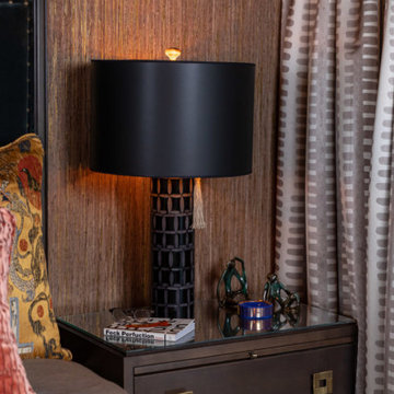
Then it was bye-bye to the pink lacquer! A local artisan worked on a faux finish for the custom dresser that the client had already invested in and we just gave it a refresh with a deep bronze finish. Balancing this piece with the playful silk tassel pendant lights that frame a beautiful original painting of red headed queens by artist Nancy Rhodes Harper.
Exquisite lighting for a sexy master bedroom
Additionally, the swirl and swoop of the forged metal light fixture overhead play off the more structured spinal-column type pattern of the black out window treatments that truly act as their own piece of art. Each element has its place and plays with the visual and textural aesthetics that make our client (and our team) swoon.
Want more colorful and moody interior spaces? Check out another one of our recent projects here! Then call us for more information on how we can help you! Read more about our full-service interior design here!
Find the right local pro for your project
 Village Home Stores
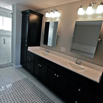
Dark stained cabinets are a perfect contrast to the white cultured marble double vanity top in this Master Bathroom. The "Wave" bowl style has become our most sought-after style from The Onyx Collection.
Applestone Homes (Davenport, IA)
 FineLine Kitchens, Inc.
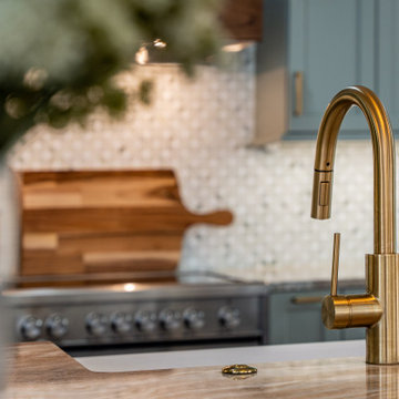
Hi everyone, I'm Sarah and Ogun we are here with fine line kitchens. So we are a couple working together. I do the interior design and remodeling of the space material selection meeting with the clients. And I handled operations outside, you know meaning all the construction work that is taking place the inside. The houses that we work in. I handle all the aspects of the construction, so today's project is very special. We're in Vienna and the client had a very big family. It's a family of seven that lives here. So we had a few aspects that we needed to keep in mind while designing this one. Having everybody be able to sit on the island. So we wanted plenty of seating all the way around. We didn't want anybody standing or anything like that. So what we did is we maximize the space. The center island is the biggest part of the kitchen. We use a natural stone to kind of give it a beautiful texture versus quartz. It's kind of standard white or kind of fabricated, so I wanted something very natural. We did this because I took my inspiration from the outside, so the inspiration if you look at the view right in front of me is there are so many greens there's a lot of brass accents and I wanted to bring this. Into this kitchen while designing it for my clients. She is very warm very. She wanted a very homey, comfy kind of look for the kitchen. So that's what we did today. As you can see, the cabinets are sage green, very light, so I still think it's a neutral, but it's a lighter color that again brings the outside in and we combine that with the oak right behind me so it's a slightly warm oak. It's not very dark. It's not very light. It's a medium brown and the same color went on the island. To kind of tie these two in and the backsplash, my favorite part is where you can see a little bit of design. It is, in my opinion still classic, but includes a pattern so the outside part is as we said in the beginning, is handled by my husband. I'd like him to speak a little bit about that. Thanks, Sarah, I want to talk to you guys a little bit about the construction part of this project. Originally this kitchen was located mostly in this area. They had their stove there sing. It was more of a peninsula layout in Sarah's and the customer vision they wanted. They wanted to get rid of the peninsula and they want to be able to have a huge island that can at least sit seven people because they're familiar with seven. So we wanted to make sure that we can achieve this design and bring it to life so that they can be happy with this layout. Some of the challenges we had, the house, the home being, you know, old home. There were a lot of you know the older electrical and plumbing that had to be replaced. We had to relocate the stove from here to this area. Over here we had put a nice foot fan that we had to relocate all the ductwork and the plumbing. Was being on the peninsula area. We had to relocate it to the center islands. So we achieved all this and kind of like bring it to bring in this kitchen up to date it looks beautiful. That's true, so yes, the old layout did not function for my clients because everything was kind of gathered on one side of the kitchen. So there was like a peninsula right there. So the end of this island kind of continued straight. And that was just the L shape. Kind of where everything was and there used to be another big table here, so they were using only kind of half of the space. So like I said at the beginning, our vision was to kind of feed everybody at the island, create some symmetry. 'cause I love that. So as you can see behind me, this is kind of the focal point symmetrical. Everything is kind of even we wanted to also panel the fridge here so it mimics the pantry and another size. So when you're looking at it, it is bringing again that symmetry back again. I hope you enjoyed this kitchen and this video and I'll see you soon. So how do you think this project turned out? It's nice. I like the color. I think it turned out nice. It's kind of like a little bit different color than what we always do. So I realize. Are you giving me a little bit of credit here that I did something different? Are you proud? I'm so proud of you. Other than that I like it. That they have kind of like a two sink. So if this was our kitchen, if we ever like you can have your own. I can have mine if we ever get into a fight then this can be like my own kitchen. Why are we gonna bring in a fight right now? So I'm cooking anyway. You're grilling most of the time, So what are you even talking about? My kitchen? That's my kitchen. You can just take the small sink. That's fine. It's always good to have your own space right there, so anyways. Thank you guys for watching. We hope to see you soon and if you have any questions please click the link below. It'll lead you to our website, house, YouTube and all of the social media is so nice to have you guys. We'll see you soon. Thanks bye bye-bye.
 S Squared Design, LLC
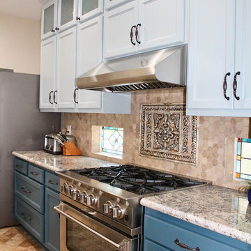
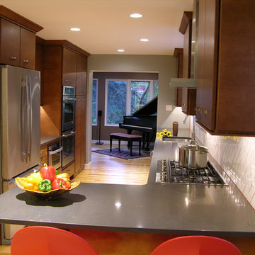
This client wanted an colorful, full of life kitchen they could create the best food in and be as stunning to look at as well. For starters, we reconfigured some base cabinets to large deep drawers and also have trash/recycle pull outs. The top cabinets now are extended to the ceiling for more storage. A custom designed tall cabinet that maximizes the storage space with a few deep drawers a recycle pull out and a side cabinet for brooms and such. Also houses two oven/microwaves. Granite countertops were an improvement from the original Formica ones. We said bye bye to the blue wallpaper and hello to a fresh warm neutral on the walls to make way for the two tone blue cabinets. We did the flooring in a herringbone pattern for even more interest. A custom designed center medallion piece above the stove adds a personal touch and a nice focal piece. A great project and very happy clients!
 HomeTech Renovations, Inc.
Randy Bye
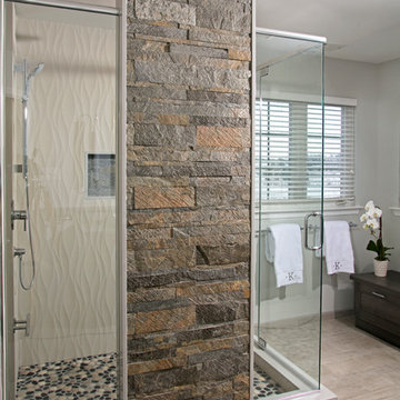
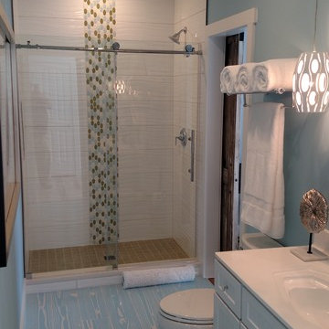
Double shower - mid-sized modern master beige tile and porcelain tile porcelain tile double shower idea in Philadelphia with furniture-like cabinets, brown cabinets, a two-piece toilet, beige walls and an undermount sink
Double shower - mid-sized modern master beige tile and porcelain tile porcelain tile double shower idea in Philadelphia with furniture-like cabinets, brown cabinets, a two-piece toilet, beige walls and an undermount sink


 Cassoni Furniture & Accessories
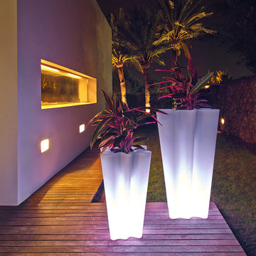
- BYE BYE PLANTER. An abstract shape drawn by the upper edge and yet an overall inferior outline which appears to be geometric, flowing from side to side, but never seeming to join. An ordinary vertical outline holds the object within it’s own identity. Its overall stretched cartoon-like appearance symbolizes journeys through space at light-speed.
16''1/2W x 15''3/4D x 27''1/2H.
23''5/8W x 22''D x 39''3/8H.
https://cassoni.com/Bye_bye_planter
 J. Francis Company LLC
Bye, Bye Beam! A new beam was installed flush with the floor framing above. Beyond, the two openings (a former door and window to a previously replaced porch are now combined in to one larger opening to the sun room beyond. New flooring ties both spaces together.
 CSR Interiors Inc.
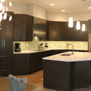
We totally transformed and opened up this kitchen, which started out with a very small island and an angled peninsula perpendicular to the angled wall. The functionality is much improved and the client gained a ton of storage and work space. It had white therma foil cabinets, green corian counter tops and a back splash with white tiles and a green leafy motif...and green and white leafy wallpaper. Bye bye all that, hello sleek and contemporary.
 Chester County Kitchen & Bath
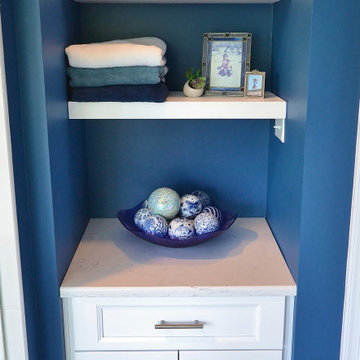
Large Master Bath remodel in West Chester PA inspired by blue glass. Bye-Bye old bathroom with large tiled tub deck and small shower and Hello new bathroom with a fabulous new look. This bathroom has it all; a spacious shower, free standing tub, large double bowl vanity, and stunning tile. Bright multi colored blue mosaic tiles pop in the shower on the wall and the backs of the his and hers niches. The Fabuwood vanity in Nexus frost along with the tub and wall tile in white stand out clean and bright against the dark blue walls. The flooring tile in a herringbone pattern adds interest to the floor as well. Over all; what a great bathroom remodel with a bold paint color paired with tile and cabinetry selections that bring it all together.
 S Squared Design, LLC
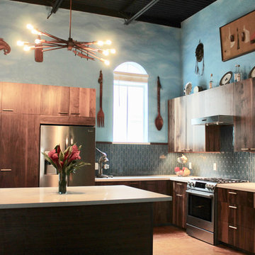
This loft was in need of a mid century modern face lift. In such an open living floor plan on multiple levels, storage was something that was lacking in the kitchen and the bathrooms. We expanded the kitchen in include a large center island with trash can/recycles drawers and a hidden microwave shelf. The previous pantry was a just a closet with some shelves that were clearly not being utilized. So bye bye to the closet with cramped corners and we welcomed a proper designed pantry cabinet. Featuring pull out drawers, shelves and tall space for brooms so the living level had these items available where my client's needed them the most. A custom blue wave paint job was existing and we wanted to coordinate with that in the new, double sized kitchen. Custom designed walnut cabinets were a big feature to this mid century modern design. We used brass handles in a hex shape for added mid century feeling without being too over the top. A blue long hex backsplash tile finished off the mid century feel and added a little color between the white quartz counters and walnut cabinets. The two bathrooms we wanted to keep in the same style so we went with walnut cabinets in there and used the same countertops as the kitchen. The shower tiles we wanted a little texture. Accent tiles in the niches and soft lighting with a touch of brass. This was all a huge improvement to the previous tiles that were hanging on for dear life in the master bath! These were some of my favorite clients to work with and I know they are already enjoying these new home!
 S Squared Design, LLC
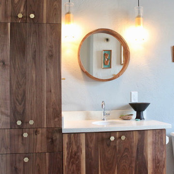
This loft was in need of a mid century modern face lift. In such an open living floor plan on multiple levels, storage was something that was lacking in the kitchen and the bathrooms. We expanded the kitchen in include a large center island with trash can/recycles drawers and a hidden microwave shelf. The previous pantry was a just a closet with some shelves that were clearly not being utilized. So bye bye to the closet with cramped corners and we welcomed a proper designed pantry cabinet. Featuring pull out drawers, shelves and tall space for brooms so the living level had these items available where my client's needed them the most. A custom blue wave paint job was existing and we wanted to coordinate with that in the new, double sized kitchen. Custom designed walnut cabinets were a big feature to this mid century modern design. We used brass handles in a hex shape for added mid century feeling without being too over the top. A blue long hex backsplash tile finished off the mid century feel and added a little color between the white quartz counters and walnut cabinets. The two bathrooms we wanted to keep in the same style so we went with walnut cabinets in there and used the same countertops as the kitchen. The shower tiles we wanted a little texture. Accent tiles in the niches and soft lighting with a touch of brass. This was all a huge improvement to the previous tiles that were hanging on for dear life in the master bath! These were some of my favorite clients to work with and I know they are already enjoying these new home!
 HomeTech Renovations, Inc.
Randy Bye
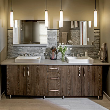
Example of a large transitional master beige tile and porcelain tile porcelain tile bathroom design in Philadelphia with flat-panel cabinets, brown cabinets, a two-piece toilet, brown walls and a drop-in sink
Example of a large transitional master beige tile and porcelain tile porcelain tile bathroom design in Philadelphia with flat-panel cabinets, brown cabinets, a two-piece toilet, brown walls and a drop-in sink
 HomeTech Renovations, Inc.
Randy Bye
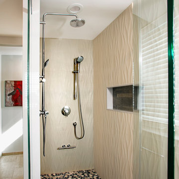
Example of a mid-sized minimalist master beige tile and porcelain tile porcelain tile double shower design in Philadelphia with furniture-like cabinets, brown cabinets, a two-piece toilet, beige walls and an undermount sink
Example of a mid-sized minimalist master beige tile and porcelain tile porcelain tile double shower design in Philadelphia with furniture-like cabinets, brown cabinets, a two-piece toilet, beige walls and an undermount sink
 S Squared Design, LLC
This loft was in need of a mid century modern face lift. In such an open living floor plan on multiple levels, storage was something that was lacking in the kitchen and the bathrooms. We expanded the kitchen in include a large center island with trash can/recycles drawers and a hidden microwave shelf. The previous pantry was a just a closet with some shelves that were clearly not being utilized. So bye bye to the closet with cramped corners and we welcomed a proper designed pantry cabinet. Featuring pull out drawers, shelves and tall space for brooms so the living level had these items available where my client's needed them the most. A custom blue wave paint job was existing and we wanted to coordinate with that in the new, double sized kitchen. Custom designed walnut cabinets were a big feature to this mid century modern design. We used brass handles in a hex shape for added mid century feeling without being too over the top. A blue long hex backsplash tile finished off the mid century feel and added a little color between the white quartz counters and walnut cabinets. The two bathrooms we wanted to keep in the same style so we went with walnut cabinets in there and used the same countertops as the kitchen. The shower tiles we wanted a little texture. Accent tiles in the niches and soft lighting with a touch of brass. This was all a huge improvement to the previous tiles that were hanging on for dear life in the master bath! These were some of my favorite clients to work with and I know they are already enjoying these new home!
 S Squared Design, LLC
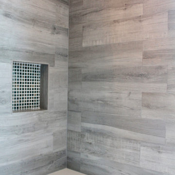
This loft was in need of a mid century modern face lift. In such an open living floor plan on multiple levels, storage was something that was lacking in the kitchen and the bathrooms. We expanded the kitchen in include a large center island with trash can/recycles drawers and a hidden microwave shelf. The previous pantry was a just a closet with some shelves that were clearly not being utilized. So bye bye to the closet with cramped corners and we welcomed a proper designed pantry cabinet. Featuring pull out drawers, shelves and tall space for brooms so the living level had these items available where my client's needed them the most. A custom blue wave paint job was existing and we wanted to coordinate with that in the new, double sized kitchen. Custom designed walnut cabinets were a big feature to this mid century modern design. We used brass handles in a hex shape for added mid century feeling without being too over the top. A blue long hex backsplash tile finished off the mid century feel and added a little color between the white quartz counters and walnut cabinets. The two bathrooms we wanted to keep in the same style so we went with walnut cabinets in there and used the same countertops as the kitchen. The shower tiles we wanted a little texture. Accent tiles in the niches and soft lighting with a touch of brass. This was all a huge improvement to the previous tiles that were hanging on for dear life in the master bath! These were some of my favorite clients to work with and I know they are already enjoying these new home!
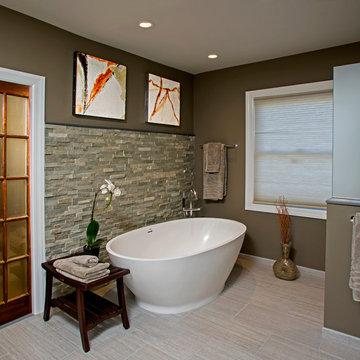 HomeTech Renovations, Inc.
Randy Bye
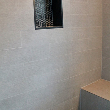
Large transitional master beige tile and porcelain tile porcelain tile bathroom photo in Philadelphia with flat-panel cabinets, brown cabinets, a two-piece toilet, brown walls and a drop-in sink
Large transitional master beige tile and porcelain tile porcelain tile bathroom photo in Philadelphia with flat-panel cabinets, brown cabinets, a two-piece toilet, brown walls and a drop-in sink
 S Squared Design, LLC
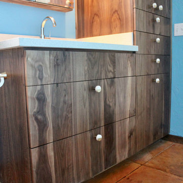
This loft was in need of a mid century modern face lift. In such an open living floor plan on multiple levels, storage was something that was lacking in the kitchen and the bathrooms. We expanded the kitchen in include a large center island with trash can/recycles drawers and a hidden microwave shelf. The previous pantry was a just a closet with some shelves that were clearly not being utilized. So bye bye to the closet with cramped corners and we welcomed a proper designed pantry cabinet. Featuring pull out drawers, shelves and tall space for brooms so the living level had these items available where my client's needed them the most. A custom blue wave paint job was existing and we wanted to coordinate with that in the new, double sized kitchen. Custom designed walnut cabinets were a big feature to this mid century modern design. We used brass handles in a hex shape for added mid century feeling without being too over the top. A blue long hex backsplash tile finished off the mid century feel and added a little color between the white quartz counters and walnut cabinets. The two bathrooms we wanted to keep in the same style so we went with walnut cabinets in there and used the same countertops as the kitchen. The shower tiles we wanted a little texture. Accent tiles in the niches and soft lighting with a touch of brass. This was all a huge improvement to the previous tiles that were hanging on for dear life in the master bath! These were some of my favorite clients to work with and I know they are already enjoying these new home!
 HomeTech Renovations, Inc.
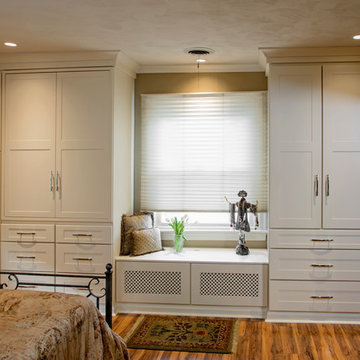
Randy Bye
Example of a large transitional master beige tile and porcelain tile porcelain tile bathroom design in Philadelphia with flat-panel cabinets, brown cabinets, a two-piece toilet, brown walls and a drop-in sink
Example of a large transitional master beige tile and porcelain tile porcelain tile bathroom design in Philadelphia with flat-panel cabinets, brown cabinets, a two-piece toilet, brown walls and a drop-in sink
7