
Search results for "Well rested body" in Home Design Ideas

 HOME & DESIGN MAGAZINE NAPLES
This home was featured in the May 2016 edition of HOME & DESIGN Magazine. To see the rest of the home tour as well as other luxury homes featured, visit http://www.homeanddesign.net/sensible-elegance/

 Ward Jewell Architect AIA
These clients came to my office looking for an architect who could design their "empty nest" home that would be the focus of their soon to be extended family. A place where the kids and grand kids would want to hang out: with a pool, open family room/ kitchen, garden; but also one-story so there wouldn't be any unnecessary stairs to climb. They wanted the design to feel like "old Pasadena" with the coziness and attention to detail that the era embraced. My sensibilities led me to recall the wonderful classic mansions of San Marino, so I designed a manor house clad in trim Bluestone with a steep French slate roof and clean white entry, eave and dormer moldings that would blend organically with the future hardscape plan and thoughtfully landscaped grounds.
The site was a deep, flat lot that had been half of the old Joan Crawford estate; the part that had an abandoned swimming pool and small cabana. I envisioned a pavilion filled with natural light set in a beautifully planted park with garden views from all sides. Having a one-story house allowed for tall and interesting shaped ceilings that carved into the sheer angles of the roof. The most private area of the house would be the central loggia with skylights ensconced in a deep woodwork lattice grid and would be reminiscent of the outdoor “Salas” found in early Californian homes. The family would soon gather there and enjoy warm afternoons and the wonderfully cool evening hours together.
Working with interior designer Jeffrey Hitchcock, we designed an open family room/kitchen with high dark wood beamed ceilings, dormer windows for daylight, custom raised panel cabinetry, granite counters and a textured glass tile splash. Natural light and gentle breezes flow through the many French doors and windows located to accommodate not only the garden views, but the prevailing sun and wind as well. The graceful living room features a dramatic vaulted white painted wood ceiling and grand fireplace flanked by generous double hung French windows and elegant drapery. A deeply cased opening draws one into the wainscot paneled dining room that is highlighted by hand painted scenic wallpaper and a barrel vaulted ceiling. The walnut paneled library opens up to reveal the waterfall feature in the back garden. Equally picturesque and restful is the view from the rotunda in the master bedroom suite.
Architect: Ward Jewell Architect, AIA
Interior Design: Jeffrey Hitchcock Enterprises
Contractor: Synergy General Contractors, Inc.
Landscape Design: LZ Design Group, Inc.
Photography: Laura Hull
 Spaces Designed, Interior Design Studio, LLC
“We could never have envisioned what could be” – Steiner Ranch Homeowner and Client
It is an especially fulfilling Project for an Interior Designer when the outcome exceeds Client expectations, and imagination. This remodeling project required instilling modern sensibilities, openness, styles and textures into a dated house that was past its prime. Strategically, the goal was to tear down where it made sense without doing a complete teardown.
Starting with the soul of the home, the kitchen, we expanded out room by room to create a cohesiveness and flow that invites, supports and provides the warmth and relaxation that only a home can.
In the Kitchen, we started by removing the wooden beams and adding bright recessed lighting. We removed the old limestone accent wall and moved the sink and cooktop from the island on to the countertop – the key goal was to create room for the family to gather around the kitchen. We replaced all appliances with modern Energy Star ones, along with adding a wine rack.
The first order of business for the Living Room was to brighten it up by adding more lighting and replacing an unused section with a glass door to the backyard. Multi-section windows were replaced with large no-split glass overlooking the backyard. Once more, the limestone accent was removed to create a clean, modern look. Replacing the dated wooden staircase with the clean lines of a metal, wire and wooded staircase added interest and freshness. An odd bend in the staircase was removed to clean things up.
The Master Bedroom went from what looked like a motel room with green carpet and cheap blinds to an oasis of luxury and charm. A section of the wraparound doors were closed off to increase privacy, accentuate the best view from the bedroom and to add usable space. Artwork, rug, contemporary bed and other accent pieces brought together the seamless look across the home.
The Master Bathroom remodel started by replacing the standard windows with a single glass pane that enhanced the view of the outdoors. The dated shower was replaced by a walk-in shower and soaking tub to create the ultimate at-home spa experience. Lighted LED mirrors frame His & Hers sinks and bathe them in a soft light.
The flooring was upgraded throughout the house to reflect the contemporary color scheme.
Each of the smaller bedrooms were similarly upgraded to match the clean and modern décor of the rest of the house.
After such a transformation inside, it was only appropriate that the exterior needed an upgrade as well. All of the legacy limestone accents were replaced by stucco and the color scheme extended from the interior of the house to the gorgeous wrap around balconies, trim, garage doors etc. to complete the inside outside transformation.
Find the right local pro for your project

 Brad Ramsey Interiors
Well-Traveled Alys Beach Home
Photo: Jack Gardner
Inspiration for a small coastal guest medium tone wood floor and brown floor bedroom remodel with white walls
Inspiration for a small coastal guest medium tone wood floor and brown floor bedroom remodel with white walls
 CONTENT Architecture
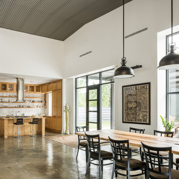
This project encompasses the renovation of two aging metal warehouses located on an acre just North of the 610 loop. The larger warehouse, previously an auto body shop, measures 6000 square feet and will contain a residence, art studio, and garage. A light well puncturing the middle of the main residence brightens the core of the deep building. The over-sized roof opening washes light down three masonry walls that define the light well and divide the public and private realms of the residence. The interior of the light well is conceived as a serene place of reflection while providing ample natural light into the Master Bedroom. Large windows infill the previous garage door openings and are shaded by a generous steel canopy as well as a new evergreen tree court to the west. Adjacent, a 1200 sf building is reconfigured for a guest or visiting artist residence and studio with a shared outdoor patio for entertaining. Photo by Peter Molick, Art by Karin Broker
 HOME & DESIGN MAGAZINE NAPLES
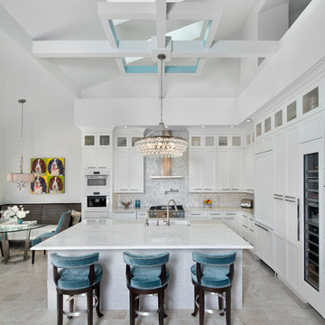
This home was featured in the May 2016 edition of HOME & DESIGN Magazine. To see the rest of the home tour as well as other luxury homes featured, visit http://www.homeanddesign.net/designer-at-home/
 Pamela Harvey Interiors
Our St. Pete studio designed this stunning home in a Greek Mediterranean style to create the best of Florida waterfront living. We started with a neutral palette and added pops of bright blue to recreate the hues of the ocean in the interiors. Every room is carefully curated to ensure a smooth flow and feel, including the luxurious bathroom, which evokes a calm, soothing vibe. All the bedrooms are decorated to ensure they blend well with the rest of the home's decor. The large outdoor pool is another beautiful highlight which immediately puts one in a relaxing holiday mood!
---
Pamela Harvey Interiors offers interior design services in St. Petersburg and Tampa, and throughout Florida's Suncoast area, from Tarpon Springs to Naples, including Bradenton, Lakewood Ranch, and Sarasota.
For more about Pamela Harvey Interiors, see here: https://www.pamelaharveyinteriors.com/
To learn more about this project, see here: https://www.pamelaharveyinteriors.com/portfolio-galleries/waterfront-home-tampa-fl

Sponsored
Sunbury, OH

J.Holderby - Renovations
Franklin County's Leading General Contractors - 2X Best of Houzz!
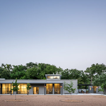 CONTENT Architecture
This project encompasses the renovation of two aging metal warehouses located on an acre just North of the 610 loop. The larger warehouse, previously an auto body shop, measures 6000 square feet and will contain a residence, art studio, and garage. A light well puncturing the middle of the main residence brightens the core of the deep building. The over-sized roof opening washes light down three masonry walls that define the light well and divide the public and private realms of the residence. The interior of the light well is conceived as a serene place of reflection while providing ample natural light into the Master Bedroom. Large windows infill the previous garage door openings and are shaded by a generous steel canopy as well as a new evergreen tree court to the west. Adjacent, a 1200 sf building is reconfigured for a guest or visiting artist residence and studio with a shared outdoor patio for entertaining. Photo by Peter Molick, Art by Karin Broker
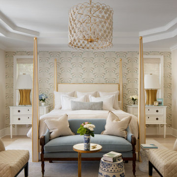 Pamela Harvey Interiors
Our St. Pete studio designed this stunning home in a Greek Mediterranean style to create the best of Florida waterfront living. We started with a neutral palette and added pops of bright blue to recreate the hues of the ocean in the interiors. Every room is carefully curated to ensure a smooth flow and feel, including the luxurious bathroom, which evokes a calm, soothing vibe. All the bedrooms are decorated to ensure they blend well with the rest of the home's decor. The large outdoor pool is another beautiful highlight which immediately puts one in a relaxing holiday mood!
---
Pamela Harvey Interiors offers interior design services in St. Petersburg and Tampa, and throughout Florida's Suncoast area, from Tarpon Springs to Naples, including Bradenton, Lakewood Ranch, and Sarasota.
For more about Pamela Harvey Interiors, see here: https://www.pamelaharveyinteriors.com/
To learn more about this project, see here: https://www.pamelaharveyinteriors.com/portfolio-galleries/waterfront-home-tampa-fl
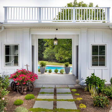
 Moss Building & Design
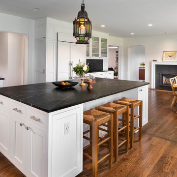
Upon entering the home from the screened porch, MOSS installed floor to ceiling semi-custom cabinetry to be used as a sort of butler’s pantry to store kitchen items, additional entertainment ware, guests’ coats, cleaning equipment and supplies, and more. The use of the unique green tone was a beautiful touch as the color green is used throughout the home’s updated décor and brings a sense of unity to the overall space. Immediately off the long hallway is the home’s kitchen, which was completely updated. Square footage was not affected but MOSS re-designed the space so that it could be used in a more functional manner. A massive kitchen island with a beautiful soapstone countertop dominates the room. Semi-custom white cabinetry lines the perimeters. New large windows provide an incredible view of the yard. Finally, a seating area with built-ins was added to supply more space for seating and for the dining room table to be moved from the center of the kitchen, previously, to the side. The kitchen also features a beautiful fireplace which had its wooden surround updated. The home’s sunroom, located next to the kitchen, was previously a few feet lower than the rest of the home. To bring a better flow to the space, MOSS raised the entire floor of the room up to meet the rest of the main level. Stunningly, the hardwood floor matches to a “T”. In the home’s living room and office, full wall built-ins were added, allowing the homeowners to display their favorite books on topics ranging from art to history, as well as showcasing statues and art sculptures and other items that are meaningful to their family. The living room fireplace’s stone and wooden surrounds were updated by MOSS as well.
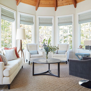
 Elza B. Design, Inc.
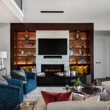
The homeowners contacted Barbara Elza Hirsch to redesign three rooms. They were looking to create a New England Coastal inspired home with transitional, modern and Scandinavian influences. This Living Room
was a blank slate room with lots of windows, vaulted ceiling with exposed wood beams, direct view and access to the backyard and pool. The floor was made of tumbled marble tile and the fireplace needed to be completely redesigned. This room was to be used as Living Room and a television was to be placed above the fireplace.
Barbara came up with a fireplace mantel and surround design that was clean and streamlined and would blend well with the owners’ style. Black slate stone was used for the surround and the mantel is made of wood.
The color scheme included pale blues, whites, greys and a light terra cotta color.
Photography by Jared Kuzia
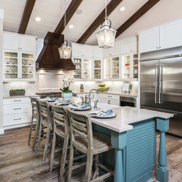 HOME & DESIGN MAGAZINE NAPLES
This home was featured in the May 2016 edition of HOME & DESIGN Magazine. To see the rest of the home tour as well as other luxury homes featured, visit http://www.homeanddesign.net/classic-cottage/
 TKS Design Group
Download our free ebook, Creating the Ideal Kitchen. DOWNLOAD NOW
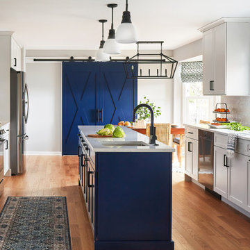
Lakefront property in the northwest suburbs of Chicago is hard to come by, so when we were hired by this young family with exactly that, we were immediately inspired by not just the unusually large footprint of this 1950’s colonial revival but also the lovely views of the manmade lake it was sited on. The large 5-bedroom home was solidly stuck in the 1980’s, but we saw tons of potential. We started out by updating the existing staircase with a fresh coat of paint and adding new herringbone slate to the entry hall.
The powder room off the entryway also got a refresh - new flooring, new cabinets and fixtures. We ran the new slate right through into this space for some consistency. A fun wallpaper and shiplap trim add a welcoming feel and set the tone for the home.
Next, we tackled the kitchen. Located away from the rest of the first floor, the kitchen felt a little isolated, so we immediately began planning for how to better connect it to the rest of the first floor. We landed on removing the wall between the kitchen and dining room and designed a modified galley style space with separate cooking and clean up zones. The cooking zone consists of the refrigerator, prep sink and cooktop, along with a nice long run of prep space at the island. The cleanup side of the kitchen consists of the main sink and dishwasher. Both areas are situated so that the user can view the lake during prep work and cleanup!
One of the home’s main puzzles was how to incorporate the mudroom and area in front of the patio doors at the back of the house. We already had a breakfast table area, so the space by the patio doors was a bit of a no man’s land. We decided to separate the kitchen proper from what became the new mudroom with a large set of barn doors. That way you can quickly hide any mudroom messes but have easy access to the light coming in through the patio doors as well as the outdoor grilling station. We also love the impact the barn doors add to the overall space.
The homeowners’ first words to us were “it’s time to ditch the brown,” so we did! We chose a lovely blue pallet that reflects the home’s location on the lake which is also vibrant yet easy on the eye. Countertops are white quartz, and the natural oak floor works well with the other honey accents. The breakfast table was given a refresh with new chairs, chandelier and window treatments that frame the gorgeous views of the lake out the back.
We coordinated the slate mudroom flooring with that used in the home’s main entrance for a consistent feel. The storage area consists of open and closed storage to allow for some clutter control as needed.
Next on our “to do” list was revamping the dated brown bar area in the neighboring dining room. We eliminated the clutter by adding some closed cabinets and did some easy updates to help the space feel more current. One snag we ran into here was the discovery of a beam above the existing open shelving that had to be modified with a smaller structural beam to allow for our new design to work. This was an unexpected surprise, but in the end we think it was well worth it!
We kept the colors here a bit more muted to blend with the homeowner’s existing furnishings. Open shelving and polished nickel hardware add some simple detail to the new entertainment zone which also looks out onto the lake!
Next we tackled the upstairs starting with the homeowner’s son’s bath. The bath originally had both a tub shower and a separate shower, so we decided to swap out the shower for a new laundry area. This freed up some space downstairs in what used to be the mudroom/laundry room and is much more convenient for daily laundry needs.
We continued the blue palette here with navy cabinetry and the navy tile in the shower. Porcelain floor tile and chrome fixtures keep maintenance to a minimum while matte black mirrors and lighting add some depth the design. A low maintenance runner adds some warmth underfoot and ties the whole space together.
We added a pocket door to the bathroom to minimize interference with the door swings. The left door of the laundry closet is on a 180 degree hinge to allow for easy full access to the machines. Next we tackled the master bath which is an en suite arrangement. The original was typical of the 1980’s with the vanity outside of the bathroom, situated near the master closet. And the brown theme continued here with multiple shades of brown.
Our first move was to segment off the bath and the closet from the master bedroom. We created a short hall from the bedroom to the bathroom with his and hers walk-in closets on the left and right as well as a separate toilet closet outside of the main bathroom for privacy and flexibility.
The original bathroom had a giant soaking tub with steps (dangerous!) as well as a small shower that did not work well for our homeowner who is 6’3”. With other bathtubs in the home, they decided to eliminate the tub and create an oversized shower which takes up the space where the old tub was located. The double vanity is on the opposite wall and a bench is located under the window for morning conversations and a place to set a couple of towels.
The pallet in here is light and airy with a mix of blond wood, creamy porcelain and marble tile, and brass accents. A simple roman shade adds some texture and it’s top-down mechanism allows for light and privacy.
This large whole house remodel gave our homeowners not only the ability to maximize the potential of their home but also created a lovely new frame from which to view their fabulous lake views.
Designed by: Susan Klimala, CKD, CBD
Photography by: Michael Kaskel
For more information on kitchen and bath design ideas go to: www.kitchenstudio-ge.com


 TKS Design Group
Download our free ebook, Creating the Ideal Kitchen. DOWNLOAD NOW
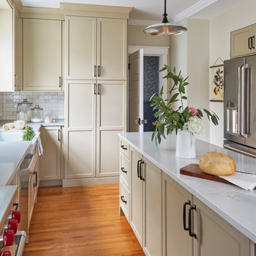
The homeowners came to us looking to update the kitchen in their historic 1897 home. The home had gone through an extensive renovation several years earlier that added a master bedroom suite and updates to the front façade. The kitchen however was not part of that update and a prior 1990’s update had left much to be desired. The client is an avid cook, and it was just not very functional for the family.
The original kitchen was very choppy and included a large eat in area that took up more than its fair share of the space. On the wish list was a place where the family could comfortably congregate, that was easy and to cook in, that feels lived in and in check with the rest of the home’s décor. They also wanted a space that was not cluttered and dark – a happy, light and airy room. A small powder room off the space also needed some attention so we set out to include that in the remodel as well.
See that arch in the neighboring dining room? The homeowner really wanted to make the opening to the dining room an arch to match, so we incorporated that into the design.
Another unfortunate eyesore was the state of the ceiling and soffits. Turns out it was just a series of shortcuts from the prior renovation, and we were surprised and delighted that we were easily able to flatten out almost the entire ceiling with a couple of little reworks.
Other changes we made were to add new windows that were appropriate to the new design, which included moving the sink window over slightly to give the work zone more breathing room. We also adjusted the height of the windows in what was previously the eat-in area that were too low for a countertop to work. We tried to keep an old island in the plan since it was a well-loved vintage find, but the tradeoff for the function of the new island was not worth it in the end. We hope the old found a new home, perhaps as a potting table.
Designed by: Susan Klimala, CKD, CBD
Photography by: Michael Kaskel
For more information on kitchen and bath design ideas go to: www.kitchenstudio-ge.com
 Rudloff Custom Builders
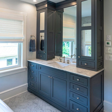
You enter this bright and light master bathroom through a custom pocket door that is inlayed with a mirror. The room features a beautiful free-standing tub. The shower is Carrera marble and has a seat, storage inset, a body jet and dual showerheads. The striking single vanity is a deep navy blue with beaded inset cabinets, chrome handles and provides tons of storage. Along with the blue vanity, the rose gold fixtures, including the shower grate, are eye catching and provide a subtle pop of color.
What started as an addition project turned into a full house remodel in this Modern Craftsman home in Narberth, PA.. The addition included the creation of a sitting room, family room, mudroom and third floor. As we moved to the rest of the home, we designed and built a custom staircase to connect the family room to the existing kitchen. We laid red oak flooring with a mahogany inlay throughout house. Another central feature of this is home is all the built-in storage. We used or created every nook for seating and storage throughout the house, as you can see in the family room, dining area, staircase landing, bedroom and bathrooms. Custom wainscoting and trim are everywhere you look, and gives a clean, polished look to this warm house.
Rudloff Custom Builders has won Best of Houzz for Customer Service in 2014, 2015 2016, 2017 and 2019. We also were voted Best of Design in 2016, 2017, 2018, 2019 which only 2% of professionals receive. Rudloff Custom Builders has been featured on Houzz in their Kitchen of the Week, What to Know About Using Reclaimed Wood in the Kitchen as well as included in their Bathroom WorkBook article. We are a full service, certified remodeling company that covers all of the Philadelphia suburban area. This business, like most others, developed from a friendship of young entrepreneurs who wanted to make a difference in their clients’ lives, one household at a time. This relationship between partners is much more than a friendship. Edward and Stephen Rudloff are brothers who have renovated and built custom homes together paying close attention to detail. They are carpenters by trade and understand concept and execution. Rudloff Custom Builders will provide services for you with the highest level of professionalism, quality, detail, punctuality and craftsmanship, every step of the way along our journey together.
Specializing in residential construction allows us to connect with our clients early in the design phase to ensure that every detail is captured as you imagined. One stop shopping is essentially what you will receive with Rudloff Custom Builders from design of your project to the construction of your dreams, executed by on-site project managers and skilled craftsmen. Our concept: envision our client’s ideas and make them a reality. Our mission: CREATING LIFETIME RELATIONSHIPS BUILT ON TRUST AND INTEGRITY.
Photo Credit: Linda McManus Images
 Moss Building & Design
Upon entering the home from the screened porch, MOSS installed floor to ceiling semi-custom cabinetry to be used as a sort of butler’s pantry to store kitchen items, additional entertainment ware, guests’ coats, cleaning equipment and supplies, and more. The use of the unique green tone was a beautiful touch as the color green is used throughout the home’s updated décor and brings a sense of unity to the overall space. Immediately off the long hallway is the home’s kitchen, which was completely updated. Square footage was not affected but MOSS re-designed the space so that it could be used in a more functional manner. A massive kitchen island with a beautiful soapstone countertop dominates the room. Semi-custom white cabinetry lines the perimeters. New large windows provide an incredible view of the yard. Finally, a seating area with built-ins was added to supply more space for seating and for the dining room table to be moved from the center of the kitchen, previously, to the side. The kitchen also features a beautiful fireplace which had its wooden surround updated. The home’s sunroom, located next to the kitchen, was previously a few feet lower than the rest of the home. To bring a better flow to the space, MOSS raised the entire floor of the room up to meet the rest of the main level. Stunningly, the hardwood floor matches to a “T”. In the home’s living room and office, full wall built-ins were added, allowing the homeowners to display their favorite books on topics ranging from art to history, as well as showcasing statues and art sculptures and other items that are meaningful to their family. The living room fireplace’s stone and wooden surrounds were updated by MOSS as well.
 HOME & DESIGN MAGAZINE NAPLES
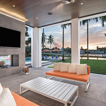
This home was featured in the May 2016 edition of HOME & DESIGN Magazine. To see the rest of the home tour as well as other luxury homes featured, visit http://www.homeanddesign.net/art-in-architecture/

Sponsored
Delaware, OH

Buckeye Basements, Inc.
Central Ohio's Basement Finishing ExpertsBest Of Houzz '13-'21
 TKS Design Group
Download our free ebook, Creating the Ideal Kitchen. DOWNLOAD NOW
Lakefront property in the northwest suburbs of Chicago is hard to come by, so when we were hired by this young family with exactly that, we were immediately inspired by not just the unusually large footprint of this 1950’s colonial revival but also the lovely views of the manmade lake it was sited on. The large 5-bedroom home was solidly stuck in the 1980’s, but we saw tons of potential. We started out by updating the existing staircase with a fresh coat of paint and adding new herringbone slate to the entry hall.
The powder room off the entryway also got a refresh - new flooring, new cabinets and fixtures. We ran the new slate right through into this space for some consistency. A fun wallpaper and shiplap trim add a welcoming feel and set the tone for the home.
Next, we tackled the kitchen. Located away from the rest of the first floor, the kitchen felt a little isolated, so we immediately began planning for how to better connect it to the rest of the first floor. We landed on removing the wall between the kitchen and dining room and designed a modified galley style space with separate cooking and clean up zones. The cooking zone consists of the refrigerator, prep sink and cooktop, along with a nice long run of prep space at the island. The cleanup side of the kitchen consists of the main sink and dishwasher. Both areas are situated so that the user can view the lake during prep work and cleanup!
One of the home’s main puzzles was how to incorporate the mudroom and area in front of the patio doors at the back of the house. We already had a breakfast table area, so the space by the patio doors was a bit of a no man’s land. We decided to separate the kitchen proper from what became the new mudroom with a large set of barn doors. That way you can quickly hide any mudroom messes but have easy access to the light coming in through the patio doors as well as the outdoor grilling station. We also love the impact the barn doors add to the overall space.
The homeowners’ first words to us were “it’s time to ditch the brown,” so we did! We chose a lovely blue pallet that reflects the home’s location on the lake which is also vibrant yet easy on the eye. Countertops are white quartz, and the natural oak floor works well with the other honey accents. The breakfast table was given a refresh with new chairs, chandelier and window treatments that frame the gorgeous views of the lake out the back.
We coordinated the slate mudroom flooring with that used in the home’s main entrance for a consistent feel. The storage area consists of open and closed storage to allow for some clutter control as needed.
Next on our “to do” list was revamping the dated brown bar area in the neighboring dining room. We eliminated the clutter by adding some closed cabinets and did some easy updates to help the space feel more current. One snag we ran into here was the discovery of a beam above the existing open shelving that had to be modified with a smaller structural beam to allow for our new design to work. This was an unexpected surprise, but in the end we think it was well worth it!
We kept the colors here a bit more muted to blend with the homeowner’s existing furnishings. Open shelving and polished nickel hardware add some simple detail to the new entertainment zone which also looks out onto the lake!
Next we tackled the upstairs starting with the homeowner’s son’s bath. The bath originally had both a tub shower and a separate shower, so we decided to swap out the shower for a new laundry area. This freed up some space downstairs in what used to be the mudroom/laundry room and is much more convenient for daily laundry needs.
We continued the blue palette here with navy cabinetry and the navy tile in the shower. Porcelain floor tile and chrome fixtures keep maintenance to a minimum while matte black mirrors and lighting add some depth the design. A low maintenance runner adds some warmth underfoot and ties the whole space together.
We added a pocket door to the bathroom to minimize interference with the door swings. The left door of the laundry closet is on a 180 degree hinge to allow for easy full access to the machines. Next we tackled the master bath which is an en suite arrangement. The original was typical of the 1980’s with the vanity outside of the bathroom, situated near the master closet. And the brown theme continued here with multiple shades of brown.
Our first move was to segment off the bath and the closet from the master bedroom. We created a short hall from the bedroom to the bathroom with his and hers walk-in closets on the left and right as well as a separate toilet closet outside of the main bathroom for privacy and flexibility.
The original bathroom had a giant soaking tub with steps (dangerous!) as well as a small shower that did not work well for our homeowner who is 6’3”. With other bathtubs in the home, they decided to eliminate the tub and create an oversized shower which takes up the space where the old tub was located. The double vanity is on the opposite wall and a bench is located under the window for morning conversations and a place to set a couple of towels.
The pallet in here is light and airy with a mix of blond wood, creamy porcelain and marble tile, and brass accents. A simple roman shade adds some texture and it’s top-down mechanism allows for light and privacy.
This large whole house remodel gave our homeowners not only the ability to maximize the potential of their home but also created a lovely new frame from which to view their fabulous lake views.
Designed by: Susan Klimala, CKD, CBD
Photography by: Michael Kaskel
For more information on kitchen and bath design ideas go to: www.kitchenstudio-ge.com
 HOME & DESIGN MAGAZINE NAPLES
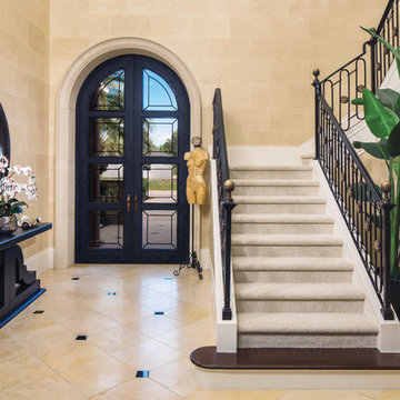
This home was featured in the May 2016 edition of HOME & DESIGN Magazine. To see the rest of the home tour as well as other luxury homes featured, visit http://www.homeanddesign.net/balancing-act/
 TKS Design Group
Download our free ebook, Creating the Ideal Kitchen. DOWNLOAD NOW
Lakefront property in the northwest suburbs of Chicago is hard to come by, so when we were hired by this young family with exactly that, we were immediately inspired by not just the unusually large footprint of this 1950’s colonial revival but also the lovely views of the manmade lake it was sited on. The large 5-bedroom home was solidly stuck in the 1980’s, but we saw tons of potential. We started out by updating the existing staircase with a fresh coat of paint and adding new herringbone slate to the entry hall.
The powder room off the entryway also got a refresh - new flooring, new cabinets and fixtures. We ran the new slate right through into this space for some consistency. A fun wallpaper and shiplap trim add a welcoming feel and set the tone for the home.
Next, we tackled the kitchen. Located away from the rest of the first floor, the kitchen felt a little isolated, so we immediately began planning for how to better connect it to the rest of the first floor. We landed on removing the wall between the kitchen and dining room and designed a modified galley style space with separate cooking and clean up zones. The cooking zone consists of the refrigerator, prep sink and cooktop, along with a nice long run of prep space at the island. The cleanup side of the kitchen consists of the main sink and dishwasher. Both areas are situated so that the user can view the lake during prep work and cleanup!
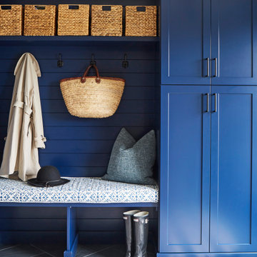
One of the home’s main puzzles was how to incorporate the mudroom and area in front of the patio doors at the back of the house. We already had a breakfast table area, so the space by the patio doors was a bit of a no man’s land. We decided to separate the kitchen proper from what became the new mudroom with a large set of barn doors. That way you can quickly hide any mudroom messes but have easy access to the light coming in through the patio doors as well as the outdoor grilling station. We also love the impact the barn doors add to the overall space.
The homeowners’ first words to us were “it’s time to ditch the brown,” so we did! We chose a lovely blue pallet that reflects the home’s location on the lake which is also vibrant yet easy on the eye. Countertops are white quartz, and the natural oak floor works well with the other honey accents. The breakfast table was given a refresh with new chairs, chandelier and window treatments that frame the gorgeous views of the lake out the back.
We coordinated the slate mudroom flooring with that used in the home’s main entrance for a consistent feel. The storage area consists of open and closed storage to allow for some clutter control as needed.
Next on our “to do” list was revamping the dated brown bar area in the neighboring dining room. We eliminated the clutter by adding some closed cabinets and did some easy updates to help the space feel more current. One snag we ran into here was the discovery of a beam above the existing open shelving that had to be modified with a smaller structural beam to allow for our new design to work. This was an unexpected surprise, but in the end we think it was well worth it!
We kept the colors here a bit more muted to blend with the homeowner’s existing furnishings. Open shelving and polished nickel hardware add some simple detail to the new entertainment zone which also looks out onto the lake!
Next we tackled the upstairs starting with the homeowner’s son’s bath. The bath originally had both a tub shower and a separate shower, so we decided to swap out the shower for a new laundry area. This freed up some space downstairs in what used to be the mudroom/laundry room and is much more convenient for daily laundry needs.
We continued the blue palette here with navy cabinetry and the navy tile in the shower. Porcelain floor tile and chrome fixtures keep maintenance to a minimum while matte black mirrors and lighting add some depth the design. A low maintenance runner adds some warmth underfoot and ties the whole space together.
We added a pocket door to the bathroom to minimize interference with the door swings. The left door of the laundry closet is on a 180 degree hinge to allow for easy full access to the machines. Next we tackled the master bath which is an en suite arrangement. The original was typical of the 1980’s with the vanity outside of the bathroom, situated near the master closet. And the brown theme continued here with multiple shades of brown.
Our first move was to segment off the bath and the closet from the master bedroom. We created a short hall from the bedroom to the bathroom with his and hers walk-in closets on the left and right as well as a separate toilet closet outside of the main bathroom for privacy and flexibility.
The original bathroom had a giant soaking tub with steps (dangerous!) as well as a small shower that did not work well for our homeowner who is 6’3”. With other bathtubs in the home, they decided to eliminate the tub and create an oversized shower which takes up the space where the old tub was located. The double vanity is on the opposite wall and a bench is located under the window for morning conversations and a place to set a couple of towels.
The pallet in here is light and airy with a mix of blond wood, creamy porcelain and marble tile, and brass accents. A simple roman shade adds some texture and it’s top-down mechanism allows for light and privacy.
This large whole house remodel gave our homeowners not only the ability to maximize the potential of their home but also created a lovely new frame from which to view their fabulous lake views.
Designed by: Susan Klimala, CKD, CBD
Photography by: Michael Kaskel
For more information on kitchen and bath design ideas go to: www.kitchenstudio-ge.com
4