
Search results for "Well rested body" in Home Design Ideas
 Lee Kimball
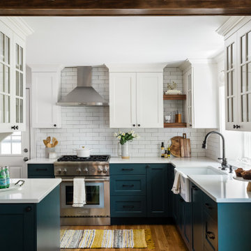
This 1940’s Colonial style home in Boston’s Jamaica Plain had strong bones and rich character but lacked the space, modern conveniences, and storage that our clients desired. While they wished to retain the look of the exterior, as well as some of the home’s unique original features,, the kitchen and dining room needed to be reimagined in design, layout, and functionality.
Key considerations were the compact size of the home and a smaller lot that didn’t give our client the flexibility of an addition. Without adding on to the existing floor plan, we needed to find a way to gain vital extra space in the kitchen, which, with walls enclosing it on all sides, was dark and disconnected from the rest of the house. Our design team coordinated with our client to reconfigure the space by opening up the wall between the dining room and the kitchen to add a few extra inches – just enough to create an open flow between the two rooms. With the removal of that wall, the formerly dark kitchen was flooded with the natural light coming from the existing dining room windows, making the entire space feel brighter and more cohesive.
The original kitchen dated back to the mid-20th century and lacked, among other conveniences, a dishwasher, enough storage, or even countertop space for food prep. In redesigning the kitchen, we visually expanded the space by incorporating white upper cabinetry, open shelving, and white subway tiles extending from the backsplash to the ceiling. A new, larger window featuring a deep stone sill brought in even more light, and the appliances and apron sink were selected to retain the traditional look of the home while delivering modern functionality.
Considering how our client would use this space, we focused on creating a purposeful workspace and storage, ensuring that there was ample countertop space and cabinetry between the sink and range. A multi-purpose cabinet and countertop which serves as a microwave station and food service area were added to the backside of the dining room wall, packing a lot of utility into a small space.
Prior to this renovation, our client had painted the dining room in Mount Saint Anne by Benjamin Moore, a tranquil blue-gray that suited the room well and allowed the original built-in corner cabinetry to stand out, highlighting the home’s charm. With the newly opened floor plan extending into the kitchen, we selected a deep custom color for the base cabinets, Yorktowne Green by Benjamin Moore, to complement the dining room and pull all of the elements together in a cohesive space.
This transformation was remarkable, both functionally and visually. The kitchen is now a bright and inviting space that flows seamlessly into the rest of the house. The homeowners are thrilled with the results, and the small changes we incorporated that made a big difference in the overall feel and functionality of the space.
 Thomas Roszak Architecture, LLC
Photo Credit: Scott McDonald, Hedrich Blessing
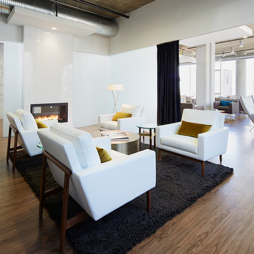
Inspiration for a contemporary open concept dark wood floor living room remodel in Chicago with white walls, a standard fireplace and a tile fireplace
Inspiration for a contemporary open concept dark wood floor living room remodel in Chicago with white walls, a standard fireplace and a tile fireplace
Find the right local pro for your project
 Elza B. Design, Inc.
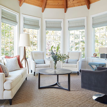
The homeowners contacted Barbara Elza Hirsch to redesign three rooms. They were looking to create a New England Coastal inspired home with transitional, modern and Scandinavian influences. This Living Room
was a blank slate room with lots of windows, vaulted ceiling with exposed wood beams, direct view and access to the backyard and pool. The floor was made of tumbled marble tile and the fireplace needed to be completely redesigned. This room was to be used as Living Room and a television was to be placed above the fireplace.
Barbara came up with a fireplace mantel and surround design that was clean and streamlined and would blend well with the owners’ style. Black slate stone was used for the surround and the mantel is made of wood.
The color scheme included pale blues, whites, greys and a light terra cotta color.
Photography by Jared Kuzia
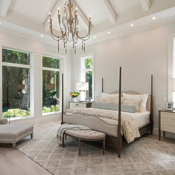
 HOME & DESIGN MAGAZINE NAPLES
This home was featured in the May 2016 edition of HOME & DESIGN Magazine. To see the rest of the home tour as well as other luxury homes featured, visit http://www.homeanddesign.net/coastal-chic-2016/
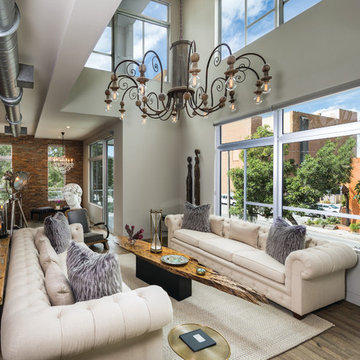 HOME & DESIGN MAGAZINE NAPLES
This home was featured in the January 2016 edition of HOME & DESIGN Magazine. To see the rest of the home tour as well as other luxury homes featured, visit http://www.homeanddesign.net/designer-at-home-loft-living-in-sarasota/
 Advance Design Studio, Ltd.
This 1930's Barrington Hills farmhouse was in need of some TLC when it was purchased by this southern family of five who planned to make it their new home. The renovation taken on by Advance Design Studio's designer Scott Christensen and master carpenter Justin Davis included a custom porch, custom built in cabinetry in the living room and children's bedrooms, 2 children's on-suite baths, a guest powder room, a fabulous new master bath with custom closet and makeup area, a new upstairs laundry room, a workout basement, a mud room, new flooring and custom wainscot stairs with planked walls and ceilings throughout the home.
The home's original mechanicals were in dire need of updating, so HVAC, plumbing and electrical were all replaced with newer materials and equipment. A dramatic change to the exterior took place with the addition of a quaint standing seam metal roofed farmhouse porch perfect for sipping lemonade on a lazy hot summer day.
In addition to the changes to the home, a guest house on the property underwent a major transformation as well. Newly outfitted with updated gas and electric, a new stacking washer/dryer space was created along with an updated bath complete with a glass enclosed shower, something the bath did not previously have. A beautiful kitchenette with ample cabinetry space, refrigeration and a sink was transformed as well to provide all the comforts of home for guests visiting at the classic cottage retreat.
The biggest design challenge was to keep in line with the charm the old home possessed, all the while giving the family all the convenience and efficiency of modern functioning amenities. One of the most interesting uses of material was the porcelain "wood-looking" tile used in all the baths and most of the home's common areas. All the efficiency of porcelain tile, with the nostalgic look and feel of worn and weathered hardwood floors. The home’s casual entry has an 8" rustic antique barn wood look porcelain tile in a rich brown to create a warm and welcoming first impression.
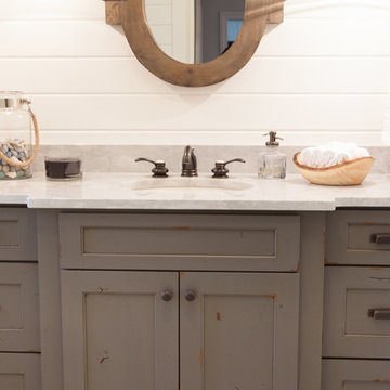
Painted distressed cabinetry in muted shades of gray/green was used in the powder room to bring out the rustic feel of the space which was accentuated with wood planked walls and ceilings. Fresh white painted shaker cabinetry was used throughout the rest of the rooms, accentuated by bright chrome fixtures and muted pastel tones to create a calm and relaxing feeling throughout the home.
Custom cabinetry was designed and built by Advance Design specifically for a large 70” TV in the living room, for each of the children’s bedroom’s built in storage, custom closets, and book shelves, and for a mudroom fit with custom niches for each family member by name.
The ample master bath was fitted with double vanity areas in white. A generous shower with a bench features classic white subway tiles and light blue/green glass accents, as well as a large free standing soaking tub nestled under a window with double sconces to dim while relaxing in a luxurious bath. A custom classic white bookcase for plush towels greets you as you enter the sanctuary bath.

 TKS Design Group
Download our free ebook, Creating the Ideal Kitchen. DOWNLOAD NOW
Lakefront property in the northwest suburbs of Chicago is hard to come by, so when we were hired by this young family with exactly that, we were immediately inspired by not just the unusually large footprint of this 1950’s colonial revival but also the lovely views of the manmade lake it was sited on. The large 5-bedroom home was solidly stuck in the 1980’s, but we saw tons of potential. We started out by updating the existing staircase with a fresh coat of paint and adding new herringbone slate to the entry hall.
The powder room off the entryway also got a refresh - new flooring, new cabinets and fixtures. We ran the new slate right through into this space for some consistency. A fun wallpaper and shiplap trim add a welcoming feel and set the tone for the home.
Next, we tackled the kitchen. Located away from the rest of the first floor, the kitchen felt a little isolated, so we immediately began planning for how to better connect it to the rest of the first floor. We landed on removing the wall between the kitchen and dining room and designed a modified galley style space with separate cooking and clean up zones. The cooking zone consists of the refrigerator, prep sink and cooktop, along with a nice long run of prep space at the island. The cleanup side of the kitchen consists of the main sink and dishwasher. Both areas are situated so that the user can view the lake during prep work and cleanup!
One of the home’s main puzzles was how to incorporate the mudroom and area in front of the patio doors at the back of the house. We already had a breakfast table area, so the space by the patio doors was a bit of a no man’s land. We decided to separate the kitchen proper from what became the new mudroom with a large set of barn doors. That way you can quickly hide any mudroom messes but have easy access to the light coming in through the patio doors as well as the outdoor grilling station. We also love the impact the barn doors add to the overall space.
The homeowners’ first words to us were “it’s time to ditch the brown,” so we did! We chose a lovely blue pallet that reflects the home’s location on the lake which is also vibrant yet easy on the eye. Countertops are white quartz, and the natural oak floor works well with the other honey accents. The breakfast table was given a refresh with new chairs, chandelier and window treatments that frame the gorgeous views of the lake out the back.
We coordinated the slate mudroom flooring with that used in the home’s main entrance for a consistent feel. The storage area consists of open and closed storage to allow for some clutter control as needed.
Next on our “to do” list was revamping the dated brown bar area in the neighboring dining room. We eliminated the clutter by adding some closed cabinets and did some easy updates to help the space feel more current. One snag we ran into here was the discovery of a beam above the existing open shelving that had to be modified with a smaller structural beam to allow for our new design to work. This was an unexpected surprise, but in the end we think it was well worth it!
We kept the colors here a bit more muted to blend with the homeowner’s existing furnishings. Open shelving and polished nickel hardware add some simple detail to the new entertainment zone which also looks out onto the lake!
Next we tackled the upstairs starting with the homeowner’s son’s bath. The bath originally had both a tub shower and a separate shower, so we decided to swap out the shower for a new laundry area. This freed up some space downstairs in what used to be the mudroom/laundry room and is much more convenient for daily laundry needs.
We continued the blue palette here with navy cabinetry and the navy tile in the shower. Porcelain floor tile and chrome fixtures keep maintenance to a minimum while matte black mirrors and lighting add some depth the design. A low maintenance runner adds some warmth underfoot and ties the whole space together.
We added a pocket door to the bathroom to minimize interference with the door swings. The left door of the laundry closet is on a 180 degree hinge to allow for easy full access to the machines. Next we tackled the master bath which is an en suite arrangement. The original was typical of the 1980’s with the vanity outside of the bathroom, situated near the master closet. And the brown theme continued here with multiple shades of brown.
Our first move was to segment off the bath and the closet from the master bedroom. We created a short hall from the bedroom to the bathroom with his and hers walk-in closets on the left and right as well as a separate toilet closet outside of the main bathroom for privacy and flexibility.
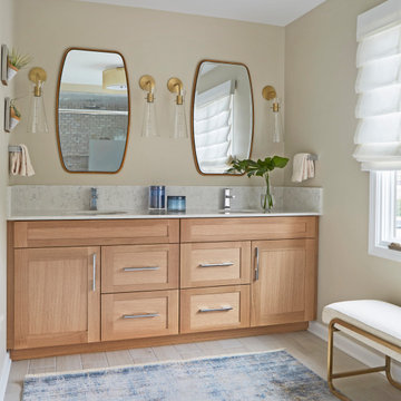
The original bathroom had a giant soaking tub with steps (dangerous!) as well as a small shower that did not work well for our homeowner who is 6’3”. With other bathtubs in the home, they decided to eliminate the tub and create an oversized shower which takes up the space where the old tub was located. The double vanity is on the opposite wall and a bench is located under the window for morning conversations and a place to set a couple of towels.
The pallet in here is light and airy with a mix of blond wood, creamy porcelain and marble tile, and brass accents. A simple roman shade adds some texture and it’s top-down mechanism allows for light and privacy.
This large whole house remodel gave our homeowners not only the ability to maximize the potential of their home but also created a lovely new frame from which to view their fabulous lake views.
Designed by: Susan Klimala, CKD, CBD
Photography by: Michael Kaskel
For more information on kitchen and bath design ideas go to: www.kitchenstudio-ge.com
 TKS Design Group
Download our free ebook, Creating the Ideal Kitchen. DOWNLOAD NOW
Lakefront property in the northwest suburbs of Chicago is hard to come by, so when we were hired by this young family with exactly that, we were immediately inspired by not just the unusually large footprint of this 1950’s colonial revival but also the lovely views of the manmade lake it was sited on. The large 5-bedroom home was solidly stuck in the 1980’s, but we saw tons of potential. We started out by updating the existing staircase with a fresh coat of paint and adding new herringbone slate to the entry hall.
The powder room off the entryway also got a refresh - new flooring, new cabinets and fixtures. We ran the new slate right through into this space for some consistency. A fun wallpaper and shiplap trim add a welcoming feel and set the tone for the home.
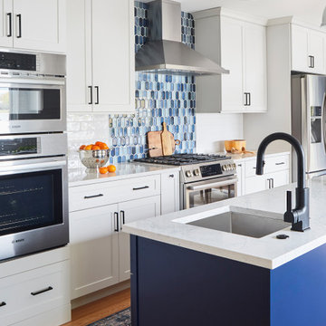
Next, we tackled the kitchen. Located away from the rest of the first floor, the kitchen felt a little isolated, so we immediately began planning for how to better connect it to the rest of the first floor. We landed on removing the wall between the kitchen and dining room and designed a modified galley style space with separate cooking and clean up zones. The cooking zone consists of the refrigerator, prep sink and cooktop, along with a nice long run of prep space at the island. The cleanup side of the kitchen consists of the main sink and dishwasher. Both areas are situated so that the user can view the lake during prep work and cleanup!
One of the home’s main puzzles was how to incorporate the mudroom and area in front of the patio doors at the back of the house. We already had a breakfast table area, so the space by the patio doors was a bit of a no man’s land. We decided to separate the kitchen proper from what became the new mudroom with a large set of barn doors. That way you can quickly hide any mudroom messes but have easy access to the light coming in through the patio doors as well as the outdoor grilling station. We also love the impact the barn doors add to the overall space.
The homeowners’ first words to us were “it’s time to ditch the brown,” so we did! We chose a lovely blue pallet that reflects the home’s location on the lake which is also vibrant yet easy on the eye. Countertops are white quartz, and the natural oak floor works well with the other honey accents. The breakfast table was given a refresh with new chairs, chandelier and window treatments that frame the gorgeous views of the lake out the back.
We coordinated the slate mudroom flooring with that used in the home’s main entrance for a consistent feel. The storage area consists of open and closed storage to allow for some clutter control as needed.
Next on our “to do” list was revamping the dated brown bar area in the neighboring dining room. We eliminated the clutter by adding some closed cabinets and did some easy updates to help the space feel more current. One snag we ran into here was the discovery of a beam above the existing open shelving that had to be modified with a smaller structural beam to allow for our new design to work. This was an unexpected surprise, but in the end we think it was well worth it!
We kept the colors here a bit more muted to blend with the homeowner’s existing furnishings. Open shelving and polished nickel hardware add some simple detail to the new entertainment zone which also looks out onto the lake!
Next we tackled the upstairs starting with the homeowner’s son’s bath. The bath originally had both a tub shower and a separate shower, so we decided to swap out the shower for a new laundry area. This freed up some space downstairs in what used to be the mudroom/laundry room and is much more convenient for daily laundry needs.
We continued the blue palette here with navy cabinetry and the navy tile in the shower. Porcelain floor tile and chrome fixtures keep maintenance to a minimum while matte black mirrors and lighting add some depth the design. A low maintenance runner adds some warmth underfoot and ties the whole space together.
We added a pocket door to the bathroom to minimize interference with the door swings. The left door of the laundry closet is on a 180 degree hinge to allow for easy full access to the machines. Next we tackled the master bath which is an en suite arrangement. The original was typical of the 1980’s with the vanity outside of the bathroom, situated near the master closet. And the brown theme continued here with multiple shades of brown.
Our first move was to segment off the bath and the closet from the master bedroom. We created a short hall from the bedroom to the bathroom with his and hers walk-in closets on the left and right as well as a separate toilet closet outside of the main bathroom for privacy and flexibility.
The original bathroom had a giant soaking tub with steps (dangerous!) as well as a small shower that did not work well for our homeowner who is 6’3”. With other bathtubs in the home, they decided to eliminate the tub and create an oversized shower which takes up the space where the old tub was located. The double vanity is on the opposite wall and a bench is located under the window for morning conversations and a place to set a couple of towels.
The pallet in here is light and airy with a mix of blond wood, creamy porcelain and marble tile, and brass accents. A simple roman shade adds some texture and it’s top-down mechanism allows for light and privacy.
This large whole house remodel gave our homeowners not only the ability to maximize the potential of their home but also created a lovely new frame from which to view their fabulous lake views.
Designed by: Susan Klimala, CKD, CBD
Photography by: Michael Kaskel
For more information on kitchen and bath design ideas go to: www.kitchenstudio-ge.com
 CONTENT Architecture
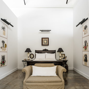
This project encompasses the renovation of two aging metal warehouses located on an acre just North of the 610 loop. The larger warehouse, previously an auto body shop, measures 6000 square feet and will contain a residence, art studio, and garage. A light well puncturing the middle of the main residence brightens the core of the deep building. The over-sized roof opening washes light down three masonry walls that define the light well and divide the public and private realms of the residence. The interior of the light well is conceived as a serene place of reflection while providing ample natural light into the Master Bedroom. Large windows infill the previous garage door openings and are shaded by a generous steel canopy as well as a new evergreen tree court to the west. Adjacent, a 1200 sf building is reconfigured for a guest or visiting artist residence and studio with a shared outdoor patio for entertaining. Photo by Peter Molick, Art by Karin Broker
 CONTENT Architecture
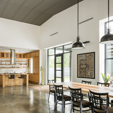
This project encompasses the renovation of two aging metal warehouses located on an acre just North of the 610 loop. The larger warehouse, previously an auto body shop, measures 6000 square feet and will contain a residence, art studio, and garage. A light well puncturing the middle of the main residence brightens the core of the deep building. The over-sized roof opening washes light down three masonry walls that define the light well and divide the public and private realms of the residence. The interior of the light well is conceived as a serene place of reflection while providing ample natural light into the Master Bedroom. Large windows infill the previous garage door openings and are shaded by a generous steel canopy as well as a new evergreen tree court to the west. Adjacent, a 1200 sf building is reconfigured for a guest or visiting artist residence and studio with a shared outdoor patio for entertaining. Photo by Peter Molick, Art by Karin Broker
 Pro-Land Landscape Construction Inc.
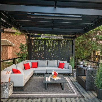
The client wanted a better flow throughout their landscape, as well as introduce straight lines to a space to modernize the irregular shaped pool.
Their upper deck was where they did a majority of their entertaining so ensuring this space was large enough for both dining and lounge was the starting point of the design. Introducing privacy from the many on looking neighbours, without completely blocking it off from the rest of their own yard was important. Laser cut privacy screens added this filtered privacy.
A round hot tub was added to the back corner of the property, which otherwise seemed like wasted space. Highlighted by the privacy panels in the same pattern used on the deck to create some consistency.
Trees were both maintained and added where needs along the property to add greenery and privacy. The entire space now feels open within the backyard, but private from neighbours.
 Five Sextillion
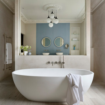
The brief was to create a Classic Contemporary Ensuite and Principle bedroom which would be home to a number of Antique furniture items, a traditional fireplace and Classical artwork.
We created key zones within the bathroom to make sufficient use of the large space; providing a large walk-in wet-floor shower, a concealed WC area, a free-standing bath as the central focus in symmetry with his and hers free-standing basins.
We ensured a more than adequate level of storage through the vanity unit, 2 bespoke cabinets next to the window and above the toilet cistern as well as plenty of ledge spaces to rest decorative objects and bottles.
We provided a number of task, accent and ambient lighting solutions whilst also ensuring the natural lighting reaches as much of the room as possible through our design.
Our installation detailing was delivered to a very high level to compliment the level of product and design requirements.

Sponsored
Fredericksburg, OH

High Point Cabinets
Columbus' Experienced Custom Cabinet Builder | 4x Best of Houzz Winner
 My House Design|Build|Team
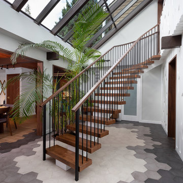
My House Design/Build Team | www.myhousedesignbuild.com | 604-694-6873 | Duy Nguyen Photography -------------------------------------------------------Right from the beginning it was evident that this Coquitlam Renovation was unique. It’s first impression was memorable as immediately after entering the front door, just past the dining table, there was a tree growing in the middle of home! Upon further inspection of the space it became apparent that this home had undergone several alterations during its lifetime... We knew we wanted to transform this central space to be the focal point. The home’s design became based around the atrium and its tile ‘splash’. Other materials in this space that add to this effect are the 3D angular mouldings which flow from the glass ceiling to the floor. As well as the colour variation in the hexagon tile, radiating from light in the center to dark around the perimeter. These high contrast tiles not only draw your eye to the center of the atrium but the flush transition between the tiles and hardwood help connect the atrium with the rest of the home.
 Roundabout Studio Inc.
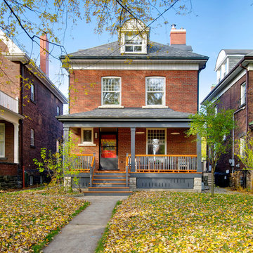
Subtle contemporary details are incorporated in the traditional front porch, that fits well with the rest of the neighbourhood.
Inspiration for a large timeless red three-story brick house exterior remodel in Toronto with a hip roof and a shingle roof
Inspiration for a large timeless red three-story brick house exterior remodel in Toronto with a hip roof and a shingle roof
 Design Inspirations Inc.
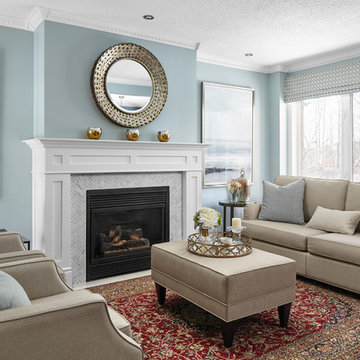
Our clients already owned the rugs in the dining, living and foyer areas as well as the Grandfather clock. We completed the rooms by blending in more transitional furnishings, lighting and window coverings to add updated appeal. We had the home owner paint the grandfather clock black and had the handrail of the stairs painted black as well as adding anchor points of black around the rooms.
We chose the wall colours from the lovely blue accents in the area rugs and carried the colour palette through the rest of the home's kitchen and main areas.
Photography by Kelly Horkoff of KWest Images
 Rochelle Lynne Design
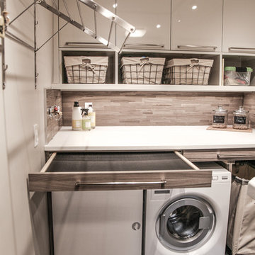
Karen was an existing client of ours who was tired of the crowded and cluttered laundry/mudroom that did not work well for her young family. The washer and dryer were right in the line of traffic when you stepped in her back entry from the garage and there was a lack of a bench for changing shoes/boots.
Planning began… then along came a twist! A new puppy that will grow to become a fair sized dog would become part of the family. Could the design accommodate dog grooming and a daytime “kennel” for when the family is away?
Having two young boys, Karen wanted to have custom features that would make housekeeping easier so custom drawer drying racks and ironing board were included in the design. All slab-style cabinet and drawer fronts are sturdy and easy to clean and the family’s coats and necessities are hidden from view while close at hand.
The selected quartz countertops, slate flooring and honed marble wall tiles will provide a long life for this hard working space. The enameled cast iron sink which fits puppy to full-sized dog (given a boost) was outfitted with a faucet conducive to dog washing, as well as, general clean up. And the piece de resistance is the glass, Dutch pocket door which makes the family dog feel safe yet secure with a view into the rest of the house. Karen and her family enjoy the organized, tidy space and how it works for them.


 Denver Mattress
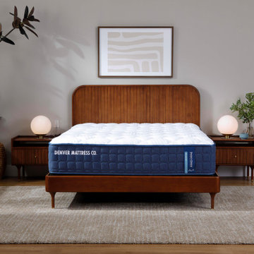
A restorative bedroom begins with comfort that helps your body truly relax. This inviting space features the Doctor's Choice® Original Plush Mattress from Denver Mattress, designed for sleepers who prefer a softer feel without sacrificing the support needed for healthy sleep.
Engineered to provide enhanced pressure relief while helping maintain proper spinal alignment, the Doctor's Choice® Original Plush is ideal for side sleepers and anyone seeking a more cushioned sleep experience. The mattress works in harmony with the room's calming design to create an environment focused on comfort, recovery, and uninterrupted rest.
Warm wood furnishings, soft blue bedding, natural textures, and soothing lighting come together to create a welcoming retreat where relaxation takes priority. The result is a bedroom that supports both physical comfort and overall well-being, helping you wake up refreshed and ready for the day ahead.
 Grounding Sheets
Grounding Sheets – Sleep Connected to the Earth
learn more
Rejuvenate each night and recharge your days.
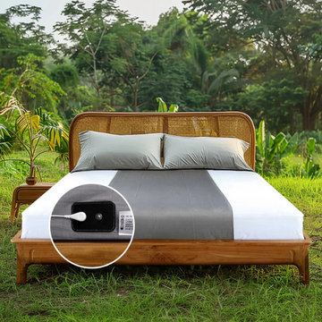
Experience the power of nature’s healing energy with our premium Grounding Sheets, designed to reconnect your body to the Earth while you rest.
Crafted with a special blend of pure silver fibers and skin-friendly cotton, these sheets offer unparalleled softness, breathability, and conductivity—so you enjoy the comfort of luxury bedding with the science-backed benefits of grounding. learn more
Feel the Difference Every Morning
As you sleep, your body naturally absorbs the Earth’s electrons through the conductive silver threads. This gentle grounding connection helps to:
Reduce stress and anxiety
Calm inflammation and muscle tension
Promote deep, restorative sleep
Balance your body’s natural rhythms
Boost energy and overall well-being
Wake up refreshed, recharged, and truly balanced—ready to take on the day with renewed energy and focus.
Why Choose Our Grounding Sheets
Pure Silver Conductive Fiber – Ensures strong, consistent grounding connection.
Soft Cotton Comfort – Gentle on sensitive skin; feels just like luxury bedding.
Continuous Grounding Effect – Works all night as you rest.
Easy to Maintain – Machine washable with mild detergent; long-lasting durability.
Science Meets Serenity – Blends modern wellness with the Earth’s timeless energy.
How It Works
Simply connect the grounding cord to your wall outlet’s ground port or an outdoor ground rod.
As you sleep, the sheet transfers the Earth’s natural electrons to your body, helping neutralize free radicals and restore electrical balance—just like walking barefoot on grass.
Restore • Heal • Energize
Reclaim your natural connection to the Earth and rediscover how good real rest can feel.
With our Grounding Sheets, each night becomes a healing experience—helping your body restore itself naturally, so you wake up healthier, calmer, and more alive.
https://earthingharmony.com/products/sheet
 RMW Team
Designing a Health-Focused Home Living Space
Designing a health-focused home living space is more than just arranging furniture and choosing colors; it's about creating an environment that promotes physical well-being, mental clarity, and overall wellness. As we spend more time at home, especially in the wake of recent global shifts towards remote work and lifestyle changes, the importance of our living spaces in supporting our health has never been greater. Here are some key considerations when designing a health-oriented home.
Natural Light and Air Quality
Natural light plays a crucial role in our health, affecting everything from our sleep patterns to our mood. When designing your home, prioritize spaces that allow for ample sunlight. Large windows, skylights, and strategically placed mirrors can help maximize natural light. In rooms where natural light is limited, consider using full-spectrum lighting that mimics daylight to support your circadian rhythms.
Air quality is another critical factor in a health-focused home. Indoor air can be more polluted than outdoor air due to various factors like off-gassing from furniture, household cleaners, and poor ventilation. Incorporating plants that are known to purify air, such as spider plants, snake plants, and peace lilies, can help improve indoor air quality. Additionally, ensure your home is well-ventilated by using exhaust fans in kitchens and bathrooms, and consider investing in air purifiers, especially if you live in an area with high pollution levels.
Ergonomic Furniture and Movement Spaces
The furniture you choose and how you arrange it can significantly impact your physical health. Ergonomic furniture, especially in workspaces, can help prevent strain and injury. Adjustable desks, supportive chairs, and monitor stands can contribute to better posture and reduced risk of musculoskeletal issues.
Incorporating spaces that encourage movement is also important. For example, a small home gym or a yoga corner can serve as a dedicated area for physical activity. Even in smaller spaces, you can create movement opportunities by ensuring there’s enough room to stretch or do simple exercises. Open floor plans or multipurpose spaces that can be easily reconfigured for different activities can help integrate movement into daily life.
Mindful and Minimalist Design
A clutter-free environment is conducive to mental clarity and relaxation. Mindful and minimalist design principles focus on creating spaces that are both functional and aesthetically pleasing without being overwhelming. Start by decluttering and organizing your belongings, keeping only what you need and what brings you joy.
Choose furniture and decor that are simple, natural, and calming. Materials like wood, stone, and natural fibers not only add a touch of nature to your home but also tend to have fewer chemicals than synthetic materials. Neutral color palettes with accents of soothing colors like blues and greens can help create a tranquil atmosphere.
Sleep and Restful Areas
A significant part of health-focused design is creating spaces that promote restful sleep. Your bedroom should be a sanctuary that encourages relaxation. Invest in a good-quality mattress and pillows that support your body. Blackout curtains, soundproofing, and maintaining a cool room temperature can also contribute to better sleep quality.
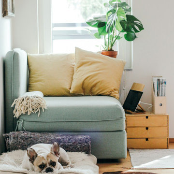
In addition to the bedroom, consider creating other restful areas in your home where you can unwind, meditate, or practice mindfulness. A cozy reading nook, a meditation space, or even a comfortable chair by a window can serve as your personal retreat.
Incorporating Nature and Green Spaces
Finally, integrating elements of nature into your living space can have a profound impact on your health. Biophilic design, which connects indoor environments with nature, has been shown to reduce stress and increase feelings of well-being. This can be as simple as adding more houseplants, incorporating natural materials, or even installing a small indoor water feature.
If you have outdoor space, create a garden or a patio where you can relax and enjoy fresh air. Even a small balcony can be transformed into a green oasis with the right plants and seating.
By thoughtfully designing your living space with health in mind, you create an environment that not only looks beautiful but also supports your physical and mental well-being.
9