
Search results for "Well rested body" in Home Design Ideas
 Studio 511
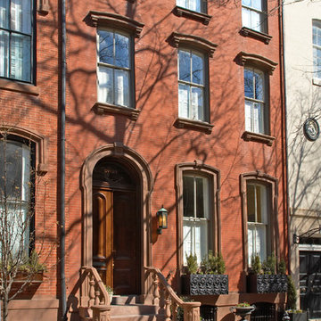
The facade of this 1840's Victorian Townhouse was restored to its original elegance. The front stoop and entry doors were rebuilt as well as the cornice and window details. Interior Design by Barbara Gisel and Mary Macelree.
 Advance Design Studio, Ltd.
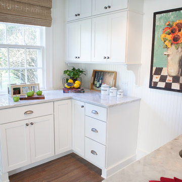
This 1930's Barrington Hills farmhouse was in need of some TLC when it was purchased by this southern family of five who planned to make it their new home. The renovation taken on by Advance Design Studio's designer Scott Christensen and master carpenter Justin Davis included a custom porch, custom built in cabinetry in the living room and children's bedrooms, 2 children's on-suite baths, a guest powder room, a fabulous new master bath with custom closet and makeup area, a new upstairs laundry room, a workout basement, a mud room, new flooring and custom wainscot stairs with planked walls and ceilings throughout the home.
The home's original mechanicals were in dire need of updating, so HVAC, plumbing and electrical were all replaced with newer materials and equipment. A dramatic change to the exterior took place with the addition of a quaint standing seam metal roofed farmhouse porch perfect for sipping lemonade on a lazy hot summer day.
In addition to the changes to the home, a guest house on the property underwent a major transformation as well. Newly outfitted with updated gas and electric, a new stacking washer/dryer space was created along with an updated bath complete with a glass enclosed shower, something the bath did not previously have. A beautiful kitchenette with ample cabinetry space, refrigeration and a sink was transformed as well to provide all the comforts of home for guests visiting at the classic cottage retreat.
The biggest design challenge was to keep in line with the charm the old home possessed, all the while giving the family all the convenience and efficiency of modern functioning amenities. One of the most interesting uses of material was the porcelain "wood-looking" tile used in all the baths and most of the home's common areas. All the efficiency of porcelain tile, with the nostalgic look and feel of worn and weathered hardwood floors. The home’s casual entry has an 8" rustic antique barn wood look porcelain tile in a rich brown to create a warm and welcoming first impression.
Painted distressed cabinetry in muted shades of gray/green was used in the powder room to bring out the rustic feel of the space which was accentuated with wood planked walls and ceilings. Fresh white painted shaker cabinetry was used throughout the rest of the rooms, accentuated by bright chrome fixtures and muted pastel tones to create a calm and relaxing feeling throughout the home.
Custom cabinetry was designed and built by Advance Design specifically for a large 70” TV in the living room, for each of the children’s bedroom’s built in storage, custom closets, and book shelves, and for a mudroom fit with custom niches for each family member by name.
The ample master bath was fitted with double vanity areas in white. A generous shower with a bench features classic white subway tiles and light blue/green glass accents, as well as a large free standing soaking tub nestled under a window with double sconces to dim while relaxing in a luxurious bath. A custom classic white bookcase for plush towels greets you as you enter the sanctuary bath.
Joe Nowak
 Twelve Stones Designs, LLC
The owners of this kitchen had spent the money to upgrade the finishes in their kitchen upon building the home 12 years ago, but after living in the space for several years they realized how nonfunctional the layout really was. The (then) two preschool aged children had grown into busy, hungry teenagers with many friends who also liked to hang out at the house. So the family needed a more functional kitchen with better traffic flow, space for daily activities revolving around the kitchen at different times of day, and a kitchen that could accommodate cooking for and serving large groups. Furthermore, the dark, traditional finishes no longer reflected the homeowners’ style. They requested a brighter, more relaxed, coastal style that reflected their love of the seaside cities they like to visit.
Originally, the kitchen was U-shaped with a narrow island in the middle. The island created narrow aisles that bottle-necked at the dishwasher, refrigerator, and cooktop areas. There was a pass-through from the foyer into the kitchen, but the owners never liked that the pass-through was also located so close to the powder room. The awkward proximity was unappealing and made guests feel uncomfortable.
The kitchen’s storage was made up of lots of narrow cabinets, apothecary drawers, clipped corner units, and very few drawers. It lacked useful storage for the larger items the family used on a daily basis. And the kitchen’s only pantry was small closet that had only builder-grade, narrow shelving with no illumination to be able to see the contents inside.
Overall, the kitchen’s lighting plan was poorly executed. Only six recessed cans illuminated the entire kitchen and nook areas. The under cabinet lighting was not evenly distributed either. In fact, the builder had mis-placed the under cabinet lighting around the decorative pilasters which made for choppy, dark cubbies. Further, the builder didn’t include any lighting over the sink or the bar area, which meant whoever was doing the dishes was always in their own shadow. That, coupled with the steep overhang of the game room above made the bar area feel like a dim, cavernous space that wasn’t inviting or task oriented. The kitchen looked out into the main living space, but the raised bar and a narrow wall (which held the only large cabinet in the kitchen) created more of a barrier than a relationship to the living room or breakfast nook. In fact, one couldn’t even see the breakfast nook from the cooktop or sink areas due to its orientation. The raised bar top was too narrow to comfortably sit to either dine at or chat from due to the lack of knee space. The the homeowners confided that the kitchen felt more like a dark, dirty prison than place where the family, or their guests, wanted to gather and commune.
The clients' needs and desires were:
➢ to create a kitchen that would be a space the family loved to be in; to relate to the adjacent spaces all around, and to have better flow for entertaining large groups
➢ to remove the walls between the breakfast nook and living area and to be able to utilize the natural light from the windows in both those areas
➢ to incorporate a functional chopping block for prepping fresh food for home cooked meals, an island with a large sink and drain board, 2 pull out trash cans, and seating for at least the 2 teens to eat or do homework
➢ to design a kitchen and breakfast nook with an airy, coastal, relaxed vibe that blended with the rest of the house's coastal theme
➢ to integrate a layered lighting plan which would include ample general illumination, specific task lighting, decorative lighting, and lots of illuminated storage
➢ to design a kitchen with not only more storage for all the husband’s kitchen gadgets and collection of oils and spices, but smart storage, including a coffee/breakfast bar and a place to store and conceal the toaster oven and microwave
➢ to find a way to utilize the large open space between the kitchen, pantry area, and breakfast nook
Twelve Stones Designs achieved the owner's goals by:
➢ removing the walls between the kitchen and living room to allow the natural light to filter in from the adjacent rooms and to create a connection between the kitchen, nook, and living spaces for a sense of unity and communion
➢ removing the existing pantry and designing 3 large pantry style cabinets with LED tape lights and rollout drawers to house lots of kitchen appliances, gadgets, and tons of groceries. We also took the cabinets all the way up to the 9’ ceiling for additional storage for seasonal items and bulk storage.
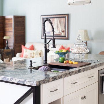
➢ designing 2 islands - 1 with a gorgeous black walnut chopping block that houses a drawer for chopping and carving knives and a custom double pull out trash unit for point of use utilization - and 1 that houses the dishwasher, a large Blanco Gourmet sink with integrated drain board, woven baskets for fresh root vegetables and kitchen towels, plenty of drawer storage for kitchen items, and bar seating for up to 4 diners.
➢ closing off the space between the kitchen and the powder room to create a beautiful new private alcove for the powder room as well as adding some decorative storage. This also gave us space to include more tall storage near the new range for precision placement of the husband’s extensive oil and spice collection as well as a location for a combo-steam oven the wife wanted for baking and cooking healthy meals.
The project is enhanced functionally by:
➢ incorporated USB and standard receptacles for the kids’ laptops and phone charging in the large island
➢ designing the small island to include additional open shelving for items used on a daily basis such as a variety of bowls, plates, and colanders. This set up also works well for the husband who prefers to “plate” his dinners in restaurant-style fashion before presenting them to the table.
➢ the integration of specific storage units, such as double stacked cutlery drawers, a custom spice pull-out, a Kuerig coffee and tea pod drawer, and custom double stacked utensil drawers
➢ moving the refrigerator to the old oven location - this eliminated the bottle neck as well as created a better relationship to the eating table. It also utilizes the floor space between the pantry, nook, and kitchen
➢ creating a banquet style breakfast nook - this banquette seating not only doubles the amount of seating for large gatherings but it better utilizes the odd space between the kitchen and the previous nook area. It also helps to create a distinct pathway from the mudroom room through the pantry area, kitchen, nook, and living room.
➢ the coffee/breakfast bar area which includes the perfect location for the concealed microwave and toaster oven, convenient storage for the coffee pods and tea accoutrements. Roll-out drawers below also house the smoothie maker, hot water kettle, and a plethora of smoothie-making ingredients such as protein powders, smoothie additives, etc. Furthermore, the drawers below the Keurig house measuring utensil, cutlery, baking supplies and tupperware storage.
➢ incorporating lots of wide drawers and pullouts to accommodate large cookware.
➢ utilizing as much vertical space as possible by building storage to the ceiling which accommodates the family’s abundant amount of serving platters, baking sheets, bakeware, casserole dishes, and additional cutting boards.
The project is enhanced aesthetically by:
➢ new 5-piece Versailles pattern porcelain tile that now seamlessly joins the entire down stairs area together creating a bright, cohesiveness feeling instead of choppy separated spaces - it also adds a coastal feeling
➢ designing a cabinet to conceal the microwave and toaster oven
➢ the coastal influenced light fixtures over the nook table and island
➢ the sandy colors of the Langdon Cambria countertops. The swirling pattern and sparkling quartz pieces remind the homeowner of black-and-tan sandy beaches
➢ the striped banquet seating whose creamy white background and blue-green stripes were the inspiration for the cabinet and wall colors.
➢ All the interior doors were painted black to coordinate with the blacks and grays in the backsplash tile and countertop. This also adds a hint of tailored formality to an otherwise casual space.
➢ the use of WAC's Oculux small aperture LED units for the overhead lighting complimented with Diode LED strips for task lighting under the cabinets and inside the pantry and glass wall cabinets. All of the lighting applications are on separate dimmer switches.
Innovative uses of materials or construction methods by Realty Restoration LLC:
➢ Each 1-1/2” x 3” block of reclaimed end-grain black walnut that makes up the center island chopping block was hand milled and built in the shop. It was designed to look substantial and proportional to the surrounding elements, executed by creating the 4 inch tall top with a solid wood chamfered edge band.
➢ The metal doors on either side of the vent hood were also custom designed for this project and built in the Realty Restoration LLC shop. They are made 1x2, 11-gauge mild steel with ribbed glass. Weighing 60 lbs a piece, heavy duty cabinet hinges were added to support the weight of the door and keep them from sagging.
➢ Under-cabinet receptacles were added along the range wall in order to have a clean, uninterrupted backsplash.
Design obstacles to overcome:
➢ Because we were removing the demising walls between the kitchen and living room, we had to find a way to plumb and vent the new island. We did this by tunneling through the slab (the slab had post tension cables which prevented us from just trenching) to run a new wet vent through a nearby structural wall. We pulled the existing hot and cold lines between upper floor joists and ran them down the structural wall as well and up through a conduit in the tunnel.
➢ Since we were converting from wall overs to a gas range it allowed us to utilize the 220 feed for the wall ovens to provide a new sub panel for all the new kitchen circuits
➢ Due to framing deficiencies inherited from the original build there was a 1-1/2” differential in the floor-to-ceiling height over a 20 foot span; by utilizing the process of cutting and furring coupled with the crown moulding details on the cabinet elevations we were able to mask the problem and provide seamless transitions between the cabinet components.
Evidence of superior craftsmanship:
➢ uniquely designed, one-of-a-kind metal “X” end panels on the large island. The end panels were custom made in the Realty Restoration LLC shop and fitted to the exact dimensions of the island. The welding seams are completely indistinguishable - the posts look like they are cut from a single sheet of metal
➢ square metal posts on the small island were also custom made and designed to compliment and carry through the metal element s throughout the kitchen
➢ the beautiful, oversized end panels on the pantry cabinets which give the breakfast nook a tailored look
➢ integrating a large format 5 piece Versailles tile pattern to seamlessly flow from the existing spaces into the new kitchen space
➢ By constructing a custom cabinet that jogged around a corner we could not remodel (housing the entry way coat closet) we were able to camouflage the adjacent wall offset within the upper and lower cabinets. By designing around the existing jog in the structural walls we accomplished a few things: we were able to find the space to house, and hide, the microwave and toaster oven yet still have a clean cohesive appearance from the kitchen side. Additionally, the owners were able to keep their much needed coat closet and we didn’t have to increase the budget with unnecessary structural work.
Find the right local pro for your project
 Adrienne DeRosa
Adrienne DeRosa © 2014 Houzz Inc.
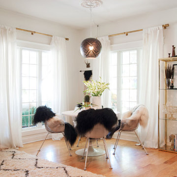
Along with the living room, this dining area has received a style overhaul. "Everything in the informal dining space as well as the living room is new," Jennifer explains. "I changed it all; the walls used to be grey and the furniture used to be off white. I had antique chippy paint cabinets and all kinds of french decor ... I have evolved from that and now want simple, fun and bright."
Starting with painting the walls white, Jennifer let the room evolve as she went. "Then I started to move the furniture around to see what I had, to make sure it worked," she describes. From there it became a process of eliminating and adding back in. The brass shelving was a "picking" find that Jennifer retrieved from the side of the road.
By emphasizing the large windows with white drapery, and adding in soft textural elements, Jennifer created a fresh space that exudes depth and comfort. "I would never want anyone to ever come in and say they don't feel comfortable. I feel I have created that chic, fun, eclectic style space that anyone of any age can enjoy and feel comfortable in."
Curtain rods, pendant lamp: West Elm; chairs: vintage Russell Woodard, Etsy
Adrienne DeRosa © 2014 Houzz
 TKS Design Group
Download our free ebook, Creating the Ideal Kitchen. DOWNLOAD NOW
The homeowners came to us looking to update the kitchen in their historic 1897 home. The home had gone through an extensive renovation several years earlier that added a master bedroom suite and updates to the front façade. The kitchen however was not part of that update and a prior 1990’s update had left much to be desired. The client is an avid cook, and it was just not very functional for the family.
The original kitchen was very choppy and included a large eat in area that took up more than its fair share of the space. On the wish list was a place where the family could comfortably congregate, that was easy and to cook in, that feels lived in and in check with the rest of the home’s décor. They also wanted a space that was not cluttered and dark – a happy, light and airy room. A small powder room off the space also needed some attention so we set out to include that in the remodel as well.
See that arch in the neighboring dining room? The homeowner really wanted to make the opening to the dining room an arch to match, so we incorporated that into the design.
Another unfortunate eyesore was the state of the ceiling and soffits. Turns out it was just a series of shortcuts from the prior renovation, and we were surprised and delighted that we were easily able to flatten out almost the entire ceiling with a couple of little reworks.
Other changes we made were to add new windows that were appropriate to the new design, which included moving the sink window over slightly to give the work zone more breathing room. We also adjusted the height of the windows in what was previously the eat-in area that were too low for a countertop to work. We tried to keep an old island in the plan since it was a well-loved vintage find, but the tradeoff for the function of the new island was not worth it in the end. We hope the old found a new home, perhaps as a potting table.
Designed by: Susan Klimala, CKD, CBD
Photography by: Michael Kaskel
For more information on kitchen and bath design ideas go to: www.kitchenstudio-ge.com
 Brad Ramsey Interiors
Well-Traveled Alys Beach Home
Photo: Jack Gardner
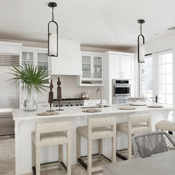
Example of a large beach style galley beige floor eat-in kitchen design with a single-bowl sink, shaker cabinets, white cabinets, marble countertops, marble backsplash, stainless steel appliances, an island, white countertops and multicolored backsplash
Example of a large beach style galley beige floor eat-in kitchen design with a single-bowl sink, shaker cabinets, white cabinets, marble countertops, marble backsplash, stainless steel appliances, an island, white countertops and multicolored backsplash
 Brad Ramsey Interiors
Well-Traveled Alys Beach Home
Photo: Jack Gardner
Inspiration for a mid-sized coastal master beige floor bedroom remodel with white walls
Inspiration for a mid-sized coastal master beige floor bedroom remodel with white walls


 TKS Design Group
Download our free ebook, Creating the Ideal Kitchen. DOWNLOAD NOW
The homeowners built their traditional Colonial style home 17 years’ ago. It was in great shape but needed some updating. Over the years, their taste had drifted into a more contemporary realm, and they wanted our help to bridge the gap between traditional and modern.
We decided the layout of the kitchen worked well in the space and the cabinets were in good shape, so we opted to do a refresh with the kitchen. The original kitchen had blond maple cabinets and granite countertops. This was also a great opportunity to make some updates to the functionality that they were hoping to accomplish.
After re-finishing all the first floor wood floors with a gray stain, which helped to remove some of the red tones from the red oak, we painted the cabinetry Benjamin Moore “Repose Gray” a very soft light gray. The new countertops are hardworking quartz, and the waterfall countertop to the left of the sink gives a bit of the contemporary flavor.
We reworked the refrigerator wall to create more pantry storage and eliminated the double oven in favor of a single oven and a steam oven. The existing cooktop was replaced with a new range paired with a Venetian plaster hood above. The glossy finish from the hood is echoed in the pendant lights. A touch of gold in the lighting and hardware adds some contrast to the gray and white. A theme we repeated down to the smallest detail illustrated by the Jason Wu faucet by Brizo with its similar touches of white and gold (the arrival of which we eagerly awaited for months due to ripples in the supply chain – but worth it!).
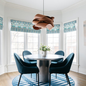
The original breakfast room was pleasant enough with its windows looking into the backyard. Now with its colorful window treatments, new blue chairs and sculptural light fixture, this space flows seamlessly into the kitchen and gives more of a punch to the space.
The original butler’s pantry was functional but was also starting to show its age. The new space was inspired by a wallpaper selection that our client had set aside as a possibility for a future project. It worked perfectly with our pallet and gave a fun eclectic vibe to this functional space. We eliminated some upper cabinets in favor of open shelving and painted the cabinetry in a high gloss finish, added a beautiful quartzite countertop and some statement lighting. The new room is anything but cookie cutter.
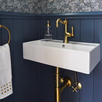
Next the mudroom. You can see a peek of the mudroom across the way from the butler’s pantry which got a facelift with new paint, tile floor, lighting and hardware. Simple updates but a dramatic change! The first floor powder room got the glam treatment with its own update of wainscoting, wallpaper, console sink, fixtures and artwork. A great little introduction to what’s to come in the rest of the home.
The whole first floor now flows together in a cohesive pallet of green and blue, reflects the homeowner’s desire for a more modern aesthetic, and feels like a thoughtful and intentional evolution. Our clients were wonderful to work with! Their style meshed perfectly with our brand aesthetic which created the opportunity for wonderful things to happen. We know they will enjoy their remodel for many years to come!
Photography by Margaret Rajic Photography
 TKS Design Group
Free ebook, Creating the Ideal Kitchen. DOWNLOAD NOW
Our clients moved into their house two years’ ago “in spite of the bathrooms”, intent on remodeling them sometime in the near future. The house is lovely a midcentury ranch set on a sprawling lot. They had saved some photos to Pinterest as inspiration as a starting point so we set out to put all those pieces together.
Notice all the wasted space in the hallway by the closet in the before picture? Well, we decided to incorporate that area into the bathroom itself so that we could have extra room for cabinets as well as the light and view from the window to the great outdoors.
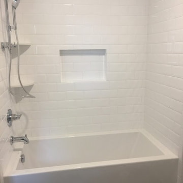
We mixed metals — chrome fixtures and lighting and black hardware and mirrors. We kept the rest of the materials neutral since it’s a smaller space. The homeowners needed storage, so we did a double vanity with a linen cabinet at one end. We installed an acrylic tub with simple white subway tile and a storage niche for shampoo. The end result is fresh, clean and functional.
Designed by: Susan Klimala, CKD, CBD
Photography by: Michael Alan Kaskel
For more information on kitchen and bath design ideas go to: www.kitchenstudio-ge.com
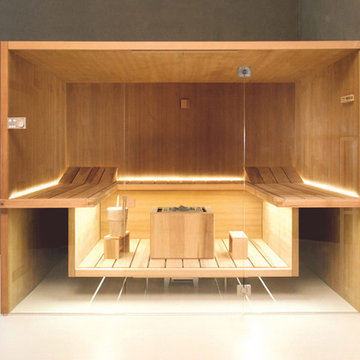
 Focal Point Hardware
Effegibi makes body-care products that draw on the historic traditions of heat therapy, with a particular focus on the Finnish sauna of Northern European origin and the Turkish bath of Mediterranean origin, all of which are factory produced but hand-finished. Ranging from sauna rooms to turkish baths, Effigibi products will complete your luxury home renovation and transform your home into the spa oasis you always wanted.
Focal Point is proud to be one of the only displaying showroom and official dealers of this luxury brand in the USA. Call our showroom at 718-336-6900 and ask to speak to one of our Effegibi experts to learn more!
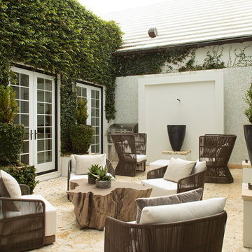 Brad Ramsey Interiors
Well-Traveled Alys Beach Home
Photo: Jack Gardner
Patio fountain - large coastal courtyard patio fountain idea with no cover
Patio fountain - large coastal courtyard patio fountain idea with no cover
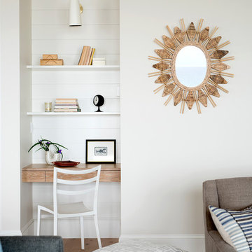
 Tyler Karu Design + Interiors
A beach-front new construction home on Wells Beach. A collaboration with R. Moody and Sons construction. Photographs by James R. Salomon.
Small beach style built-in desk light wood floor and beige floor study room photo in Portland Maine with white walls
Small beach style built-in desk light wood floor and beige floor study room photo in Portland Maine with white walls
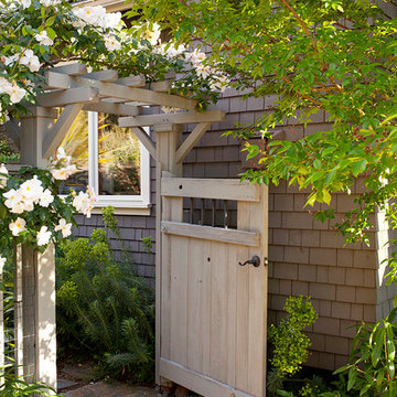
 Pedersen Associates
Barbara Ries
Inspiration for a traditional partial sun stone garden path in San Francisco with a pergola.
Inspiration for a traditional partial sun stone garden path in San Francisco with a pergola.

Sponsored
Fredericksburg, OH

High Point Cabinets
Columbus' Experienced Custom Cabinet Builder | 4x Best of Houzz Winner
 Rochelle Lynne Design
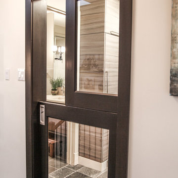
Karen was an existing client of ours who was tired of the crowded and cluttered laundry/mudroom that did not work well for her young family. The washer and dryer were right in the line of traffic when you stepped in her back entry from the garage and there was a lack of a bench for changing shoes/boots.
Planning began… then along came a twist! A new puppy that will grow to become a fair sized dog would become part of the family. Could the design accommodate dog grooming and a daytime “kennel” for when the family is away?
Having two young boys, Karen wanted to have custom features that would make housekeeping easier so custom drawer drying racks and ironing board were included in the design. All slab-style cabinet and drawer fronts are sturdy and easy to clean and the family’s coats and necessities are hidden from view while close at hand.
The selected quartz countertops, slate flooring and honed marble wall tiles will provide a long life for this hard working space. The enameled cast iron sink which fits puppy to full-sized dog (given a boost) was outfitted with a faucet conducive to dog washing, as well as, general clean up. And the piece de resistance is the glass, Dutch pocket door which makes the family dog feel safe yet secure with a view into the rest of the house. Karen and her family enjoy the organized, tidy space and how it works for them.
 Star Furniture
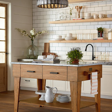
Everyone loves to hang out in the kitchen, and the Kitchen Island from the Magnolia Home collection will add a nostalgic focal point to gather round. Inspired by a vintage kitchen worktable, it has a worn-in character with its distressed Bench wood stain finish. Also available in Jo's White painted finish.
- Sheet metal top in aged zinc finish.
- Wide tapering legs.
- Towel bars on both ends.
- Open bottom shelf.
- Drawers for kitchen tool storage.
- Metal bar hardware in black finish.
The beautiful Magnolia Home line was designed exclusively by Joanna Gaines to convey her fresh, unique design style that embodies her lifestyle of home and family. Each piece falls onto a specific genre: Boho, Farmhouse, French Inspired, Industrial, Primitive or Traditional. Painted finishes and wood stains are offered that replicate the look of age-worn vintage patinas.
This piece is part of her Farmhouse genre, which is welcoming, comfortable and timelessly fresh. It features charming details such as scalloped trim, farmhouse-style turnings and age-worn finishes. Farmhouse is a nostalgic look into the way things used to be; how people worked with their hands, came home, ate well, and rested. It's a story of times past, how things used to be made, how they used to look. This style is the simplicity and timelessness of the past.
 Rochelle Lynne Design
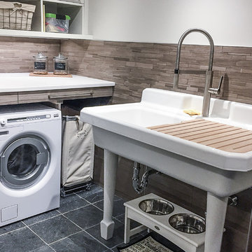
Karen was an existing client of ours who was tired of the crowded and cluttered laundry/mudroom that did not work well for her young family. The washer and dryer were right in the line of traffic when you stepped in her back entry from the garage and there was a lack of a bench for changing shoes/boots.
Planning began… then along came a twist! A new puppy that will grow to become a fair sized dog would become part of the family. Could the design accommodate dog grooming and a daytime “kennel” for when the family is away?
Having two young boys, Karen wanted to have custom features that would make housekeeping easier so custom drawer drying racks and ironing board were included in the design. All slab-style cabinet and drawer fronts are sturdy and easy to clean and the family’s coats and necessities are hidden from view while close at hand.
The selected quartz countertops, slate flooring and honed marble wall tiles will provide a long life for this hard working space. The enameled cast iron sink which fits puppy to full-sized dog (given a boost) was outfitted with a faucet conducive to dog washing, as well as, general clean up. And the piece de resistance is the glass, Dutch pocket door which makes the family dog feel safe yet secure with a view into the rest of the house. Karen and her family enjoy the organized, tidy space and how it works for them.
 Simply Home Decorating
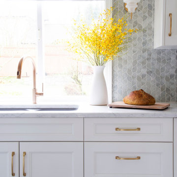
This spacious home in North Vancouver's Deep Cove community had been built and decorated just over 20 years ago and was in need of updating. Our clients who are empty nesters, spend much of their time in the kitchen and family room so we focused on these spaces keeping in mind that the more formal spaces on the main floor will follow in a few years time. For the most part the layout of their kitchen worked well for them so our role was to tweak the kitchen and family room furniture layout and to select updated finishes and furnishings. Since this home transformation is not happening all at once, we purposefully selected classic finishes, like antique brass hardware, that will tie in with the rest of the home's decor until it can be updated. The resulting refresh stays true to the original feel of the house while giving it a clean, updated look.


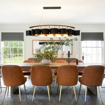
 Kristin Hoaglund Design
This beautiful French Provincial home is set on 10 acres, nestled perfectly in the oak trees. The original home was built in 1974 and had two large additions added; a great room in 1990 and a main floor master suite in 2001. This was my dream project: a full gut renovation of the entire 4,300 square foot home! I contracted the project myself, and we finished the interior remodel in just six months. The exterior received complete attention as well. The 1970s mottled brown brick went white to completely transform the look from dated to classic French. Inside, walls were removed and doorways widened to create an open floor plan that functions so well for everyday living as well as entertaining. The white walls and white trim make everything new, fresh and bright. It is so rewarding to see something old transformed into something new, more beautiful and more functional.
 Famaliving San Diego
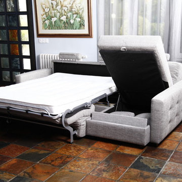
The Bolero sofa bed is ideal for people who value comfort and quality. Made in Spain by world-renowned manufacturer Famaliving, this sofa offers a customizable design with a slew of features. The quality of the 4" memory foam mattress is so good you will hardly believe it’s a sofa sleeper and not a Queen Size Bed with a tempurpedic mattress. As for the upholstery, you can pick any of our 600 fabrics to make it match your decor, or if you prefer, we also offer COM. The mattress comes in two sizes: 55" x 78" and 64" x 78"; but since it’s a 4" mattress you will need to use a Queen sized sheet no matter which option you go with. The optional chaise lounge side offers spacious storage for your bedding as well as the adjustable foot rest level that elevates your feet - a feature that provides supreme comfort while lounging. You have the option of a straight or curved-arm rest design, which provides an opportunity to make your sofa bed more Modern or Transitional. All famaliving furniture comes with the lifetime warranty on the frame and 10 years on the seat suspension system.
We deliver Nationwide!
Visit our showroom at:
Famaliving San Diego
401 University Ave,
San Diego, CA 92103
Questions? Ready to purchase?
Tel. 1-619-900-7674
sandiego@famaliving.com
 CLB Architects
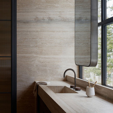
Monitor's Rest | Park City, Utah | CLB Architects
Inspiration for a modern double-sink bathroom remodel in Salt Lake City
Inspiration for a modern double-sink bathroom remodel in Salt Lake City
23