
Search results for "Wellness extend" in Home Design Ideas
 Housetrends Magazine
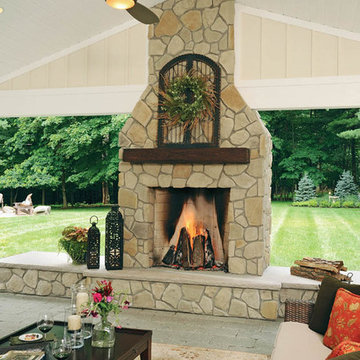
When you open the back doors of the home of Nancy and Jeremy Campbell in Granville, you don’t just step out onto a patio. You enter an extension of a modern living space that just happens to be outdoors. Their patio’s unique design and setting provides the comfort and style of indoors while enjoying the natural beauty and fresh air of outdoors.
It all started with a rather desolate back yard. “It was completely blank, there was nothing back there,” Nancy remembers of the patio space of this 1972 split-level house they bought five years ago. With a blank slate to work with, the Campbells knew the key elements of what they wanted for their new outdoor space when they sat down with Travis Ketron of Ketron Custom Builders to design it. “We knew we wanted something covered so we could use it in the rain, and in the winter, and we knew we wanted a stone fireplace,” Nancy recalls.
Travis translated the Campbells’ vision into a design to satisfy outdoor entertaining and relaxing desires in all seasons. The new outdoor space is reminiscent of a vast, rustic great room complete with a stone fireplace, a vaulted ceiling, skylights, and ceiling fans, yet no walls. The space is completely open to the elements without any glass or doors on any of the sides, except from the house. Furnished like a great room, with a built-in music system as well, it’s truly an extension of indoor living and entertaining space, and one that is unaffected by rain. Jeremy comments, “We haven’t had to cover the furniture yet. It would have to be a pretty strong wind to get wet.” Just outside the covered patio is a quartet of outdoor chairs adorned with plush cushions and colorful pillows, positioned perfectly for users to bask in the sun.
In the design process, the fireplace emerged as the anchor of the space and set the stage for the outdoor space both aesthetically and functionally. “We didn’t want it to block the view. Then designing the space with Travis, the fireplace became the center,” remembers Jeremy. Placed directly across from the two sets of French doors leading out from the house, a Rumford fireplace and extended hearth of stone in neutral earth tones is the focal point of this outdoor living room. Seating for entertaining and lounging falls easily into place around it providing optimal viewing of the private, wooded back yard. When temperatures cool off, the fireplace provides ample warmth and a cozy setting to experience the change of seasons. “It’s a great fireplace for the space,” Jeremy says of the unique design of a Rumford style fireplace. “The way you stack the wood in the fireplace is different so as to get more heat. It has a shallower box, burns hotter and puts off more heat. Wood is placed in it vertically, not stacked.” Just in case the fireplace doesn’t provide enough light for late-night soirees, there is additional outdoor lighting mounted from the ceiling to make sure the party always goes on.
Travis brought the idea of the Rumford outdoor fireplace to the Campbells. “I learned about it a few years back from some masons, and I was intrigued by the idea then,” he says. “We like to do stuff that’s out of the norm, and this fireplace fits the space and function very well.” Travis adds, “People want unique things that are designed for them. That’s our style to do that for them.”
The patio also extends out to an uncovered area set up with patio tables for grilling and dining. Gray pavers flow throughout from the covered space to the open-air area. Their continuous flow mimics the feel of flooring that extends from a living room into a dining room inside a home. Also, the earth tone colors throughout the space on the pavers, fireplace and furnishings help the entire space mesh nicely with its natural surroundings.
A little ways off from both the covered and uncovered patio area is a stone fire pit ring. Removed by just the right distance, it provides a separate place for young adults to gather and enjoy the night.
Adirondack chairs and matching tables surround the outdoor fire pit, offering seating for anyone who doesn’t wish to stand and a place to set down ingredients for yummy fireside treats like s’mores.
Padded chairs outside the reach of the pavilion and the nearby umbrella the perfect place to kick back and relax in the sun. The colorful throw pillows and outdoor furniture cushions add some needed color and a touch of personality.
Enjoying the comforts of indoors while being outdoors is exactly what the Campbells are doing now, particularly when lounging on the comfortable wicker furniture that dominate most of the area. “My favorite part of the whole thing is the fireplace,” Nancy says.
Jeremy concludes, “There is no television, it would destroy the ambiance out there. We just enjoy listening to music and watching the fire.”

 Moss Building & Design
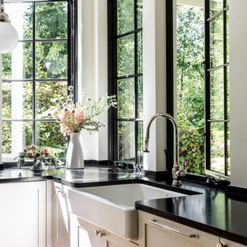
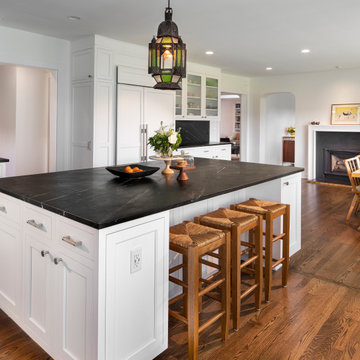
Upon entering the home from the screened porch, MOSS installed floor to ceiling semi-custom cabinetry to be used as a sort of butler’s pantry to store kitchen items, additional entertainment ware, guests’ coats, cleaning equipment and supplies, and more. The use of the unique green tone was a beautiful touch as the color green is used throughout the home’s updated décor and brings a sense of unity to the overall space. Immediately off the long hallway is the home’s kitchen, which was completely updated. Square footage was not affected but MOSS re-designed the space so that it could be used in a more functional manner. A massive kitchen island with a beautiful soapstone countertop dominates the room. Semi-custom white cabinetry lines the perimeters. New large windows provide an incredible view of the yard. Finally, a seating area with built-ins was added to supply more space for seating and for the dining room table to be moved from the center of the kitchen, previously, to the side. The kitchen also features a beautiful fireplace which had its wooden surround updated. The home’s sunroom, located next to the kitchen, was previously a few feet lower than the rest of the home. To bring a better flow to the space, MOSS raised the entire floor of the room up to meet the rest of the main level. Stunningly, the hardwood floor matches to a “T”. In the home’s living room and office, full wall built-ins were added, allowing the homeowners to display their favorite books on topics ranging from art to history, as well as showcasing statues and art sculptures and other items that are meaningful to their family. The living room fireplace’s stone and wooden surrounds were updated by MOSS as well.
Find the right local pro for your project
 Lee Kimball
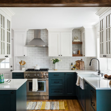
This 1940’s Colonial style home in Boston’s Jamaica Plain had strong bones and rich character but lacked the space, modern conveniences, and storage that our clients desired. While they wished to retain the look of the exterior, as well as some of the home’s unique original features,, the kitchen and dining room needed to be reimagined in design, layout, and functionality.
Key considerations were the compact size of the home and a smaller lot that didn’t give our client the flexibility of an addition. Without adding on to the existing floor plan, we needed to find a way to gain vital extra space in the kitchen, which, with walls enclosing it on all sides, was dark and disconnected from the rest of the house. Our design team coordinated with our client to reconfigure the space by opening up the wall between the dining room and the kitchen to add a few extra inches – just enough to create an open flow between the two rooms. With the removal of that wall, the formerly dark kitchen was flooded with the natural light coming from the existing dining room windows, making the entire space feel brighter and more cohesive.
The original kitchen dated back to the mid-20th century and lacked, among other conveniences, a dishwasher, enough storage, or even countertop space for food prep. In redesigning the kitchen, we visually expanded the space by incorporating white upper cabinetry, open shelving, and white subway tiles extending from the backsplash to the ceiling. A new, larger window featuring a deep stone sill brought in even more light, and the appliances and apron sink were selected to retain the traditional look of the home while delivering modern functionality.
Considering how our client would use this space, we focused on creating a purposeful workspace and storage, ensuring that there was ample countertop space and cabinetry between the sink and range. A multi-purpose cabinet and countertop which serves as a microwave station and food service area were added to the backside of the dining room wall, packing a lot of utility into a small space.
Prior to this renovation, our client had painted the dining room in Mount Saint Anne by Benjamin Moore, a tranquil blue-gray that suited the room well and allowed the original built-in corner cabinetry to stand out, highlighting the home’s charm. With the newly opened floor plan extending into the kitchen, we selected a deep custom color for the base cabinets, Yorktowne Green by Benjamin Moore, to complement the dining room and pull all of the elements together in a cohesive space.
This transformation was remarkable, both functionally and visually. The kitchen is now a bright and inviting space that flows seamlessly into the rest of the house. The homeowners are thrilled with the results, and the small changes we incorporated that made a big difference in the overall feel and functionality of the space.
 Blue Sound Construction, Inc.
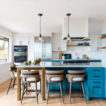
An all new kitchen freshens this water view home and better reflects the serene outdoor beauty without. Remodeled by Blue Sound Construction, Interior Design by KP Spaces, Design by Brian David Roberts, Photography by Miranda Estes.
 David Coulson Design Ltd.
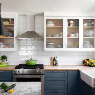
Example of a 1960s l-shaped light wood floor eat-in kitchen design in Other with a farmhouse sink, shaker cabinets, blue cabinets, wood countertops, white backsplash, subway tile backsplash, stainless steel appliances and an island


Sponsored
Sunbury, OH

J.Holderby - Renovations
Franklin County's Leading General Contractors - 2X Best of Houzz!
 catlin stothers design
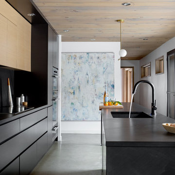
This country house was previously owned by Halle Berry and sits on a private lake north of Montreal. The kitchen was dated and a part of a large two storey extension which included a master bedroom and ensuite, two guest bedrooms, office, and gym. The goal for the kitchen was to create a dramatic and urban space in a rural setting.
Photo : Drew Hadley
 Michael K Chen Architecture
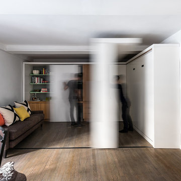
A sliding storage element and a series of sliding panels create distinct spaces within a compact 390 sf Manhattan apartment. Sliding elements are motorized and can operated manually.


 Clark Collins - Collins Design & Development
Eric Foote
Example of a small tuscan kitchen design in Santa Barbara
Example of a small tuscan kitchen design in Santa Barbara
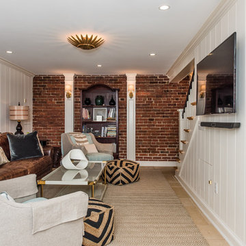
 FineCraft Contractors, Design + Build
Location: Bethesda, MD, USA
This total revamp turned out better than anticipated leaving the clients thrilled with the outcome.
Finecraft Contractors, Inc.
Interior Designer: Anna Cave
Susie Soleimani Photography
Blog: http://graciousinteriors.blogspot.com/2016/07/from-cellar-to-stellar-lower-level.html


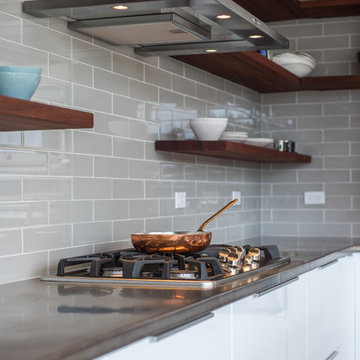
 AoDK Inc.
A couple wanted a weekend retreat without spending a majority of their getaway in an automobile. Therefore, a lot was purchased along the Rocky River with the vision of creating a nearby escape less than five miles away from their home. This 1,300 sf 24’ x 24’ dwelling is divided into a four square quadrant with the goal to create a variety of interior and exterior experiences while maintaining a rather small footprint.
Typically, when going on a weekend retreat one has the drive time to decompress. However, without this, the goal was to create a procession from the car to the house to signify such change of context. This concept was achieved through the use of a wood slatted screen wall which must be passed through. After winding around a collection of poured concrete steps and walls one comes to a wood plank bridge and crosses over a Japanese garden leaving all the stresses of the daily world behind.
The house is structured around a nine column steel frame grid, which reinforces the impression one gets of the four quadrants. The two rear quadrants intentionally house enclosed program space but once passed through, the floor plan completely opens to long views down to the mouth of the river into Lake Erie.
On the second floor the four square grid is stacked with one quadrant removed for the two story living area on the first floor to capture heightened views down the river. In a move to create complete separation there is a one quadrant roof top office with surrounding roof top garden space. The rooftop office is accessed through a unique approach by exiting onto a steel grated staircase which wraps up the exterior facade of the house. This experience provides an additional retreat within their weekend getaway, and serves as the apex of the house where one can completely enjoy the views of Lake Erie disappearing over the horizon.
Visually the house extends into the riverside site, but the four quadrant axis also physically extends creating a series of experiences out on the property. The Northeast kitchen quadrant extends out to become an exterior kitchen & dining space. The two-story Northwest living room quadrant extends out to a series of wrap around steps and lounge seating. A fire pit sits in this quadrant as well farther out in the lawn. A fruit and vegetable garden sits out in the Southwest quadrant in near proximity to the shed, and the entry sequence is contained within the Southeast quadrant extension. Internally and externally the whole house is organized in a simple and concise way and achieves the ultimate goal of creating many different experiences within a rationally sized footprint.
 Organized Living
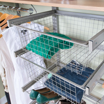
Organized Living Reveal Baskets complements freedomRail organizing systems perfectly. Simply snap Reveal baskets in to freedomRail Uprights and they slide out to provide full access and visibility to items being stored. Available in white and nickel at OrganizedLiving.com.
 Kimberlee Kristine
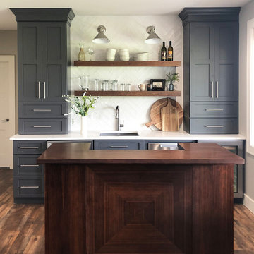
Example of a mid-sized transitional walk-out laminate floor and brown floor basement design in Seattle with gray walls, a standard fireplace and a stone fireplace
 Rasmussen Construction
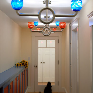
Custom made light fixtures that you can use to swing down the hall.
Design: Gast Architects
Photo by: Stephen Fridge
Hallway - large contemporary ceramic tile hallway idea in San Francisco with beige walls
Hallway - large contemporary ceramic tile hallway idea in San Francisco with beige walls


 Craig O'Connell Architecture
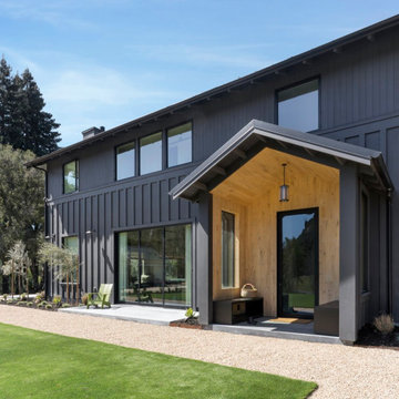
After the devastating Tubbs fire, Craig reimagined this Calistoga property into a wine country retreat for the owners' family as well as corporate/wellness guests. He approached the design by studying the natural elements of the site including trees, views and light, the vernacular design of the area and the clients’ personality. Craig designed a barn and the house – made up of a one-story and a two-story building – connected by a stunning 20-foot steel and glass breezeway. Expansive doors and windows create seamless indoor/outdoor flow and numerous patios and the pool area provide comfortable outdoor spaces. The modern and warm interior is bright, luxurious and comfortable.
 Route Design : Ashley Winn
Kate Osborne
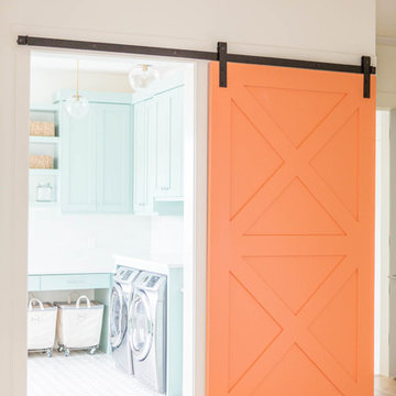
Inspiration for a transitional laundry room remodel in Salt Lake City
Inspiration for a transitional laundry room remodel in Salt Lake City
 Advance Design Studio, Ltd.
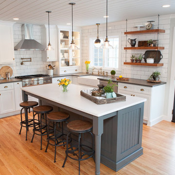
When this suburban family decided to renovate their kitchen, they knew that they wanted a little more space. Advance Design worked together with the homeowner to design a kitchen that would work for a large family who loved to gather regularly and always ended up in the kitchen! So the project began with extending out an exterior wall to accommodate a larger island and more moving-around space between the island and the perimeter cabinetry.
Style was important to the cook, who began collecting accessories and photos of the look she loved for months prior to the project design. She was drawn to the brightness of whites and grays, and the design accentuated this color palette brilliantly with the incorporation of a warm shade of brown woods that originated from a dining room table that was a family favorite. Classic gray and white cabinetry from Dura Supreme hits the mark creating a perfect balance between bright and subdued. Hints of gray appear in the bead board detail peeking just behind glass doors, and in the application of the handsome floating wood shelves between cabinets. White subway tile is made extra interesting with the application of dark gray grout lines causing it to be a subtle but noticeable detail worthy of attention.
Suede quartz Silestone graces the countertops with a soft matte hint of color that contrasts nicely with the presence of white painted cabinetry finished smartly with the brightness of a milky white farm sink. Old melds nicely with new, as antique bronze accents are sprinkled throughout hardware and fixtures, and work together unassumingly with the sleekness of stainless steel appliances.
The grace and timelessness of this sparkling new kitchen maintains the charm and character of a space that has seen generations past. And now this family will enjoy this new space for many more generations to come in the future with the help of the team at Advance Design Studio.
Photographer: Joe Nowak
11