
Search results for "Work from home" in Home Design Ideas

 Margaret L. Norcott, Allied ASID
Kids Craft Room
Photo Credit: Woodie Williams Photography
Large transitional gender-neutral medium tone wood floor playroom photo in Jacksonville with white walls
Large transitional gender-neutral medium tone wood floor playroom photo in Jacksonville with white walls

 OLSON LEWIS + Architects
Major gut renovation of this coastal estate preserved its basic layout while expanding the kitchen. A veranda and a pair of gazebos were also added to the home to maximize outdoor living and the water views. The interior merged the homeowners eclectic style with the traditional style of the home.
Photographer: James R. Salomon
Contractor: Carl Anderson, Anderson Contracting Services
 REEDesign Interiors by Roderick Reed
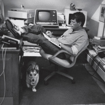
REEDesigns 4 TIPS FOR CREATING A HOME OFFICE:
Working from Home now? Now matter how big your space ponder these 4 tips:
1. Consider the light – bright light can be wonderful for both mood, however not when it is glaring onto your computer screen. Take both natural and artificial light sources into account when planning the room. Add shears or blinds and possibly reorient you screen.
2. Keep things organized! Nothing kills productivity like than a cluttered work space. especially if it is small.
3. Incorporate art and object's for personality.
4. Breathe some nature into the space with plants or fresh cut flowers.
Find the right local pro for your project

 Southern Living
Inspiration for a coastal galley medium tone wood floor eat-in kitchen remodel in Birmingham with a double-bowl sink, recessed-panel cabinets, white cabinets, stainless steel appliances and an island
 Brendan McHugh, Architect, Manasquan, NJ
VISION AND NEEDS:
Our client came to us with a vision for their dream house for their growing family with three young children. This was their second attempt at getting the right design. The first time around, after working with an out-of-state online architect, they could not achieve the level of quality they wanted. McHugh delivered a home with higher quality design.
MCHUGH SOLUTION:
The Shingle/Dutch Colonial Design was our client's dream home style. Their priorities were to have a home office for both parents. Ample living space for kids and friends, along with outdoor space and a pool. Double sink bathroom for the kids and a master bedroom with bath for the parents. Despite being close a flood zone, clients could have a fully finished basement with 9ft ceilings and a full attic. Because of the higher water table, the first floor was considerably above grade. To soften the ascent of the front walkway, we designed planters around the stairs, leading up to the porch.

 Milgard Windows & Doors
The Kiguchi family moved into their Austin, Texas home in 1994. Built in the 1980’s as part of a neighborhood development, they happily raised their family here but longed for something more contemporary. Once they became empty nesters, they decided it was time for a major remodel. After spending many years visiting Austin AIA Home Tours that highlight contemporary residential architecture, they had a lot of ideas and in 2013 were ready to interview architects and get their renovation underway.
The project turned into a major remodel due to an unstable foundation. Architects Ben Arbib and Ed Hughey, of Arbib Hughey Design were hired to solve the structural issue and look for inspiration in the bones of the house, which sat on top of a hillside and was surrounded by great views.
Unfortunately, with the old floor plan, the beautiful views were hidden by small windows that were poorly placed. In order to bring more natural light into the house the window sizes and configurations had to be addressed, all while keeping in mind the homeowners desire for a modern look and feel.
To achieve a more contemporary and sophisticated front of house, a new entry was designed that included removing a two-story bay window and porch. The entrance of the home also became more integrated with the landscape creating a template for new foliage to be planted. Older exterior materials were updated to incorporate a more muted palette of colors with a metal roof, dark grey siding in the back and white stucco in the front. Deep eaves were added over many of the new large windows for clean lines and sun protection.
“Inside it was about opening up the floor plan, expanding the views throughout the house, and updating the material palette to get a modern look that was also warm and inviting,” said Ben from Arbib Hughey Design. “Prior to the remodel, the house had the typical separation of rooms. We removed the walls between them and changed all of the windows to Milgard Thermally Improved Aluminum to connect the inside with the outside. No matter where you are you get nice views and natural light.”
The architects wanted to create some drama, which they accomplished with the window placement and opening up the interior floor plan to an open concept approach. Cabinetry was used to help delineate intimate spaces. To add warmth to an all-white living room, white-washed oak wood floors were installed and pine planks were used around the fireplace. The large windows served as artwork bringing the color of nature into the space.
An octagon shaped, elevated dining room, (named “the turret”), had a big impact on the design of the house. They architects rounded the corners and added larger window openings overlooking a new sunken garden. The great room was also softened by rounding out the corners and that circular theme continued throughout the house, being picked up in skylight wells and kitchen cabinetry. A staircase leading to a catwalk was added and the result was a two-story window wall that flooded the home with natural light.
When asked why Milgard® Thermally Improved Aluminum windows were selected, the architectural team listed many reasons:
1) Aesthetics: “We liked the slim profiles and narrow sightlines. The window frames never get in the way of the view and that was important to us. They also have a very contemporary look that went well with our design.”
2) Options: “We liked that we could get large sliding doors that matched the windows, giving us a very cohesive look and feel throughout the project.”
3) Cost Effective: “Milgard windows are affordable. You get a good product at a good price.”
4) Custom Sizes: “Milgard windows are customizable, which allowed us to get the right window for each location.”
Ready to take on your own traditional to modern home remodeling project? Arbib Hughey Design advises, “Work with a good architect. That means picking a team that is creative, communicative, listens well and is responsive. We think it’s important for an architect to listen to their clients and give them something they want, not something the architect thinks they should have. At the same time you want an architect who is willing and able to think outside the box and offer up design options that you may not have considered. Design is about a lot of back and forth, trying out ideas, getting feedback and trying again.”
The home was completely transformed into a unique, contemporary house perfectly integrated with its site. Internally the home has a natural flow for the occupants and externally it is integrated with the surroundings taking advantage of great natural light. As a side note, it was highly praised as part of the Austin AIA homes tour.

 Caroline Sharpnack
Photo: Caroline Sharpnack © 2017 Houzz
Example of a country light wood floor and beige floor kitchen/dining room combo design in Nashville with blue walls
Example of a country light wood floor and beige floor kitchen/dining room combo design in Nashville with blue walls
Sponsored
Columbus, OH

Wannemacher Interiors
Customized Award-Winning Interior Design Solutions in Franklin Cnty OH

 O’Hara Interiors
Martha O'Hara Interiors, Interior Design & Photo Styling | City Homes, Builder | Troy Thies, Photography
Please Note: All “related,” “similar,” and “sponsored” products tagged or listed by Houzz are not actual products pictured. They have not been approved by Martha O’Hara Interiors nor any of the professionals credited. For information about our work, please contact design@oharainteriors.com.

 Simmons Estate Homes
Example of a classic dark wood floor open concept kitchen design in Dallas with recessed-panel cabinets, white cabinets, white backsplash and stone slab backsplash

 FineLine Kitchens, Inc.
Hi everyone, I'm Sarah and Ogun we are here with fine line kitchens. So we are a couple working together. I do the interior design and remodeling of the space material selection meeting with the clients. And I handled operations outside, you know meaning all the construction work that is taking place the inside. The houses that we work in. I handle all the aspects of the construction, so today's project is very special. We're in Vienna and the client had a very big family. It's a family of seven that lives here. So we had a few aspects that we needed to keep in mind while designing this one. Having everybody be able to sit on the island. So we wanted plenty of seating all the way around. We didn't want anybody standing or anything like that. So what we did is we maximize the space. The center island is the biggest part of the kitchen. We use a natural stone to kind of give it a beautiful texture versus quartz. It's kind of standard white or kind of fabricated, so I wanted something very natural. We did this because I took my inspiration from the outside, so the inspiration if you look at the view right in front of me is there are so many greens there's a lot of brass accents and I wanted to bring this. Into this kitchen while designing it for my clients. She is very warm very. She wanted a very homey, comfy kind of look for the kitchen. So that's what we did today. As you can see, the cabinets are sage green, very light, so I still think it's a neutral, but it's a lighter color that again brings the outside in and we combine that with the oak right behind me so it's a slightly warm oak. It's not very dark. It's not very light. It's a medium brown and the same color went on the island. To kind of tie these two in and the backsplash, my favorite part is where you can see a little bit of design. It is, in my opinion still classic, but includes a pattern so the outside part is as we said in the beginning, is handled by my husband. I'd like him to speak a little bit about that. Thanks, Sarah, I want to talk to you guys a little bit about the construction part of this project. Originally this kitchen was located mostly in this area. They had their stove there sing. It was more of a peninsula layout in Sarah's and the customer vision they wanted. They wanted to get rid of the peninsula and they want to be able to have a huge island that can at least sit seven people because they're familiar with seven. So we wanted to make sure that we can achieve this design and bring it to life so that they can be happy with this layout. Some of the challenges we had, the house, the home being, you know, old home. There were a lot of you know the older electrical and plumbing that had to be replaced. We had to relocate the stove from here to this area. Over here we had put a nice foot fan that we had to relocate all the ductwork and the plumbing. Was being on the peninsula area. We had to relocate it to the center islands. So we achieved all this and kind of like bring it to bring in this kitchen up to date it looks beautiful. That's true, so yes, the old layout did not function for my clients because everything was kind of gathered on one side of the kitchen. So there was like a peninsula right there. So the end of this island kind of continued straight. And that was just the L shape. Kind of where everything was and there used to be another big table here, so they were using only kind of half of the space. So like I said at the beginning, our vision was to kind of feed everybody at the island, create some symmetry. 'cause I love that. So as you can see behind me, this is kind of the focal point symmetrical. Everything is kind of even we wanted to also panel the fridge here so it mimics the pantry and another size. So when you're looking at it, it is bringing again that symmetry back again. I hope you enjoyed this kitchen and this video and I'll see you soon. So how do you think this project turned out? It's nice. I like the color. I think it turned out nice. It's kind of like a little bit different color than what we always do. So I realize. Are you giving me a little bit of credit here that I did something different? Are you proud? I'm so proud of you. Other than that I like it. That they have kind of like a two sink. So if this was our kitchen, if we ever like you can have your own. I can have mine if we ever get into a fight then this can be like my own kitchen. Why are we gonna bring in a fight right now? So I'm cooking anyway. You're grilling most of the time, So what are you even talking about? My kitchen? That's my kitchen. You can just take the small sink. That's fine. It's always good to have your own space right there, so anyways. Thank you guys for watching. We hope to see you soon and if you have any questions please click the link below. It'll lead you to our website, house, YouTube and all of the social media is so nice to have you guys. We'll see you soon. Thanks bye bye-bye.

 Sears Architects
Photographer: Ashley Avila
For building specifications, please see description on main project page.
For interior images and specifications, please visit: http://www.houzz.com/projects/332182/lake-house.

 Drewett Works
This homage to prairie style architecture located at The Rim Golf Club in Payson, Arizona was designed for owner/builder/landscaper Tom Beck.
This home appears literally fastened to the site by way of both careful design as well as a lichen-loving organic material palatte. Forged from a weathering steel roof (aka Cor-Ten), hand-formed cedar beams, laser cut steel fasteners, and a rugged stacked stone veneer base, this home is the ideal northern Arizona getaway.
Expansive covered terraces offer views of the Tom Weiskopf and Jay Morrish designed golf course, the largest stand of Ponderosa Pines in the US, as well as the majestic Mogollon Rim and Stewart Mountains, making this an ideal place to beat the heat of the Valley of the Sun.
Designing a personal dwelling for a builder is always an honor for us. Thanks, Tom, for the opportunity to share your vision.
Project Details | Northern Exposure, The Rim – Payson, AZ
Architect: C.P. Drewett, AIA, NCARB, Drewett Works, Scottsdale, AZ
Builder: Thomas Beck, LTD, Scottsdale, AZ
Photographer: Dino Tonn, Scottsdale, AZ

Sponsored
Columbus, OH

Hope Restoration & General Contracting
Columbus Design-Build, Kitchen & Bath Remodeling, Historic Renovations

 Carrick Custom Home Design
Built by Highland Custom Homes
Single front door - mid-sized transitional medium tone wood floor and beige floor single front door idea in Salt Lake City with beige walls and a blue front door
Single front door - mid-sized transitional medium tone wood floor and beige floor single front door idea in Salt Lake City with beige walls and a blue front door
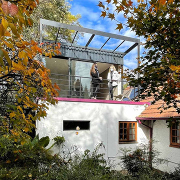
 Avox Architects
We designed his light steel frame home office above an existing flat roof section of the house.
Home office - small modern home office idea
Home office - small modern home office idea

 Chango
Architecture, Interior Design, Custom Furniture Design & Art Curation by Chango & Co.
Example of a mid-sized classic built-in desk light wood floor and brown floor study room design in New York with gray walls and no fireplace
Example of a mid-sized classic built-in desk light wood floor and brown floor study room design in New York with gray walls and no fireplace
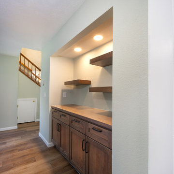
 Advanced Home Improvement, Inc.
Warm wood open shelves and elegant black hardware. The striking 2" thick shelves not only add a statement but also provide a perfect showcase for curated décor and glassware.

Sponsored
Westerville, OH

Custom Home Works
Franklin County's Award-Winning Design, Build and Remodeling Expert
 Drewett Works
WINNER: Silver Award – One-of-a-Kind Custom or Spec 4,001 – 5,000 sq ft, Best in American Living Awards, 2019
Affectionately called The Magnolia, a reference to the architect's Southern upbringing, this project was a grass roots exploration of farmhouse architecture. Located in Phoenix, Arizona’s idyllic Arcadia neighborhood, the home gives a nod to the area’s citrus orchard history.
Echoing the past while embracing current millennial design expectations, this just-complete speculative family home hosts four bedrooms, an office, open living with a separate “dirty kitchen”, and the Stone Bar. Positioned in the Northwestern portion of the site, the Stone Bar provides entertainment for the interior and exterior spaces. With retracting sliding glass doors and windows above the bar, the space opens up to provide a multipurpose playspace for kids and adults alike.
Nearly as eyecatching as the Camelback Mountain view is the stunning use of exposed beams, stone, and mill scale steel in this grass roots exploration of farmhouse architecture. White painted siding, white interior walls, and warm wood floors communicate a harmonious embrace in this soothing, family-friendly abode.
Project Details // The Magnolia House
Architecture: Drewett Works
Developer: Marc Development
Builder: Rafterhouse
Interior Design: Rafterhouse
Landscape Design: Refined Gardens
Photographer: ProVisuals Media
Awards
Silver Award – One-of-a-Kind Custom or Spec 4,001 – 5,000 sq ft, Best in American Living Awards, 2019
Featured In
“The Genteel Charm of Modern Farmhouse Architecture Inspired by Architect C.P. Drewett,” by Elise Glickman for Iconic Life, Nov 13, 2019


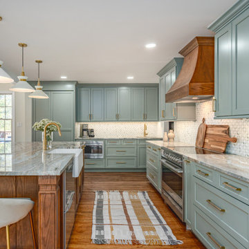 FineLine Kitchens, Inc.
Hi everyone, I'm Sarah and Ogun we are here with fine line kitchens. So we are a couple working together. I do the interior design and remodeling of the space material selection meeting with the clients. And I handled operations outside, you know meaning all the construction work that is taking place the inside. The houses that we work in. I handle all the aspects of the construction, so today's project is very special. We're in Vienna and the client had a very big family. It's a family of seven that lives here. So we had a few aspects that we needed to keep in mind while designing this one. Having everybody be able to sit on the island. So we wanted plenty of seating all the way around. We didn't want anybody standing or anything like that. So what we did is we maximize the space. The center island is the biggest part of the kitchen. We use a natural stone to kind of give it a beautiful texture versus quartz. It's kind of standard white or kind of fabricated, so I wanted something very natural. We did this because I took my inspiration from the outside, so the inspiration if you look at the view right in front of me is there are so many greens there's a lot of brass accents and I wanted to bring this. Into this kitchen while designing it for my clients. She is very warm very. She wanted a very homey, comfy kind of look for the kitchen. So that's what we did today. As you can see, the cabinets are sage green, very light, so I still think it's a neutral, but it's a lighter color that again brings the outside in and we combine that with the oak right behind me so it's a slightly warm oak. It's not very dark. It's not very light. It's a medium brown and the same color went on the island. To kind of tie these two in and the backsplash, my favorite part is where you can see a little bit of design. It is, in my opinion still classic, but includes a pattern so the outside part is as we said in the beginning, is handled by my husband. I'd like him to speak a little bit about that. Thanks, Sarah, I want to talk to you guys a little bit about the construction part of this project. Originally this kitchen was located mostly in this area. They had their stove there sing. It was more of a peninsula layout in Sarah's and the customer vision they wanted. They wanted to get rid of the peninsula and they want to be able to have a huge island that can at least sit seven people because they're familiar with seven. So we wanted to make sure that we can achieve this design and bring it to life so that they can be happy with this layout. Some of the challenges we had, the house, the home being, you know, old home. There were a lot of you know the older electrical and plumbing that had to be replaced. We had to relocate the stove from here to this area. Over here we had put a nice foot fan that we had to relocate all the ductwork and the plumbing. Was being on the peninsula area. We had to relocate it to the center islands. So we achieved all this and kind of like bring it to bring in this kitchen up to date it looks beautiful. That's true, so yes, the old layout did not function for my clients because everything was kind of gathered on one side of the kitchen. So there was like a peninsula right there. So the end of this island kind of continued straight. And that was just the L shape. Kind of where everything was and there used to be another big table here, so they were using only kind of half of the space. So like I said at the beginning, our vision was to kind of feed everybody at the island, create some symmetry. 'cause I love that. So as you can see behind me, this is kind of the focal point symmetrical. Everything is kind of even we wanted to also panel the fridge here so it mimics the pantry and another size. So when you're looking at it, it is bringing again that symmetry back again. I hope you enjoyed this kitchen and this video and I'll see you soon. So how do you think this project turned out? It's nice. I like the color. I think it turned out nice. It's kind of like a little bit different color than what we always do. So I realize. Are you giving me a little bit of credit here that I did something different? Are you proud? I'm so proud of you. Other than that I like it. That they have kind of like a two sink. So if this was our kitchen, if we ever like you can have your own. I can have mine if we ever get into a fight then this can be like my own kitchen. Why are we gonna bring in a fight right now? So I'm cooking anyway. You're grilling most of the time, So what are you even talking about? My kitchen? That's my kitchen. You can just take the small sink. That's fine. It's always good to have your own space right there, so anyways. Thank you guys for watching. We hope to see you soon and if you have any questions please click the link below. It'll lead you to our website, house, YouTube and all of the social media is so nice to have you guys. We'll see you soon. Thanks bye bye-bye.
9