
Search results for "Write ups autonomously" in Home Design Ideas
 Pamela Dailey Design
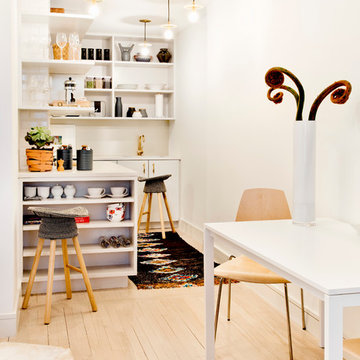
This 400 s.f. studio apartment in NYC’s Greenwich Village serves as a pied-a-terre
for clients whose primary residence is on the West Coast.
Although the clients do not reside here full-time, this tiny space accommodates
all the creature comforts of home.
Bleached hardwood floors, crisp white walls, and high ceilings are the backdrop to
a custom blackened steel and glass partition, layered with raw silk sheer draperies,
to create a private sleeping area, replete with custom built-in closets.
Simple headboard and crisp linens are balanced with a lightly-metallic glazed
duvet and a vintage textile pillow.
The living space boasts a custom Belgian linen sectional sofa that pulls out into a
full-size bed for the couple’s young children who sometimes accompany them.
Efficient and inexpensive dining furniture sits comfortably in the main living space
and lends clean, Scandinavian functionality for sharing meals. The sculptural
handrafted metal ceiling mobile offsets the architecture’s clean lines, defining the
space while accentuating the tall ceilings.
The kitchenette combines custom cool grey lacquered cabinets with brass fittings,
white beveled subway tile, and a warm brushed brass backsplash; an antique
Boucherouite runner and textural woven stools that pull up to the kitchen’s
coffee counter puntuate the clean palette with warmth and the human scale.
The under-counter freezer and refrigerator, along with the 18” dishwasher, are all
panelled to match the cabinets, and open shelving to the ceiling maximizes the
feeling of the space’s volume.
The entry closet doubles as home for a combination washer/dryer unit.
The custom bathroom vanity, with open brass legs sitting against floor-to-ceiling
marble subway tile, boasts a honed gray marble countertop, with an undermount
sink offset to maximize precious counter space and highlight a pendant light. A
tall narrow cabinet combines closed and open storage, and a recessed mirrored
medicine cabinet conceals additional necessaries.
The stand-up shower is kept minimal, with simple white beveled subway tile and
frameless glass doors, and is large enough to host a teak and stainless bench for
comfort; black sink and bath fittings ground the otherwise light palette.
What had been a generic studio apartment became a rich landscape for living.
 Kyle Hunt & Partners, Incorporated
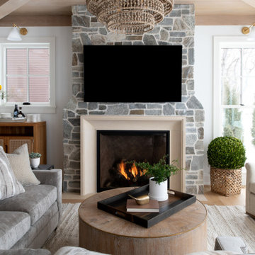
Classic lake charm is felt from the moment you arrive. This cedar shingle coastal home has a relaxed breezy feel that is enjoyed year-round with a busy family schedule and a love for entertaining. The main level includes an open kitchen layout, shiplap paneling at the entry and staircase, and a sunroom with a beautiful wood ceiling and beam detail that connects to a screen porch with a built-in grilling area for serving up casual summer meals. Wire-brushed white oak flooring flows throughout most of the home.
 TVL Creative Ltd.
Our clients had just recently closed on their new house in Stapleton and were excited to transform it into their perfect forever home. They wanted to remodel the entire first floor to create a more open floor plan and develop a smoother flow through the house that better fit the needs of their family. The original layout consisted of several small rooms that just weren’t very functional, so we decided to remove the walls that were breaking up the space and restructure the first floor to create a wonderfully open feel.
After removing the existing walls, we rearranged their spaces to give them an office at the front of the house, a large living room, and a large dining room that connects seamlessly with the kitchen. We also wanted to center the foyer in the home and allow more light to travel through the first floor, so we replaced their existing doors with beautiful custom sliding doors to the back yard and a gorgeous walnut door with side lights to greet guests at the front of their home.
Living Room
Our clients wanted a living room that could accommodate an inviting sectional, a baby grand piano, and plenty of space for family game nights. So, we transformed what had been a small office and sitting room into a large open living room with custom wood columns. We wanted to avoid making the home feel too vast and monumental, so we designed custom beams and columns to define spaces and to make the house feel like a home. Aesthetically we wanted their home to be soft and inviting, so we utilized a neutral color palette with occasional accents of muted blues and greens.
Dining Room
Our clients were also looking for a large dining room that was open to the rest of the home and perfect for big family gatherings. So, we removed what had been a small family room and eat-in dining area to create a spacious dining room with a fireplace and bar. We added custom cabinetry to the bar area with open shelving for displaying and designed a custom surround for their fireplace that ties in with the wood work we designed for their living room. We brought in the tones and materiality from the kitchen to unite the spaces and added a mixed metal light fixture to bring the space together
Kitchen
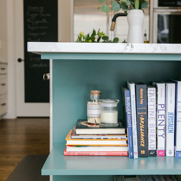
We wanted the kitchen to be a real show stopper and carry through the calm muted tones we were utilizing throughout their home. We reoriented the kitchen to allow for a big beautiful custom island and to give us the opportunity for a focal wall with cooktop and range hood. Their custom island was perfectly complimented with a dramatic quartz counter top and oversized pendants making it the real center of their home. Since they enter the kitchen first when coming from their detached garage, we included a small mud-room area right by the back door to catch everyone’s coats and shoes as they come in. We also created a new walk-in pantry with plenty of open storage and a fun chalkboard door for writing notes, recipes, and grocery lists.
Office
We transformed the original dining room into a handsome office at the front of the house. We designed custom walnut built-ins to house all of their books, and added glass french doors to give them a bit of privacy without making the space too closed off. We painted the room a deep muted blue to create a glimpse of rich color through the french doors
Powder Room
The powder room is a wonderful play on textures. We used a neutral palette with contrasting tones to create dramatic moments in this little space with accents of brushed gold.
Master Bathroom
The existing master bathroom had an awkward layout and outdated finishes, so we redesigned the space to create a clean layout with a dream worthy shower. We continued to use neutral tones that tie in with the rest of the home, but had fun playing with tile textures and patterns to create an eye-catching vanity. The wood-look tile planks along the floor provide a soft backdrop for their new free-standing bathtub and contrast beautifully with the deep ash finish on the cabinetry.
Find the right local pro for your project
 Lisa Garcia Architecture + Interior Design
Lisa Garcia Architecture + Interior Design
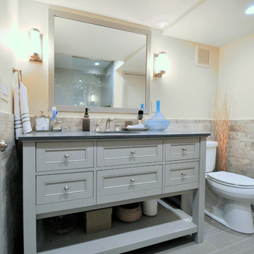
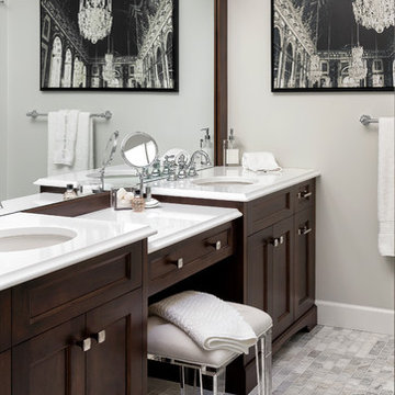
Inspiration for a small transitional master gray tile and stone tile porcelain tile bathroom remodel in DC Metro with an undermount sink, beaded inset cabinets, gray cabinets, granite countertops, a two-piece toilet and beige walls
Inspiration for a small transitional master gray tile and stone tile porcelain tile bathroom remodel in DC Metro with an undermount sink, beaded inset cabinets, gray cabinets, granite countertops, a two-piece toilet and beige walls
 ZeroEnergy Design
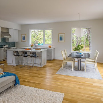
This modern green home offers both a vacation destination on Cape Cod near local family members and an opportunity for rental income.
FAMILY ROOTS. A West Coast couple living in the San Francisco Bay Area sought a permanent East Coast vacation home near family members living on Cape Cod. As academic professionals focused on sustainability, they sought a green, energy efficient home that was well-aligned with their values. With no green homes available for sale on Cape Cod, they decided to purchase land near their family and build their own.
SLOPED SITE. Comprised of a 3/4 acre lot nestled in the pines, the steeply sloping terrain called for a plan that embraced and took advantage of the slope. Of equal priority was optimizing solar exposure, preserving privacy from abutters, and creating outdoor living space. The design accomplished these goals with a simple, rectilinear form, offering living space on the both entry and lower/basement levels. The stepped foundation allows for a walk-out basement level with light-filled living space on the down-hill side of the home. The traditional basement on the eastern, up-hill side houses mechanical equipment and a home gym. The house welcomes natural light throughout, captures views of the forest, and delivers entertainment space that connects indoor living space to outdoor deck and dining patio.
MODERN VISION. The clean building form and uncomplicated finishes pay homage to the modern architectural legacy on the outer Cape. Durable and economical fiber cement panels, fixed with aluminum channels, clad the primary form. Cedar clapboards provide a visual accent at the south-facing living room, which extends a single roof plane to cover the entry porch.
SMART USE OF SPACE. On the entry level, the “L”-shaped living, dining, and kitchen space connects to the exterior living, dining, and grilling spaces to effectively double the home’s summertime entertainment area. Placed at the western end of the entry level (where it can retain privacy but still claim expansive downhill views) is the master suite with a built-in study. The lower level has two guest bedrooms, a second full bathroom, and laundry. The flexibility of the space—crucial in a house with a modest footprint—emerges in one of the guest bedrooms, which doubles as home office by opening the barn-style double doors to connect it to the bright, airy open stair leading up to the entry level. Thoughtful design, generous ceiling heights and large windows transform the modest 1,100 sf* footprint into a well-lit, spacious home. *(total finished space is 1800 sf)
RENTAL INCOME. The property works for its owners by netting rental income when the owners are home in San Francisco. The house especially caters to vacationers bound for nearby Mayo Beach and includes an outdoor shower adjacent to the lower level entry door. In contrast to the bare bones cottages that are typically available on the Cape, this home offers prospective tenants a modern aesthetic, paired with luxurious and green features. Durable finishes inside and out will ensure longevity with the heavier use that comes with a rental property.
COMFORT YEAR-ROUND. The home is super-insulated and air-tight, with mechanical ventilation to provide continuous fresh air from the outside. High performance triple-paned windows complement the building enclosure and maximize passive solar gain while ensuring a warm, draft-free winter, even when sitting close to the glass. A properly sized air source heat pump offers efficient heating & cooling, and includes a carefully designed the duct distribution system to provide even comfort throughout the house. The super-insulated envelope allows us to significantly reduce the equipment capacity, duct size, and airflow quantities, while maintaining unparalleled thermal comfort.
ENERGY EFFICIENT. The building’s shell and mechanical systems play instrumental roles in the home’s exceptional performance. The building enclosure reduces the most significant energy glutton: heating. Continuous super-insulation, thorough air sealing, triple-pane windows, and passive solar gain work together to yield a miniscule heating load. All active energy consumers are extremely efficient: an air source heat pump for heating and cooling, a heat pump hot water heater, LED lighting, energy recovery ventilation (ERV), and high efficiency appliances. The result is a home that uses 70% less energy than a similar new home built to code requirements.
OVERALL. The home embodies the owners’ goals and values while comprehensively enabling thermal comfort, energy efficiency, a vacation respite, and supplementary income.
PROJECT TEAM
ZeroEnergy Design - Architect & Mechanical Designer
A.F. Hultin & Co. - Contractor
Pamet Valley Landscape Design - Landscape & Masonry
Lisa Finch - Original Artwork
European Architectural Supply - Windows
Eric Roth Photography - Photography
 We Got Lites
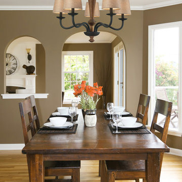
Six Light Burnt Bronze Up Chandelier
Example of a mid-sized mountain style light wood floor enclosed dining room design in New York with brown walls and no fireplace
Example of a mid-sized mountain style light wood floor enclosed dining room design in New York with brown walls and no fireplace

Sponsored
Columbus, OH
Free consultation for landscape design!

Peabody Landscape Group
Franklin County's Reliable Landscape Design & Contracting
 TVL Creative Ltd.
Our clients had just recently closed on their new house in Stapleton and were excited to transform it into their perfect forever home. They wanted to remodel the entire first floor to create a more open floor plan and develop a smoother flow through the house that better fit the needs of their family. The original layout consisted of several small rooms that just weren’t very functional, so we decided to remove the walls that were breaking up the space and restructure the first floor to create a wonderfully open feel.
After removing the existing walls, we rearranged their spaces to give them an office at the front of the house, a large living room, and a large dining room that connects seamlessly with the kitchen. We also wanted to center the foyer in the home and allow more light to travel through the first floor, so we replaced their existing doors with beautiful custom sliding doors to the back yard and a gorgeous walnut door with side lights to greet guests at the front of their home.
Living Room
Our clients wanted a living room that could accommodate an inviting sectional, a baby grand piano, and plenty of space for family game nights. So, we transformed what had been a small office and sitting room into a large open living room with custom wood columns. We wanted to avoid making the home feel too vast and monumental, so we designed custom beams and columns to define spaces and to make the house feel like a home. Aesthetically we wanted their home to be soft and inviting, so we utilized a neutral color palette with occasional accents of muted blues and greens.
Dining Room
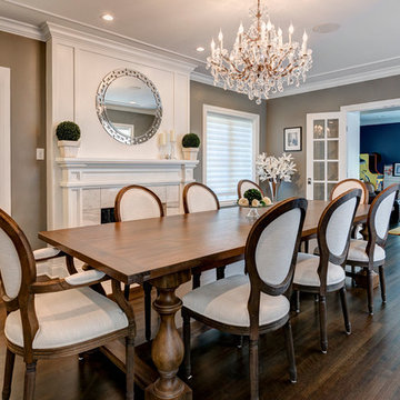
Our clients were also looking for a large dining room that was open to the rest of the home and perfect for big family gatherings. So, we removed what had been a small family room and eat-in dining area to create a spacious dining room with a fireplace and bar. We added custom cabinetry to the bar area with open shelving for displaying and designed a custom surround for their fireplace that ties in with the wood work we designed for their living room. We brought in the tones and materiality from the kitchen to unite the spaces and added a mixed metal light fixture to bring the space together
Kitchen
We wanted the kitchen to be a real show stopper and carry through the calm muted tones we were utilizing throughout their home. We reoriented the kitchen to allow for a big beautiful custom island and to give us the opportunity for a focal wall with cooktop and range hood. Their custom island was perfectly complimented with a dramatic quartz counter top and oversized pendants making it the real center of their home. Since they enter the kitchen first when coming from their detached garage, we included a small mud-room area right by the back door to catch everyone’s coats and shoes as they come in. We also created a new walk-in pantry with plenty of open storage and a fun chalkboard door for writing notes, recipes, and grocery lists.
Office
We transformed the original dining room into a handsome office at the front of the house. We designed custom walnut built-ins to house all of their books, and added glass french doors to give them a bit of privacy without making the space too closed off. We painted the room a deep muted blue to create a glimpse of rich color through the french doors
Powder Room
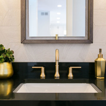
The powder room is a wonderful play on textures. We used a neutral palette with contrasting tones to create dramatic moments in this little space with accents of brushed gold.
Master Bathroom
The existing master bathroom had an awkward layout and outdated finishes, so we redesigned the space to create a clean layout with a dream worthy shower. We continued to use neutral tones that tie in with the rest of the home, but had fun playing with tile textures and patterns to create an eye-catching vanity. The wood-look tile planks along the floor provide a soft backdrop for their new free-standing bathtub and contrast beautifully with the deep ash finish on the cabinetry.
 Chelsea Design + Construction
Chelsea Construction Corp.
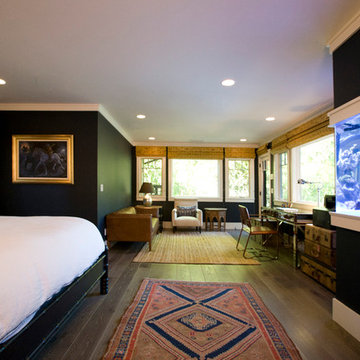
Example of a large trendy master light wood floor bedroom design in Los Angeles with blue walls
Example of a large trendy master light wood floor bedroom design in Los Angeles with blue walls
 NILES
NILESThis 1,000ft² recording and production studio, built in 2021 for producer couple Latifah Alattas and Lucas Morton, was designed as a fully custom creative environment that supports writing, mixing, and collaboration at the highest level. Both Latifah and Lucas are multi-instrumentalists, engineers, and mixers, and the studio reflects the full range of their workflows—visually inspiring, technically precise, and intuitive in every room.
The facility was built from the ground up with a strong emphasis on architectural acoustics and plug-and-play connectivity. The layout includes two Control Rooms, multiple isolation booths, and shared common spaces, all tied together with seamless audio integration. No matter where you are in the studio, routing, monitoring, and communication remain effortless and consistent.
Behind the aesthetic, the acoustic design is exceptionally robust. Six independent floating-floor systems support the suites, ensuring each room operates with minimal sound transmission. Tailored sound-reducing wall assemblies, full-lite doors, engineered window systems, and intentional treatment plans deliver clarity, isolation, and precision for tracking and mixing. Each space is mechanically decoupled, allowing multiple rooms to run simultaneously without compromise.
For monitoring, both Latifah and Lucas chose Genelec “The Ones” series monitors with GLM calibration to ensure accurate translation and consistency across the entire facility.
Natural light and a warm, welcoming aesthetic anchor the visual identity of the studio, reflecting the creative energy and personality of its owners. The result is a highly functional, beautifully crafted space where ideas can move freely and production can happen without limitations.
 TVL Creative Ltd.
Our clients had just recently closed on their new house in Stapleton and were excited to transform it into their perfect forever home. They wanted to remodel the entire first floor to create a more open floor plan and develop a smoother flow through the house that better fit the needs of their family. The original layout consisted of several small rooms that just weren’t very functional, so we decided to remove the walls that were breaking up the space and restructure the first floor to create a wonderfully open feel.
After removing the existing walls, we rearranged their spaces to give them an office at the front of the house, a large living room, and a large dining room that connects seamlessly with the kitchen. We also wanted to center the foyer in the home and allow more light to travel through the first floor, so we replaced their existing doors with beautiful custom sliding doors to the back yard and a gorgeous walnut door with side lights to greet guests at the front of their home.
Living Room
Our clients wanted a living room that could accommodate an inviting sectional, a baby grand piano, and plenty of space for family game nights. So, we transformed what had been a small office and sitting room into a large open living room with custom wood columns. We wanted to avoid making the home feel too vast and monumental, so we designed custom beams and columns to define spaces and to make the house feel like a home. Aesthetically we wanted their home to be soft and inviting, so we utilized a neutral color palette with occasional accents of muted blues and greens.
Dining Room
Our clients were also looking for a large dining room that was open to the rest of the home and perfect for big family gatherings. So, we removed what had been a small family room and eat-in dining area to create a spacious dining room with a fireplace and bar. We added custom cabinetry to the bar area with open shelving for displaying and designed a custom surround for their fireplace that ties in with the wood work we designed for their living room. We brought in the tones and materiality from the kitchen to unite the spaces and added a mixed metal light fixture to bring the space together
Kitchen
We wanted the kitchen to be a real show stopper and carry through the calm muted tones we were utilizing throughout their home. We reoriented the kitchen to allow for a big beautiful custom island and to give us the opportunity for a focal wall with cooktop and range hood. Their custom island was perfectly complimented with a dramatic quartz counter top and oversized pendants making it the real center of their home. Since they enter the kitchen first when coming from their detached garage, we included a small mud-room area right by the back door to catch everyone’s coats and shoes as they come in. We also created a new walk-in pantry with plenty of open storage and a fun chalkboard door for writing notes, recipes, and grocery lists.
Office
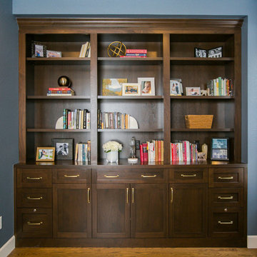
We transformed the original dining room into a handsome office at the front of the house. We designed custom walnut built-ins to house all of their books, and added glass french doors to give them a bit of privacy without making the space too closed off. We painted the room a deep muted blue to create a glimpse of rich color through the french doors
Powder Room
The powder room is a wonderful play on textures. We used a neutral palette with contrasting tones to create dramatic moments in this little space with accents of brushed gold.
Master Bathroom
The existing master bathroom had an awkward layout and outdated finishes, so we redesigned the space to create a clean layout with a dream worthy shower. We continued to use neutral tones that tie in with the rest of the home, but had fun playing with tile textures and patterns to create an eye-catching vanity. The wood-look tile planks along the floor provide a soft backdrop for their new free-standing bathtub and contrast beautifully with the deep ash finish on the cabinetry.
 Eco Design & Builders Inc.
Custom made kitchen cabinets with a color that we created after many tests and the results...wow. I love simplicity, even when I write to you what you see, so lets do this:
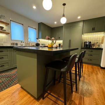
The custom cabinets are 3/4'' plywood frame and the doors and the face of the drawers are maple as well. Remember, when you hear Maple kitchen cabinets, that is what it means.
NOT all of it Maple, there is but very uncommon. Unless you can afford it and really want it so why not, right?
Self close, smart stops, pantry. Regarding any pantry, custom cabinets or semi custom, they both have pull out shelves but up to 5' high. City Code.
The city worry that nothing will full on you or little children.
The counter is Hond, no sheen Quartz with straight edge.
The floor is the original Oak. It always amaze me that they used to build houses with solid Oak floor. WOW!! The backsplash is Porcelain with wavy look.
The floating shelves are heavy duty, meaning, the wood is solid and we need to create a custom metal to drill it to the shelve and installing it to the studs. This is if you want to put heavy stuff like plats, glasses etc.
Island with a sitting area so we extended the counter out by 16''. If you want to extend more, brackets will ne needed for supporting the countertop.
That is it basically.
I hope I made it clear. I know it's not easy to do/plan a project with many challenges and the main one is to who are you going to give your savings, your money to do the remodeling, to create your dream. I know. Just follow your heart, take 3 bids, no need more, you will just get more confused.
Much blessing to you.
Ori
 Cantoni Irvine
Brad Haines knows a thing or two about building things. The intensely creative and innovative founder of Oklahoma City-based Haines Capital is the driving force behind numerous successful companies including Bank 7 (NASDAQ BSVN), which proudly reported record year-end earnings since going public in September of last year. He has beautifully built, renovated, and personally thumb printed all of his commercial spaces and residences. “Our theory is to keep things sophisticated but comfortable,” Brad says.
That’s the exact approach he took in his personal haven in Nichols Hills, Oklahoma. Painstakingly renovated over the span of two years by Candeleria Foster Design-Build of Oklahoma City, his home boasts museum-white, authentic Venetian plaster walls and ceilings; charcoal tiled flooring; imported marble in the master bath; and a pretty kitchen you’ll want to emulate.
Reminiscent of an edgy luxury hotel, it is a vibe conjured by Cantoni designer Nicole George. “The new remodel plan was all about opening up the space and layering monochromatic color with lots of texture,” says Nicole, who collaborated with Brad on two previous projects. “The color palette is minimal, with charcoal, bone, amber, stone, linen and leather.”
“Sophisticated“Sophisticated“Sophisticated“Sophisticated“Sophisticated
Nicole helped oversee space planning and selection of interior finishes, lighting, furnishings and fine art for the entire 7,000-square-foot home. It is now decked top-to-bottom in pieces sourced from Cantoni, beginning with the custom-ordered console at entry and a pair of Glacier Suspension fixtures over the stairwell. “Every angle in the house is the result of a critical thought process,” Nicole says. “We wanted to make sure each room would be purposeful.”
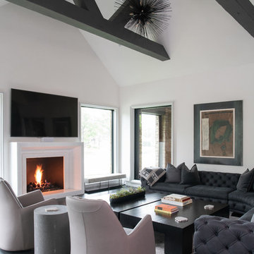
To that end, “we reintroduced the ‘parlor,’ and also redefined the formal dining area as a bar and drink lounge with enough space for 10 guests to comfortably dine,” Nicole says. Brad’s parlor holds the Swing sectional customized in a silky, soft-hand charcoal leather crafted by prominent Italian leather furnishings company Gamma. Nicole paired it with the Kate swivel chair customized in a light grey leather, the sleek DK writing desk, and the Black & More bar cabinet by Malerba. “Nicole has a special design talent and adapts quickly to what we expect and like,” Brad says.
To create the restaurant-worthy dining space, Nicole brought in a black-satin glass and marble-topped dining table and mohair-velvet chairs, all by Italian maker Gallotti & Radice. Guests can take a post-dinner respite on the adjoining room’s Aston sectional by Gamma.
In the formal living room, Nicole paired Cantoni’s Fashion Affair club chairs with the Black & More cocktail table, and sofas sourced from Désirée, an Italian furniture upholstery company that creates cutting-edge yet comfortable pieces. The color-coordinating kitchen and breakfast area, meanwhile, hold a set of Guapa counter stools in ash grey leather, and the Ray dining table with light-grey leather Cattelan Italia chairs. The expansive loggia also is ideal for entertaining and lounging with the Versa grand sectional, the Ido cocktail table in grey aged walnut and Dolly chairs customized in black nubuck leather. Nicole made most of the design decisions, but, “she took my suggestions seriously and then put me in my place,” Brad says.
She had the master bedroom’s Marlon bed by Gamma customized in a remarkably soft black leather with a matching stitch and paired it with onyx gloss Black & More nightstands. “The furnishings absolutely complement the style,” Brad says. “They are high-quality and have a modern flair, but at the end of the day, are still comfortable and user-friendly.”
The end result is a home Brad not only enjoys, but one that Nicole also finds exceptional. “I honestly love every part of this house,” Nicole says. “Working with Brad is always an adventure but a privilege that I take very seriously, from the beginning of the design process to installation.”
Sponsored
Columbus, OH

Hope Restoration & General Contracting
Columbus Design-Build, Kitchen & Bath Remodeling, Historic Renovations
 Kim Teron Design Studio
This project was an extravagant space planning opportunity: A merger of three suites on the 12th floor of one of Ottawa’s newest skyline additions - Cathedral Hill. There is nothing more satisfying than being able to design a custom luxury home from the ground up, and with the ample square footage we had to play with, this project was an absolute dream.
We took full of advantage of the endless protected vistas of the Ottawa River and Gatineau Hills beyond by using minimalist design to let the views sing. For a luxurious, yet understated touch, we sourced superior materials like Corian, white oak engineered hardwood and Italian-imported porcelain.
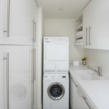
In keeping with worry-free condo living, we included features like integrated drape pockets, and utilities like laundry and pantry situated near the kitchen for easy, hidden accessibility. In the 2,400 + square foot space, we created 2 bedrooms; completely autonomous from each other and divided by common living space that is open, airy, yet easy to delineate into entertaining and lounge-ready spaces. Scroll down to see the final product!
 Up The Wall
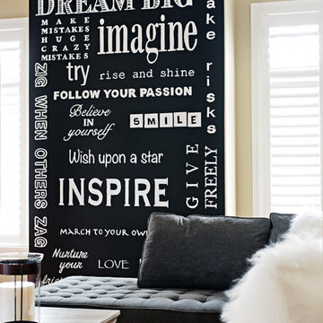
This is a word wall, custom painted for a client with all her favourite inspirational quotes. The wall was painted black first, then the white letters. Photography by Mike Chajecki
 Kim Teron Design Studio
Our clients were an energetic and outgoing couple that loved life, laughter and their family including two well-loved Dachshund dogs.
Their home on a lushly treed cul de sac in Manor Park boasts plenty of character, with pockets of rooms devoted to their artistic and musical passions.
As a trained chef, the husband proudly and naturally commanded the lions share of the kitchen, leaving little room for his wife’s love of baking and crafting. Fine food, good wine and a myriad of guitars are at the root of their impromptu and casual
gatherings.
The original design request was to update the kitchen in functionality and
appearance. With one look at the adjacent space which was not visible to the kitchen but commanded a stunning view with south facing windows - and this project morphed into combining two separate spaces into one.
We opened up the kitchen to incorporate the sunroom and create one large open
concept sun-filled happy space with direct access to the rear yard and seating areas. The kitchen was designed to act as one space with clearly delineated zones, where each person could cook autonomously while being together. Additionally, we maintained a soft seating lounge area and a desk for crafting in natural light.
At the heart of the kitchen is a 6’ x 8’ solid black cherry island which serves as the
social hub for gatherings. We used different materials and textures in each zone to clearly represent the two uniquely individual and dynamic personalities of this
couple. A black and white glass mosaic tile backsplash speaks to the glass fused
hobby that is created in the same space while creating a dramatic statement of a
playful artistic expression.
The custom designed wine niches introduce abstract rectilinear forms. The use of
rich materials, two-toned cabinets, custom floating black cherry shelving and a
classic colour palette of black and white act as a backdrop or canvas, which intentionally allows room for each personal expression to shine.
We doubled the storage capacity within the kitchen which is still discreet and still allows for an abundance of glass front interior lit cabinets to showcase their treasured collections.
 Maibach's Home Furnishings
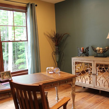
A beautiful leg desk by Hooker Furniture is a nice way to make a statement that gives an office a touch of elegance. Adding a mirrored piece in any room is a great way brighting up an area because its reflective. The two door mirrored console adds pattern and multiple materials to the room which is great because the more you can add the better.

Sponsored
Sunbury, OH

J.Holderby - Renovations
Franklin County's Leading General Contractors - 2X Best of Houzz!
 Naaya Studio
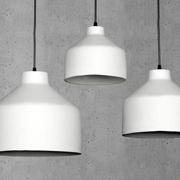
Introducing one of the most requested shapes, inspired by milk canisters this design is picking up quite a bit of trend off lately. and hence our design for those who are looking for classic good old looks and a barn feeling. An edgy form available in three sizes that allows you to suit all the requirement whether you are looking to buy for bedside, above dining or kitchen island.
3 variation of sizes available as per below dimensions:
1. 8.5" dia x 7" height
2. 10.5" dia x 8.75" height
3. 12.5" dia x 10.5" height
Buy assorted of more than 1 and save big!
PRODUCT INFO
- A small Naaya logo (approx 3/4") is embossed in 1 place on the inside surface of lamp.
- All the shades are available in Plug in as well as hard wired version.
- 10 feet (3 meter) of wire comes as standard with plug in versions. country specific converter is supplied with Indian pin
- 6 feet (2 meter) wire is supplied with all the hard wired version
- All Light electrical Fixtures are in compliance with US, European, UK, Australian, Canadian and International Standard.
- Each lamp comes with individual canopy. Individual canopy are available black or white color (please specify). By default Black canopy will be sent.
- Lamp comes with E27 holder (bulbs not supplied)
- 3 port black / white canopy is available on request.
- Wire/cord length and color (black/white) can be changed on request, please write to us. Black cord will be sent by default
 Suzanne Martin Design
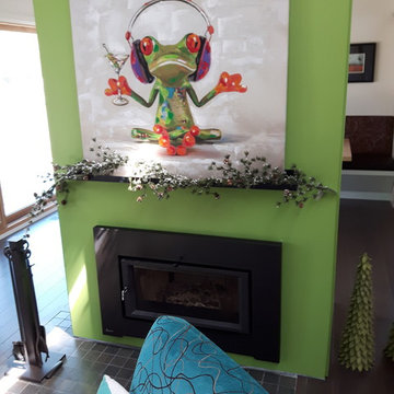
Midcentury rejuvenation, Removed several walls to open up this ground floor to immerse into the Beaverwood landscape. Keeping to the original 1960 design, we used vibrant colours and natural materials. Custom-designed cabinetry, illuminated ceiling canopies, a ceiling mount hood fan and so much more!
Photographed by: Tezz Photography
 down2earth Interior Design, LLC.
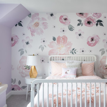
Who wouldn’t want a giant floral mural as the focus wall of their daughter’s bedroom? This mom (and daughter) certainly embraced the feminine here, with this colorful mural behind the bed. We paired the mural with Sherwin Williams color ‘Inspired Lilac’, because lavender is the young occupant’s favorite.
On the Jenny Lind bed, we used fresh cut floral bedding.
Round white night tables are a perfect place to put down that bedtime reading when young eyes get heavy. The gold reading lamps were an opportunity for a little bling. A window bench is the perfect place for a young reader to cuddle up. The bench material is just a little bit sparkly. It’s made of a polyurethane and has “ink resistant technology”, so it’s a forgiving upholstery selection for a spot where a young girl might be writing.
81