
Search results for "Year end streaming" in Home Design Ideas
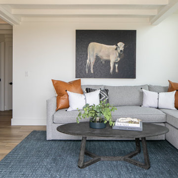
 Hunt and Gather Design Company
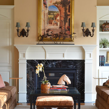
This stunning project was a 5k complete remodel, design, and full furnish. In addition we also did an additional 1k square foot guest suite build out. The project beginning to end took about 1 year. This was a full-service design client we worked with remotely and with site visits.

 KITCHEN DESIGN PLUS
A new home for a lovely family. They saw the potential in every room, but needed some help with a strange and outdated kitchen. We tore down a wall, shuffled appliances and made a space that will shine for years to come.
Cabinetry by Glenwood Kitchens Ltd
Countertops by Jade Stone Halifax
and Ultimate Countertop Solutions
Before Pictures at the end
 J. KURTZ Architects
A multi-year labor of love, the Maine Addition thoughtfully expands a historic 19th-century vacation home in picturesque Round Pond, Maine. Designed to honor the original structure's classic coastal heritage while introducing elevated modern living, this custom addition seamlessly blends timeless New England craftsmanship with sophisticated, high-end updates.
Find the right local pro for your project

 Skill Construction & Design, LLC
There are so many design elements to this kitchen, I almost don’t know where to start. Bright and airy with crisp clean white cabinets, the kitchen is open and welcoming. Still crisp but gently contrasting, the stainless steel appliance add depth amid the white. To keep this kitchen warm, natural oak covers the floors and a toasted wheat color washes the walls. And then there is the architectural elements. You know. That post and beam in the middle of the room. It’s the center of attention.
When you walk into a room your eyes roam around, establishing the size and shape of the room as your feet take you forward. From the front door of this home straight ahead you encountered this wall. The dining area to the right gives you a glimpse of things to come. Where there is a dining room you will usually find a kitchen.
The architecture of years gone by consistently hides the kitchen, the heart of the home, behind walls. I sympathize with my Mom, and all the other Moms, who have had to spend so much time tucked into a tight kitchen, away from the family. This wall had to go, but it was structural. We needed its support but not its bulk.
So we got rid of the bulk and only the bulk. Instead of a wall we have a post and beam, offering all of the structure we need. We could have installed a huge steel beam and reconfigure the joists to upset the beam, but why? The small beam and post add an incredible architectural element. It’s turning lemons into lemon, we simply made the most of what we had. It may be functional but it’s so fantastic. It looks like we created the effect just for the drama.
The original kitchen may have had a working triangle and some counter space, but it was fairly small, with each area only a step or two away. The dark cabinets made the space feel even smaller and the butcher block patterned laminate counter tops were very dated. The appliances were feeling their age as well, from a coil burner electric stove to a top freezer refrigerator. To keep this kitchen within its space, a half wall separated it from the dining area.
With the wall gone we borrowed some space from the living room and extended what was a U shaped kitchen into an L. At the living room window we start our new kitchen. We kept a small part of the wall to support the other end of our decorative beam. Sandwiched between a large pantry and our new French door refrigerator, the wall disappears. With our new open floor plan a sizable island was in order.
We split our cooking areas and installed a continuous grill gas cooktop into the island. A sleek island hood takes care of exhaust and adds an extra element to our architectural feature. Under the cooktop we added over-sized drawers for pots and pan storage. The frameless cabinets from New River Cabinetry are maple, painted white, with the Herndon door style. With the cooktop safely nestled into our island, we still had to add an oven.
We used the space where the old range sat for a large single oven of stainless steel and glass. If it worked for one, why not two? We created a home for a microwave in the wall cabinets. It’s perfect for heating leftovers so close to the refrigerator.
An important consideration for hot spots in your kitchen is landing zones. Each of our cooking areas have generous landing zones, one on each side of the cooktop and an entire counter area above or below the ovens, depending on which one you’re using.
We wanted to give the sink area more room so the half wall had to come out. We moved the trash and recycle cans into a cabinet, removed the heavy soffits and kept the sink under the window.
With that little bit of extra space we were able to add a larger cabinet above the dishwasher and slide it all down. This used to be where the carpeting met the vinyl floor, but all of it is gone. Long oak planks eliminate that final divide between the kitchen and the dining area, while adding visual length to the area. White wall cabinets on each side of the window reflect the sunlight for a brighter view.
With all of the darker cabinetry the backsplash walls had been painted white. Even still, there was a darkness in the corners and it wasn’t very exciting. We wanted to add visual interest and reflect the new under-cabinet lighting, eliminating the shadows in this corner.
With 1″x 2″ Arabescato Honed marble mosaics and those under-cabinet lights, we achieved the perfect balance. The marble has subtle swirls in gray and beige on a clean white background, but with the honed finish the light is softly reflected instead of glaring. For granite, we chose the soft gray tones of Luna Pearl. The speckles of gray and beige are a gentle contrast to the white cabinets and emulate the color of the stainless steel.
Between the carpet, red half wall, dark railing and dated light fixture, the dining area felt tired. Since the kitchen lacked sufficient storage, a large utility cabinet crowded the table space without adding any decorate elements.
Although it didn’t get any bigger, our dining area feels fresher and more open too. With the oak flooring joining the area to the rest of our space and the toasted wheat on the walls, the white table and chairs compliment the cabinetry while contrasting the warmer colors. We replaced the chandelier with recessed lighting and changed that railing too.
With our new open floor plan, we ended up with a fairly open area in between our foyer closet and the living room window. Not one to miss an opportunity, we filled the space with a multi-functional work space.
With the sunlight streaming in this bright corner works for anything this family needs.
There’s plenty of space for a chair under this large desk drawer. A closed cabinet below, glass doors above and lots of open shelving let you store and or showcase your belongings. We added a lite area at the top to keep away the darker corners.
The transformation is complete. This kitchen and all of its features are truly the center of attention in this home.
http://www.designsbyskill.com/
http://www.rjkconstructioninc.com/
 Skill Construction & Design, LLC
There are so many design elements to this kitchen, I almost don’t know where to start. Bright and airy with crisp clean white cabinets, the kitchen is open and welcoming. Still crisp but gently contrasting, the stainless steel appliance add depth amid the white. To keep this kitchen warm, natural oak covers the floors and a toasted wheat color washes the walls. And then there is the architectural elements. You know. That post and beam in the middle of the room. It’s the center of attention.
When you walk into a room your eyes roam around, establishing the size and shape of the room as your feet take you forward. From the front door of this home straight ahead you encountered this wall. The dining area to the right gives you a glimpse of things to come. Where there is a dining room you will usually find a kitchen.
The architecture of years gone by consistently hides the kitchen, the heart of the home, behind walls. I sympathize with my Mom, and all the other Moms, who have had to spend so much time tucked into a tight kitchen, away from the family. This wall had to go, but it was structural. We needed its support but not its bulk.
So we got rid of the bulk and only the bulk. Instead of a wall we have a post and beam, offering all of the structure we need. We could have installed a huge steel beam and reconfigure the joists to upset the beam, but why? The small beam and post add an incredible architectural element. It’s turning lemons into lemon, we simply made the most of what we had. It may be functional but it’s so fantastic. It looks like we created the effect just for the drama.
The original kitchen may have had a working triangle and some counter space, but it was fairly small, with each area only a step or two away. The dark cabinets made the space feel even smaller and the butcher block patterned laminate counter tops were very dated. The appliances were feeling their age as well, from a coil burner electric stove to a top freezer refrigerator. To keep this kitchen within its space, a half wall separated it from the dining area.
With the wall gone we borrowed some space from the living room and extended what was a U shaped kitchen into an L. At the living room window we start our new kitchen. We kept a small part of the wall to support the other end of our decorative beam. Sandwiched between a large pantry and our new French door refrigerator, the wall disappears. With our new open floor plan a sizable island was in order.
We split our cooking areas and installed a continuous grill gas cooktop into the island. A sleek island hood takes care of exhaust and adds an extra element to our architectural feature. Under the cooktop we added over-sized drawers for pots and pan storage. The frameless cabinets from New River Cabinetry are maple, painted white, with the Herndon door style. With the cooktop safely nestled into our island, we still had to add an oven.
We used the space where the old range sat for a large single oven of stainless steel and glass. If it worked for one, why not two? We created a home for a microwave in the wall cabinets. It’s perfect for heating leftovers so close to the refrigerator.
An important consideration for hot spots in your kitchen is landing zones. Each of our cooking areas have generous landing zones, one on each side of the cooktop and an entire counter area above or below the ovens, depending on which one you’re using.
We wanted to give the sink area more room so the half wall had to come out. We moved the trash and recycle cans into a cabinet, removed the heavy soffits and kept the sink under the window.
With that little bit of extra space we were able to add a larger cabinet above the dishwasher and slide it all down. This used to be where the carpeting met the vinyl floor, but all of it is gone. Long oak planks eliminate that final divide between the kitchen and the dining area, while adding visual length to the area. White wall cabinets on each side of the window reflect the sunlight for a brighter view.
With all of the darker cabinetry the backsplash walls had been painted white. Even still, there was a darkness in the corners and it wasn’t very exciting. We wanted to add visual interest and reflect the new under-cabinet lighting, eliminating the shadows in this corner.
With 1″x 2″ Arabescato Honed marble mosaics and those under-cabinet lights, we achieved the perfect balance. The marble has subtle swirls in gray and beige on a clean white background, but with the honed finish the light is softly reflected instead of glaring. For granite, we chose the soft gray tones of Luna Pearl. The speckles of gray and beige are a gentle contrast to the white cabinets and emulate the color of the stainless steel.
Between the carpet, red half wall, dark railing and dated light fixture, the dining area felt tired. Since the kitchen lacked sufficient storage, a large utility cabinet crowded the table space without adding any decorate elements.
Although it didn’t get any bigger, our dining area feels fresher and more open too. With the oak flooring joining the area to the rest of our space and the toasted wheat on the walls, the white table and chairs compliment the cabinetry while contrasting the warmer colors. We replaced the chandelier with recessed lighting and changed that railing too.
With our new open floor plan, we ended up with a fairly open area in between our foyer closet and the living room window. Not one to miss an opportunity, we filled the space with a multi-functional work space.
With the sunlight streaming in this bright corner works for anything this family needs.
There’s plenty of space for a chair under this large desk drawer. A closed cabinet below, glass doors above and lots of open shelving let you store and or showcase your belongings. We added a lite area at the top to keep away the darker corners.
The transformation is complete. This kitchen and all of its features are truly the center of attention in this home.
http://www.designsbyskill.com/
http://www.rjkconstructioninc.com/
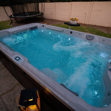
 Richard's Total Backyard Solutions
The perfect balance of recreation, relaxation, and resistance with this Endless Pools® R200. This R200 features an End2End roll-away swim spa cover, a spa-side caddy and custom swim spa steps. Elevate your swim experience at night with stunning underwater LED lights. We also extended the living space of this backyard patio by adding comfort deck to the swim spa and pergola area. The perfect backyard Staycation for endless fun year-round!
#hottubs #pools #swimspas

 Advance Design Studio, Ltd.
When Bill and Jackie Fox decided it was time for a 3 Season room, they worked with Todd Jurs at Advance Design Studio to make their back yard dream come true. Situated on an acre lot in Gilberts, the Fox’s wanted to enjoy their yard year round, get away from the mosquitoes, and enhance their home’s living space with an indoor/outdoor space the whole family could enjoy.
“Todd and his team at Advance Design Studio did an outstanding job meeting my needs. Todd did an excellent job helping us determine what we needed and how to design the space”, says Bill.
The 15’ x 18’ 3 Season’s Room was designed with an open end gable roof, exposing structural open beam cedar rafters and a beautiful tongue and groove Knotty Pine ceiling. The floor is a tongue and groove Douglas Fir, and amenities include a ceiling fan, a wall mounted TV and an outdoor pergola. Adjustable plexi-glass windows can be opened and closed for ease of keeping the space clean, and use in the cooler months. “With this year’s mild seasons, we have actually used our 3 season’s room year round and have really enjoyed it”, reports Bill.
“They built us a beautiful 3-season room. Everyone involved was great. Our main builder DJ, was quite a craftsman. Josh our Project Manager was excellent. The final look of the project was outstanding. We could not be happier with the overall look and finished result. I have already recommended Advance Design Studio to my friends”, says Bill Fox.
Photographer: Joe Nowak
Sponsored
Sunbury, OH

J.Holderby - Renovations
Franklin County's Leading General Contractors - 2X Best of Houzz!

 ZeroEnergy Design
This renovated brick rowhome in Boston’s South End offers a modern aesthetic within a historic structure, creative use of space, exceptional thermal comfort, a reduced carbon footprint, and a passive stream of income.
DESIGN PRIORITIES. The goals for the project were clear - design the primary unit to accommodate the family’s modern lifestyle, rework the layout to create a desirable rental unit, improve thermal comfort and introduce a modern aesthetic. We designed the street-level entry as a shared entrance for both the primary and rental unit. The family uses it as their everyday entrance - we planned for bike storage and an open mudroom with bench and shoe storage to facilitate the change from shoes to slippers or bare feet as they enter their home. On the main level, we expanded the kitchen into the dining room to create an eat-in space with generous counter space and storage, as well as a comfortable connection to the living space. The second floor serves as master suite for the couple - a bedroom with a walk-in-closet and ensuite bathroom, and an adjacent study, with refinished original pumpkin pine floors. The upper floor, aside from a guest bedroom, is the child's domain with interconnected spaces for sleeping, work and play. In the play space, which can be separated from the work space with new translucent sliding doors, we incorporated recreational features inspired by adventurous and competitive television shows, at their son’s request.
MODERN MEETS TRADITIONAL. We left the historic front facade of the building largely unchanged - the security bars were removed from the windows and the single pane windows were replaced with higher performing historic replicas. We designed the interior and rear facade with a vision of warm modernism, weaving in the notable period features. Each element was either restored or reinterpreted to blend with the modern aesthetic. The detailed ceiling in the living space, for example, has a new matte monochromatic finish, and the wood stairs are covered in a dark grey floor paint, whereas the mahogany doors were simply refinished. New wide plank wood flooring with a neutral finish, floor-to-ceiling casework, and bold splashes of color in wall paint and tile, and oversized high-performance windows (on the rear facade) round out the modern aesthetic.
RENTAL INCOME. The existing rowhome was zoned for a 2-family dwelling but included an undesirable, single-floor studio apartment at the garden level with low ceiling heights and questionable emergency egress. In order to increase the quality and quantity of space in the rental unit, we reimagined it as a two-floor, 1 or 2 bedroom, 2 bathroom apartment with a modern aesthetic, increased ceiling height on the lowest level and provided an in-unit washer/dryer. The apartment was listed with Jackie O'Connor Real Estate and rented immediately, providing the owners with a source of passive income.
ENCLOSURE WITH BENEFITS. The homeowners sought a minimal carbon footprint, enabled by their urban location and lifestyle decisions, paired with the benefits of a high-performance home. The extent of the renovation allowed us to implement a deep energy retrofit (DER) to address air tightness, insulation, and high-performance windows. The historic front facade is insulated from the interior, while the rear facade is insulated on the exterior. Together with these building enclosure improvements, we designed an HVAC system comprised of continuous fresh air ventilation, and an efficient, all-electric heating and cooling system to decouple the house from natural gas. This strategy provides optimal thermal comfort and indoor air quality, improved acoustic isolation from street noise and neighbors, as well as a further reduced carbon footprint. We also took measures to prepare the roof for future solar panels, for when the South End neighborhood’s aging electrical infrastructure is upgraded to allow them.
URBAN LIVING. The desirable neighborhood location allows the both the homeowners and tenant to walk, bike, and use public transportation to access the city, while each charging their respective plug-in electric cars behind the building to travel greater distances.
OVERALL. The understated rowhouse is now ready for another century of urban living, offering the owners comfort and convenience as they live life as an expression of their values.
Eric Roth Photo
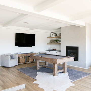 Hunt and Gather Design Company
This stunning project was a 5k complete remodel, design, and full furnish. In addition we also did an additional 1k square foot guest suite build out. The project beginning to end took about 1 year. This was a full-service design client we worked with remotely and with site visits.
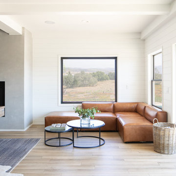 Hunt and Gather Design Company
This stunning project was a 5k complete remodel, design, and full furnish. In addition we also did an additional 1k square foot guest suite build out. The project beginning to end took about 1 year. This was a full-service design client we worked with remotely and with site visits.
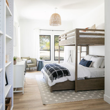 Hunt and Gather Design Company
This stunning project was a 5k complete remodel, design, and full furnish. In addition we also did an additional 1k square foot guest suite build out. The project beginning to end took about 1 year. This was a full-service design client we worked with remotely and with site visits.
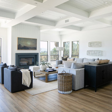 Hunt and Gather Design Company
This stunning project was a 5k complete remodel, design, and full furnish. In addition we also did an additional 1k square foot guest suite build out. The project beginning to end took about 1 year. This was a full-service design client we worked with remotely and with site visits.

 Christiane Holmquist Landscape Design
With this client who has been passionate about plants all his life, there was naturally a close collaboration and a lot of input from him. Upon closer inspection you'd find some very exceptional plants that are sort of experimental but "all worth the try" in Gordon's eyes. And he is right! I relished the opportunity to use Star Magnolia stellata, Redbud Cercis 'Avondale' and 'Silver Cloud', Arabian Lilac 'Grand Duke of Tuscany', Royal Bromeliad Vriesea imperialis, also many unusual bulbs such as Scilla.
Besides structure providing shrubs and trees (Tecoma, existing Indian Hawthorne with beautiful structures, Sweet Pea Bush, Golden Breath of Heaven, Ilex, Ginkgo, Bronze Loquat etc.) you'll see here also my favorite perennials, succulents and grasses, all as low care and undemanding as well as low-water as possible, to keep the landscape colorful and interesting year round.
One of the highlights of this garden are the dry stream beds, bird bath and garden bench that we added. Built originally by himself and his wife, the dry stream beds were overgrown, mostly hidden by plant debris, or half rolling down hill. We had fun selecting a mixed collection of colorful and richly textured boulders of various sizes over, and with the input from 7 team members: Gordon, me, the contractor, the supervisor and three workers, we re-created the stream beds, making sure that anchor stones on the sides were well embedded in the slope, and that stone shelves and “top dressing” with smaller pebbles would add to the visual interest. Now these beds form very pleasing architectural features that look like they have always been there.
We were all surprised how quickly all plants adapted to the site and started growing and putting out bloom. Now the old birdbath, a traditional white thing with dove figurines resting on the scalloped bowl, looked out of place, and I suggested to replace it with a stone bowl. And that part of the garden just called for a bench under the Macademia nut tree, to observe the birds and contemplate the whole creation. Only stone would do, but not any stone! Gordon picked a Basalt boulder that was naturally bowl shaped. It’s so heavy that it took 8 men to heave it into place! The Basalt bench was not much lighter, and together they make a very inviting scene. This job should last for a while.
Photographed by Emma Almendarez at http://www.emmatheodoraphotography.com/
Sponsored
Columbus, OH

Wannemacher Interiors
Customized Award-Winning Interior Design Solutions in Franklin Cnty OH

 Good Directions, Inc.
The base of all of our bird houses and feeders are made of a solid cellular vinyl, a wood alternative that gives you the look and feel of wood, with little maintenance. The end result is an architecturally pleasing house that looks like wood, but lasts like vinyl. The redwood roofs are made to endure the elements year after year. Our copper tops age over time to a natural patina or you may choose a Blue Verde roof that will give you the patina look right out of the box!

 User
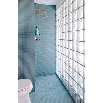
This new boardwalk replaced the original 30 year old boardwalk. This was built with pressure treated lumber and stainless steel fasteners. The homeowners asked for a pair of benches at the end of the walk. It was a great idea and it created a beautiful area to hang out with friends and family. Also, a shower to rinse off was a nice feature.
 Hunt and Gather Design Company
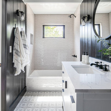
This stunning project was a 5k complete remodel, design, and full furnish. In addition we also did an additional 1k square foot guest suite build out. The project beginning to end took about 1 year. This was a full-service design client we worked with remotely and with site visits.
 J. KURTZ Architects
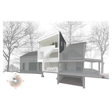
A multi-year labor of love, the Maine Addition thoughtfully expands a historic 19th-century vacation home in picturesque Round Pond, Maine. Designed to honor the original structure's classic coastal heritage while introducing elevated modern living, this custom addition seamlessly blends timeless New England craftsmanship with sophisticated, high-end updates.
Sponsored
Sunbury, OH
J.Holderby - Renovations
Franklin County's Leading General Contractors - 2X Best of Houzz!
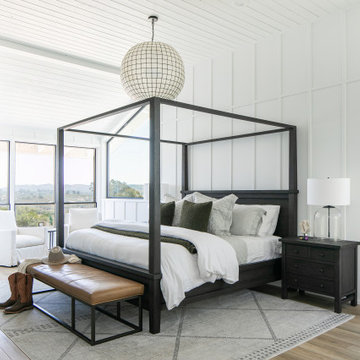 Hunt and Gather Design Company
This stunning project was a 5k complete remodel, design, and full furnish. In addition we also did an additional 1k square foot guest suite build out. The project beginning to end took about 1 year. This was a full-service design client we worked with remotely and with site visits.

 Brown Dog Enterprises
This material was salvaged by Second Use in Seattle. It is 2x6 car decking used for flooring in an old foundry. We pressure washed the years of dirt and grime away, sanded for hours, stained dark walnut and applied 4 coats of finish. The finished treads were then installed on a spiral staircase.
The end result is a solid looking tread with great character1

 Significant Homes LLC
Photography by Keith Scott Morton
From grand estates, to exquisite country homes, to whole house renovations, the quality and attention to detail of a "Significant Homes" custom home is immediately apparent. Full time on-site supervision, a dedicated office staff and hand picked professional craftsmen are the team that take you from groundbreaking to occupancy. Every "Significant Homes" project represents 45 years of luxury homebuilding experience, and a commitment to quality widely recognized by architects, the press and, most of all....thoroughly satisfied homeowners. Our projects have been published in Architectural Digest 6 times along with many other publications and books. Though the lion share of our work has been in Fairfield and Westchester counties, we have built homes in Palm Beach, Aspen, Maine, Nantucket and Long Island.
137