
Search results for "Your own client" in Home Design Ideas

 Endless Pools
Your very own swim oasis, courtesy of Endless Pools. The retractable glass walls let you choose: breathe in the crisp plains air and feel its warmth on your face, or just luxuriate in the sheltered view.

 O’Hara Interiors
The light fixture over the lower level game table was custom designed by Martha O'Hara Interiors. We selected materials from our client's family farm in order to assemble a functional, light. Martha O'Hara Interiors, Interior Design | L. Cramer Builders + Remodelers, Builder | Troy Thies, Photography | Shannon Gale, Photo Styling
Please Note: All “related,” “similar,” and “sponsored” products tagged or listed by Houzz are not actual products pictured. They have not been approved by Martha O’Hara Interiors nor any of the professionals credited. For information about our work, please contact design@oharainteriors.com.


Find the right local pro for your project

 Architessa
From drab and outdated, to a fantastic modern farmhouse feel, Architectural Ceramics designers were able to give these residents the kitchen of their dreams with the help of the latest trend in tile- cement! Cement tiles are made one at a time by hand, with blends of cement, marble powder, fine sand, and natural mineral color pigments to create the patterns the world has fallen in love with. After helping the client narrow down their favorite selections from Architectural Ceramic’s thousands of high quality tile options, a custom concrete design in shades of blue and grey for their backsplash turned out to be the perfect match to the rest of the kitchen. Architectural Ceramics designers eagerly work to make your project their top priority with a one of a kind design you can brag about for years to come. Visit our website to make an appointment at http://www.architecturalceramics.com/.

 Catherine Shively, Interior Designer
Inspiration for a large transitional master beige floor freestanding bathtub remodel in Seattle with flat-panel cabinets, light wood cabinets, multicolored walls, an undermount sink, quartzite countertops and a hinged shower door

 Arbor Mills
Close up view of tilt out drawer recharging station, customized by Arbor Mills cabinetry
Example of a transitional kitchen design in Chicago
Example of a transitional kitchen design in Chicago

Sponsored
Columbus, OH
Free consultation for landscape design!

Peabody Landscape Group
Franklin County's Reliable Landscape Design & Contracting


 Living with Lolo
Entry in Trailside View | Refined Transitional Home in Scottsdale, AZ |
Room Type: Whole Home Remodel and Furnishings |
Project Name: Trailside View Residence |
Key Feature: A full home remodel and furnishings project anchored by white oak cabinetry and countertops, where the clients gave Living with Lolo real creative freedom to play with bold fabrics, wallpapers, and drapery that most homeowners would talk themselves out of.
Challenge: Transitional design can play it safe by default, neutral palette, inoffensive finishes, nothing that makes you catch your breath. The remodel needed a strong foundation that felt refined and timeless, but the clients wanted more than that. They wanted a home with personality, and the challenge was channeling that creative openness into something cohesive rather than chaotic.
Solution: Living with Lolo used white oak cabinetry and countertops to ground the remodel in warmth and quiet sophistication, then let the soft goods carry the personality. Bold fabric choices, expressive wallpapers, and thoughtful drapery gave each room its own moment without losing the thread that connected the whole home. Because the remodel and furnishings were managed together under one roof, the bolder design choices landed the way they were intended to rather than feeling like afterthoughts layered onto a finished renovation.
Materials: White oak cabinetry, white oak countertops, curated wallpapers, bold upholstery fabrics, custom drapery, and layered accessories sourced through Living with Lolo's trade relationships.
Budget: $250,000 to $550,000 |
Timeline: Approximately 5 to 9 months from design through completion.

 Susan Yeley Homes
This gem of a house was built in the 1950s, when its neighborhood undoubtedly felt remote. The university footprint has expanded in the 70 years since, however, and today this home sits on prime real estate—easy biking and reasonable walking distance to campus.
When it went up for sale in 2017, it was largely unaltered. Our clients purchased it to renovate and resell, and while we all knew we'd need to add square footage to make it profitable, we also wanted to respect the neighborhood and the house’s own history. Swedes have a word that means “just the right amount”: lagom. It is a guiding philosophy for us at SYH, and especially applied in this renovation. Part of the soul of this house was about living in just the right amount of space. Super sizing wasn’t a thing in 1950s America. So, the solution emerged: keep the original rectangle, but add an L off the back.
With no owner to design with and for, SYH created a layout to appeal to the masses. All public spaces are the back of the home--the new addition that extends into the property’s expansive backyard. A den and four smallish bedrooms are atypically located in the front of the house, in the original 1500 square feet. Lagom is behind that choice: conserve space in the rooms where you spend most of your time with your eyes shut. Put money and square footage toward the spaces in which you mostly have your eyes open.
In the studio, we started calling this project the Mullet Ranch—business up front, party in the back. The front has a sleek but quiet effect, mimicking its original low-profile architecture street-side. It’s very Hoosier of us to keep appearances modest, we think. But get around to the back, and surprise! lofted ceilings and walls of windows. Gorgeous.
 Che Bella Interiors Design + Remodeling
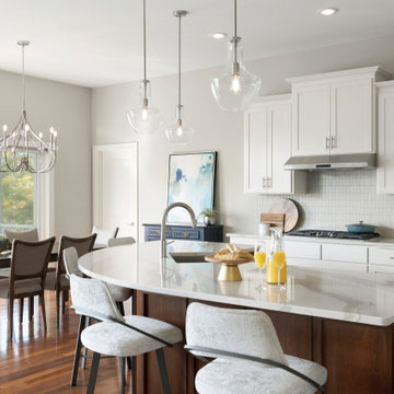
Originally dark and dated, this kitchen was transformed to enhance function and open up the kitchen. We cut down the old, two-tiered island to one level, creating a beautiful contrast against the freshly painted white perimeter cabinets.
Photos by Spacecrafting Photography
 Twelve Stones Designs, LLC
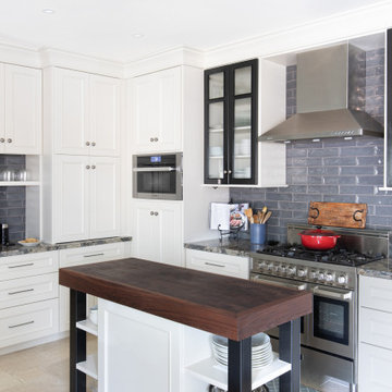
The owners of this kitchen had spent the money to upgrade the finishes in their kitchen upon building the home 12 years ago, but after living in the space for several years they realized how nonfunctional the layout really was. The (then) two preschool aged children had grown into busy, hungry teenagers with many friends who also liked to hang out at the house. So the family needed a more functional kitchen with better traffic flow, space for daily activities revolving around the kitchen at different times of day, and a kitchen that could accommodate cooking for and serving large groups. Furthermore, the dark, traditional finishes no longer reflected the homeowners’ style. They requested a brighter, more relaxed, coastal style that reflected their love of the seaside cities they like to visit.
Originally, the kitchen was U-shaped with a narrow island in the middle. The island created narrow aisles that bottle-necked at the dishwasher, refrigerator, and cooktop areas. There was a pass-through from the foyer into the kitchen, but the owners never liked that the pass-through was also located so close to the powder room. The awkward proximity was unappealing and made guests feel uncomfortable.
The kitchen’s storage was made up of lots of narrow cabinets, apothecary drawers, clipped corner units, and very few drawers. It lacked useful storage for the larger items the family used on a daily basis. And the kitchen’s only pantry was small closet that had only builder-grade, narrow shelving with no illumination to be able to see the contents inside.
Overall, the kitchen’s lighting plan was poorly executed. Only six recessed cans illuminated the entire kitchen and nook areas. The under cabinet lighting was not evenly distributed either. In fact, the builder had mis-placed the under cabinet lighting around the decorative pilasters which made for choppy, dark cubbies. Further, the builder didn’t include any lighting over the sink or the bar area, which meant whoever was doing the dishes was always in their own shadow. That, coupled with the steep overhang of the game room above made the bar area feel like a dim, cavernous space that wasn’t inviting or task oriented. The kitchen looked out into the main living space, but the raised bar and a narrow wall (which held the only large cabinet in the kitchen) created more of a barrier than a relationship to the living room or breakfast nook. In fact, one couldn’t even see the breakfast nook from the cooktop or sink areas due to its orientation. The raised bar top was too narrow to comfortably sit to either dine at or chat from due to the lack of knee space. The the homeowners confided that the kitchen felt more like a dark, dirty prison than place where the family, or their guests, wanted to gather and commune.
The clients' needs and desires were:
➢ to create a kitchen that would be a space the family loved to be in; to relate to the adjacent spaces all around, and to have better flow for entertaining large groups
➢ to remove the walls between the breakfast nook and living area and to be able to utilize the natural light from the windows in both those areas
➢ to incorporate a functional chopping block for prepping fresh food for home cooked meals, an island with a large sink and drain board, 2 pull out trash cans, and seating for at least the 2 teens to eat or do homework
➢ to design a kitchen and breakfast nook with an airy, coastal, relaxed vibe that blended with the rest of the house's coastal theme
➢ to integrate a layered lighting plan which would include ample general illumination, specific task lighting, decorative lighting, and lots of illuminated storage
➢ to design a kitchen with not only more storage for all the husband’s kitchen gadgets and collection of oils and spices, but smart storage, including a coffee/breakfast bar and a place to store and conceal the toaster oven and microwave
➢ to find a way to utilize the large open space between the kitchen, pantry area, and breakfast nook
Twelve Stones Designs achieved the owner's goals by:
➢ removing the walls between the kitchen and living room to allow the natural light to filter in from the adjacent rooms and to create a connection between the kitchen, nook, and living spaces for a sense of unity and communion
➢ removing the existing pantry and designing 3 large pantry style cabinets with LED tape lights and rollout drawers to house lots of kitchen appliances, gadgets, and tons of groceries. We also took the cabinets all the way up to the 9’ ceiling for additional storage for seasonal items and bulk storage.
➢ designing 2 islands - 1 with a gorgeous black walnut chopping block that houses a drawer for chopping and carving knives and a custom double pull out trash unit for point of use utilization - and 1 that houses the dishwasher, a large Blanco Gourmet sink with integrated drain board, woven baskets for fresh root vegetables and kitchen towels, plenty of drawer storage for kitchen items, and bar seating for up to 4 diners.
➢ closing off the space between the kitchen and the powder room to create a beautiful new private alcove for the powder room as well as adding some decorative storage. This also gave us space to include more tall storage near the new range for precision placement of the husband’s extensive oil and spice collection as well as a location for a combo-steam oven the wife wanted for baking and cooking healthy meals.
The project is enhanced functionally by:
➢ incorporated USB and standard receptacles for the kids’ laptops and phone charging in the large island
➢ designing the small island to include additional open shelving for items used on a daily basis such as a variety of bowls, plates, and colanders. This set up also works well for the husband who prefers to “plate” his dinners in restaurant-style fashion before presenting them to the table.
➢ the integration of specific storage units, such as double stacked cutlery drawers, a custom spice pull-out, a Kuerig coffee and tea pod drawer, and custom double stacked utensil drawers
➢ moving the refrigerator to the old oven location - this eliminated the bottle neck as well as created a better relationship to the eating table. It also utilizes the floor space between the pantry, nook, and kitchen
➢ creating a banquet style breakfast nook - this banquette seating not only doubles the amount of seating for large gatherings but it better utilizes the odd space between the kitchen and the previous nook area. It also helps to create a distinct pathway from the mudroom room through the pantry area, kitchen, nook, and living room.
➢ the coffee/breakfast bar area which includes the perfect location for the concealed microwave and toaster oven, convenient storage for the coffee pods and tea accoutrements. Roll-out drawers below also house the smoothie maker, hot water kettle, and a plethora of smoothie-making ingredients such as protein powders, smoothie additives, etc. Furthermore, the drawers below the Keurig house measuring utensil, cutlery, baking supplies and tupperware storage.
➢ incorporating lots of wide drawers and pullouts to accommodate large cookware.
➢ utilizing as much vertical space as possible by building storage to the ceiling which accommodates the family’s abundant amount of serving platters, baking sheets, bakeware, casserole dishes, and additional cutting boards.
The project is enhanced aesthetically by:
➢ new 5-piece Versailles pattern porcelain tile that now seamlessly joins the entire down stairs area together creating a bright, cohesiveness feeling instead of choppy separated spaces - it also adds a coastal feeling
➢ designing a cabinet to conceal the microwave and toaster oven
➢ the coastal influenced light fixtures over the nook table and island
➢ the sandy colors of the Langdon Cambria countertops. The swirling pattern and sparkling quartz pieces remind the homeowner of black-and-tan sandy beaches
➢ the striped banquet seating whose creamy white background and blue-green stripes were the inspiration for the cabinet and wall colors.
➢ All the interior doors were painted black to coordinate with the blacks and grays in the backsplash tile and countertop. This also adds a hint of tailored formality to an otherwise casual space.
➢ the use of WAC's Oculux small aperture LED units for the overhead lighting complimented with Diode LED strips for task lighting under the cabinets and inside the pantry and glass wall cabinets. All of the lighting applications are on separate dimmer switches.
Innovative uses of materials or construction methods by Realty Restoration LLC:
➢ Each 1-1/2” x 3” block of reclaimed end-grain black walnut that makes up the center island chopping block was hand milled and built in the shop. It was designed to look substantial and proportional to the surrounding elements, executed by creating the 4 inch tall top with a solid wood chamfered edge band.
➢ The metal doors on either side of the vent hood were also custom designed for this project and built in the Realty Restoration LLC shop. They are made 1x2, 11-gauge mild steel with ribbed glass. Weighing 60 lbs a piece, heavy duty cabinet hinges were added to support the weight of the door and keep them from sagging.
➢ Under-cabinet receptacles were added along the range wall in order to have a clean, uninterrupted backsplash.
Design obstacles to overcome:
➢ Because we were removing the demising walls between the kitchen and living room, we had to find a way to plumb and vent the new island. We did this by tunneling through the slab (the slab had post tension cables which prevented us from just trenching) to run a new wet vent through a nearby structural wall. We pulled the existing hot and cold lines between upper floor joists and ran them down the structural wall as well and up through a conduit in the tunnel.
➢ Since we were converting from wall overs to a gas range it allowed us to utilize the 220 feed for the wall ovens to provide a new sub panel for all the new kitchen circuits
➢ Due to framing deficiencies inherited from the original build there was a 1-1/2” differential in the floor-to-ceiling height over a 20 foot span; by utilizing the process of cutting and furring coupled with the crown moulding details on the cabinet elevations we were able to mask the problem and provide seamless transitions between the cabinet components.
Evidence of superior craftsmanship:
➢ uniquely designed, one-of-a-kind metal “X” end panels on the large island. The end panels were custom made in the Realty Restoration LLC shop and fitted to the exact dimensions of the island. The welding seams are completely indistinguishable - the posts look like they are cut from a single sheet of metal
➢ square metal posts on the small island were also custom made and designed to compliment and carry through the metal element s throughout the kitchen
➢ the beautiful, oversized end panels on the pantry cabinets which give the breakfast nook a tailored look
➢ integrating a large format 5 piece Versailles tile pattern to seamlessly flow from the existing spaces into the new kitchen space
➢ By constructing a custom cabinet that jogged around a corner we could not remodel (housing the entry way coat closet) we were able to camouflage the adjacent wall offset within the upper and lower cabinets. By designing around the existing jog in the structural walls we accomplished a few things: we were able to find the space to house, and hide, the microwave and toaster oven yet still have a clean cohesive appearance from the kitchen side. Additionally, the owners were able to keep their much needed coat closet and we didn’t have to increase the budget with unnecessary structural work.

 Hufft
The organic shape of the surrounding trees contrasts the hard-lined form of the home. To the right, a photo studio is clad in pre-cast concrete. The large front door defines the central entry. To the left, the great room is screened by perforated metal.
Heavy Metal is a contemporary take on the Miesian courtyard house, in a rural setting. In this instance, the courtyard is created as much by the landscaping and vegetation as it is by the architecture.
Photography by Andrew Fabin

 Horticultural Solutions, LLC
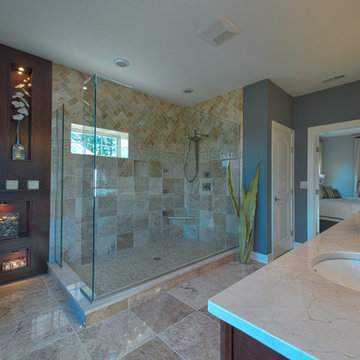
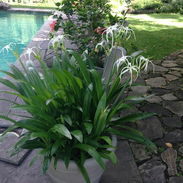
Mixing up the flowering urns with green fun species is what adds dimension to your gardens.
This property is in Bedford, New York.
A little about us:
Many find rejuvenation and relaxation by vacationing in lavish resorts that offer beautiful atmospheres or surroundings, imagine getting that escape in your own home. This can include walking gardens taking your imagination to places. We offer experiences in our design through accents of moss covered toad stools, crafted areas of flower blooms amongst floor greens leading to layered boulder settings to rest, or extended stone patio areas dressed in overflowing urns and the light sounds of soothing water flow which is then completed with the view from the entertaining outdoor bar of lush lawns spotted with magically shaped White Oaks. These details describe some of which inspire and our customers. Great gardens can do great things for the beholder. We create healthy and sustainable all season environments of fragrance, color and visual depth.
We are proud to be Fairfield and Westchester County’s Fine Landscaping and Landscape Maintenance Service Company by providing our clients with over 30 years of what they expect from a quality design, installation and follow-up landscaper.
We are fully insured and licensed by the State of Connecticut and the County of Westchester and specialized in servicing the landscape needs of the finest of homes in Greenwich, New Canaan, Bedford Hills, Chappaqua, Armonk and several other beautiful towns and hamlets surrounding them. We believe that some key characteristics of our business set us apart from other landscapers. The mentality built into our age and experience allows us to serve all landscaping and hardscaping projects— as large as they may get — while also being reliable and responsive. We are a locally owned business which means that each client receives individualized service based on their needs and their landscape’s growing conditions. To minimize the damage done to garden beds and hardscapes (pathways, waterfalls and pools) from other portions of the property’s maintenance, so we offer these services along with the garden servicing plan, entitled The ‘All Scapes’ Maintenance Service Agreement . Please contact us any time of the year. We are always working on something to beautify your world.
See us at our website: http://www.horticulaturalsolutionsny.com
Landscape Design: http://www.horticulaturalsolutionsny.com/gallery
Landscape Plans: http://www.horticulturalsolutionsny.com/design
Landscape Consultation: http://www.horticulturalsolutionsny.com/consultation
Tree installation: See us at our website: http://www.horticulturalsolutionsny.com/trees
Masonry: See us at our website: http://www.horticulturalsolutionsny.com/masonry
Portfolio: http://www.horticulturalsolutionsny.com/portfolio
Bedford Hills Portfolio: http://www.horticulturalsolutionsny.com/portfolio/BedfordHills
New Canaan Portfolio: http://www.horticulturalsolutionsny.com/portfolio/NewCanaan
Fairfield County Portfolio: http://www.horticulturalsolutionsny.com/portfolio/Fairfield
Westport Portfolio: http://www.horticulturalsolutionsny.com/portfolio/Westport
Greenwich Portfolio: http://www.horticuturalsolutionsny.com/portfolio/Greenwich
Katonah Portfolio: http://www.horticulturalsolutionsny.com/portfolio/Katonah
Chappaqua Portfolio: http://www.horticulturalsolutionsny.com/portfolio/Chappaqua
Armonk Portfolio: http://www.horticulturalsolutionsny.com/portfolio/Armonk
Scardale Portfolio: http://www.horticulturalsolutionsny.com/portfolio/Scardale
Pound Ridge Portfolio: http://www.horticulturalsolutionsny.com
Landscape Design: http://www.horticulturalsolutionsny.com/gallery
Landscape Plans: http://www.horticulturalsolutionsny.com/design
Landscape Consultation: http://www.horticulturalsolutionsny.com/consultation
Tree installation: See us at our website: http://www.horticulturalsolutionsny.com
Masonry: See us at our website: http://www.horticulaturalsolutionsny.com
Portfolio: http://www.horticulturalsolutionsny.com
Bedford Hills Portfolio: http://www.horticulturalsolutionsny.com
New Canaan Portfolio: http://www.horticulturalsolutionsny.com
Fairfield County Portfolio: http://www.horticulturalsolutionsny.com
Westport Portfolio: http://www.horticulturalsolutionsny.com
Greenwich Portfolio: http://www.horticulturalsolutionsny.com
Katonah Portfolio: http://www.horticulturalsolutionsny.com
Chappaqua Portfolio: http://www.horticulturalsolutionsny.com
Armonk Portfolio: http://www.horticulturalsolutionsny.com
Scardale Portfolio: http://www.horticulturalsolutionsny.com
Pound Ridge Portfolio: http://www.horticulturalsolutionsny.com

 Western Outdoor Designs
Creating your outdoor living space means claiming your own little slice of nature and customizing it to suit your lifestyle and enhance your daily routine. Sometimes there is nothing more relaxing than sitting on your favorite patio chair, feeling the warm sun mixed with a cool breeze, and smelling the fragrant flowers blossoming in your garden. Imagine how much more time you would spend outside if you had your very own cabana, bungalow, pergola, sunroom or pool house to enjoy! Think of all the ways an outdoor room could enhance your Southern California lifestyle and prime your home for entertaining guests year-round.


 Interiors by Popov
Having two young boys presents its own challenges, and when you have two of their best friends constantly visiting, you end up with four super active action heroes. This family wanted to dedicate a space for the boys to hangout. We took an ordinary basement and converted it into a playground heaven. A basketball hoop, climbing ropes, swinging chairs, rock climbing wall, and climbing bars, provide ample opportunity for the boys to let their energy out, and the built-in window seat is the perfect spot to catch a break. Tall built-in wardrobes and drawers beneath the window seat to provide plenty of storage for all the toys.
You can guess where all the neighborhood kids come to hangout now ☺


 Victoria Klein
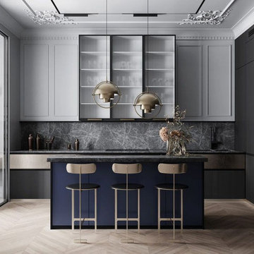
Almost entirely furnished with clients' own furniture and lighting we reupholstered several of the pieces, added new lampshades, covered the floor with English rush matting and refreshed the entire room with a splash of coral paint, black and white striped silk curtains, new sofa pillows and painted the alcove and fireplace surround black for extra punch.
 TVL Creative Ltd.
This 1910 West Highlands home was so compartmentalized that you couldn't help to notice you were constantly entering a new room every 8-10 feet. There was also a 500 SF addition put on the back of the home to accommodate a living room, 3/4 bath, laundry room and back foyer - 350 SF of that was for the living room. Needless to say, the house needed to be gutted and replanned.
Kitchen+Dining+Laundry-Like most of these early 1900's homes, the kitchen was not the heartbeat of the home like they are today. This kitchen was tucked away in the back and smaller than any other social rooms in the house. We knocked out the walls of the dining room to expand and created an open floor plan suitable for any type of gathering. As a nod to the history of the home, we used butcherblock for all the countertops and shelving which was accented by tones of brass, dusty blues and light-warm greys. This room had no storage before so creating ample storage and a variety of storage types was a critical ask for the client. One of my favorite details is the blue crown that draws from one end of the space to the other, accenting a ceiling that was otherwise forgotten.
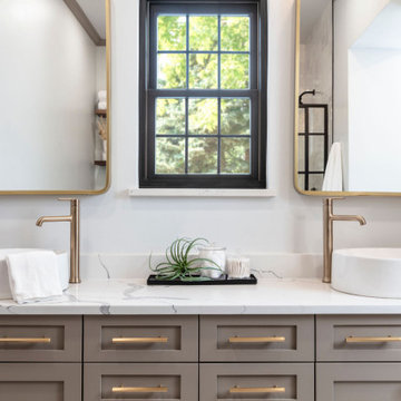
Primary Bath-This did not exist prior to the remodel and the client wanted a more neutral space with strong visual details. We split the walls in half with a datum line that transitions from penny gap molding to the tile in the shower. To provide some more visual drama, we did a chevron tile arrangement on the floor, gridded the shower enclosure for some deep contrast an array of brass and quartz to elevate the finishes.
Powder Bath-This is always a fun place to let your vision get out of the box a bit. All the elements were familiar to the space but modernized and more playful. The floor has a wood look tile in a herringbone arrangement, a navy vanity, gold fixtures that are all servants to the star of the room - the blue and white deco wall tile behind the vanity.
Full Bath-This was a quirky little bathroom that you'd always keep the door closed when guests are over. Now we have brought the blue tones into the space and accented it with bronze fixtures and a playful southwestern floor tile.
Living Room & Office-This room was too big for its own good and now serves multiple purposes. We condensed the space to provide a living area for the whole family plus other guests and left enough room to explain the space with floor cushions. The office was a bonus to the project as it provided privacy to a room that otherwise had none before.
164