
Search results for "Separation wall ideas" in Home Design Ideas
 Neolithic Materials
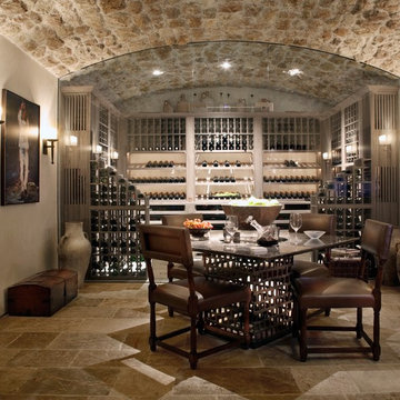
Our Reclaimed Tuscan Wall Cladding, which have been hand salvaged from ancient cities across the Mediterranean Sea, are antique limestone wall veneers. In its original form, they are up to 15" thick. Call (949) 241-5458 for more information or visit our website at NeolithicDesign.com
 Next Generation Capital
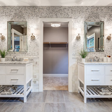
Vanity wall through to master closet, dual furniture like vanities, marble tops, mosaic wall tile, decorator mirrors and lighting
Mid-sized transitional master mosaic tile and gray tile ceramic tile bathroom photo in Sacramento with an undermount sink, flat-panel cabinets, white cabinets, marble countertops and brown walls
Mid-sized transitional master mosaic tile and gray tile ceramic tile bathroom photo in Sacramento with an undermount sink, flat-panel cabinets, white cabinets, marble countertops and brown walls
 Architect Heather Johnston
CASA 1O
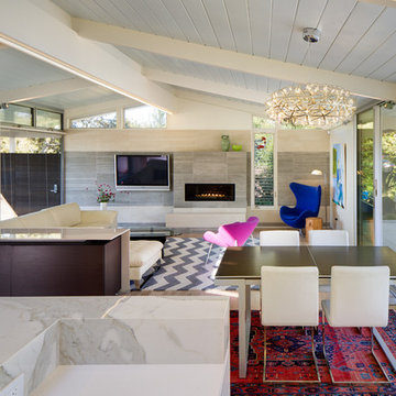
Contemporary on a Mid-century Scaffold.
Largely unmodified since its design by Russell Forester and construction in 1957, the structure housed the original family until 2013. An intimate 1,910 square foot space, the house acquired a separate 600 square foot cottage in the 70’s designed by another architect. New owners purchased the house with the idea of keeping the original architect’s intent intact – the simple accommodation of everyday life with a focus on outdoor living only possible in Southern California. At the same time the house needed insulation, new electrical, plumbing, siding – everything but new studs and foundations.
A single roof beam travels south from the north fireplace wall all the way to the bedrooms in the back. Functions occur to either side, with private access to exterior courtyards. How do we accentuate the uncomplicated while enhancing the qualities of the chosen materials? Contemporary applied to a mid-century scaffold.
We focused on reduction, a few things performing many tasks. Each component, material or color performs more than one duty.
Lighting is paramount, enhancing the design’s procession from front to back, north to south, public to private. Strip LED’s reinforce the beam’s linear presence and spot LED’s make punctuation points of the roof purlins. Hidden up and down-lights in the cabinets and elsewhere provide the rooms with a quiet glow.
Exterior grass plantings give the only vertical dimension to the design, waving as the breeze moves them. All else is horizontal: caramelized bamboo siding, porcelain tile, roof line and ocean horizon.
Architect: Heather Johnston Architect
Landscaping: HJA
Photography: Brady Architectural Photography
Find the right local pro for your project
 Gentry Raines Interior Design
John Magor Photography
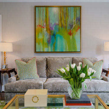
Transitional formal and enclosed living room photo in Richmond with gray walls
Transitional formal and enclosed living room photo in Richmond with gray walls
 place architecture:design
Photo Credit: ©Tom Holdsworth,
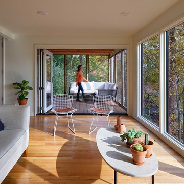
A screen porch was added to the side of the interior sitting room, enabling the two spaces to become one. A unique three-panel bi-fold door, separates the indoor-outdoor space; on nice days, plenty of natural ventilation flows through the house. Opening the sunroom, living room and kitchen spaces enables a free dialog between rooms. The kitchen level sits above the sunroom and living room giving it a perch as the heart of the home. Dressed in maple and white, the cabinet color palette is in sync with the subtle value and warmth of nature. The cooktop wall was designed as a piece of furniture; the maple cabinets frame the inserted white cabinet wall. The subtle mosaic backsplash with a hint of green, represents a delicate leaf.
 Modern Blaze
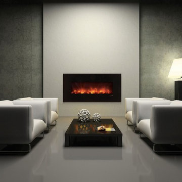
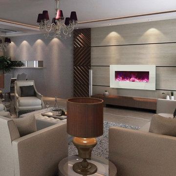
Another great placement for a wall mounted electric fireplace is a sitting or lounge area of your living room. Picture having a deep conversation with your friend sitting on a couple of chairs in front of the fireplace while enjoying the peaceful flickering of the flames. Or reading a book on a chaise next to the fireplace and absorbing the warmth radiating from the it.
 Lauren Shadid Architecture + Interiors
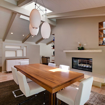
Dining Room Remodel. Custom Dining Table and Buffet. Custom Designed Wall incorporates double sided fireplace/hearth and mantle and shelving wrapping to living room side of the wall. Privacy wall separates entry from dining room with custom glass panels for light and space for art display. New recessed lighting brightens the space with a Nelson Cigar Pendant pays homage to the home's mid-century roots.
photo by Chuck Espinoza

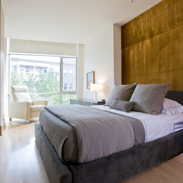
 Ernesto Santalla PLLC
Ernesto Santalla was approached to create a new home for two Washington, DC lawyers wishing to downsize their living space. The move took them from a row house in Washington's historic Dupont Circle neighborhood to a two bedroom apartment in the vibrant, up-and-coming U Street Corridor. Our task was to transform a rather plain and generic apartment into a custom, sophisticated space in a few strategic moves. Ceiling details serve to define functional areas of the living space without creating divisions. Changing some doors from wood to frosted glass, creates a sense of continuity between spaces, and allows light to travel between spaces. Lighting was inserted strategically, to enhance certain functions of the home. The kitchen was partially enclosed with a plane of frosted glass to create visual separation from the main living space while still allowing natural light to filter in from the expansive wall of floor-to-ceiling windows. Color was used to reinforce the architectural intent and simplify spaces, such as the entry, which as many doors and frames. Furniture was selected to blend with the client's collection of heirloom pieces, creating a sophisticated juxtaposition. Statement pieces like a ceiling light from Viabizzuno create impact while maintaining the visual simplicity of our minimal approach.
Photography by Geoffrey Hodgdon
 TKS Design Group
Download our free ebook, Creating the Ideal Kitchen. DOWNLOAD NOW
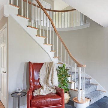
Lakefront property in the northwest suburbs of Chicago is hard to come by, so when we were hired by this young family with exactly that, we were immediately inspired by not just the unusually large footprint of this 1950’s colonial revival but also the lovely views of the manmade lake it was sited on. The large 5-bedroom home was solidly stuck in the 1980’s, but we saw tons of potential. We started out by updating the existing staircase with a fresh coat of paint and adding new herringbone slate to the entry hall.
The powder room off the entryway also got a refresh - new flooring, new cabinets and fixtures. We ran the new slate right through into this space for some consistency. A fun wallpaper and shiplap trim add a welcoming feel and set the tone for the home.
Next, we tackled the kitchen. Located away from the rest of the first floor, the kitchen felt a little isolated, so we immediately began planning for how to better connect it to the rest of the first floor. We landed on removing the wall between the kitchen and dining room and designed a modified galley style space with separate cooking and clean up zones. The cooking zone consists of the refrigerator, prep sink and cooktop, along with a nice long run of prep space at the island. The cleanup side of the kitchen consists of the main sink and dishwasher. Both areas are situated so that the user can view the lake during prep work and cleanup!
One of the home’s main puzzles was how to incorporate the mudroom and area in front of the patio doors at the back of the house. We already had a breakfast table area, so the space by the patio doors was a bit of a no man’s land. We decided to separate the kitchen proper from what became the new mudroom with a large set of barn doors. That way you can quickly hide any mudroom messes but have easy access to the light coming in through the patio doors as well as the outdoor grilling station. We also love the impact the barn doors add to the overall space.
The homeowners’ first words to us were “it’s time to ditch the brown,” so we did! We chose a lovely blue pallet that reflects the home’s location on the lake which is also vibrant yet easy on the eye. Countertops are white quartz, and the natural oak floor works well with the other honey accents. The breakfast table was given a refresh with new chairs, chandelier and window treatments that frame the gorgeous views of the lake out the back.
We coordinated the slate mudroom flooring with that used in the home’s main entrance for a consistent feel. The storage area consists of open and closed storage to allow for some clutter control as needed.
Next on our “to do” list was revamping the dated brown bar area in the neighboring dining room. We eliminated the clutter by adding some closed cabinets and did some easy updates to help the space feel more current. One snag we ran into here was the discovery of a beam above the existing open shelving that had to be modified with a smaller structural beam to allow for our new design to work. This was an unexpected surprise, but in the end we think it was well worth it!
We kept the colors here a bit more muted to blend with the homeowner’s existing furnishings. Open shelving and polished nickel hardware add some simple detail to the new entertainment zone which also looks out onto the lake!
Next we tackled the upstairs starting with the homeowner’s son’s bath. The bath originally had both a tub shower and a separate shower, so we decided to swap out the shower for a new laundry area. This freed up some space downstairs in what used to be the mudroom/laundry room and is much more convenient for daily laundry needs.
We continued the blue palette here with navy cabinetry and the navy tile in the shower. Porcelain floor tile and chrome fixtures keep maintenance to a minimum while matte black mirrors and lighting add some depth the design. A low maintenance runner adds some warmth underfoot and ties the whole space together.
We added a pocket door to the bathroom to minimize interference with the door swings. The left door of the laundry closet is on a 180 degree hinge to allow for easy full access to the machines. Next we tackled the master bath which is an en suite arrangement. The original was typical of the 1980’s with the vanity outside of the bathroom, situated near the master closet. And the brown theme continued here with multiple shades of brown.
Our first move was to segment off the bath and the closet from the master bedroom. We created a short hall from the bedroom to the bathroom with his and hers walk-in closets on the left and right as well as a separate toilet closet outside of the main bathroom for privacy and flexibility.
The original bathroom had a giant soaking tub with steps (dangerous!) as well as a small shower that did not work well for our homeowner who is 6’3”. With other bathtubs in the home, they decided to eliminate the tub and create an oversized shower which takes up the space where the old tub was located. The double vanity is on the opposite wall and a bench is located under the window for morning conversations and a place to set a couple of towels.
The pallet in here is light and airy with a mix of blond wood, creamy porcelain and marble tile, and brass accents. A simple roman shade adds some texture and it’s top-down mechanism allows for light and privacy.
This large whole house remodel gave our homeowners not only the ability to maximize the potential of their home but also created a lovely new frame from which to view their fabulous lake views.
Designed by: Susan Klimala, CKD, CBD
Photography by: Michael Kaskel
For more information on kitchen and bath design ideas go to: www.kitchenstudio-ge.com
 Modern Blaze
Nowadays, more and more people are cutting off their cable and opt to not own a TV at all. Wether you are a part of this trend or just want your living room to be more classy, wall mounted electric fireplace can be a good TV replacement in your living room. It creates a beautiful focal point and welcoming ambiance.
 Paper Moon Painting
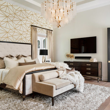
In this lovely, luxurious master bedroom, we installed the headboard wallpaper with a white and gold pattern, and painted the walls and trim in a fresh soft white. Gold accents tie everything together!
 Delphinium Design
Photography: Tiffany Ringwald
Builder: Ekren Construction
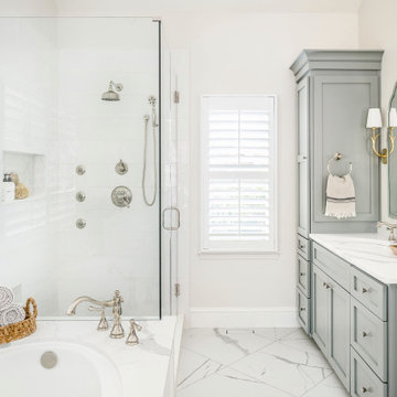
Inspiration for a transitional master white tile and porcelain tile porcelain tile, white floor and double-sink corner shower remodel in Charlotte with shaker cabinets, gray cabinets, an undermount tub, an undermount sink, quartz countertops, a hinged shower door, white countertops, a niche and a built-in vanity
Inspiration for a transitional master white tile and porcelain tile porcelain tile, white floor and double-sink corner shower remodel in Charlotte with shaker cabinets, gray cabinets, an undermount tub, an undermount sink, quartz countertops, a hinged shower door, white countertops, a niche and a built-in vanity
 Haven Design and Construction
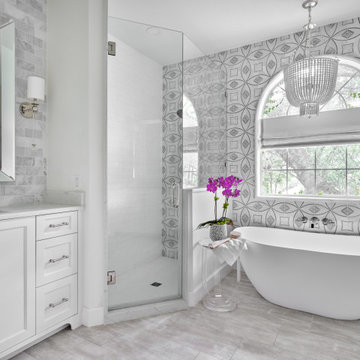
This spa like master bath was transformed into an eye catching oasis featuring a marble patterned accent wall, freestanding tub and spacious corner shower. His and hers vanities face one another, while the toilet is tucked away in a separate water closet. The beaded chandelier over the tub serves as a beautiful focal point and accents the curved picture window that floods the bath with natural light.
Sponsored
Columbus, OH
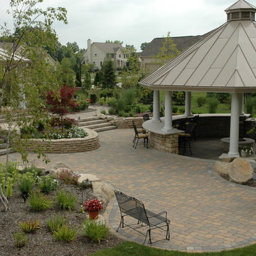
Free consultation for landscape design!

Peabody Landscape Group
Franklin County's Reliable Landscape Design & Contracting
 L. Weatherbee Design Studio
Lisa Weatherbee
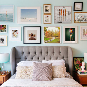
Example of an eclectic bedroom design in New York with blue walls
Example of an eclectic bedroom design in New York with blue walls
 Jo Rabaut
Chris Little Photography
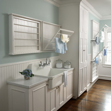
Laundry room - traditional laundry room idea in Atlanta with white cabinets, white countertops and a drop-in sink
Laundry room - traditional laundry room idea in Atlanta with white cabinets, white countertops and a drop-in sink
 Nuwal Panels
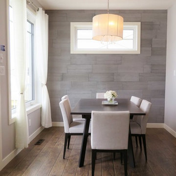
Example of a small minimalist dark wood floor and brown floor kitchen/dining room combo design in Atlanta with beige walls
 Milgard Windows & Doors
The Kiguchi family moved into their Austin, Texas home in 1994. Built in the 1980’s as part of a neighborhood development, they happily raised their family here but longed for something more contemporary. Once they became empty nesters, they decided it was time for a major remodel. After spending many years visiting Austin AIA Home Tours that highlight contemporary residential architecture, they had a lot of ideas and in 2013 were ready to interview architects and get their renovation underway.
The project turned into a major remodel due to an unstable foundation. Architects Ben Arbib and Ed Hughey, of Arbib Hughey Design were hired to solve the structural issue and look for inspiration in the bones of the house, which sat on top of a hillside and was surrounded by great views.
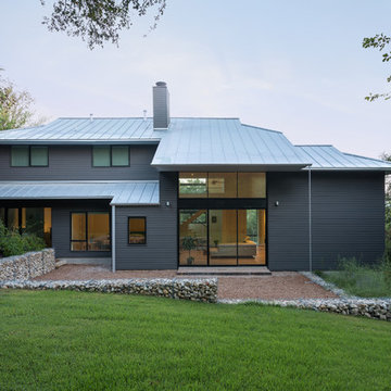
Unfortunately, with the old floor plan, the beautiful views were hidden by small windows that were poorly placed. In order to bring more natural light into the house the window sizes and configurations had to be addressed, all while keeping in mind the homeowners desire for a modern look and feel.
To achieve a more contemporary and sophisticated front of house, a new entry was designed that included removing a two-story bay window and porch. The entrance of the home also became more integrated with the landscape creating a template for new foliage to be planted. Older exterior materials were updated to incorporate a more muted palette of colors with a metal roof, dark grey siding in the back and white stucco in the front. Deep eaves were added over many of the new large windows for clean lines and sun protection.
“Inside it was about opening up the floor plan, expanding the views throughout the house, and updating the material palette to get a modern look that was also warm and inviting,” said Ben from Arbib Hughey Design. “Prior to the remodel, the house had the typical separation of rooms. We removed the walls between them and changed all of the windows to Milgard Thermally Improved Aluminum to connect the inside with the outside. No matter where you are you get nice views and natural light.”
The architects wanted to create some drama, which they accomplished with the window placement and opening up the interior floor plan to an open concept approach. Cabinetry was used to help delineate intimate spaces. To add warmth to an all-white living room, white-washed oak wood floors were installed and pine planks were used around the fireplace. The large windows served as artwork bringing the color of nature into the space.
An octagon shaped, elevated dining room, (named “the turret”), had a big impact on the design of the house. They architects rounded the corners and added larger window openings overlooking a new sunken garden. The great room was also softened by rounding out the corners and that circular theme continued throughout the house, being picked up in skylight wells and kitchen cabinetry. A staircase leading to a catwalk was added and the result was a two-story window wall that flooded the home with natural light.
When asked why Milgard® Thermally Improved Aluminum windows were selected, the architectural team listed many reasons:
1) Aesthetics: “We liked the slim profiles and narrow sightlines. The window frames never get in the way of the view and that was important to us. They also have a very contemporary look that went well with our design.”
2) Options: “We liked that we could get large sliding doors that matched the windows, giving us a very cohesive look and feel throughout the project.”
3) Cost Effective: “Milgard windows are affordable. You get a good product at a good price.”
4) Custom Sizes: “Milgard windows are customizable, which allowed us to get the right window for each location.”
Ready to take on your own traditional to modern home remodeling project? Arbib Hughey Design advises, “Work with a good architect. That means picking a team that is creative, communicative, listens well and is responsive. We think it’s important for an architect to listen to their clients and give them something they want, not something the architect thinks they should have. At the same time you want an architect who is willing and able to think outside the box and offer up design options that you may not have considered. Design is about a lot of back and forth, trying out ideas, getting feedback and trying again.”
The home was completely transformed into a unique, contemporary house perfectly integrated with its site. Internally the home has a natural flow for the occupants and externally it is integrated with the surroundings taking advantage of great natural light. As a side note, it was highly praised as part of the Austin AIA homes tour.
Sponsored
Sunbury, OH

J.Holderby - Renovations
Franklin County's Leading General Contractors - 2X Best of Houzz!
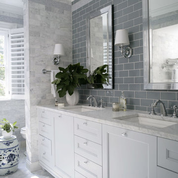
 Heather Garrett Design
A growing family, a rambling Georgian estate. The question: how to imbue tradition with a fresh spirit? The charge was to maintain the idea of old school charm without the interior feeling just… old. An illustration could be found in picture molding (which we added, then painted to disappear into the walls) or a modern plaster sculpture teetering upon an old barrister bookcase. Charm, with a wink.
Photography by John Bessler
 Haven Design and Construction
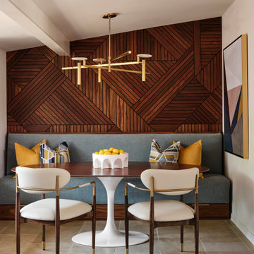
One functional challenge was that the home did not have a pantry. MCM closets were historically smaller than the walk-in closets and pantries of today. So, we printed out the home’s floorplan and began sketching ideas. The breakfast area was quite large, and it backed up to the primary bath on one side and it also adjoined the main hallway. We decided to reconfigure the large breakfast area by making part of it into a new walk-in pantry. This gave us the extra space we needed to create a new main hallway, enough space for a spacious walk-in pantry, and finally, we had enough space remaining in the breakfast area to add a cozy built-in walnut dining bench. Above the new dining bench, we designed and incorporated a geometric walnut accent wall to add warmth and texture.
 Jagoe Homes Inc.
Jagoe Homes, Inc.
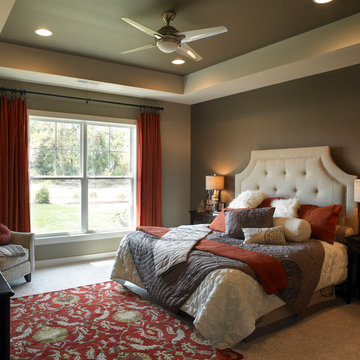
Project: Creekside at Deer Valley, Mulberry Craftsman Model Home.
Location: Owensboro, Kentucky. Elevation: Craftsman-C1, Site Number: CSDV 81.
1