
Search results for "Two toned grey" in Home Design Ideas
 Paper Moon Painting
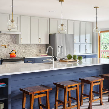
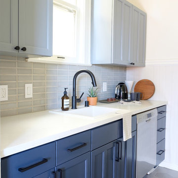
We painted the upper cabinets in Benjamin Moore's "Stonington Gray", and the lowers in Benjamin Moore "Hale Navy", in this updated kitchen in Rollingwood, TX.
 Normandy Remodeling
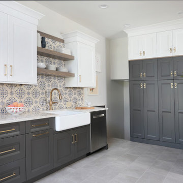
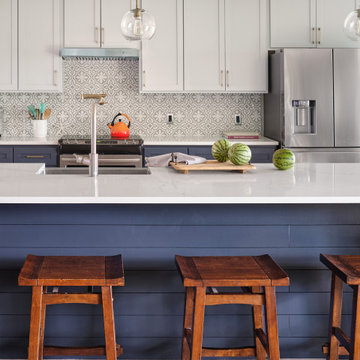
Whimsical floral pattern tile backsplash pulls together the two-toned gray and white cabinetry. The gold faucet dresses up the white apron front sink and compliments the gold hardware on the cabinets. A handy outlet on the end of the peninsula is helpful for plugging in kitchen gadgets and equipment.

 User
UserThis clean profile, streamlined kitchen embodies today's transitional look. The white painted perimeter cabinetry contrasts the grey stained island, while perfectly blending cool and warm tones.
Find the right local pro for your project
 Le Reve Design & Assoc.
John Klycinski
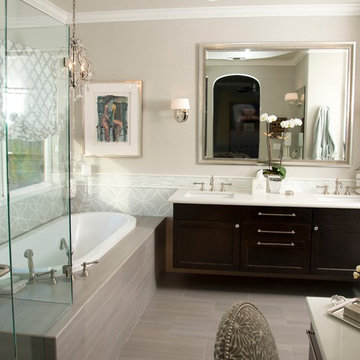
Drop-in bathtub - transitional gray tile drop-in bathtub idea in San Francisco with an undermount sink, shaker cabinets and dark wood cabinets
Drop-in bathtub - transitional gray tile drop-in bathtub idea in San Francisco with an undermount sink, shaker cabinets and dark wood cabinets
 Paper Moon Painting
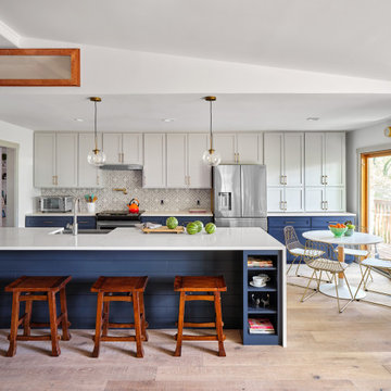
We painted the upper cabinets in Benjamin Moore's "Stonington Gray", and the lowers in Benjamin Moore "Hale Navy", in this updated kitchen in Rollingwood, TX.
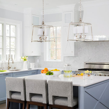
 Laura Fox Interior Design, LLC
Glamorous chef-inspired kitchen with blue and white two-tone cabinets, marble mosaic tile backsplash, and nickel hardware and pendant lights
Photo by Stacy Zarin Goldberg Photography
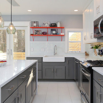
 A&C Kitchens & Baths
Cabinetry provided by A&C Kitchens
Work completed by Bellweather Construction
Kitchen - large transitional l-shaped porcelain tile kitchen idea in Philadelphia with a farmhouse sink, shaker cabinets, white backsplash, glass tile backsplash, gray walls, an island, white cabinets, quartzite countertops and stainless steel appliances
Kitchen - large transitional l-shaped porcelain tile kitchen idea in Philadelphia with a farmhouse sink, shaker cabinets, white backsplash, glass tile backsplash, gray walls, an island, white cabinets, quartzite countertops and stainless steel appliances

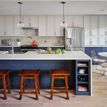 Paper Moon Painting
We painted the upper cabinets in Benjamin Moore's "Stonington Gray", and the lowers in Benjamin Moore "Hale Navy", in this updated kitchen in Rollingwood, TX.
 Fireclay Tile
This refreshed kichen by Gina Rachelle Design shows us how a shorter tile backsplash can make a big difference.
Photos by Max Maloney
Small trendy single-wall ceramic tile and gray floor eat-in kitchen photo in San Francisco with an undermount sink, shaker cabinets, blue cabinets, quartz countertops, gray backsplash, ceramic backsplash, stainless steel appliances, no island and white countertops
Small trendy single-wall ceramic tile and gray floor eat-in kitchen photo in San Francisco with an undermount sink, shaker cabinets, blue cabinets, quartz countertops, gray backsplash, ceramic backsplash, stainless steel appliances, no island and white countertops
 Paper Moon Painting
We painted the upper cabinets in Benjamin Moore's "Stonington Gray", and the lowers in Benjamin Moore "Hale Navy", in this updated kitchen in Rollingwood, TX.
 The Kitchen Place
Dawn T Smith Photography
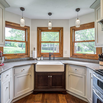
Enclosed kitchen - mid-sized transitional u-shaped medium tone wood floor enclosed kitchen idea in Cincinnati with a farmhouse sink, beaded inset cabinets, gray backsplash, subway tile backsplash, stainless steel appliances, gray cabinets, quartz countertops and no island
Enclosed kitchen - mid-sized transitional u-shaped medium tone wood floor enclosed kitchen idea in Cincinnati with a farmhouse sink, beaded inset cabinets, gray backsplash, subway tile backsplash, stainless steel appliances, gray cabinets, quartz countertops and no island
 Tesi Design, Inc. Interiors and Cabinetry
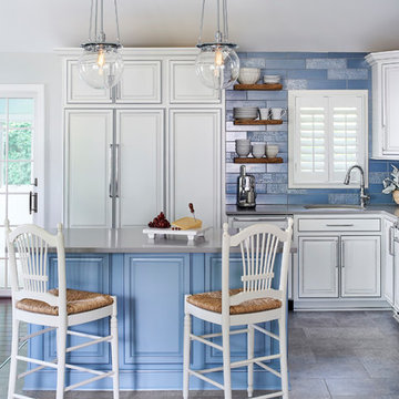
Two-tone raised panel kitchen. White with a blue/grey edge glazing on the perimeter cabinetry and a wedgewood blue on the center island.
Photography: Vic Wahby Photography
 Laura Fox Interior Design, LLC
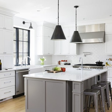
Stunning custom chef's kitchen with white cabinets, gray island, black pendant lights, and marble countertops
Photo by Stacy Zarin Goldberg Photography

 Covered Bridge Cabinetry
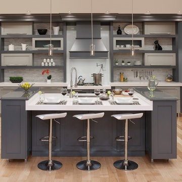
Covered Bridge Cabinetry specializes in the highest qulaity custom kitchen cabinetry. Our extensive line of accessories, details, and embellishments makes it easy to truly make your kitchen one of a kind. This contemporary kitchen features our Farmington door style in a two-toned grey design. The light grey shown is our Driftwood Grey, while the dark grey is Stonehedge. The island also features our Williamson door style in Cameo White. Featuring furniture shelves, angled crown molding, and a chimney wood hood, this kitchen is perfect for the lover of clean lines and modern style. Photography by St. Niell Studio
 DDK Kitchen Design Group
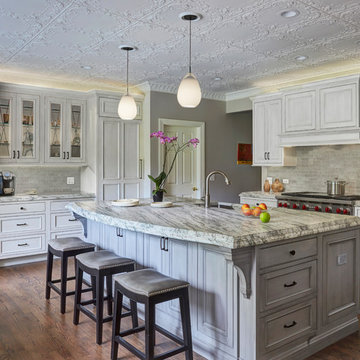
Welcome to this sophisticated kitchen full of grey tones. The perimeter is a soft white with a grey brushstroke while the island is a rich grey with an onyx brushstoke. The contrast is subtle and beautiful. This is a 48" Wolf range and two sub zero tower refrigeration units. One a freezer one a refrigerator. Glass doors cabinets are lit up and show off some family coins treasured by the family.
The butlers pantry shines bright and adds to the elegance of the kitchen. Photographs by Mike Kaskel. Cabinets by Decora Elite

 TKS Design Group
Download our free ebook, Creating the Ideal Kitchen. DOWNLOAD NOW
This client was referred to us from a past client. They are a busy 2-career household with young children and enjoy entertaining friends and family in their home. They have a beautiful open concept home but unfortunately the kitchen was not fitting for the rest of the home. They were not quite sure what to do with the space. We talked about trying to refresh it or do more of a minor remodel, but in the end they decided a full gut would get them to where they wanted to be.
One problem was there was no place for guests to hang out other than the large and awkward banquette area. The brick wall and tiled hood area were feeling a bit dated and tired. The space was just not functional for their lifestyle. There was no prep space near the cooktop and no landing area for items coming out of the ovens or refrigerator, plus a big dead zone in the center of the room.
Banquettes, like the one they previously had in the space, are great for small spaces, but when they get really large like this one, it makes getting in and out of the seating area awkward and uncomfortable. Plus, there was room for a large table, so we eliminated the awkward built in.
We started by removing the faux brick wall between the kitchen and back entry. We relocated the entry to the garage over a couple feet in order to get every last inch out of the new kitchen. We also made the decision to close up the primary window that faced the pretty ho hum brick wall of the neighbor’s house. There was plenty of light coming in from the seating area, so we just didn’t feel the window was adding much to the room.
Construction went smoothy. There was a bit of rework with electrical, flooring and HVAC, but in the end, we think it was well worth it.
The clients really wanted a sleek contemporary look, and we originally had planned for a full height slab backsplash, but due to it’s size, it was a budget buster. Instead, we got creative and settled on large format porcelain tiles that have a similar feel but were a fraction of the cost. We made sure the wall was plumb and level so that the fit and finish would mimic that of slab material.
The final space was quite a change. A large prep sink sits directly across from the new pro-style range with plenty additional prep space on the large island. The refrigerator and ovens now have miles of landing space, and a nice tight work triangle makes cooking a breeze.
Since we wanted a more contemporary feel, not many wall cabinets were included. Instead, we outfitted some of the drawers for dish storage with a peg system. Two large pantries flanking the refrigerator hold baking supplies and small appliances. Large drawers by the cooktop hold pots and pans, and an appliance garage tucked away to the left of the range hides away miscellaneous items. The large island also houses a microwave drawer and tons of storage, most of which is drawers offering maximum convenience.
The island now seats 5-6 people comfortably along with the new table in the seating area which can seat up to 8. Entertaining will be a breeze in this space. With such a clean backdrop, we knew we would need some drama with the lighting, so we chose two sets of staggered pendants, which we adjusted for the right visual balance above the island.
We also included a small coffee station to the right of the main kitchen, which helps keep the coffee clutter out of the kitchen proper. Two tones of complimentary gray are featured in this kitchen. The perimeter is a light gray that reads almost white. The island is a gray stain that adds some depth and interest with the visible wood texture. The countertops are clean white quartz, and the hardware, barstools and light fixtures add warm brass tones. I see lots of cooking and entertaining with family and friends in the near future in this bright and airy new space.
Designed by: Susan Klimala, CKD, CBD
Photography by: Michael Kaskel
For more information on kitchen and bath design ideas go to: www.kitchenstudio-ge.com
 Kitchen Solvers of Columbus
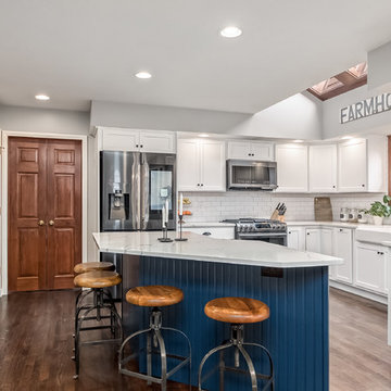
Kitchen remodeling project where the homeowners elected to upgrade their kitchen to a more transitional look by refacing their existing cabinets. They went with a two-tone color look by refacing the island cabinets in a navy bead board panel and shaker doors while the rest of the kitchen was done in a shaker pilot white. We next installed a Quartz Statuary Classique countertop and a White Subway with Pearl Grey Grout backsplash. We also created a beautiful and functional bar area with custom floating shelves and backsplash all the way to the ceiling. To finish the new look we also installed a new farm sink and 1” cove molding.
 Melissa Hill Home Design
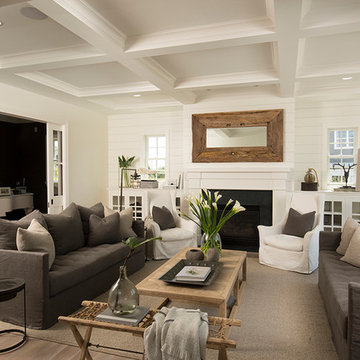
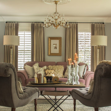
An enchanting mix of rustic and elegant elements, We designed this room around the beautiful pictures that ornament its’ walls. Each photo has a deep meaning for our client, who photographed them while on a trip to New York City with her father. It was there that she was shown the place her parents fell in love: the steps where they would talk for hours, where they first saw each other and experienced that sacred “love at first sight moment”. Inspired by these photos we filtered them in a beautifully sentimental sepia tone. We custom framed these images in thick gold and they became our vision for the room. Following the color ways of the photos, the room carries deep gray and brown tones as well as a pop of purple color with the sofa. Throughout the room we incorporated various finishes of wood, antique brass, lacquer and iron to establish a stunning contrast that became cohesive. We mixed luxurious elements, like the white lacquer candleholders, golden bookends and black chalices atop the more rustic unfinished wooden table to create a beautiful display. The pillows decorating the sofa mixed both textures and finishes from sheen to matte in keeping with the theme of different style elements becoming harmonious. In the two front corners rest chairs of a deeper gray, with a luxe brown throw and golden pillow that further enrich the sepia-tone feel of the photographs. Each element was carefully designed with these photos in mind, to evoke the nostalgic feeling of the images and provide our client and her family a place in which they can relax, reminisce and truly enjoy their time with one another.
Custom designed by Hartley and Hill Design. All materials and furnishings in this space are available through Hartley and Hill Design. www.hartleyandhilldesign.com 888-639-0639
 Kitchen Land
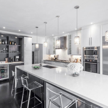
Contemporary Kitchen Design | White Glazed Slab and Grey Matte finish doors by Luxor | Caesarstone Quartz waterfall countertop | Grey Slate Hardwood Floors | Designed by Pat Noddle
 Designing First Impressions
Nadia Gottfried
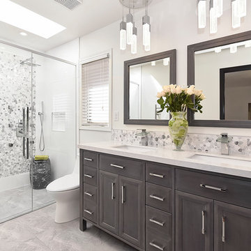
Double shower - contemporary master gray tile and pebble tile porcelain tile double shower idea in Calgary with recessed-panel cabinets, white walls, marble countertops and an undermount sink
Double shower - contemporary master gray tile and pebble tile porcelain tile double shower idea in Calgary with recessed-panel cabinets, white walls, marble countertops and an undermount sink
1