Software
Houzz Logo Print
fratantonilifestyles

What do you think?

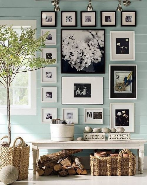
Do you think that overdoing picture frames can take away from the home? I'm thinking of incorporating this vibe in a new home and don't know if it looks to busy. Please give your input!

Comments (40)

  • 12 years ago
    i like it. most importantly, do you like it?
    Fratantoni Lifestyles thanked sarainitaly
  • PRO
    12 years ago
    I think it would add a great touch!
  • 12 years ago
    I love it. wouldn't change a thing!
    Fratantoni Lifestyles thanked vtxred
  • 12 years ago
    At the risk of being too blunt, I think this trend is getting old. If you are suggesting it for a client, I'd be a little hesitant as you might risk be viewed at not being innovative or fresh - unless you come up with a new twist or take on it. If it is for your own home, have at it.
    Fratantoni Lifestyles thanked bennnie
  • PRO
    12 years ago
    Thank you both for your input!
  • 12 years ago
    last modified: 12 years ago
    bennnie- I am proficient in *blunt*ese. It is my first language;))
  • 12 years ago
    Again at the risk of being blunt, if you do suggest for a client, I would consider running the white frames on the top and the black frames down the side, as it currently looks a little unbalanced. But I'm just an over-opinionated but well meaning home owner and not a professional, so take my thoughts with a grain of salt.
  • 12 years ago
    margo - lol - I'm a little too proficient at it at times - as my Southern friends tell me.
    Fratantoni Lifestyles thanked bennnie
  • 12 years ago
    last modified: 12 years ago
    Fratantoni Lifestyles....I'm always a bit confused by your "dilemmas" and "polls"?
    You post so often, and I can never tell if these are your real designs or real "dilemmas" or are they ALL just images taken from other sites around the internet?

    http://seapavaa.org/outstanding-tips-to-remember-valuable-retro-moment-with-lovely-photograph/beautiful-ideas-for-decorating-photos-frame-on-blu-wall/
    Fratantoni Lifestyles thanked bubbasgma
  • Fratantoni Lifestyles thanked sarainitaly
  • 12 years ago
    I like it if done correctly, but very rarely have I actually seen it done correctly. I do like the example above, but most attempts on Houzz are dismal failures.
    Fratantoni Lifestyles thanked User
  • PRO
    12 years ago
    Those are beautiful thank you, and thank you for the advice!
  • 12 years ago
    I agree with bennnie's bluntness (the 2nd one) that the dark frames should be on the lower side and the white ones near the top.
    Fratantoni Lifestyles thanked Patricia Pelgrims
  • 12 years ago
    Huh?
    Fratantoni Lifestyles thanked bubbasgma
  • PRO
    12 years ago
    For this piece, I'm trying to incorporate the look in a home. The image was taken from another site to give an example of what I was thinking of doing. Thank You
  • 12 years ago
    I like the idea of a gallery wall if other areas of the home are more restrained. I plan to incorporate one myself in a dining area to help section off the space and keep the eye moving around my open space.
    Fratantoni Lifestyles thanked lucindanyc
  • 12 years ago
    I would remove the top row-don't like it higher than window frame.
    Fratantoni Lifestyles thanked bgfuqua
  • 12 years ago
    last modified: 12 years ago
    Like the look, but would cater it to the dimensions of the wall area, as well as where it is in the house. Too much for a bedroom, but great for a hall or den, etc. Good for a large wall in an open space that needs filling.
    Fratantoni Lifestyles thanked Maureen
  • 12 years ago
    Never a take away if done right with taste and moderation
    Fratantoni Lifestyles thanked Geneviève
  • 12 years ago
    Do the clients have a lot of art/photos they want to display? Or would you be supplying all of the arwork? I think it's a great solution for people who want to display a lot of photos and matting/framing them all the same or in a very similar way (like in your inspiration photo) keeps it cohesive and uncluttered. I'm not sure how I feel about it if it's just art that you pick out for them.
    Fratantoni Lifestyles thanked Becky Harris
  • PRO
    12 years ago
    are you thinking of using track lighting to highlight the frames as used in the picture you've featured? If so you may want to put a lot of consideration in the pieces that go into the frames as this type of lighting tends to highlight the artwork considerably once installed. Good luck, we love this trend!
  • PRO
    12 years ago
    We were thinking of changing the clients photos to all being black and white so it is not distracting. Any thoughts? and yes we want to keep the frames with a border to make them pop!
  • PRO
    12 years ago
    I like the cluttered look when there's a bit less organization, though this style is a bit more well suited to a home with a modern style.
    Fratantoni Lifestyles thanked Dawson & Clinton
  • PRO
    12 years ago
    I agree! Thank you
  • 12 years ago
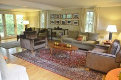
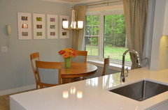
    My photo walls - apologies for not having them be closeups -- all photos are pictures taken by me during my travels.
  • 12 years ago
    I would not mix and match frame colors unless ALL of the frames were different in an interesting way. If it is a collected frame wall I would use larger mats, smaller pix, and all black and white photos. For my white framed wall I picked the most colorful pictures I had of tropical plants and flowers and they really pop.
  • PRO
    12 years ago
    I would change the grid a little and make an uneven pattern following the lines if the window though and you feel like there is overload.
    When you use a bench make sure you dont lean against the paintings nor fill it with stuff it makes no sense. The bench should be functional.
    Fratantoni Lifestyles thanked Adriana van de Pol
  • PRO
    12 years ago
    Great idea, but poorly executed. All frames in this installation should match in color but not necessarily in style. The layout is not good and could have been installed in a more pleasing manner. Proceed cautiously.
    Fratantoni Lifestyles thanked Gray & Walter, Ltd.
  • PRO
    12 years ago
    I like the idea of displaying arts of work with pictures. What I don't like is all the matching small frames in a row of nothing pictures. I also feel the frames need to be unaligned. This gives it a fun feeling. As to if it were aligned it gives the eyes the feeling it needs to follow the organization and look at everything at the same time, this is overwhelming therefore boring and you become uninterested. Other then this I like the idea but there a variety of way to play with this.
    Fratantoni Lifestyles thanked Pfuner Design - Miami Interior Designers
  • PRO
    12 years ago
    Okay, thank you for your input!
  • PRO
    12 years ago
    I'd just be careful on making sure all the pictures are level - if you are going to do a row of same size like on the image (top row). They look a bit uneven in the photo you posted.
    Fratantoni Lifestyles thanked Pacific Design Group
  • PRO
    12 years ago
    I completely agree with what you are saying! Thank you!
  • PRO
    12 years ago
    I love the idea of displaying lots of frames. Painters tapes is a great way to lay them out of the wall before putting the nails in the wall.
    Fratantoni Lifestyles thanked Bassett Home Furnishings of Fayetteville, AR
  • PRO
    12 years ago
    last modified: 12 years ago
    For what it's worth... IMHO the randomness of the sizes and shapes makes it less favorable... unless used in a very informal or casual setting.

    But that's most likely because by the nature of my business... symmetry, lines, precise angles, balance, etc. are my comfort zone,
    The slight irregularities tend to "jump out" at me... and NO... I'm not suffering OCB... lol (Hopefully)
    Fratantoni Lifestyles thanked Select Hardwood Floor Co.
  • PRO
    12 years ago
    It look perfect, I like it :)
    Fratantoni Lifestyles thanked 123 Remodeling Inc.
  • PRO
    12 years ago
    Thank you for all your comments!
  • 12 years ago
    It's too busy and cluttered for my taste. This is a good solution for those who have a bunch of little pictures they wish to display. Depending on the arrangement, it can give a casual vibe, like "Make yourself at home. You can make a mess, 'cause it's a mess already!" or it can look like a modern art gallery, especially if the frames are minimal, matching, and laid out on a grid or in a line. I get more of the casual sense from the photo you showed. My preference (for pictures, plants, doodads on display) is for one big good one rather than many little ones.
    Fratantoni Lifestyles thanked stryker
  • 12 years ago
    last modified: 12 years ago
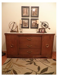
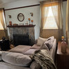
    Personally I like it. The key to making this look great without too much visual cacophony is to have the frames all the "same", either in frame style or in color. Also it helps to solidify the look when the images are all in black and white. Color photos are beautiful too but if you want a 'cleaner' look, do black and white or sepia tone, depending on your design aesthetic. Here's a pic of photo I took. They were all color photos but I printed them in sepia tone to relate to other colors in the room, and framed them in the same frames. Just an idea....... (Sorry this picture isn't very clear....hope you get the basic idea. Click on it to see the entire photo. The thumbnail here has cropped off the top.)
  • 12 years ago
    This is a gorgeous vignette. I'm totally going to bookmark this picture!