Software
Houzz Logo Print
hzdeleted_15492741

Kitchen Open on the living room?

12 years ago
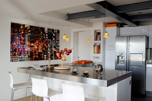
Between an open kitchen and loft living space in this house.

Comments (35)

  • PRO
    12 years ago
    Not sure why there is a question mark in the title as this looks to be a finished project.
  • PRO
    12 years ago
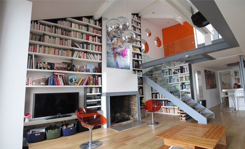
    Very interesting. I like the concept. What are the two random chairs in the living room? One in front of the tv and one in front of the fireplace, they completely serve no function. Other than that everything looks good. Was this your work?
    User thanked SoCal Contractor
  • PRO
    12 years ago
    thank you yes that's our job. chairs are waiste offices located in Paris flea market and restored
  • 12 years ago
    Are upper cabinets by the peninsula still acceptable style?
    User thanked boons13
  • 12 years ago
    last modified: 12 years ago
    Beautiful !
    User thanked grobby
  • PRO
    12 years ago
    merci….
  • 12 years ago
    Love it!
    User thanked Lisa W
  • PRO
    12 years ago
    thank's lisa
  • 12 years ago
    Very kinetic. Would like to see a picture of the living room taken from behind the island counter - is there a couch or upholstered chairs to soften things and give the eye a rest?
    User thanked zweiback
  • 12 years ago
    too busy!! didnt know u had a tv or a fireplace..looks like a big pantry off kitchen or a library with a kitchen and orange doesnt allow the mind or eye to rest.. too many books ..no time to rest!!
  • PRO
    12 years ago
    thank you for your comment we see that you are a true connoisseur.
  • 12 years ago
    Very nice! Loved the colors
    User thanked jazliz
  • 12 years ago
    Good inspiration - I have a kitchen to update with the loft up above, the vaulted ceilings and the beams - thank you so much for sharing this.
    User thanked mcobley
  • 12 years ago
    last modified: 12 years ago
    My first impression of this area Wow...however, I also think that this is a "guys pad" It gives me the feeling of "cold" (no! not because its a guys pad) because as I look around I see that you have stainless counter tops, white cabinets, white chairs with metal bottoms, and a stainless fridge at the back of this (all cold items) and wonderful but I think it can look very hospital and antiseptic if you don't balance it with some warm items.
    I have 4 suggestions..not all may be an option but they are suggestions meant to help...and if you didn't expect feedback you wouldn't have posted this right?

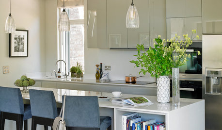
    1. perhaps the addition of textured fabric placemats and napkins on the island...... why not pull the green that is in the art work onto the counter by adding a bowl of granny smith apples (or lemons) in a dark wood bowl the place where you have the red tray. I have difficulty seeing the coffee cups as they blend into the counter...and they are great cups. Its also difficult to see the item to the right of the cups...what is that by the way?

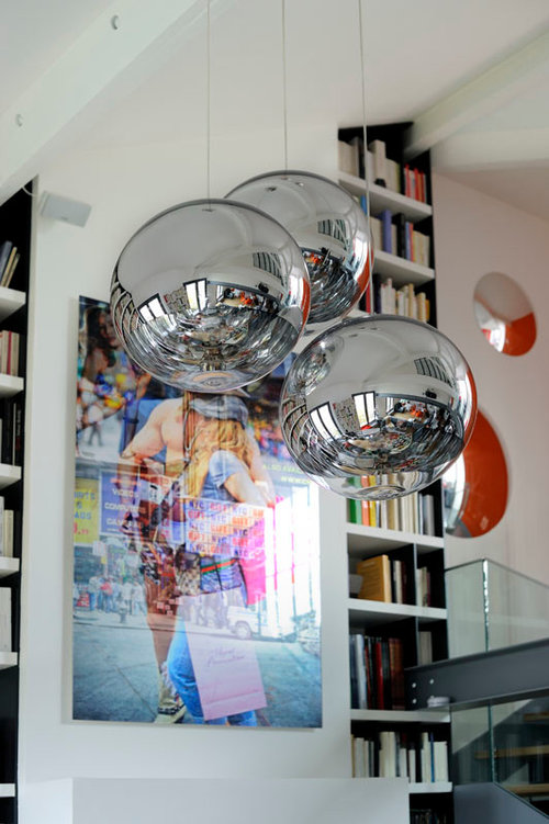
    2. The pendant lights are too small for this large are throwing it off scale. I think three larger ones would have worked better . An economical solution is to change the shades...Ive seen slated rectangular wood shades at Menards!! yes, it tends to lend itself to the Asian inspiration..it will still work in this space without looking as if your decor is totally Asian...this is obviously modern/contemporary but the wood will help warm this up...teak color will work if its all you can find as a start

    3. There appears to be a lot of "stuff" on the island and it is a visual distraction when I view in conjunction with the art work....which you can change to a subject matter not a busy...then the counter tops won't appear "messy" or cluttered even though they are not messy in this picture...I guess it is how you live...do you always put stuff away or leave stuff on counters? If you have children...stuff is usually out

    4. Personally, I like the chairs...but when put together with the items such as the white walls, cabinets, and stainless it gives me the feeling of being cold. It chases me away from that area..If its a reasonable option try wood chairs...or chairs just with leather on the seats...the economical option-- use a colored throw over one of the chairs

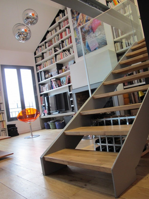
    I love the glass banister but its blends in with the gray sides...perhaps a darker color?

    What about adding an area rug to ground this space? The book shelves are a great feature but they are loaded with many books...perhaps adding objects instead of ALL books may make it appear less busy? I do not posses the education that you have in architecture and design, so I welcome your feedback on my thoughts.
    User thanked mcr1288
  • PRO
    12 years ago
    Very elegant modern kitchen I love it
    User thanked Anoshka
  • 12 years ago
    I love the kitchen. I cannot see the photo of the 2 chairs but have to say from my perspective, one in front of the TV and one in front of the fireplace is perfect!:)
    User thanked higgles
  • 12 years ago
    And your company sits where?? No warmth. needs a modern couch or davenport.
    User thanked Çarol Pehrson
  • PRO
    12 years ago
    hello and thank you to follow our company we work throughout the world. Our showrooms are located in Paris, London and Madrid.
  • 12 years ago
    Love the fruit stand, too
    User thanked User
  • PRO
    12 years ago
    Diyer59 on the contrary we should be listening to the more than others thank you for your comments
  • 12 years ago
    very gracious Atelier HR... very gracious :)
  • 12 years ago
    last modified: 12 years ago
    Atelier Hr I'm sorry, I don't understand the answer you've given to my question. What exactly are you asking for in this post or is this an advertisement for a company you are associated with?

    I didn't think this space was for advertisements, rather for DIYers who have questions regarding what they are working on.
  • PRO
    12 years ago
    Great space...what material did you use for the countertop in the kitchen?
  • 12 years ago
    the books bring great appeal too.
    User thanked senab
  • 12 years ago
    Diyer59, maybe it's a matter of " loss in translation?"
  • PRO
    12 years ago
    dyer do not think that's better.
  • PRO
    12 years ago
    you prefer open or closed kitchen to the living room ?
  • 12 years ago
    Nice work! Overall design is very fresh. May I ask about the floating stairs? They appear to be a construction 2 x 12 with a blonde stain and varnish; is that correct?
    User thanked timmytwister
  • 12 years ago
    I am a female. I love everything about the space. I could totally live there. It feels fun & full of energy!
    User thanked K
  • 12 years ago
    Thank you for the charcoal colored ceiling posts. Mine are white which I have not quite liked. Black seemed too harsh. Now I have the right color at last. I never would have thought of that color!
    User thanked K
  • 12 years ago
    Beutiful concept
    User thanked vanjar
  • PRO
    12 years ago
    That countertop is great and matches well with the kitchen. Looks like a nice place to have a small party with friends or family.
    User thanked 123 Remodeling Inc.
  • 12 years ago
    Amazing space. Great job!
    User thanked tahitianmoon
  • 12 years ago
    Seems to me I've seen this posted before.