

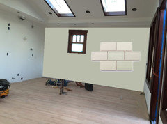
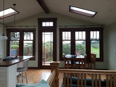
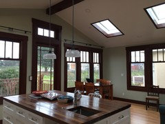
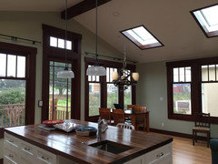
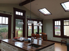
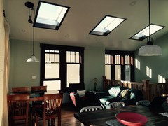
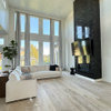
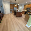
1920 Craftsman - PLEASE help with Paint Color for Kitchen/Sitting Area
11 years ago
last modified: 11 years ago
Featured Answer
Sort by:Oldest
Comments (13)
Related Professionals
Monroe Interior Designers & Decorators · Williamsburg Interior Designers & Decorators · Danbury Interior Designers & Decorators · Muncie Interior Designers & Decorators · Elmira Interior Designers & Decorators · Montrose Interior Designers & Decorators · Bloomington Architects & Building Designers · Plainfield Architects & Building Designers · Bozeman Architects & Building Designers · Kansas City Kitchen & Bathroom Designers · Mason City Kitchen & Bathroom Designers · Sioux City Kitchen & Bathroom Designers · Grand Rapids Kitchen & Bathroom Designers · Platteville Kitchen & Bathroom Designers · Great Falls Kitchen & Bathroom Designers 11 years agolast modified: 11 years ago
 11 years ago
 11 years ago
- 11 years agolast modified: 11 years ago
- 11 years ago
 11 years ago
- 11 years ago
- 11 years ago



Related Stories
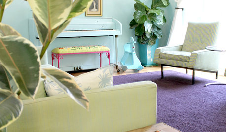
HOUZZ TOURSMy Houzz: Saturated Colors Help a 1920s Fixer-Upper Flourish
Bright paint and cheerful patterns give this Spanish-style Los Angeles home a thriving new personality
Full Story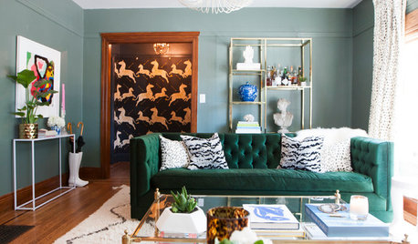
MY HOUZZMy Houzz: Patterns Perk Up a 1920s Craftsman in Berkeley
Before and After: See how layered patterns, contemporary wallpaper and color accents add punch to this California home
Full Story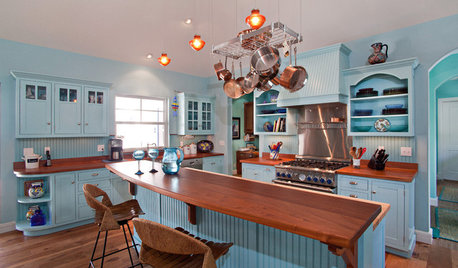
KITCHEN DESIGNHere's Help for Your Next Appliance Shopping Trip
It may be time to think about your appliances in a new way. These guides can help you set up your kitchen for how you like to cook
Full Story
COLORPick-a-Paint Help: How to Create a Whole-House Color Palette
Don't be daunted. With these strategies, building a cohesive palette for your entire home is less difficult than it seems
Full Story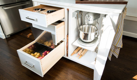
KITCHEN OF THE WEEKKitchen of the Week: Storage Galore in a 1920s Colonial
Pullouts, slots, special drawers and more — this customized kitchen packs in plenty of organizing solutions
Full Story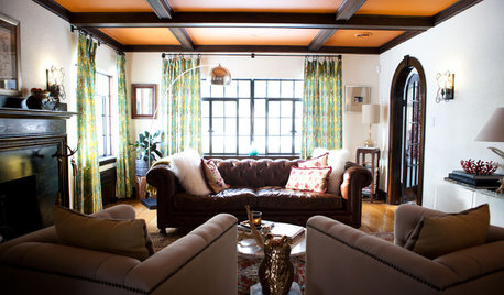
HOUZZ TOURSMy Houzz: Antiques Mingle With Modern Style in a 1920s Tudor
See how careful curating and a strong vision turned an empty New England home into an eclectic sight to behold
Full Story
CRAFTSMAN DESIGNMy Houzz: Creative Color in a Seattle Craftsman
A pleasing paint palette, fold-out windows and room for art let a small home live large
Full Story
KITCHEN DESIGNDesign Dilemma: My Kitchen Needs Help!
See how you can update a kitchen with new countertops, light fixtures, paint and hardware
Full Story
HOUZZ TOURSMy Houzz: Light and Airy 1920s Seattle Apartment
Bright walls, warm woods, 'eclectic ancestor' style and lots of natural light mark this 1920s apartment
Full Story
KITCHEN DESIGNKitchen of the Week: Warming Trend in a 1920s Georgian
Renovation creates a formal yet functional and relaxed hub for entertaining — and takes care of the insulation problem
Full Story

lucindalane