Software
Houzz Logo Print
kchap71

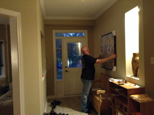
Picture too big for front entry.

11 years ago
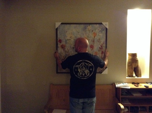
Hi, I am hoping to get some advice on our front entry.

I am planning on staining our front bench a walnut colour and am looking for a picture to place above it. I purchased a 3'x3' picture today, but I'm thinking it is too large. I LOVE the picture itself however as It really warms up the space.

The width of the hallway is 6' feet and approx 10' long. I was hoping I might get some advice on 1) what size of art should I place above the bench 2) what size of rug should I look for?

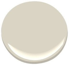
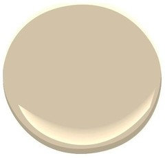
Also, the entire main level of our 2 storey house is painted BM Shaker Beige, but I'm finding it a very dark Color if there is no sunlight. Should I change the color of the front hallway? Any suggestions?

Comments (24)

  • PRO
    11 years ago
    the painting is great...just hang it a little higher on the wall......You also might want to move the bench and the picture over closer to the door......

    Since you feel that the paint color is too dark, try painting it two shade lighter of the same paint........
    kchap71 thanked Lampert Dias Architects, Inc.
  • 11 years ago
    I'm a firm believer in procuring art for love and not for décor. If you love it, keep it. Honestly the size is fine, it could be wider to fit the width of the bench but the narrow length of the room, it will not be noticeable--the picture however will be.
    I would oversize your rug 5x8 to create an illusion of space and to add warmth. I would suggest a muted rug to counterbalance your art pieces. I would clean up the hallway and perhaps remove the extra shelving units. if you need storage a small demi-lune or console table with baskets at the bottom. best of luck!

    [houzz=
    Warmington North · More Info
    ]
    kchap71 thanked Clay Aragon
  • 11 years ago
    @karemore55 beat me to it! exactly what she said is what I wanted to say ;-)
  • 11 years ago
    Karemore55 - by coordinating color for the inside of the door/sidelight what would you suggest?
  • 11 years ago
    It depends on what other colors you have in your home. Would charcoal or gray work? Or moss green? Blue-gray? Bright yellow?

    It just looks like you have an opportunity to make some more impact in that entryway:)
  • 11 years ago
    How about adding some lighting to the hall area, sconces or a ceiling fixture?
  • 11 years ago
    Karemore55-I really like that idea. Thanks!

    Freeadvice- we do need to upgrade the lighting in that area. Any suggestions for a fixture? Also, in general what type of lighting is suggested ie type of light bulbs ?
  • 10 years ago

    Hi! I am ordering a rug this weekend from Birch Lane and having it shipped to Canada, but I'm struggling with one thing. Our front entry is appox 6.3 ft wide and you can see what it approx. looks like above. I am debating between a rug with a border or a rug without a border. I'm not sure which would visually make the space look larger..

    I'm also struggling with Color - I really want a rug to brighten up the space. I will be painting the entry a lighter color and adding a console, shoe storage and seating. Thoughts?


    http://www.birchlane.com/Birch-Lane-Suzanne-Rug-BL4458.html

    http://www.birchlane.com/Birch-Lane-Marnie-Rug-BL3756.html

    http://www.birchlane.com/Birch-Lane-Bandhura-Rug-BL7355.html

    http://www.birchlane.com/Birch-Lane-Ava-Rug-Brick-BL3808.html


    As you can tell I'm still very undecided. Living in Ottawa Canada I would like to go wool to withstand our winters, and it will get wet, dirty etc. with winter boots etc. I worry and indoor/outdoor rug won't give the warmth I want in the look nor the comfort underfoot.


  • PRO
    10 years ago
    I LOVE the red zig zag rug!!! So fun!!
    kchap71 thanked Missi Smith Design Co.
  • 10 years ago

    Did you end up hanging the picture from your original post? If so, I think the red zig-zag rug would be really cute...

  • 10 years ago

    Thank you Missy! Do you think a more solid looking / no border rug would make the space appear larger?

  • 10 years ago

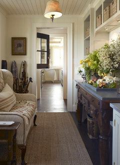
    Tgb1 - I did but it's now on loan to my sister as she is selling her house. Instead of that painting I will likely find a small print and add to the top of a console I hope to buy once the rug is in place. I'd like the space to be warm and homey. A similar feel to the pic clay posted above but with a bit more colour.

  • 10 years ago
    I'm not sure if anyone is still here, but we are getting around to painting our front entry, main hall, stairwell and upstairs hallway. Changing it from Shaker Beige which I find too dark to BMO Muslin. Does anyone have experience with that Color?? I was reading back in this thread and Navajo white was recommended which is quite a bit darker than the Muslin. Thoughts???
  • 10 years ago
    I like the Navajo white that karemore suggested earlier, so I would think your lighter color would work. I agree that what u have currently is too dark.
  • 10 years ago
    I once painted my den BMoore Muslin, and thought it looked quite blah - kind of like builder beige. So I definitely don't recommend that one!
  • 10 years ago

    karemore55 - Would you still recommend Ben Moore Navajo White for the front entry if we took that color all through our downstairs hallway, up the stairs to the 2nd level and the upper hallway?

    The only other color on the main level would be Shaker Beige. On the 2nd level BM Edgecomb Grey in both bathrooms and office. Shaker Beige in our bedroom. Girls rooms are purple and yellow and I won't be trying to coordinate with those :o)

  • 10 years ago
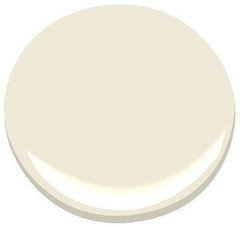
    Kchap, Yes, I think Navajo White would be the perfect neutral for the stairways and hall......these are typically darker areas of the house, and it will be light enough to up without being a true white. It also looks very pretty with the Shaker Beige and Edgecomb Gray. They all have green undertones, which is why they get along so well.

    As for the kids' rooms.....they are entities unto themselves, aren't they? So, yes, best to just ignore - they'll probably end up being different color in a few years anyway!

    Here are your two current color with Navajo White in between - very nice!
  • 10 years ago

    karemore55 - I've looked at some pictures online and in some of them the color Navajo White appears to have a yellow tone to it. As we are a two storey we have very little natural light in the hallway upstairs and downstairs and the front hall gets filtered light in the AM only. In your experience would this color appear more yellow or more creamy? I'd ideally like a creamy color to come through.

  • 10 years ago

    Go Navajo White - it has worked in all three places I have lived. Always gets compliments. Love the large picture! Good luck.

  • 10 years ago
    Good morning, kchap! I have never used Navajo White, so I'm only guessing here....but, with little natural light you'd probably see more of the color's undertones. I'm sure you've looked at the paint strip, and you see how the darker colors on the strip are in the yellow-green range? So, I wouldn't expect to see yellow or ivory tones - but colors are tricky! In fact, I just painted a bathroom Ben Moore Moonshine, and at times it looks icy blue to me - which I'm fine with, but I was surprised.

    I almost used Navajo White on the main walls of my current home, but opted to go even whiter and used Mascarpone instead. But, you have a comment from vacationlovingmom singing its praises, so if it was me I'd bite the bucket and go for it!

    And, if you do, please PLEASE post your after pics as I will be dying to see how it looks - and most importantly, whether you are happy with it!
  • 10 years ago
    That should have read bite the bullet - not bucket. Lol
  • 10 years ago

    btw.. if anyone wants to chime in on my bathroom reno - please do!! Any inspiration or guidance would be appreciated. [https://www.houzz.com/discussions/main-bathroom-reno-need-urgent-advice-dsvw-vd~3504919[(https://www.houzz.com/discussions/main-bathroom-reno-need-urgent-advice-dsvw-vd~3504919)


  • 4 years ago
    last modified: 4 years ago

    I don't think your art work shone above is too big! It looks nice. Also, painting your bench placed below your art will give the bench a much more rich and modern look. I think a walnut color door with pale gray walls would look good and give it a more stand out modern look. Also, if you paint the walls a light cream beige and paint the front door a color called Weimaraner by Bingaman Moore it would contrast and look awesome with the dark walnut bench. Just a couple paint colors you might look at and see if you would like the look of the of either mentioned. If your shelving unit is real wood I would stain that darker too.