Software
Houzz Logo Print
alsad

Help with dining room needed!

11 years ago
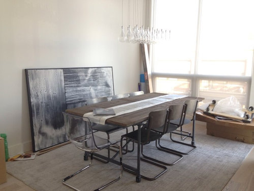
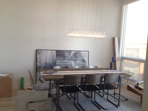
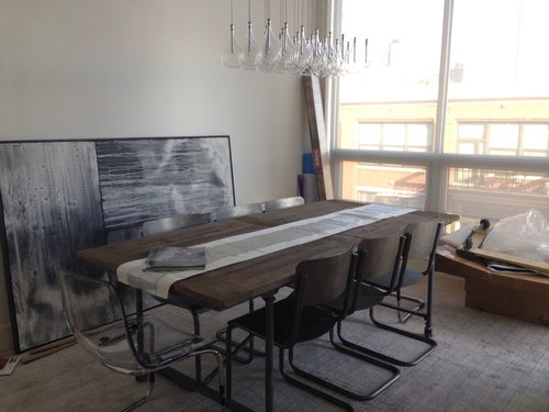
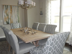
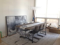
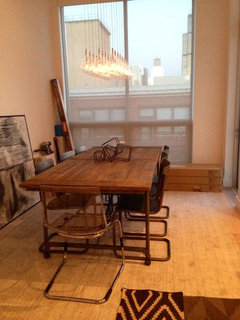
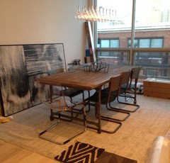
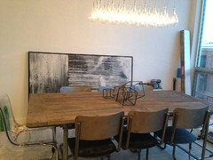
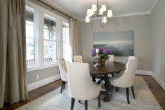
Hi everyone! I am decorating my dining area and would love some advice on fine tuning, wall color etc. we are thinking of painting the wall the painting is against a medium grey. Do you guys think the painting works and is big enough?? Does the rug work?

Comments (41)

  • 11 years ago
    Also wanted to mention that we have sheer window treatments already bc we didn't want to block the view (they are actually down in the pics I sent)
  • 11 years ago
    I love it
  • 11 years ago
    Those chairs look like a tight fit for 3 people on each side. I like your painting but it looks bigger than the table? I think your table need to be bigger to balance with the painting and comfortably seat 6 + 2 on the ends.

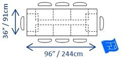
    I think you need to plan on 24 inches per person so 24 x 3 = 72 inch long table. Width should be a minimum of 36 but more is better. Then to add a person at each end calls for an even longer table. What are the dimensions of your table?
  • PRO
    11 years ago
    I like the wall color the way it looks now. It looks light and airy. Love the over sized artwork and rug as well.
  • 11 years ago
    Love what you have going on. I would put some samples up of the different paint colors to see how they work with the painting. The color you have on the wall now looks really good with the painting, table, chairs, chandelier, and rug.
  • 11 years ago
    Love your choices so far! To bring in a contrasting color that will show off the beautiful art and define the dining area, consider wallpaper or grass cloth in moulding as a backdrop for the painting. I would love to see what other colors you have in your home.
    Greenwich · More Info
  • PRO
    11 years ago
    last modified: 11 years ago
    First, consider what you want to emphasize. You have wonderfully high ceilings, and the white wall color deemphasizes that. Second, consider overall palette. I am guessing that you are intent on preserving a neutral palette. I do not see you painting that wall red and feeling comfortable in that space. So, my first suggestion would be to consider a pale mustard yellow. Mustard and grey compliment each other well. Second suggestion would be to stick with your idea of grey, but do not go too light. Get a rich, warm grey and go darker than you would normally think, and that will increase the drama of the high ceilings. The painting (lovely) will really stand out on the wall.
  • 11 years ago
    I think it looks amazing! I like what Leslie suggested - a dark dark blue grey. great job!
  • PRO
    11 years ago
    what are you, if anything, doing with the window.. and what is happening on the other walls?
  • 11 years ago
    Thank you for the comments and suggestions! The table is 84 by 39 inches and while we would've wanted a longer table we had to go with a table that didn't overcrowd the space but still fit 8 people.

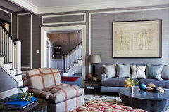
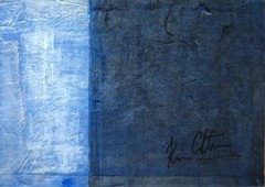
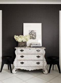
    I know some of you commented on the paint color looking good as is.. There is just a flat white on the walls right now but the shadows make it look like there's color on the wall. While some of you are spot on about me not wanting to waver from a neutral color scheme, I do worry about the space looking cold and uninviting.. While we love the contemporary light floors throughout they are a design challenge! The other option I have is not doing this painting but adding a pop of color with an indigo art piece (see pic for example). Would love to hear people's thoughts on whether I should stay neutral and stick it out until accessories etc add the homey feeling I'm craving or swap out the painting for some color?
  • 11 years ago
    I think your room looks fab!!
    great choice for the table and chairs and the light fixture and that wonderful piece of art.
    I love the muted colour scheme as it suits the style/design I believe you are trying to attain..
    Yeah, it works :-)
  • 11 years ago
    It looks lovely. I think you should remove the rug altogether. The space is small so uninterrupted lines will make it look larger. I would also keep the wall very neutral. I would then add the color with any accessories of your choice in primary colors. You seem to like blue. Perhaps a fantastic center piece in cobalt blue? Or changing the light fixture to cobalt blue pendants? (I love what you have though). I also feel you can make a minimalist modern room look warm with a live centerpiece of orchids in white. The greenery will add life to the room. The painting looks fantastic.
  • 11 years ago
    Yes, something living such as orchids, as mentioned above, would be nice.
  • 11 years ago
    I agree with anne dee-I love your subtle and muted color palette. I really think you could paint the walls in a light gray or even a pale yellow as village west design suggested. I can understand you wanting to add a touch of color, but I don't think it will take much. I really love your first choice of art and think you will have endless possibilities to add a splash of color in other ways- red or orange flowers, orchids, and other accessories. My suggestion to you is to put some paint samples up on the wall next to the painting and see which one works best. You room is beautiful!
  • 11 years ago
    You know it's very nice but it feels like a conference room. The way to remedy that, if you don't want to paint, is to add a beautiful pop of color with a stronger rug.
  • 11 years ago
    I like the ghost chairs but something with more weight might balance the ends of the table.
  • 11 years ago
    I would go with one of the colors in the painting. As for the table, (not my style) I would set the 2end chairs off the when not in use. You probably don't always have that many people eating there all the time. Then you could pick a different color to accent with. I would some greenery in there also. To me it make it a little more homey. Good luck with your project. If love to see it finished.
  • 11 years ago
    Hi! I think your room is lovely with a great table and chairs and lamp! Would you dare to paint the wall behind the painting petrol blue? If you choose a fun accent colour you wouldn't need to change anything else! Just a few accessories in that accent colour.
  • 11 years ago
    last modified: 11 years ago
    I think the rug is neutral and therefore isn't fighting with the art, which you want to be the focal point. In regards to wall color, I think I would select a deep grey that is in your art for a more dramatic room and to create some contrast with the light rug and floor. Your lighting will reflect off the dark walls for a lovely feel in the evening. I would remove the table runner and add a sculpture or glass bowl, etc. houzz=
    Serene Coastal Home · More Info
    ]
  • PRO
    11 years ago
    The room is beautiful. You have made excellent choices in the furniture and accessories. The artwork if perfect and just the right proportion for the size of the room. I wouldn't change a thing. Adding a taupe paint will maintain the neutral scheme while adding warmth to the space and adding contrast with your art work. You will want to find the right compliment to the blueish grey in the painting, but it looks like SW6072 Versatile Gray is a taupe color that would work really well. All the best.
  • 11 years ago
    Thank you for the suggestions! I'll try a few paint samples and post pics
  • 11 years ago
    This is the SW grey suggested. Bear in mind the monitor could change the tone of the colour.
  • 11 years ago
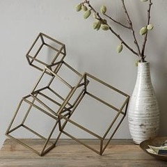
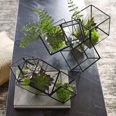
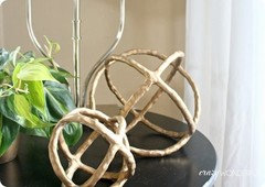
    Thanks for the suggestion to remove the table runner :) it's old and temporary.. Have a few things in mind besides vases instead that I will try (might have to use two at a ts given the size of the table). Thoughts??
  • PRO
    11 years ago
    last modified: 11 years ago
    Yes to the leaded glass boxes with succulents (pic 2).
    Love the table, adore the Sklo lighting fixture and the artwork is perfection.

    I think the chairs look crowded only because of the bases - they take up a lot of floor space.

    Stick with the monochromatic look. Select a paint color similar to the grey tone of the area rug but a few shades darker in a matte finish - you don't want shiny walls with all the natural light in the room.
  • 11 years ago
    last modified: 11 years ago
    Really like the black framed glass blocks, as they work well with the darker metal on the chair legs and art's frame. Maybe try removing the greenery, for a more sculptured, sleek look?
  • 11 years ago
    I think a darker more dramatic rug would better define your dining area. With your light flooring and style of dining table and chairs, a more dynamic carpet, perhaps in a subtle geometric pattern would really create a sophisticated statement for your space.
  • 11 years ago
    I love the room and your choices. I'd find a nice soft gray paint and do the art wall as an accent wall in charcoal. Maybe choose the light color and then do the accent wall as the darkest color on the same paint strip. Don't know if the tone would be right with your art, but SW Peppercorn is a nice charcoal. Love that light fixture. I'm very jealous of that!
  • PRO
    11 years ago
    last modified: 11 years ago
    Hello! I agree with a lot of what has already been mentioned. I do think that to make a real statement, you could do a cold color on the wall with the artwork so it pops. I would recommend a deep plum or deep blue-gray. I also think that the head and side chairs are too similar in style and scale. Have you thought about a larger table and larger head chairs so everything doesn't seem so tight? I would also suggest a darker rug to ground the space. Hope this helps. Good luck!
  • 11 years ago
    Beautiful choices just as is
  • 11 years ago
    Ok so here are some followup thoughts/ideas..
    Firstly, I do wish we could do fewer chairs or a larger table but our budget or space doesn't allow that and we really need to keep the seating for eight. In the future what I really want is a Live edge walnut table!

    I would love your suggestions or comments on the following potential options:

    #1
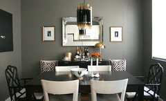
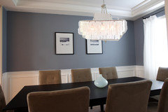
    Taking away the carpet completely and doing a large white painting instead of the black-and-white one currently there. Painting the walls a medium or really dark gray (see pics for examples)

    #2
    Changing the rug to one of the two swatches you can see at the bottom?? Thoughts? Some people mentioned doing a darker rug at the bottom though I feel like if I do that with dark walls and the black-and-white painting it may be too dark. Our floors are really light and we got them to primarily keep the space looking bright and open so I really don't want to take away from that.
  • 11 years ago
    Also I took away the runner and added a more sculptured piece. I also did feel like there are too many pieces fighting for attention here hence the mention of a simpler, white painting
  • 11 years ago
    I think gray would look great on that wall with the picture. As you have it now, your light fixture gets lost against the light wall. I think the picture will look fine against a gray wall as it does have some lighter tones in it. Your current center piece gets lost on the table, so either put the runner back on if you're going to use that centerpiece or find something else. I'd like to see something shiny and metallic, or a substantial wood piece, or something green.
  • 11 years ago
    I think I like the current art with a charcoal wall. I agree that will accent the light fixture nicely. I'm not crazy about the two little rug swatches. Current rug seems to work pretty well.
  • 11 years ago
    Oh and seeing the example pic you posted with a dark wall, definitely take a look at SW peppercorn.
  • PRO
    11 years ago
    Another vote for the dark wall (matte paint), And the rug, and the art. I like the sculptured piece but it would look better if it were white - it doesn't really show up in the pictures posted - does it show well in real life?
  • 11 years ago
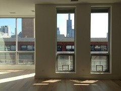
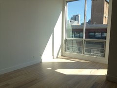
    Given so many votes for a dark wall, will definitely try it out.. I see your point Ann regarding the light fixture getting lost against a white wall. Also it looks like you guys think the rug should stay? I'm attaching a picture of the space without furniture so you can see what the exposed floor is like (we probably wouldn't have put a rug there but worried about the chairs scratching the floor).

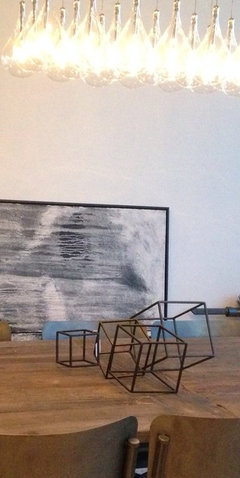
    As for the sculpture, I actually contemplated painting it white to make it pop more.. But also worry about too many things being the focus of attention..I was going to see how everything looked once the wall was painted and the painting is up on the wall and then play around with the table's decor.. Meanwhile here's a close up of it (I also thought of placing a miniature white vase inside one of the cubes to draw attention to it)

    All in all, do you guys think the space looks amateur-ish?? Or put together?
  • 11 years ago
    P.S: I love peppercorn by SW! Also really like iron mountain by Benjamin moore though it might be too dark of a grey for the dining room (actually thinking of using it on the accent wall of our son's room so all the colorful art we are putting it pops)
  • 11 years ago
    alsad, I think you should keep the area rug and love the monochromatic color scheme you have going on in your dining room. You should put some paint samples up on the wall to see what works best with your art. I agree that if you paint the wall, it will make the light fixture stand out. I tried peppercorn by SW on a wall in my home. While it was pretty, it was too dark for my space- it would probably end up looking great in your space, though, bc you have a lot of natural light. I also think a lighter shade of gray would be beautiful in your space, too. Here are some pictures that might help you visualize both dark and light gray walls....but I really think you need to try some samples to see what works best. Good luck! Paint some samples and post pictures! Keep you rug. It works well.
  • 11 years ago
    I think you should play with some natural colored thinks to warm it up. Like a sisal rug , a brown cowhide, brass or copper touches,or an accent wall in a camel or tan. I love gray and black slightly warmed with browns. My bedroom is that mix with B&W photos for another texture. I really love your painting btw.