

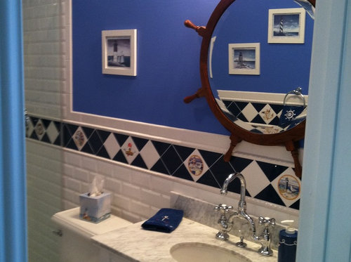
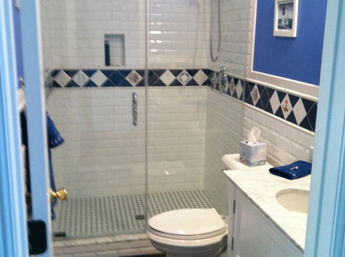
Thoughts on choice of paint color.
14 years ago
Featured Answer
Sort by:Oldest
Comments (19)
 14 years ago
Related Professionals
Winston-Salem Interior Designers & Decorators · Muskogee Interior Designers & Decorators · Rock Hill Interior Designers & Decorators · Sioux Falls Interior Designers & Decorators · Riverside Interior Designers & Decorators · Cincinnati Architects & Building Designers · Wichita Falls Architects & Building Designers · Waterloo Architects & Building Designers · Watertown Architects & Building Designers · Queens Architects & Building Designers · Florence Kitchen & Bathroom Designers · Moline Kitchen & Bathroom Designers · Trenton Kitchen & Bathroom Designers · Lima Kitchen & Bathroom Designers · North Platte Kitchen & Bathroom Designers 14 years ago
- 14 years ago
- 14 years ago
- 14 years ago
- 14 years ago
 PRO14 years agolast modified: 14 years ago
- 14 years ago
- 14 years ago
- 14 years agolast modified: 14 years ago
 PRO14 years ago
- 14 years ago
- 14 years ago
- PRO14 years agolast modified: 14 years ago
- 14 years ago
 14 years ago
- 14 years ago
- 14 years ago


Related Stories

COLORPick-a-Paint Help: How to Quit Procrastinating on Color Choice
If you're up to your ears in paint chips but no further to pinning down a hue, our new 3-part series is for you
Full Story
COLOR10 Color Combos You Never Thought Would Work
Orange and blue? Purple and green? Yes and yes. Unlikely pairings can look great if you do them right
Full Story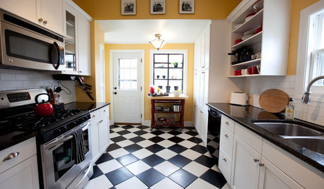
FLOORSChecks, Please! 13 Choices for Checkered Floors
Checkerboard Patterns Go From Casual to Ritzy, From Marble to Grass
Full Story
My Houzz: Thoughtful Updates to an Outdated 1900s Home
Handmade art and DIY touches bring a modern touch to a classic Boston-area home
Full Story
CRAFTSMAN DESIGNHouzz Tour: Thoughtful Renovation Suits Home's Craftsman Neighborhood
A reconfigured floor plan opens up the downstairs in this Atlanta house, while a new second story adds a private oasis
Full Story
SMALL HOMESHouzz Tour: Thoughtful Design Works Its Magic in a Narrow London Home
Determination and small-space design maneuvers create a bright three-story home in London
Full Story
KITCHEN DESIGNNew This Week: 4 Kitchen Design Ideas You Might Not Have Thought Of
A table on wheels? Exterior siding on interior walls? Consider these unique ideas and more from projects recently uploaded to Houzz
Full Story
KITCHEN DESIGNReaders' Choice: The 10 Most Popular Kitchens of 2012
Citing savvy organizational solutions, gorgeous lighting and more, Houzzers saved these kitchen photos in droves
Full Story
LIFE12 House-Hunting Tips to Help You Make the Right Choice
Stay organized and focused on your quest for a new home, to make the search easier and avoid surprises later
Full Story




Carolyn Albert-Kincl, ASID