Software
Houzz Logo Print
amysrq

Icestone counters...need help w/ backsplash tile

17 years ago

Here is a pic of my countertop. It is Icestone Sage Pearl. The concrete is a grayish white and the "bits" are recycled bottle glass and oyster shell. The shell ranges in color from a pale amber to pearly gray.

{{gwi:1579791}}

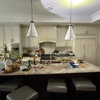
This is the kitchen:

{{gwi:1579793}}

I was going to use a green glass subway tile, but somewhere along the way I decided I liked the monochromatic look of a warm beige glass against the neutral walls. But now, I am thinking that pale beige glass subway is kind of boring and I think it's going to need to be cleaned every time I cook (3x/day).

What is interesting is that even though the Icestone is really pretty, it doesn't bring the sparkle I though it would to the overall look of the kitchen. At least not like a fabulous backsplash does. My last kitchen has Oceanside Glasstile mosaic and it was a real beauty. The Icestone doesn't give you a wow unless you're looking right at it. I am wondering if that gives me more leeway to do a splashy tile.

My question is this: How far can I go with tile? Can I do a mosaic or will it just put the whole thing over the top? I am looking at Malaga Cove Butterscotch Pearl which I'll link to below. It would pull the oyster shell I think...

Anyone who's read this far...thanks! I know I get ramble-y! :-)

Here is a link that might be useful: What about this?

Comments (42)

  • 17 years ago

    I think a mosaic would look great since your kitchen is basically nuetral now. You could incorporate the green,beige, and blue as seen in your countertop. Like your kitchen!!

  • 17 years ago

    What a beautiful kitchen! I love that countertop - I've never heard of Icestone, but I love the idea of the recycled materials in it. I think your original idea of green glass subway tile would be lovely - it would pick up all the green glass in the counter. It sounds like it may be lower key than you really want, but it would certainly be *my* taste. ;-)

  • 17 years ago

    I think that would look lovely but I'm a fan of larger subway tiles (less grouty) and think either the butterscotch color or pulling the sagey green would look great.

  • 17 years ago

    I was picturing glass mosaic tiles that look more like clear colored glass. I'm not sure I like the streaky pattern with the pattern already happening in the counter...But it's tough to see them separately and judge. Green glass was the first thing I thought of when looking at your counters...Or something the color of the background with some glass accents.

  • 17 years ago

    First thing I thought of was some Ming Green marble or green glass.

    But it looks like you're into the orange accents so I don't think that would work. A butterscotch color to bring out the shells would be nice. I definitely think you could "get away" with a blingy mosaic or some nice shiny accent pieces.

  • 17 years ago

    Here are a few more pics, by request.

    {{gwi:1579794}}

    {{gwi:1579645}}

  • 17 years ago

    Yosarajo, thanks for the vote for mosaic. And for the compliment. I am enjoying the kitchen, perhaps even more than the last one. But I am having trouble with the finishing touches.

    Charlikin, my house is LEED certified, as is Icestone. It is a green product and was made within 100 miles of here...less of a footprint. Green was my original thought and I often go full circle and come back to where I started in my life. So maybe I just need to find the right green.

    Remodel, what do you think of that Interstyle pic I keep saving, over and over again? It looks to be the right color. Do you think it would be too busy?

    Rhome, I have considered doing something very plain with a bling-y accent....maybe a stripe. Maybe that's a good way to get my sparkle without going over the top. (I usually go for very simple design with fabulous material....easier to get my head around!)

    Pbrisjar, the accents are bright red, on the warm side. I never thought of marble -- I'll have to look into that. Don't know if you saw it at Home Dec, but I made a not-so-subtle request to see your kitchen. Your post over there piqued my curiosity. Purple!!! Wow!

  • 17 years ago

    Hm, I wonder what icestone would look like as a full-height backsplash behind your actual cooking area, at least? There would be *no* groutlines, much easier cleaning (I have stainless there, and glass tile everywhere else), and we'd get to see the lovely icestone straight on rather than from an angle. Might it even work as a full-height backsplash *everywhere* in the kitchen? I really love the through-composed look of full-height countertop material backsplashes...

  • 17 years ago

    Here's one from Mirage Glasstiles Reflection Series.. the color should work but I'm not certain it's not too busy:
    {{gwi:1579795}}

    Very blingy... coloration is perfect! From mosaicsource their Venetian series:
    {{gwi:1579796}}

    One last one also from mosaic source, their powder tile series... much more subtle.
    {{gwi:1579797}}

    They have a ton of stuff to look through. HEre's a link to them.

    Here is a link that might be useful: glass tile source

  • 17 years ago

    I guess I have a very simplistic mind, because all I'm seeing is a bottle green glass subway tile to match the bottle green flecks in the IceStone. I think it would be quite striking!

    Alternatives: amber to pick up the amber flecks. (Though I like the bottle green better.)

    Or just a clear or white glass to emphasize the, er, iciness. Some clear glass has a green tinge, but I'd prefer in this case *not* to have that tinge - if you're gonna do green, do green.

    OTOH, that Venetian glass remodelfla came up with is interesting... right colors. Can't tell if it might be too busy. We need mock-ups!

  • 17 years ago

    I'm loving that Venetian one. Can anyone do a mockup? (I still like the idea of a slab behind the range, though)

  • 17 years ago

    Fly, I would love to have done the icestone on the back splash. But, it only comes at about 3 cm thick, though I suppose I could have designed it in. Too late for that now though. I combined Silestone slabs and tiles in the FL bathroom. Wish I had that option here.

    Remodel, you are truly the tile resource you are purported to be! Thanks for that link. It shows the butterscotch Malaga tile I have been looking at today, with a jpeg so I can get it into photobucket. Lots of other great things to look at too. I love the Venetian/Falling Water tile and actually have a sample of that somewhere for another kitchen. I'll have to dig it out.

    Charlikin, simplistic is good! :-) One thing I may not have mentioned is that someday I may paint the cabs. I had originally wanted peacock blue but the cabinet company I had to use for the build only had stain in Colonial Blue. (Yack!) That's one big reason why I am thinking in terms of a neutral. Then again, if I really love my backsplash, maybe I will remain content with the dark wood!

    I don't know about the whole "too busy" thing either. And I don't do mock ups. But, I'll post some pics of the materials again, butted up next to each other. Maybe that will help.
    {{gwi:1579791}}


    {{gwi:1579791}}

    The really good thing about doing the small mosaic is that I would do it myself I think. If I go with glass subway, which is less forgiving, I would have to hire it out. I have no experience with tilework, but I am pretty crafty and have done some stained glass work in the past. I also have a good eye for lining things up properly. I am the scotch-tape-queen-of-science-fair-projects around here. Gimme a little square and I'll attach it straight for ya!

  • 17 years ago

    amy... I've been posting so many backsplash choices today... I can't remember clearly which one you kept saving! can you link it?

  • 17 years ago

    I like the smaller one better, lighting and such being equal.

  • 17 years ago

    Me too, Fly.

    Sorry Remodel. I forgot my backsplash was not located at the center of the universe! Here it is:

    {{gwi:1579800}}

  • 17 years ago

    Oh AMy that's nice. I love the different sizes in it.

    Yes, I saw your not so subtle hint "over there" and responded but will respond here in case you missed it. I have posted pics of my kitchen all over the place but since we are far from complete I've not done the full kitchen porn shots.

    Visually there hasn't been tons of progress on the kitchen decor in some time as Hubby has been focused on other things. I'm hoping (really really hoping) to be posting pics of my finished floor in the near future but not yet.

    In the meantime, feel free to look at what we've done so far.

    Here is a link that might be useful: My main photo album

  • 17 years ago

    That's my favorite! I still say I might a little contrast randomly with the 1x1 little squares. I believe they will customize any way you want. That was Interceramic... right?

  • 17 years ago

    BTW, if you want to see some gorgeous ming green, check out nomorebluekitchen's pics. The particular ming green she used is no longer available but there are others out there.

    Here is a link that might be useful: This was the only one I found on a quick search.

  • 17 years ago

    Pbrisjar, now I remember your kitchen. Those are some gorgeous slabs of marble. Good for you for going with purple!

    Remodel, yes, that was Interstyle. I think maybe I could install that myself, too. (I hope Bill V. isn't reading this...;-)...I'm sure it give pros the hives when they hear about really amateur DIYs!)

    I just went to the Interstyle website again and realized that there is a showroom about two miles from here. They didn't not list it under my state, but rather in the state where the warehouse is located. Yippee!

  • 17 years ago

    Your first idea of the butterscotch and the other glass tiles will look fine if you want to stay with a very traditional, neutral look. I don't favor the irridescent horizontals as much because I feel they aren't as happy with the counters, which have a sort of atomic ranch vibe.

    When you say you wanted blue cabinets I'm hearing you want a burst of something a bit unconventional.

    I'd be looking at Susan Jablon mosaics. There are a ton of combos -- some on this page have all your colors -- because the scheme seems to be done already so it's just a question of working the wall, cabinet, counters in with a hint of the wonderful orange you've got on the floor (which I think is a great accent color in there though you might not agree.) Also, there seems to be a ton of DIY info there.

    Here is a link that might be useful: Susan Jablon

  • 17 years ago

    I like all the suggestions and choices, really.

    The Venetian is starting to show its range of flashing colors in that shot, but trust me the pale iridescent mosaic will give a ton of variety too. Even a sample can't foretell the whole gorgeous story. [And yes, you CAN install the small mosaics yourself. Lord knows if I could do it with my slapdash ways you can too.]

    Think I've said your kitchen is super-lovely in the past, but it is rather serene right now; you could extend the zen with the backsplash or return to your roots. I have a feeling your head is saying "neutral" a la the green glass or beige glass subways and your heart is saying "joyous." But I may be projecting. ;)

    You have a lot of linear lines in your kitchen and if you want to mix it up, I could see something like the below --with a fairly blend-y grout -- creating some serious fun:

    {{gwi:1579801}}

    Vetro Bello Glass Mosaic Tiles. Deep amber dots adorned with a metallic iridescence. The dots are about 3/4" in diameter. 224 tiles per sheet. 11.5" x 11.5" sheet size. Mesh-backed. Sold in full sheets only. Full Sheet $39.50

    {{gwi:1579802}}

    The ovals are about 0.5" wide x 2" long. 102 tiles per 1 square feet sheet. Mesh-backed. Sold in full sheets only.
    Full Sheet $39.50

    IIRC Pratt & Larson has glass pennyrounds in a zillion colors, too.

    Both the above are from the same place I bought my iridescent Sicis from a million years ago. The owner is a mosaicist too -- and thus very helpful.

    Here is a link that might be useful: Mosaic-Tile.com

  • 17 years ago

    I see S Jablon has the iridecent pennyrounds and ovals in more colorways, so that could be another source if you're interested!

  • 17 years ago

    Late to the party, but IMHO there is no comparison once you see them side by side. The butterscotch ones appear to go so much better with the countertop, and all of a sudden the green pops out. I loved the Venetian when it was by itself, but next to your counter it makes both seem like a really bad match.

    I wonder if some of the GWers who are so wonderful at mockups could do one with your kitchen? Someone did for me, and even though we're not ready for BS (long story of problem with our granite), it was remarkable at how the slate mosaic I was leaning towards became eliminated once I (and every other GWer) saw it in the mock-up!

    I've been living with a painted BS for over a year now, and I'm glad I have, cuz now I'm leaning towards a much more neutral BS than I would have a year ago. I'm an accessory person, and I think you may be too. It was great this Christmas being able to decorate and not have to worry about colour clashings like I did before we renovated.

    Is there anywhere close by that you can see that Malaga Cove tile in person, and ideally a large sample of it?

  • 17 years ago

    Hi there! What a beautiful kitchen!

    One thing that kept occurring to me whenever I looked back at your picture of the stove wall is that before you do something very showy and sparkly up to the hood, you should make sure that you are okay with how off-centered it will be on that wall. When I first saw your pictures, I thought that a plain glass sheet behind the range and then a low, 4" or so line of one of the mosaics going around the rest of the kitchen would look best. You could back-paint the glass a green to match the glass in your countertop, if it didn't have enough of the green tinge on it's own.

    It might take a bit more cleaning to keep it perfect and streak free if you do any frying, but you won't have any staining issues like you would have with grout.

  • 17 years ago

    Thank you Rococo for stopping by this thread. I do have Susan Jablon tile in my bathroom. I should look more there. When I was mostly considering clear (glossy) glass tile, I decided I wanted something thicker, more depth to it. Saw the double layers of glass at waterworks, but for 70/sq ft, I kept walking!

    Vix, I was just thinking of you this morning, wishing I could ask for your help. I usually don't have the chutzpah to make a call-out, but I see I didn't need to. Thanks for showing up! :-)

    You may be right about the head-heart battle. I approached this new house with the idea that I was ready to tone down the color thing a bit, northern light and all that. But, I am using what I have and still feel drawn to more color than less. I love my sand-colored walls in a way I never thought I would. They are Ellen Kennon, so the color plays in the light nicely.

    Anyway, getting back to the tile...I think Fisheggs (Beluga?) has a good point about the imbalance on that wall. I have been aware of that issue in an intuitive way, but now he/she's got me thinking that the reason I am after a monochromatic look is to solve the balance issue.

    Fisheggs, thanks for bringing me fully into that awareness!

    My plan was to run the tile across the range wall up to the height of the cabs on the adjacent wall, except for where the hood is....there the tile would go all the way up against the hood. I had also thought about very neutral tile with a splashy accent behind the range, but had ruled that out early on due to this same problem.

    Hmmmm....now I think I should consider ways to re-balance the wall using tile. I wonder if that's possible.... Oh, I will be hanging an antique servants call box just northeast of the hood, so there will be some added weight there. Now I feel a bit better!

  • 17 years ago

    Hmmm--- if you have the tile going up that high, then the difference at the range would be less of a feature. Again, I'm not sure it will be a negative feature, just that your eye may be drawn to it. The call box sounds really nice!

  • 17 years ago

    Update on the tile search:

    I got a shipment of samples, including that butterscotch that I really thought would work and it is sooo gold. Too big a commitment to a color I don't love. I also brought home a board of shellstone mosaic....all mother of pearl...amazing! But the color was a bit too white against the grayed down matrix of the Icestone. And DH said it was too nebbishy for him. He wants color.

    So, I think I may surrender to green, accepting the limitation that places on someday painting the cabs. I found a pale green from that Venetian series that looks great with the green in the Icestone. The sample came in yesterday, I have yet to fetch it. here it is with the counter:


    This is not an iridescent tile. As much as I am drawn to the iridescent tiles, when I brought the boards home, they just seemed over the top in my very bright kitchen. I realized that the mosaic in my old kitchen was a mix of matte, glossy and iridescent. I think that mitigated the glitz factor some.

    The only question I have now, if the sample looks as good as the board did, is whether I just stop here or go on searching, which would mean driving many hours to various tile showrooms and generally torturing myself over the decision. I guess I'll be closer to the answer when I see the sample.

  • 17 years ago

    Looks like a good style for the cabs if color is right.

  • 17 years ago

    It definitely goes but just be sure you're a green lover. You'll be making a commitment to that color.

  • 17 years ago

    Well, I picked up the sample and is it lighter and more uniform than the photo above. I am a green lover...so much so that I had wanted to paint the cabs green. (Vix once called my previous home House 'O Green!)

  • 17 years ago

    I think that green tile is gorgeous and looks terrific with your counter.

  • 17 years ago

    I think the green tile is beautiful and is the perfect compliment to your countertops. You did a great job. No need to look any further!

  • 17 years ago

    I LOVE the green stone you just posted, especially with your countertop, and think you have found the one! I love green, too, so much so that DH is saying we need to change our last name to "Green" (LOL).

  • 17 years ago

    Those green tiles will look smashing with the icestone. Your kitchen is very cool!

    Remember helping me with some BM blue paints for my kitchen? I'm painting it BM 703 - Catalina Blue today. Thanks again!

  • 17 years ago

    That green tile is similar to what I'm looking for. I looked on the mosaicsource web site and only saw a dark olive green in the venitian series. Could you tell me exactly where to find it?

    Thanks,
    claire

  • 17 years ago

    Maureen, I am so glad to hear you are happy with the Catalina. It is a gorgeous color. Would love to see pics when it is done.

    Serendipity, the tile is from Hirsch Glass Corp. Color is JS3256.

  • 17 years ago

    Thanks Amysrq!

  • 17 years ago

    amy-- Thought this might help you visualize a little more... my backsplash is Walker Zanger Weave glass tile in "equator" (made by Oceanside glasstile). It has a subtle iridscence and looks close to the green in your icestone. The tile size is 1x6" Lovely kitchen, BTW.

    Here is a link that might be useful: Green glass tile

  • 17 years ago

    C&K, I can't see your picture....and it's making me crazy!!!! can you try to repost, please?

    I used OGT in my last kitchen. I know that color from the website and would love to see your pics. Do you think Equator looks like bottle glass green? Or is it more muted?

    Thanks for the compliment. :) Now I'm off to the WZ website...

  • 17 years ago

    Boy, the color representations are so much better on the WZ site than OGT. That Equator is gorgeous. And I think the OGT iridescence is less intense than the Hirsch.

  • 17 years ago

    Hi Amy-- Sorry for the bad link. I think I fixed it below. Sadly, my pics don't give you the best representation of the color. Probably the closest is in picture #2, and the Walker Zanger catalog is pretty close to true as well. The green is more muted than bottle green, like a lighly grayed sage.

    And I have really come to love the subtle iridescence (that originally was a compromise for my husband). In most light, you don't see it, only when a ray of direct sunlight hits... since you're familiar with Oceanside glasstile, you probably know what I mean. We used Laticrete grout in Lichen and then we found Lutron outlet covers that matched the tile color perfectly (installed after my pics were taken).

    Anyway, your cabinets, Icestone and design are gorgeous. I don't think you can go wrong with any of the choices you are mulling. Good luck!

    Here is a link that might be useful: Backsplash, link fixed (hopefully)

  • 17 years ago

    Thank you so much! That is one gorgeous kitchen!

    I would almost pick the tile based on the fact that I could get outlet covers to match. I had a long and very specific conversation with the GC's electrician about how to install the outlets at counter lever. And they are (drum roll please) six inches above! (It is sad....everything I dislike about this house goes right back to the electrician. I was too overwhelmed to catch quite a number of mistakes and now we live with them.)

    I am afraid the Equator may be too gray for the fairly bright green in the Icestone, but it is perfect in your kitchen. I also love the garden window. The orchids I brought with me from FL are languishing in the dry heat of New England. I'd love to have a set up like that...someday...