Software
Houzz Logo Print
bepo2003

Confused about color :(

13 years ago
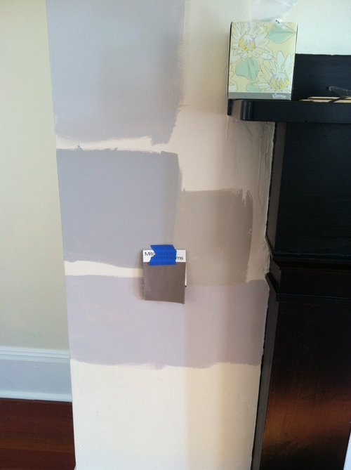
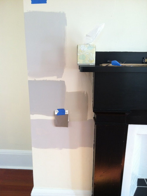
Hi everyone. I'm in need of help. We ordered our couch in the small patch color you see in this pic -- it's a pewter. In the store it looked so great against grey walls. At our new house, it looks more dark sagey olive brown perhaps. We originally decided on stonington gray (the bottom paint swab), but the couch seems awful with that. We then painted revere pewter around the living room ( second from bottom right swatch). Do either of these look okay with it. I'm so confused and we already ordered the couch.

The other paint searches are barren plain on top and smoke embers below.

I think revere pewter looks best with the couch, but I really loved stonington gray.

I'd really appreciate your advice. I'm so sad that we may have ordered the wrong color. At Mitchell Gold it looked great against the gray walls. It looks completely different in our house. I'm so upset :(
I feel like we made a terrible choice.

Comments (41)

  • 13 years ago
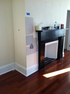
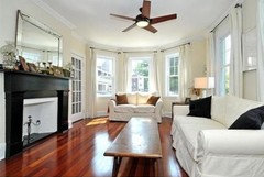
    Here's a pic from further away and a pic of the house when staged by the sellers.
  • 13 years ago
    I like the tan color best of all with the color of your sofa. Or the beige for the room.
  • 13 years ago
    There are so many grays out there, keep looking till you find one, take a piece of the fabric with you when you go to the pain store, buy a qt and keep on till you find the one that works, I like the chip to the right of the sofa, also the lighting in the stores is so different than your home
  • 13 years ago
    Sorry. One more point. We were coordinating deep purple pillows with the couch. Again in the store it looked amazing. We ordered the three seater dr Pitt in a slip cover. We then ordered two dr Pitt armless chairs, to go where the previous owners had their live seat. Our thought was that most of the time we'd leave the chairs. But then on family nights we'd push it together like the cushiony dr Pitt is meant to be like. We don't have a living room and family room. This is the main family space. This room comes off our dining room.
  • 13 years ago
    There are so many grays out there, keep looking till you find one, take a piece of the fabric with you when you go to the pain store, buy a qt and keep on till you find the one that works, I like the chip to the right of the sofa, also the lighting in the stores is so different than your home, I like the tan color too
  • 13 years ago
    Anna, we've literally gone through every gray in the books. The problem now is that none of it seems to look good with the couch we ordered :(
  • 13 years ago
    Either the Stonington or the Revere Pewter will be great with the sofa. Curious, did you bring a swatch/sample home into your lighting prior to picking the sofa. Lighting can play such a factor.
  • 13 years ago
    I would go with the tan color. Its a great neutral. And with the pillow color it will work well.
  • 13 years ago
    Paint colors are challenging. I found a designer in my city that is my go to gal whenever I paint. She never steers me wrong. $75 consult fee but Worth every penny. She comes to the house with all her color wheels, looks at the light , the room, the furnishings. I am always confident after I've met with her. I found her after I saw someone else's amazing space and they told me that they had used her.
  • 13 years ago
    We couldn't get into the house before we closed and Mitchell gold was having a sale on the couch. We never though a couch color would look so different. We were working with a designer and she never mentioned that as a concern when we ordered. We looked at the search on the store against the colors we were considering in the store the couch was agains a gray wall along side windows. And so it seemed close to our house. We made a terrible mistake. I'm so upset.
  • 13 years ago
    We couldn't get into the house before we closed and Mitchell gold was having a sale on the couch. We never though a couch color would look so different. We were working with a designer and she never mentioned that as a concern when we ordered. We looked at the search on the store against the colors we were considering in the store the couch was agains a gray wall along side windows. And so it seemed close to our house. We made a terrible mistake. I'm so upset.
  • 13 years ago
    last modified: 13 years ago
    A lot of times designer may not mention things or may not know it at all about the color change. Have you talked to the designer to let her know how you feel. Maybe she could have the color changed or can you return the sofa. Is it a custom made sofa? I'd go with the color to the right of the swatcg, is it pewter?
  • 13 years ago
    The designer doesn't work for Mitchell gold and it was custom made.
  • 13 years ago
    The designer doesn't work for Mitchell gold and it was custom made.
  • 13 years ago
    See if you can sell it and hopefully find a sofa that you really love.
  • 13 years ago
    What about a white that has a hint of grey, white trim will show it's not pure white then paint the wall with the fireplace in an identical paint of the couch color. With art work and purple accents this will look beautiful. It's only paint and it's much easier to repaint a wall then it is to replace your couch.
  • 13 years ago
    So true, go for it. Sounds nice. Please post pictures when done.
  • 13 years ago
    Hi, it's all about lighting. There are so many different types of light sources and stores use the best lighting source to give the furniture that "showroom" look.
    The color your leaning to looks great. Remember the room will look different during the day and different at night.
  • 13 years ago
    Revere Pewter looks fine! Love that color, it is like a blank canvas...almost everything goes with it and it is a neutral that is actually pretty.
  • PRO
    13 years ago
    Revere pewter is a GREAT colour....It is one of my favourite right now :) hope it all comes together for u.
  • 13 years ago
    Hi---
    RP looks best, but I think if you're going to incorporate the purple hues a gray with more of a red undertone is what you need. Check these colors by Sherwin Williams SW 7079-PONDER, SW 7080 QUEST GRAY, and SW 7081 SENSUOUS GRAY (all on same chip) AND SW 6001 Grayish, SW 6002 Essential Gray, and SW 6003 Proper Gray (all on same chip)::::: Check these by Ben Moore: AC-28 SMOKE EMBERS, AC-29 San Antonio Gray, AC-30 Winter Gates (all on same chip) AND 2112-60 Cement Gray, 2112-50 Stormy Monday, and 2112-40 Stone (all on same chip)...
    ONE of those colors from the 4 paint chips will work for you. Good Luck and keep us posted. :)
  • 13 years ago
    last modified: 13 years ago
    I think Revere Pewter and the rest of swatches are TOO DARK for the space, I agree with lionscale! You only need a hint of pewter. Try a half formula of it.
  • 13 years ago
    Hi, Like dzynewhiz says it really is about the lighting!! The Revere Pewter looks great. I also like the colors Natalie has suggested. Good luck, and please let us see how it turns out.

    This is for all of the wonderful designers on board. I appreciate all of the help that you give. I also had an experience with a special order sofa. I was looking for one that would have a sage green tint in it, to go with a rug, which color my husband and I told the designer we wanted. After ordering the one she suggested, we asked her for a swatch so that I could find some different pillows than what the store carried. We discovered that in most any other lighting the swatch was a plain dull brown. We immedietely went back to see if we could change the order. She said, "Oh we get lots of complaints about the color changing!! but it's a special order so we can't take it back. " What she didn't know is after that, I decided to never use her again. She lost some great commissions as we were also ready to purchase furniture for three other rooms. This story did have a happy ending. She called us a week later and said the manufacturer had notified her, that they were no longer using the fabric she had written up. She wanted us to go with a different fabric, instead we said no, and now we were able to cancel the order and get almost a full refund with the exception of her designer fee.
    So designers please give us homeowners a heads up about the difference lighting makes. Thanks!!
  • 13 years ago
    If I may add something here. The reason why the RP is not working well is because of your floor color. It has a lot of red tone---the RP color has ash (grayish/green undertone) when paired with the floor the green hues become more prevalent because green and red are opposites. THEREFORE-you should select a paint color with red undertones. The Edgecomb Gray on the same chart as the Revere Pewter would have been a better choice-as it has more red tone in it. When you're out picking up more paint charts, take a sheet of plain white paper with you and look at the colors next to the white---this will give you a better understanding of undertones. Happy Painting!
  • 13 years ago
    Oh don't despair. The grays you picked have a lot of purple and bluish tones. The right gray is out there.
  • 13 years ago
    Thanks everyone. The revere pewter is actually growing on us. It doesn't seem bad next to the floors. But based on the red green thing I'm now confused again.
    The issuer isn't finding the right grey. The issue is that no One looks good with the couch.

    For those who said rp is bad. The room has a ton of light. Twelve windows. So it doesn't seem dark to me?
  • 13 years ago
    I can't see your sofa color but Mitchell Gold has beautiful fabrics. What always works for me is to match the fabric color exactly with a chip. Then move up the color strip until you hit a color you like. For instance, I am looking at a sagey olive brown on a BM color fan right now that is on the 2141 strip. If your sofa is 2141-40, I would choose one of the two above that for my walls. Not very creative, but it works for me any time I am stuck choosing a color.
  • 13 years ago
    It's not bad, it's too dark for the space of this size and this much trim and windows, it just calls for a sun room almost white like the previous owners have it.
  • 13 years ago
    It's not bad, it's too dark for the space of this size and this much trim and windows, it just calls for a sun room almost white like the previous owners have it.
  • 13 years ago
    Ben Moore's Apparition at 1/2 strength is one of my never fail go-to colors. Beautiful room by the way.
  • 13 years ago
    We used Revere Pewter in several rooms, it is a beautiful color and goes with a lot of different things. Looks different in each room, btw, and many visitors have commented on the great color. It's still neutral, and you can pick up on the couch colors elsewhere in the room
  • 13 years ago
    We used Revere Pewter in several rooms, it is a beautiful color and goes with a lot of different things. Looks different in each room, btw, and many visitors have commented on the great color. It's still neutral, and you can pick up on the couch colors elsewhere in the room
  • 13 years ago
    why don't you call MGBW and ask what color gray they used which you liked?
  • 13 years ago
    The revere pewter is the best match for the small fabric swatch, but I think you should keep looking if you don't love it. Also, keep in mind there are so many variations of taupe that your sofa may not look exactly like that swatch considering different dye lots. Unless you really want to paint first, I might recommend waiting until the sofa arrives and seeing it in your space. Good luck!
  • 13 years ago
    Try a more neutral paint like Ben Moore, white wisp. It has a tint of grey but not too much so that it looks blue.
  • 13 years ago
    Thanks everyone for the advice. We decided on revere pewter. We tested several swatches and it looks great. Thank so much!
  • 12 years ago
    Did you post pictures? I would like to see them. Picking the right paint colour is challenging, especially since different lighting brings out the undertones. I chose Classic Grey, but then didn't like it in my West facing kitchen, because the undertones are yellow and it looked like vanilla on the walls when the light flooded in. So I changed it to White Wisp, which Laura Moore mentioned above. I thought it looked a bit blue, but what I am seeing is a slight mint green undertone. I'm now trying Classic Grey for the bathrooms [no natural light] to see if it works there. Still need to decide the bedrooms and living room/dining area and foyer. I wanted an off-white with a touch of grey, but seems almost impossible to find. Bought a sample pot of baby's breath, and when I painted two coats onto a foam sample board, it looks very yellow [nothing like the chip]. *sigh* At least the Chantilly Lace looks nice on the ceilings. :)
  • 10 years ago

    I know this post is from long ago... but any chance that someone has a picture of either Apparition (or Revere Pewter) at half strength 50%... i know JMoyer said it was a go to... i'd love to see a picture.....

  • 10 years ago
    I love your couch choice. I also like the tan color to the right of your swatch - a great neutral that will look wonderful with your floor and fireplace surround too. I don't think you could go wrong with some sort of light tan color.
  • 10 years ago
    Just a thought. I love grey, but it's been around for quite a few years now. Our office is grey. Our bedroom a green grey and our living room a blue grey. I'm going to do the great room in a light tan color - I think.