Software
Houzz Logo Print
deedles_gw

Inspiration pic #973 :)

14 years ago
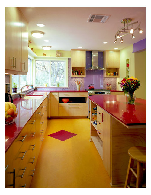
The inspiration pic parade goes on! Fell in love with this in the spirit of something completely different. Specifically like the quartz counters with the light maple cabinets and the lavender backsplash.

eclectic kitchen design by austin design-build CG&S Design-Build

How do y'all think my green Chambers stove would look tucked into that color scheme?

I think it could be kinda fun...

Comments (26)

  • 14 years ago

    like it was born to be there : )

  • 14 years ago

    No offense with this comment...

    Like a clown threw up in your kitchen.

    Love your range, but not in that room.

  • 14 years ago

    I agree with breezy's assessment. Love the range, love the cabs... not crazy about the backsplash or counter color...but regardless of my likes/dislikes; your lovely range would not work in that room.

  • 14 years ago

    I think it's the exact same color as the paint on the walls, isn't it? So I guess it fits in perfectly?

  • 14 years ago

    It's like walking in on your parents gettin' it on.

    The pic is good. The range is good. Keep them away from each other as long as I'm watching.

  • 14 years ago

    I could see the green with the lavender, but not with the lavender AND the red. Maybe if you switched up the counter color...

    But regardless of color, the vintage range doesn't seem like a good fit for the glossy moderness of that kitchen, at least taking that kitchen in its entirety. A more balanced mix of vintage and modern might work.

  • 14 years ago

    The red and yellow are too harsh (for my taste) but a softer yellow, a little lavender and that green range would be nice. Of course, I like color :)

    Maybe even a better combination (with some lavender flowers as accents, of course) would be somthing like this...maybe with very soft yellow walls and green on the island...and your range! {{!gwi}}From Kitchen plans

  • 14 years ago

    "parents getting it on". Nice visual, thanks for that, Marcolo. *ack*

    Anyway moving on: two yes's, the rest 'please god no' is what I'm getting so far...

    Maybe I'll do a dream board and see what it all looks like. I have this chicken wallpaper that I'm just crazy about and it does have a lavender grey background. More like grey just kinda leaning towards lavender, really. It has red and green and oh.. well this:

    That could be the back splash with tempered glass in front of it.
    And then:

    Marcolo? Remodelfla? guys?

    Seriously then. I do like the counter top, stove and wallpaper. A lot. I have the stove. Could I ask what makes the wallpaper work with that stove? I mean, I think they do work.. same era and all. Maybe the red counters are too much. But white cabinets are out. Burnt out on white. Dark cabinets with light quartz counter maybe?

    Obviously this is nowhere in the range of the OTK or most anyone's kitchen anywhere on here that I've seen anyway. I have a love of the vintage, grandma type stuff and can't seem to shake it; hence, love vintage chicken wallpaper. I hope people will still help even though where I'm going isn't too mainstream.

  • 14 years ago

    Thanks for the ideas, Lavender. I appreciate your helpfulness. I think it was you that got me onto color and away from wood, wood and more wood, wasn't it? lol.
    Yeah, the yellow is too much. Guess it was the red and lavender that I really liked. I always seem to plant red and purple flowers together in my window boxes, too. Maybe with the green stove it's too much. I don't know. I'd really like something 'different' though.

  • 14 years ago

    More roosters! Did you see the DAT french country thread? You might like my valance material :)

    Seriously, the wallpaper is a bit over the top (even for me). What about getting one rooster, framing him...or maybe hang a calendar under him? Would that be old kitchen/appropriate?

    Disclaimer- On my monitor (which could be off) the greens don't match and the background is definitely gray...no lavender to be seen.

  • 14 years ago

    i would love to see dark green cabinets with your stove and chicken wallpaper, then maybe a white or light gray counter to tone it all down. but i am not a decorator type but i love artistic kitchens.. cannot wait to see what you pick!

  • 14 years ago

    Well, here's a colorful kitchen, but the colors are a bit more subdued. It shows you can bring in color, without overwhelming the space, at least IMHO :)
    {{!gwi}}From Kitchen plans

    Or you could go with a lighter yellow and use the green for an accent... {{!gwi}}From Kitchen plans

    Or you can stick with green as your main color (with white and a bit of wood) and use yellow and red (even purple) as accent colors... {{!gwi}}From Kitchen plans

  • 14 years ago

    Your Chambers range is awesome!

  • 14 years ago

    Absolutely love the range. I'm more of a softer color person myself - the yellow floor is way too much for me - plus it reflects off of the cabinets, and you lose the lovely look of the light maple cabinets. And the purple on the wall over the doorway to the right is too harsh for me.

    Where did you find that range? How well does it work?

  • 14 years ago

    Thanks everyone for your thoughts on this.
    Lavender: Actually, in real life, the greens are pretty close and the grey does have a definite lavender cast to it. It's much prettier in person than on the computer... and more interesting. There is also a black hen and a fence with different colored hollyhocks, not just the white rooster over and over. It's really nice paper, not some strip-able vinyl stuff. I showed it to my sister on the computer and she thought it was a bit OTT, too. Then, after she saw it in person she fell in love with it. By the time she left my house, she was saying "you have to use that paper".
    Also, in real life, the green of my stove is a bit closer to mint than in that pic. It's a bit washed out in that pic.
    Michou: I'm going to start thinking about that darker cabs with lighter countertops idea. Thanks!
    Decor: thanks!
    Kammer: I agree with your thoughts on the floor, totally. We found the stove on Craigslist and drove 11 hours to get it. Then spent at least a month, probably 2, to take it completely apart, clean everything (Grease is the word), DH fixed a couple of things and we replaced a couple others. It works wonderfully and is a testament to the quality items Americans used to produce. The oven is so well sealed and insulated that you can heat it up, shut the dampers and turn off the gas and it'll keep on cooking. I cooked a 20lb. turkey with about 40 minutes of gas the last 2 years. Anyway, thanks!

  • 14 years ago

    Now I think you're just havin' us on. :-). You remind me of me, I would bring all these wild ideas (well I didn't think they were wild) to my DH and he finally said to me " Bring me the three choices that are legitimately in the running as being valid options". I think that was after I brought him the suggestion of the all black bathroom with a silver leaf ceiling. It would have been sooo cool (I thought).

    Your choice reminds me of a rainbow that went neon. Way too much. And marcolo - great imagery as always.

  • 14 years ago

    Deedles- I want to see the black hen, with the hollyhocks! And maybe more of the little baby chicks. They're so cute, running along the edge. I thought it was the rooster, over and over, but this sounds much better :)

    Colors are always off on the computer. What about wood cabinets with black countertops and maybe a green island with white quartz countertop? Maybe put the red and purple colors in as accents. You could have a bookcase on one end of the island or cabinetry...with red or purple back...or use red or purple on the back of glass uppers. I think you should use some of the bright yellow, from the baby chicks, too.

    There are so many great vintage fabrics, I think you could bring a lot of colors in that way too...and don't forget free standing pieces, like a hutch. And what about a linoleum topped table (in color of your choice) with red chairs? Or maybe more colorful appliances?

    I'm not a purist, so when I think vintage, I'd mix 30s through 50s and look like you had too much fun, at a flea market/vintage store. Enjoy! {{!gwi}}From Kitchen plans
    {{!gwi}}From Kitchen plans

  • 14 years ago

    You could use conceivably use all those colors, just in very, very different proportions, accents to a softer scheme, maybe, as your range is much gentler in color than all of them. I like the kitchen, BTW.

  • 14 years ago

    I love your stove and I love the wallpaper with the stove. I also love the red of the counters in the inspiration pic with the stove and paper. But I think using that bold red as an accent (as in Lavender's pic of the vintage table) would be a better way to interject that color than to have it on your countertops.

    What if you went with natural birch cabinets? That might be a good way to bring in yellow.

  • 14 years ago

    The inspiration pic is interesting but the red and yellow tones are much too jarring IMHO. The upper half of the picture is lovely, but from the counters and down loses it for me. The yellow makes the wood cabs' color look off and I bet it looks awful when seen with the pretty green wall color. If they wanted a bold toned counter, they should have found one in a medium to dark green that coordinates with the wall's green color. Then used a different, softer, yellow for the floor paired with a green or dark purple. You can have fun with colors without making it so over the top. In your case, since your stove is a fun color itself, I'd use some dark green accents, but would let the stove be the only light green around. If it is the only one in that color value, it will stand out more.

    I also don't see the greens in the rooster wallpaper working with your stove, but maybe if you put a sample in the same pic of the stove so the lighting is equal, I'd change my mind.
    We have our second lavender kitchen now (lavender walls) because we love the color. I just would not use red with it in any way. Yellows are fine, but not the French's mustard yellow. When you pair red and lavender, it reminds me of tween decor.

    Our whole house's scheme is based around greens and purples but I was careful not to overload either color in any room but each one has some sort of noticeable accent in it. The purple in the kitchen is on the pale walls and a darker shade will be in the tile feature, along with 2 shades of green. The cabs are white, the floor has 2 grays and a black. My accessories are either chrome, black or white. I like using color with neutrals and not overloading a room. That inspiration pic feels like a preschool that was decorated by the kids while the teachers were tied to chairs.
    Lavender's 3rd pic above with the white cabs & green is much more my style and is less likely to make it tiresome over a long haul. Even though I am not a huge fan of red, that last pic with the red table set is a lot more livable. The accessories add whimsy without making anyone dizzy. If anyone wants to change the look, it couldn't be easier. It is very classic and adaptable. When the paint needs redoing, it will be so easy to get a whole new look by changing the color. In the inspiration pic, they are locked in until it is ripped out.

  • 14 years ago

    Oh here is the reference to vomit...

    I like your rooster paper and I like it with your stove. It has that bit of red that is so charming with your stove.

    On your other thread I mentioned that I didn't like the cherry wood with the stove. I like a bit better, the lighter wood in this collage, but I still think painted cabinets would look better. A nice soft very very light buttery creamy white to go with that soft green. Just enough creamy to take the edge off the white.

  • 14 years ago

    am unhappy with the "clown vomit" metaphor. I think there should be happier ways to refer to this decorating muse.

    deedles how do you like this kitchen's muse? Can you picture your range in here, without the 1950s overt references?

    [contemporary kitchen design[(https://www.houzz.com/photos/contemporary-kitchen-ideas-phbr1-bp~t_709~s_2103) by seattle general contractor Ventana Construction LLC

    [contemporary kitchen design[(https://www.houzz.com/photos/contemporary-kitchen-ideas-phbr1-bp~t_709~s_2103) by seattle general contractor Ventana Construction LLC

    ___

    There's a wonderful, wacky kitchen that I saw in past that I'm searching for on Houzz. Hope I can find it but don't know if I have enough time to keep searching.

  • 14 years ago

    Oops, I didn't know this thread still had life!

    Uh,I could see my stove with elements in that room. Like the cab style and the lights.. not so much the tile. I think it's fun and I'd have loved it when I was a bit younger. The red goes to far into pink for my tastes. Great counters. That yellow or ivory on the upper cabs is pretty nice looking though. That seems to be in the range of buttermilk? I've seen this pic... Houzz, right?

  • 14 years ago

    Florantha, great kitchen. BTY I thought the "Clown Vomit" metaphor was so cute. I picture sparkly confetti and individually wrapped colorful candy flying everywhere! Who doesn't love a clown;)

  • 14 years ago

    Fruitloops Kitchen? (nah, strike that one--this isn't kidstuff). Jester's kitchen? Happy kitchen? Even Clown at Home or Clown in the Kitchen makes me happier than the offensive word vomit--I'm a mom and there are too many associations with the word. How about Mixed Color Kitchen?

    Yes Houzz, deedles. Ventana Contruction. If I remember correctly, this was a little house. You can sub in your own colors--I was looking for the strong color contrasts.

    By the way, look hard at the inspiration photo. Delete the purple and green paint. What is left? The red and the yellow. Two not-close-on-color-wheel colors. If the green and purple were shades of orange to brown, what would happen to the color scheme?

    Try taking a light green on the color wheel close to your stove and finding colors in same relationship as in the inspiration photo. Does it tame the clown but retain the mixed colors?

    Because you're mixing the older style stove with new elements you are also creating a mixed kitchen in that sense. The trick will be to keep them in a calm enough relationship to make the elements work. Unless you are a strong pesonality yourself and can live in an aggressively painted room and be comfortable there.

    Have you looked at Kohler sinks that might match the range?

    The chicken wallpaper brings back my childhood; that same color background was on the wall next to my own bed, but with 18th century birds and vines twining up the wall. Is it gray? Is it brown? Is it green? (Is it vomit?) It's a tough color to live with, despite the happier elements in the wallpaper. Sobering.

    Because wallpaper is not usually seen in such a small area and because there will be broken pieces of the repeated pattern, a few square feet of wallpaper will always look incomplete and out of scale. I suggest, if you have enough of the wallpaper, that you try cutting out the elements and gluing them on a different background for your glass backsplash. Do you have enough to make chickens crow in a line behind the range? And would you want a rectangular border or just use the chickens as a whimsical erratic?

    Consider stencils also. You can cut stencils to mimic the elements of the wallpaper you like.

    If the chickens have their way with you, then choose one of the wallpaper colors for an accent, one for dominance. Don't let them battle for top position. I think that's the reason why the inspiration photo is jarring to some--can't decide which is the main color. There is a battle there.

  • 14 years ago

    Florantha; thank you for that post. You've given me some more points to ponder. The paper, BTW is repro of old stuff so I can buy/use as much as I want to pay for. The background of the paper is grey with definite lavender tone.
    All the suggestions seem to echo the 'pull a color or colors from the wallpaper' and I agree. The opinions differ as to what color or colors. And where to pull them to? The cabs? The curtains? The floor? I already have the green in the stove and a close green in my sink so I'm inclined to let those be the green in this space. I'm real lucky that I'm not weeks away from having to decide! I do have the luxury of some time here.

    Every post gives me good points to ponder.