Software
Houzz Logo Print
debraw1968

Paint Colours for Small Retail Store??

13 years ago

Hello Everyone,

My husband and I have a small retail store that we are about to move into a larger space. I need to paint before we move in, and am looking for colour suggestions. The new space has good lighting and is an open rectangular area, with fairly high ceilings. We sell computers as well as computer related products and accessories.

As far as fixed elements, we have a large desk that is a darker chestnut brown and the flooring is a darker mahogany/cherry (?) wood look vinyl. Our shelving can be painted and I plan on getting a couple of open bookshelves to use as storage that I want to paint to co-ordinate with the rest of the space.

Our current wall colour is something similar to Lenox Tan, perhaps slightly darker. I've forgotten the name of what I used, but it wasn't a BM colour.

I am not sure if I should go with a neutral colour or something more fun. I've considered blue and like BM Schooner, AF 520, but not sure if that would be too much blue. A lot of the products that are on our shelves have blue packaging...think "Microsoft" blue or the blue from "Brother" packaging.

I have also posted this question in the Paint section and got some input from AnnieDeighnaugh...thank you!!

I would appreciate any ideas and/or colour combinations that you think would look good in this type of retail space.

Comments (28)

  • 13 years ago

    I can't really answer you as color is such a personal choice but below is some good reading on the effect of color in retail stores.
    Good luck with your new location and also for complete success.

    Here is a link that might be useful: paint article

  • 13 years ago

    Perhaps you can nose around some computer stores or similar techie places as well as other stores and see what colors they use and how you react being in the space with those colors....I made a lot of choices for building my house by looking at other houses....it's amazing what you learn when you focus your attention on something that you'd otherwise typically go by and ignore.

  • 13 years ago

    Interesting poing, yayagal....I recently dragged DH into an abercrombie store just for fun....I would/could never shop there with the music so loud, the lighting so dark you can't see what you're buying and the ridiculousness of wanting over $100 for a pair of jeans that is ripped and torn and paint splattered...I make him throw his jeans out when they look like that!!! Clearly, I'm not that younger retail shopper!

  • 13 years ago

    First I should say I'm not your chosen customer - my DH is in charge of all that - but since there is not a lot of color and visual interest in computer equipment (except for some of the small devices that do come in zippy colors) I would seriously consider choosing a hot, vibrant palette for your walls as a backdrop for your things, and to add energy and life to the process of shopping for electronics.

    I know this doesn't seem related, but I think it is. Think about some of the television programs about law enforcement, how deadly dull the real thing is, and how much color is added to the sets to counteract it - NCIS comes to mind, with their rich terra cotta and umber and teal blue walls.

  • 13 years ago

    Thank you for the input. I will take AnnieDeighnaugh's advise and "nose around some computer stores or similar techie places" to see what they have done in their stores.

    I want to jazz the place up but don't want to scare away our customers either. We are in a smaller town with a high senior population and so get a lot of older customers. I am looking for colours that are lively but not too crazy.

    Following the suggestions that I got on the other thread that I posted in the Paint forum, I looked at blue and gray walls. I like this blue, gray combo that uses a warmer gray found here: https://www.benjaminmoore.com/en-ca/for-your-home/rooms-by-colour/elegant-artful-home-office

    I also like this one with a cooler blue and gray combo here: http://www.benjaminmoore.com/en-ca/for-your-home/rooms-by-colour/fresh-modern-living-space

    Do you like the warm or cool combination better?

    What are your opinions on doing the wall with the entry door as well as the wall opposite the door a blue colour and the two side walls a gray?

    Here is a link that might be useful: Blue/Gray combo

  • 13 years ago

    I have been googling images of different stores ans everything coming up is creamy white walls or very neutral.
    I guess it makes sense so that your product is what sticks out.
    Perhaps you can go this route and then add some color in another way.
    Colorful chairs so people can be drawn in to relax and browse.

  • 13 years ago

    Maybe something calming, lol. A lot of people find technology stressful, especially needing a computer. You mention small town, a lot of senior citizens. The seniors I know do not like today's loud colors and noisy environments (don't have to be a senior for that!). Or new technology!

    Calm, uncluttered, simple environment would be my suggestion. Lots of open space to breathe. (I sometimes find it stressful to go buy something simple like toothpaste or aspirin, with 50 brands and variations staring back at me on the shelf!).

    This post was edited by snookums2 on Wed, Mar 6, 13 at 13:53

  • PRO
    13 years ago

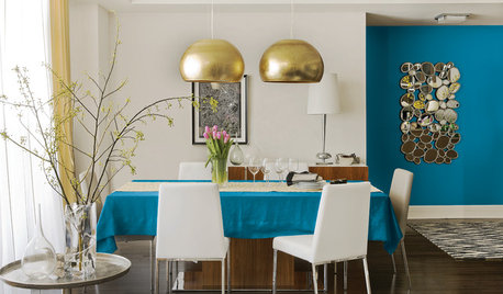
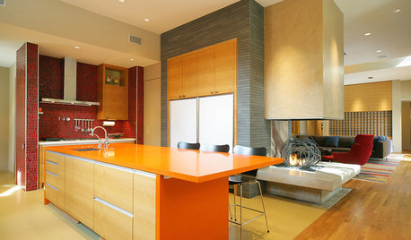
    Yes to bronwynsmom. choosing a hot, vibrant palette for your walls as a backdrop for your things, and to add energy and life.

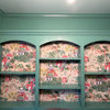
    I think a look like this is fabulous for a small showroom. Especially when the product can be lacking in color and visual interest.

  • 13 years ago

    Don't you think seniors or those in a small town (is that relevant anymore? lol) would be a bit blown away by this? Seniors in my world would head for the exit in a NY minute.

  • PRO
    13 years ago

    @snookie
    How sad and puzzling that the people you know who live in small towns and the people you know who are seniors would be blown away by bright color.

  • 13 years ago

    Nothing sad about it. It's a valid design question. But I'm sure Debra is saavy to her customer base and can figure it out for herself without further discussion.

  • 13 years ago

    I love the lucerne and storm room colors, but note what really finishes the look off is the touch of pink and bright green that add energy in a small but important way.

  • 13 years ago

    I like the warm one, the meditation colored room. As Annie said, the energy comes from small touches of the red and blue. It looks calm and warm. Sophisticated and strong with the black frames and other colors. It also looks business like to me, like an office.

    Will there be black computer screens displaying images? Colored laptops around? What is the flooring color? Maybe adding some color to the ceiling would liven things up without becoming overstimulating at eye level. People have a lot to process and think about when choosing technology. Both that and needing to spend a lot of money on it can be stressful.

  • 13 years ago

    I am curious as to why you would look at what everyone else is doing, and then do that.

    What reason would anyone have to choose you, if you don't provide something no one else has - attractive colored walls, for instance?

    I do think huge flower graphics are going too far, but something that is warm rather than techno-cold - particularly if you are catering to older people - makes more sense to me.

  • 13 years ago

    Making it a warm, friendly non-techie environment sounds like a good idea. What would be good to accomplish that?

  • PRO
    13 years ago

    The VMSD site has tons of pics of stores that specialize in electronics. Granted, these are big budget stores but might give you some ideas for paint color.

    Here is a link that might be useful: Designing for data

  • 13 years ago

    The people in this town tend to be very conservative. They don't like change or growth in anyway so it seems. For example, someone was been trying to bring in a "Tim Horton's" coffee shop but the town counsel fought tooth and nail to keep them out. They also have said no to a very small subdivision that a developer wanted to bring in.

    With that in mind I do like the idea of using a small section of a wall to show off products like the one deedee99 posted, but tamed down. I have seen tone on tone patterns that were interesting but not overwhelming. I'll keep that in mind as an option for part of a feature wall.

  • 13 years ago

    I also think it's a function of expectations, and the expectations are that techie stuff is going to be a little on the wild side....like the "geek squad" logo colors...

    So I'd avoid boring and cold, look for color with some contrast to add energy, but keep the lights up and the music down for the seniors. DH is a codger and I'm fast approaching that, and we're more turned off by darkness and loud thumping music than we are by bright color schemes...especially if the color schemes are attractive combos .

    Also, Debra, what colors do you like? I'm assuming you will be spending more time in the store than any of your customers....

  • 13 years ago

    I like the colors in the BM "elegant artful office" scheme shown in one of the OP's posts above. The cooler colors look like a dining room.

    The wildly pink graphic wall above showcases the talents of a designer and artist. The purpose of a background in a retail shop is to showcase the goods. Those purses look very insignificant in front of that wall, which wouldn't help to sell them.

    We also own a business, Debra, and last weekend had the entire place painted. We used soothing tones of beige and gray throughout. The carpet, going in as I type, is likewise going to be neutral. We did this deliberately to project a certain feel in the offices because we know the people who will be visiting them.

    I would say not to be afraid of bold colors, but don't use them to "make a statement" or for their own sake. Design in retail and office settings serves a different purpose than the indulgent personal. And you obviously already know that and will do what seems right to you
    :-)

  • 13 years ago

    I like the idea of a modern techie wall that might be more for the young set.

  • 13 years ago

    The BM office palette is similar to what came into my mind reading your OP. I would like a calm, sophisticated palette that suggests a productive yet easy work space.

    I have two rooms in my house that have similar color schemes. One has BM Wish on the walls -- a little lighter than meditation if I recall correctly. But it is gorgeous with darker wood and with blues. My powder room has a similar but bit more grey color. We had to do some remixing to get it just right, so it's not an off the card color, but it also looks great with dark wood and we have medium grey-blues in the artwork that play very well with it. You could pull in some navy accents, silver fixtures. It is a palette that can be successful exec, comfortable home office, but not be too stale or boring with the younger set.

    Many retail spots are white walled with changing displays, signs, posters, banners, etc. and perhaps one accent wall. I believe our Best Buy is all white walls with color on the floor and displays. I think Apple does their stores in a silvery grey-white that is clean, sharp and plays off their clean black, white silver techie products, large screens with vivid colors (and bright colored ipods and cases) and I think ours has one wall with wood backed display.

    Doesn't sound like you are in an area or working with a clientele that would go for the loud accent wall, but you can do something with tone on tone in more subtle colorways -- even same color with matte and gloss. Do you have a store logo you might want to put up in the gloss? If not, it could be stripes, trees (birch trunks - like wallpaper), graphic and techie symbols -- anything.

    Another thing I would consider is what colors appeal to you and DH. You will be spending a lot of time there and you should feel comfortable and successful there. The store will also reflect your personality and energy, so I would probably start there ant hen figure out how to put that color into a package that works for your customer base.

  • PRO
    13 years ago

    First, I forgot to say congratulations earlier. Congratulations on the move!

    You are expanding so what you have done before has worked. You know the layout your store needs to function, so that part is done. You are asking (I think!) how to visually engage your customer. Don't be afraid to entertain your customer.

    "Shopping isn't just about the very act of buying. ItâÂÂs about making a good 1st impression, delighting and entertaining, and then keeping customers coming back for more". ~FAB Counsel

    Otherwise, why not stay home and shop online in your pajamas?

    If you are comfortable with one small area done in an exciting color do that. Live with it for a while and see how your customer reacts. The yardstick of how a visual component is working in a retail environment is always in the numbers anyway. Watch your numbers and see what happens.

  • 13 years ago

    Debra, of all the suggestions , I like the colors you chose the best. The calming walls and that classy dark blue is just lovely and neither masculine nor feminine exclusively but a combination that will welcome customers of all ages. I know when I enter a techie store there's so much in gray and black that a calming background with that punch of blue would work to make me slow down a bit and look more carefully at the products. Good luck in your endeavor.

  • 13 years ago

    I have no suggestions on color. However, I will point out that the display screens of the items you have in your retail store have plenty of color and activity going on all by themselves. For me, I appreciate a calming atmosphere with good lighting. Just my 2 cents.

  • 13 years ago

    I went to lunch at a local place the other day and I was floored by how happy this place made me just by the use of "real" color and not fearing stepping outside of the comfortable vanilla zone. Yes, it does look a bit like Wasabi, but just take a look

    And on the inside, notice that the same color is used on a paneling that is about 4' high, then they do use some ivory, mixed with the brick. And then there is the ceiling...it's coffered with a lighter spring green in it. I was floored that this place existed and someone around here actually went out on a limb and did something exciting with color.

    I know you are not talking about a restaurant, but I wanted to show this to you--I immediately thought of this thread when I saw it.

  • PRO
    13 years ago

    Someone may have mentioned branding and I missed it but architectural color needs to support your brand. It's about branding more than decorating. Secondary goal is visual ergonomics.

    Business color design differs from residential color design on those two priorities. Branding and Visual Ergonomics.

  • 13 years ago

    Luckily, that is the way the OPs thoughts are leaning. Above she mentioned using a palette of blues and grays and white to showcase the blue boxes in which their goods are shipped and sold. I think she is on the right track for a retail store that sells something that particularly older people may find a bit intimidating.

  • PRO
    13 years ago

    That is the right track, kswl. Agreed. I wonder if OP's store has a logo and brand of its own. One approach might be to incorporate OP's branding colors and product colors to create a cohesive palette for the store interior/front.

Sponsored
Urban Upkeep LLC
Average rating: 5 out of 5 stars6 Reviews
Columbus High Quality Painting Expert