Software
Houzz Logo Print
cessnabmw

Backsplash - Help pick from these 3 choices

15 years ago

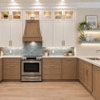
Kitchen is almost done now :)

Please can you help pick us pick a backsplash from the 3 pictured below?

Thanks!

{{!gwi}}

Comments (44)

  • 15 years ago

    Beautiful kitchen. Lovely backsplash choices. What is the island counter? I really like the dark one, but don't know if I would like something like that behind the stove - might be too intense. Would you consider using two, one behind the stove that is a little simpler, like the light ones (one on the left?) then the dark for the rest?

    Again all are nice, the big question is do you want the contrast of the dark or the blended stone beauty of the light. Good luck.

  • 15 years ago

    Thanks for the feedback and compliments.

    Island counter is the same as the rest. It's plywood now we're just waiting for it to be fabricated.

    I don't think we would want to do 2 backsplashes.

  • 15 years ago

    depends on the look your after...

    the first (lightest one) give a smooth calm, sorta dissappears look.
    the 2nd one is a too busy and yet close to the counter.
    the 3rd will give a very dramatic look that will really enhance the counter but may darken the joint up a lot.

    I just came from a V dark BS and hated it - but that 3rd one's cool!

  • 15 years ago

    Backsplash #3 could be amazing in your kitchen!

  • 15 years ago

    Pretty kitchen. I prefer the lightest one. The dark is very dramatic and might overwhelm -- you have a large backsplash area. If this were my kitchen I would choose a simpler subway or plain tile because your gorgeous counter has a lot going on and I would not want to have anything competing with it. But, among the three you have pre-selected, the quietest one seems to work best IMO.

  • 15 years ago

    cessna, you and I are doing almost the same kitchen.
    I'm using a white subway.

    Out of the three choices, I like the first one best.

    Can I ask you, how high are your ceilings?
    I like what you did with your cabinets.

    Corrie

  • 15 years ago

    The last one has much more character. I think it will add some zing and could end up as one of your fave features.
    It is dark, but with your cabs and your counter, you have some leeway to go darker without making it a dark room. The other ones are more predictable and poplar (although #2 has too much variation with the counter).
    Bottom line: life is too short to play it so safe....

  • 15 years ago

    I like the lightest one as well. Let your countertop be the showstopper. What do you have planned for behind the stove?
    Monica

  • 15 years ago

    Interesting! I usually love that lighter tile that you have and I'm not usually a fan of the very contemporary glass tile, but I think the darker tile looks stunning here.

    I like the contrast it offers, while also picking up the darker tone and color from the glass cab doors, stainless appliances and granite. I can't quite tell what your flooring is -- light as well? I'd worry that everything is starting to read rather the same light tone, without that dark to put in some visual relief. I guess I prefer to not have the only darker tones be appliances.

  • 15 years ago

    i vote the dark dramatic one, gives the feel of modern and edgy

  • 15 years ago

    The one on the left if you want calm and serene. The one on the right if you want "WOW" and for the backsplash to be a statement in the room. The one in the middle looks like you didn't know which way you wanted to go, and doesn't accomplish either.

  • 15 years ago

    Tough one. I love the way the third "pow-y" choice seems to echo the sparkle of the glass in the cabinets flanking the range. (unless that's some trick of the photography?). And I, like others find the second choice, a bit too varigated in the same way the granite is. The third choice is nice, but...to me a bit boring. Too much beige/tan between that backsplash and the granite.

    I'm wondering if you would consider doing the third choice behind the range and then running a "stripe" of it, maybe three courses...around the rest of the backsplash, using something quieter as a field tile? It's a little hard to tell in the photograph...it wouldn't by any chance coordinate with the first choice?

  • 15 years ago

    I like the first one best. I like calm, soothing colors. I also feel that a dark color backsplash causes the space to recede.

    I also like the first one better because I feel the tile shape is less trendy.

    That said, all of them are lovely.

  • 15 years ago

    I like the 1st one. Simple and timeless. Think the 3rd is very trendy so you may get tired of it down the road.

  • 15 years ago

    What kind of under cabinet lighting do you have? I like the color that they give off.

  • 15 years ago

    I like the darker backsplash--especially the way it brings in the dark wood of the island.

  • 15 years ago

    I like the dark one the best. It gives some contrast and life to the kitchen. The dark tones pick up some of the color that's in your counter and in your glass cab doors. Is the cabinetry for your Island dark? It won't look overwhelming or too dark once you have it everywhere - it will actually create some visual depth.
    I say go for the dark. The light ones just look a little plain and to matchy matchy.

  • 15 years ago

    I don't like the third one closeup, but it looks good at a distance. The first one is nice and calm, but the colors are too similar to your granite. You know what though? I don't love any of them. Sorry!

  • 15 years ago

    Tough pick... I like them all but am going to vote for the darker glass. I really like those glass cabs either side of the range.

  • 15 years ago

    I like the dark one. It seems to really complement the glass on your cabinet doors. And, your cabinets are so light that you could get away with it. As others have said, it would be very dramatic and make your kitchen unique. But, I would consider doing something different behind the stove. What do you think about a sheet of stainless--or something simple and easy to clean. In addition to being easier to clean, it might help help balance the dark backsplash so that it is 'just right' rather than 'a tad too much.'

  • 15 years ago

    Can't tell what the last one really looks like--the glass has a purple tone on my monitor. Does it match the glass in cabs?

    I like the marbles because they blend well with countertop. The room might use a crisp smoky gray also, but not purple gray. Your cab paint looks bluish on my monitor and the glass definitely has a black edging on it and a smoky gray glass.

    Undertones are important in lightish color schemes. Before you decide, try more photos with different lighting--daylight, ceiling light, shadows, strong direct light, fluorescent light. Do you have one of those full spectrum portable lights used for craft projects? Photos may tell you something that your eyes are missing.

    The middle choice intrigues me because I suspect that a larger sample would pull out more colors from the countertop, but sometimes it's better to let one color dominate in order to not compete with the countertop, in which case that first one fits the bill.

  • 15 years ago

    The third one. It really picks up the colors in the granite, the stainless steel appliances, and the glass cabinets above. It's neutral but it has some sparkle.

  • 15 years ago

    Cess

    To my eye the dark will make a statement but to my taste, that statement would be too much- meaning when I walk into your beautiful new kitchen my eye is forced to the backsplash & there it stays, the rest of the elements morph in comparison - if that makes sense.

    Can you lay the backsplash directly on the counter & snap some pics. I'm picking up some peachy undertones in tile, that I don't see in the counter - almost as if they are fighting each other... Can you post different shots of kitchen, wall color, accents?

  • 15 years ago

    My vote goes for the dark one....look at how it makes the countertop POP! Beautiful! I love the glass cabinets also...great job!

  • 15 years ago

    The lightest one. IMHO you already have two focal points. The granite and the glass doors. Both are spectacular. If your granite was a plain solid, I would go with the third. With the third I honesty think your eyes would get tired and not have a place to rest.
    Also, maybe I am wrong, but your kitchen gives a traditional feel and the glass tiles would move it in a more modern direction.

  • 15 years ago

    I'm with Breezygirl. I don't like the first two (but that's just me...I have something against tan colored backsplashes;don't know why) and while I love the dark one, I wouldn't have the courage to cover such a big space with it. A white tile using a 3 or 4 inch strip of the dark glass would be very cool, IMO. BTW, your kitchen is beautiful.

  • 15 years ago

    I like the first one best but I would lay it on the vertical instead of the horizontal. It would give a nice, calm tile a bit of the unexpected.

  • 15 years ago

    the first one...and then-over the range insert 2 horiz rows
    cut from the dark-each 4 in of height or so, spaced apart from each other-I saw this effect-like glass strips thrown into a nice matte wall of the simpler tile--very effective-you'll get a little drama to mix with your glass doors,and reduce the cost.

  • 15 years ago

    I like the one of the left the best! Really lets the rest of the kitchen show off. You have beautiful counters that really need to shine!

  • 15 years ago

    I've been thinking about your tile ideas since I posted last night. I feel bad saying I don't love any of them. That dark one is cool, but it just seems like too much of a good thing to put it all over. Too much and too dark. At least for me. I think it would take your elegant and transitional kitchen to trendy and bling-y. But maybe that's the look you're going for there. Have you taken the Sweeby Test for your backsplash?

  • 15 years ago

    I have added one more option to this now...

    The tile guy suggested putting up these 20" x 20" tiles that we have on the kitchen floor onto the backsplash. It would end up being full tiles except at the stove where we can add some kind of design or maybe the dark marble / glass tiles in the first pic.

    I have also added some pics of our floors..

    What do you think?

    NB: We can select any of these tiles (so no issue with cost or installation), as they were included in the contract.

    .
    .
    .

    Thoughts?

  • 15 years ago

    If it were me, I would use #1 from the original pic and create something special behind your stove with the accent you've used on the floor. Like I might make box with the accent tile and run the same bs tile vertical instead of horizontal or on a 45 degree angle in that area. Just a thought. Good luck and I can't wait to see what you do!

  • 15 years ago

    I know it isn't one of the options you have given us, but I would be more tempted to pick the beautiful mini brick mosaic you have on your floors. I don't think I like your contractor's idea of putting the larger floor tile on the backsplash. If he were to cut them into 3" by 6" subway tiles it might look great though.

    Seeing a larger perspective on your kitchen is very helpful.

  • 15 years ago

    Up close, I liked the BS in the center. From a distance, I like the dark/right one for the better contrast/visual interest. We also have a busy granite with busy backsplash. I like it, but some people don't. I do not like the idea of the floor tile. That will be way too matchy.

    Maybe the center one with a strip of the mini bricks that you have in the floor?

  • 15 years ago

    I think I agree with Sumnerfan - the light tiles and then use the dark ones for a focal point behind the oven.

    I do love the drama of the darkest tiles, but that look made my kitchen a cave, so i guess that one depends on the light in there most of the time.

  • 15 years ago

    Here is a thought.... Run the brick tile on the floor just in the area behind your range. Then use the lighter floor tile ( I would see if it comes in subway size) and run that throughout the rest. The floor tile complements your granite and won't compete with it. The brick floor accent ties the whole thing together.

  • 15 years ago

    I agree with several of the above. It would be very pretty to add the floor tiles in a smaller cut, and repeat the use of the mosaic accent floor tiles you have. The "infinite horizon" look it would give by having the same tile above the counters would be really striking. It would also eliminate having to introduce yet another stone into the mix. Gorgeous floors!!!!

  • 15 years ago

    In the lighting in this second set of pictures, the backsplash and granite look quite different than in round one. Now I really don't care for numbers one and two...they seem to have too much brown/tan in them, while the color of the floor seems perfect...more grey/taupe. I don't think I would be happy with the large format of the floor tiles though. I'd either see about getting them cut or finding something very close in tones, but in a smaller tile. And yes, I would definitely do something different behind the range and perhaps as an accent in the backsplash. I still love the darker glass and marble choice as an accent, and would prefer it to the minibricks of the floor...don't want to be too matchy.

  • 15 years ago

    I like the dark glass BS best. The contrast between light cabinets above it and the slightly lighter granite below it really gives a WOW and I like that! The other two are just not IT. I also like that the dark glass ties in well with your dark island.
    As for the floor tile, do not use it as a backsplash, it has a very regular pattern and that will make it fight with your gorgeous granite. HTH, Petra

  • 15 years ago

    Your floor tile and accent tile are gorgeous! Would you mind sharing what the floor tile is?
    I know that is no help to you on the backsplash....

  • 15 years ago

    elle3 - the floor tile use is of two colours. The one running straight is called Colorado Ivory and is 20" x 20". The one in the breakfast area is Colorado Sand (just a shade darker) and those have been installed at an angle.

    The mosaic is Emperado Dark.

  • 15 years ago

    Your kitchen has a beautiful classic timeless feel. I like the first one the best to keep that feel. I agree with the previous poster that suggested doing an accent behind the stove. Perhaps a herringbone pattern. The first one also looks like it will not go out of style as quickly.

  • 15 years ago

    Does your floor tile come in other sizes? If not, cut the tile lengthwise into 3 4x24's or 6 4x12's and see what they would look like in a 1/3 or 50% offset and in a herringbone. I prefer a lighter BS rather than the dark one. The dark one draws attention away from the cupboard detail and I just don't like a dark band between the uppers and base cabs. I don't know why because I like the opposite - white band between dark uppers and base cabs. Maybe it's because I don't like dark in my field of view.

  • 15 years ago

    The one on the left. It picks up the colors of the granite, but it's not fighting for attention with it, and it;'s a nice traditional feel.

    The one on the right needs a plain counter top - it's dramatic and there can only be one drama queen per kitchen. Also it's too dramatic and modern for the kitchen and would wreck the nice airy traditional look.

    The one in the middle is just mediocre. it's struggling to be trendy with the4 thin tiles but trying to be inconspicuous with the color.

Sponsored
Snider & Metcalf Interior Design, LTD
Average rating: 5 out of 5 stars25 Reviews
Leading Interior Designers in Columbus, Ohio & Ponte Vedra, Florida