Software
Houzz Logo Print
domesticah

Color Gurus please help (pic heavy)

15 years ago
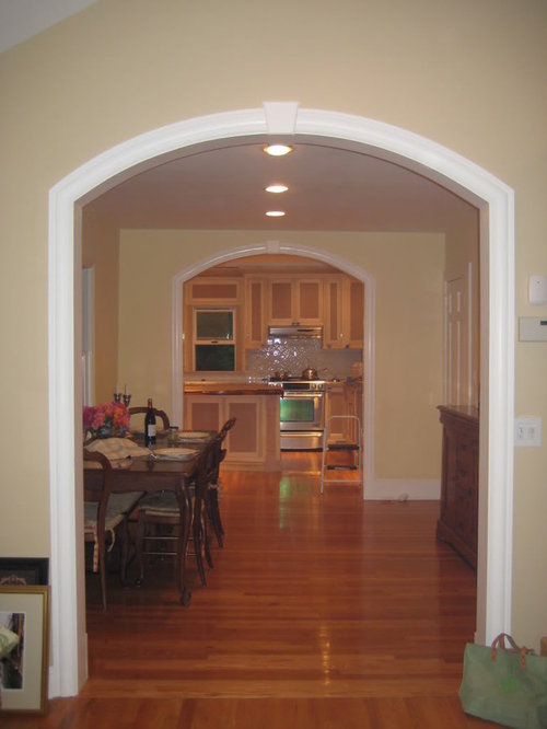
Hi there, I am a longtime lurker, and have posted in this decorating forum once before, but I usually hang over at the kitchen forum. We have just finished our kitchen facelift, and I would be very grateful for any advice regarding some color choices. My painter comes Monday (eek!!), and I am still undecided. I have made a few paint mistakes in my past and would very much like to avoid anotherone ; )

I am painting the kitchen and ajoining breakfast room. I plan to paint the kitchen cabinets BM Simply white (2143-70) to match the trim in my 1930's little house.

My Family room is Richmond Bisque. The other downstairs colors: LR Wilmington Tan, DR Hepplewhite Ivory.

I am thinking about BM Muslin, Sail Cloth or Simply White for the walls of the kitchen. I am leaning to Muslin for the Breakfast room. These two room are small and darkish.

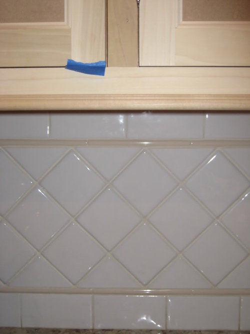
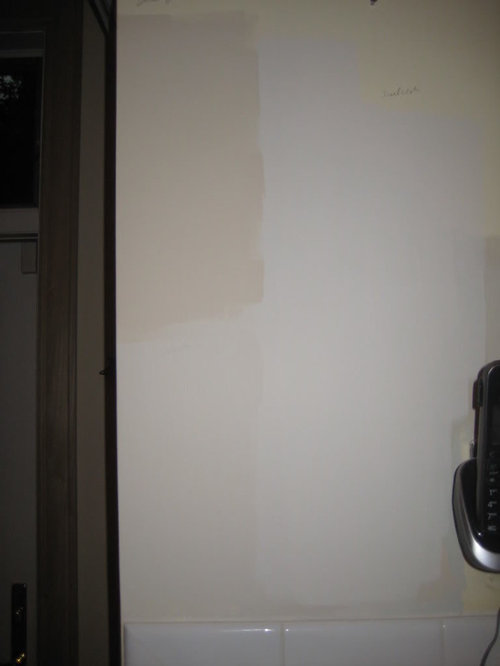
What do you think? Is muslin too pinkish? I would go love to go gray, but I need to match the beige trim in the tile. Here are some pictures:

(looking in from family room)


(island is walnut)

{{!gwi}}

Tile.

The rooms being painted are somewhat dark. Your advice would be most appreciated. Thanks a ton.

Comments (17)

  • 15 years ago

    Oh wow, domesticah, your kitchen is gorgeous!! My home has small windows, so I was really afraid of making it darker. My cabinets are a work in progress (they'll be white, very similar to Simply White), and I just finished painting Sail Cloth in my living room and kitchen.

    Overall, I love it. It can have a slight pink/peach hue at certain times of day (my lunch break, thankfully, not mornings or evenings when I'm home more), but I think that could be due in part to my ugly purple carpet and laminate. Most of the time it's warm, soft & neutral...and reminds me of the rooms in Ballards catalog. I almost did White Sand, which is a little darker, and I'm glad I stuck with Sail Cloth. I really think it's a color that's hard to go wrong with.

    My messy in-progress pics:


    Here is a link that might be useful: You've probably already seen these pics of Sail Cloth, but just in case not...

  • 15 years ago

    Hi Jessicaml, Thanks so much for posting those sail cloth pics and your kind word about my almost finished kitchen. I like Sail Cloth (the color is very soft and warm in your space)...but I still keep coming back to gray blue (like quiet moments). I love the pictures of kitchens with just a hint of blue or green, but Just don't know if those cool colors would mesh with my existing colors or the trim on my tile. Thanks again for commenting.

  • 15 years ago

    Oh, wow, you're island is amazing. I see where you wrote Sail Cloth on the samples you painted on the wall. What are the other two? I'm going through a blue gray phase myself, but I'm not good and knowing what colors play well together, so I'm anxious to see what others say.

  • 15 years ago

    I, too, am in the bluish gray phase and love BM quite moments. But would any bluish paint color go with your counter tops?
    My back splash is white with some blue tiles interspersed and I'm ready to paint my cabinets a pretty white (creamy?). However, I've been unable to find a granite or quartz counter top that would work with these colors. Does anybody have any suggestions? Marble would be perfect, but I don't like the quartz marble top.

  • 15 years ago

    Hi there I am also thinking about blue green like woodlawn green, I have it in my bedroom and love love love it. But it may not go downstairs, I am going to try it on paper today and post. Here it is in my bedroom with simply white trim.

  • 15 years ago

    I think your bedroom color would look great in the kitchen!

  • 15 years ago

    wow what a beautiful home! I love a light green, same as your bed room or similar, for your space! But from seeing what you have already accomplished in your house I would say trust your own gut!

  • 15 years ago

    I love both the Woodlawn Green and Quiet Moments. I have trouble picturing them with the warm countertops in your kitchen, but I agree with roarah; try them and trust your instinct! You clearly have good taste. Plus, Sail Cloth would pretty much match the trim tile...it might end up too boring for you.

  • 15 years ago

    Hi, thanks for the compliments! msrose and nosoccormom I just googled quite moments with my granite and you were right, I don't think it would work with the countertops. By the way, msrose, the other colors are Everlasting (top left) and Muslin (bottom right). I did see BM pewter in one post and it looked lovely -- I am going to run out and get a sample today ;). Painter put me off another week, so while I may not like waiting, I have more time to change my mind! ha! and i know I will. I think the muslin goes well with the richmond bisque so I am going to use that color in the eating room as a transition to the kitchen (even went out and bought the paint).I like everlasting but I have seen it look kinda purlplish in some pictures. So next up is the BM pewter. Thanks for the comments and happy fathers day to the dads in your lives.

  • 15 years ago

    Beautiful kitchen! I have no doubt you'll come up with a color that will be a winner. I'm not seeing gray in there but it's hard to tell with the wood unpainted how a gray would play with the white and the counters with your light. But who knows? Could be great! I'd love to see more of your **1930's little house.** It looks to be a well cared for charmer!

  • 15 years ago

    I like the color of your accent tile in the backsplash. One of the colors you have on the wall looks similar to that. Will you be using any other colors in the kitchen or dining room that you would like to tie in? I also like the color of the family room.

    Off topic but I like your exhaust fan - is there information on that posted in the kitchen forum?

    Looking forward to pictures of your finished kitchen!

  • 15 years ago

    What a pretty home! Your cabinets are going to be wonderful painted out and I love that island countertop.

    Looking at the kitchen separately: I'm not usually a beige person (I think it's the name of the color, which reminds me of the pinky-beiges of the past). However, I gotta say... I really could see matching to the tile color as a crisp, classic, beautiful solution. What's the splotch in the upper left? It seems like a contender. Given your granite doesn't appear to be up against any drywall, I'd think you would have a little more flexibility, but you could also pick up one of the granite tones.

    Looking big picture: It's hard for me to imagine a gray or the cooler tones in your space because of that beautiful effect you have going with those arches leading into a room into a room perspective. It looks like you can't really see kitchen wall from that view, so maybe that's a non-issue, but if I had your wonderful layout, I'd be focused as much or more on preserving that lovely continuity of tone your architecture is inviting you to play with as the tile border color. Your current colors flow so well. I really love how it goes from darker to lighter but stays in the same tonal family to a large degree. I'd personally be tempted to stay with a color strip and use a shade from each of them for each room.

    PS - I'm being infected with the gray bug, too. I'm beginning to see it as highly contagious. And potentially dangerous, for warm color girls who live in Alaska anyway. lol I'm trying to decide if I need a vaccination (which typically involves injesting a bit into the system) or quarantine (strictly enforced restrictions from going into that territory).

    PPS - Fun to see sailcloth on the walls, in both splotch and finished product form. That color recently perked my curiosity.

  • 15 years ago

    Light Pewter or Revere Pewter? I love both but decided the first was too gray for me and the 2nd was too dark for me. I'd love to see either in your space. Beautiful colors, though.

    (Steph, if you're still reading, I think any peach hues in Sail Cloth are from my purple carpet & yet-to-be-painted orange wood)

  • 15 years ago

    For those of you who liked Sail Cloth but find yourself drawn to gray...I almost chose Gray Mist, and kind of regretted not going that route once the Sail Cloth was up. Gray Mist seemed a bit more sophisticated and might have tied in better with my planned gray counters. Sail Cloth has grown on me so that I'm happy with the atmosphere of it now, but if my new gray countertops look funny with the Sail Cloth, I'll be repainting in Gray Mist.

    Here is a link that might be useful: Gray Mist

  • 15 years ago

    I am a big fan of both Quiet Moments and Healing Aloe. For the record, if you're still deciding, this is Healing Aloe in our master bath with what appears to be at least a somewhat-similar countertop (mine does have a bit of bluish-gray in it).

    I think you could go either way. I think the blue would be really pretty, but a more monochromatic scheme would be sophisticated and pretty too. My personal inclination would be to throw a bit of color (i.e., the Quiet Moments or Healing Aloe) in for some contrast to the other more neutral walls.

  • 15 years ago

    colors are not my cup of tea as my home tends to be VERY colorful.... but had you considered painting the cabinets two-tones? Because the longshot photo looking into the kitchen was so eye catching to me.... when I thot it was light trim surrounding darker inside panel paint.

    And where did you get that WONDERFUL countertop for your island. that made me drool!

  • 15 years ago

    oh my gosh, so many things to consider. rrs626 -- my fan is a cheapie, home depot allure broan fan. karen, the countertop is from the hardwood lumber company (it arrives unfinished). Jessica, love revere pewter -- I am trying to get up the courage to go darker (maybe even a taupe color) ala beekeeperswife's kitchen -- so striking but not sure i can pull it off...I will have to take a look at gray mist. sueb-- healing aloe is beautiful love that green, and our countertops are similar.

    Steph, you hit the nail on the head with my concern about going darker or outside my warm color scheme -- wondering if it will take away from the flow and be too jarring to the eye...Painter promises to come Monday, so I really need to make up my mind. Am leaning toward Everlasting for the kitchen (that is the blotch on the wall, upper left)...
    dml -- I will post more pics when the kitchen is finished and the house is not upside down.
    thanks all. : )