Software
Houzz Logo Print
singerslew

The acid green kitchen has been neutralized - update photo

14 years ago
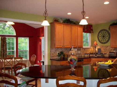
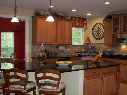
So we decided to go ahead and try the BM lady finger on the walls. Do I love it? No. I don't hate it either.

Here is the before, painted BM sweet daphne

Here is the after

Any thoughts?

Comments (36)

  • 14 years ago

    I DO love it, gives a sense of calmness and now you notice the details on the backsplash and chairs etc.

  • 14 years ago

    I love it also. Maybe you will with time. :)

  • 14 years ago

    I much prefer this color, but you should do what makes you happy. With that being said, IMHO your kitchen accents stand out much more when they do not have to compete with the green.

  • 14 years ago

    I agree with what the others have said. Especially as it played with the red in the next room, that green was too overpowering for your kitchen. Nice!

  • 14 years ago

    I prefer the "after." It's much more understated and elegant than the green. I agree it allows your finishings and accents to stand out more.

  • 14 years ago

    I hope you learn to love it because it looks great.

  • 14 years ago

    Agree with everyone else. It allows your decor to shine.

  • 14 years ago

    Wow, I didn't even notice that beautiful backsplash in the before picture but it looks gorgeous in the after pic. I really like the change in colour!

  • 14 years ago

    Frenchie, it looks nice. I did like your lively acid green and think the problem before wasn't the color but the strong contrasts that set off every single item and surface as if they were all supposed to be the center of attention. Now that you've created a quiet, harmonious background, maybe you could capitalize on it to bring the green back in tertiary accents? I miss it. :)

  • 14 years ago

    I like both rooms but the second room allows your backsplash and curtains to be noticed and feels peaceful. You can always add splashes of colors in accessories.

  • 14 years ago

    I like it too! Was this the color that the decorator suggested?

  • 14 years ago

    I love the after! It really makes the whole space cohesive. Good pick of a background!

  • 14 years ago

    When I saw your original post I loved the green and hoped you wouldn't change it but.....now that I see your beautiful kitchen with the change I have to say I love it!

  • 14 years ago

    It doesn't give a blah/bland look like I thought it might. I really like it. I notice your pretty backsplash and all the accessories more. With the bright green, I noticed the paint first. I hope it grows on you! :)

    Thank you for the bedding info in the other thread, btw. I'm not sure if I ever responded back.

  • 14 years ago

    Aaaw, thanks for your feedback everyone! I'm so glad to know you guys don't think it's blah. Ellendi - this is the color suggested by the decorator. I think it's going to take me a while to get used to it - I do love color. At the same time, it really does wonders for the backsplash. DH loves it and doesn't miss the green one bit.

    The decorator had picked this color out for the kitchen, butler's pantry, foyer and stairwell... The family room, which is open to the kitchen and morning room, will be 2 shades of green - BM moon shadow for the walls and BM at home with nature for the ceiling. That should break up the BM lady finger a bit.

    One little thing I am sad about with this color though - DH gave me a clock as a housewarming gift for our previous house. It has sentimental value, but I'm afraid it might have to go:

    sheesharee - you are welcome for the bedding info. I take it you're working on your daughter's room?

  • 14 years ago

    I think this is a nice change from the acid green, which was fighting with the cabinets a bit. Now, a darker, more olive green would have been wonderful, and been great with the backsplash, too.

    Personally, I would have gone a bit darker, but I think this is very restful and doesn't compete with the red in the next room.

    I think your clock is fine. If it really is a problem for you, consider having it framed in a woodtone like your cabinets or in black to compliment the piece over by the sink.

    Enjoy your 'new' space!

  • 14 years ago

    I love the new color. I also think the clock is just fine.

    I used the same color in my husbands bathroom, so I am a little partial.

  • 14 years ago

    The clock looks fine there. I think the room looks good and the contents of the room stand out more, but you really seem to be a color lover. If you are, it makes me sad to see you compromise your likes and go into such safe territory. I think an olive or a darker green would have been lovely and stood up more to the adjacent red in the other room. Perhaps you need to keep working?
    A tan color would be great in areas like hallways as a medium to bridge all of the colors.

  • 14 years ago

    SO MUCH BETTER!

    High Five
    Haley

  • PRO
    14 years ago

    Maybe you could use the red from the adjacent room and paint a red circle behind the clock -- so it *holds* the clock and *frames* it with a red border.

  • 14 years ago

    I think the new color works better with the bs, but I agree with those who would favor a darker more olive green next time. Since it is newly painted, I'd enjoy it for a few years but go over to green when it shows signs of wear.

    I loved the old color, but the bs did not work with it as well as with the new color. The bs is earthy and the green paint was perky. If you use an earthier green next time, I think it would be ideal. The current color is good and it makes the kitchen new again, so I'd call it a success ;)

    I think the clock looks fine on the new wall color.

  • 14 years ago

    I really like the new color! I agree that it looks elegant and restfull and now the backsplash and accessories stand out more. I also agree that an olive would be a nice choice as well. You have a beautiful kitchen!

  • 14 years ago

    No kids yet but in time. :) It's not too often fabrics really stand out to me but that is such a pretty combination.

  • 14 years ago

    I loved the green, and I personally would have changed out the backsplash rather than have gone with this color. It's pink tones do complement the pink backsplash and doesn't fight with the cabinets, but it doesn't make them stand out that much either. If you like it fine, but if it still feels uneasy for you, try out several different construction paper backsplashes to see if you can't find one with less pink tones. One with some COLOR in it to work with that green. I think a yellow subway tile with a line of green or red accent would be just the thing. The original green accented the yellow tones in the cabinet, which worked great with the adjacent red room for a very warm vibe. The pink tones still read warm, but not in the vibrant fresh way that the green was giving the room.

  • 14 years ago

    I love green and even I like the cream color better.

    I'm in love with your counter-tops. Is that ceramic tile flooring? I also love the barstools, they look comfortable, many are not. Sorry, it sounds like you have shown your kitchen before, but this is my first glimpse of it. It's very pretty. I have a red DR and tan kitchen (wallpaper) so I'm taking notes. The clock looks great, very subtle. Maybe subtle is hard to get used to after the punchy green?

    p.s. What color would you paint the LR if you had these colors in your house?

  • 14 years ago

    I too would've gone a tad darker, but it looks so much better overall!!!

    ~Jeana

  • 14 years ago

    I really like the new color and I am a "green" person as well.

  • 14 years ago

    I also like the "after" look. I felt the green clashes with the back splash a little.

  • 14 years ago

    Love the after. It give the space a more elegant feel. The before was pretty but the after is gorgeous.

    I think the clock is fine but if it bothers you I like Les' suggestion to frame it.

  • 14 years ago

    LOVE, LOVE, LOVE the new color! It has a calmness about it and does a wonderful job of bringing out the details in your kitchen and dining room. Also love the clock and would NOT part with it. I think I would paint a brown square behind it and trim it out with stained molding to highlight the wonderful clock. You have a beautiful home!

  • 14 years ago

    Wow - thanks everyone for kind comments!

    whiteriver - I'm curious to know what other colors you have at your house.

    les917, htnspz, diannolo and interior stylist - I haven't ruled out olive green for down the road. My sofas in the family room are a deep olive green. This kitchen gets very little natural light and I was worried about making it too dark...

    live wire oak - we just installed the backsplash last spring and we love it. It goes perfectly with the cabinets, countertop and flooring. It also compliments some other elements in the house. Since it was way more expensive than a can of paint, we were happy to repaint the walls : )

    prairiegirlz- thanks for your kind words : ) My countertops are a Level 1 impala black granite. It is very uniform in color, with very faint flecks of gray, beige and copper.

    And yes, we have ceramic tile floors. We moved up here from TX where tile floors are the norm. We had the option of hardwood floors, but with 5 kids and a dog I didn't feel like I could keep them nice for long. DH says some day he would like a darker tile in there, but who knows when that will be!

    We bought the "Avignon" bar stools and cushions from Ballard Designs about a year ago. I think they are comfortable, but I am 5'5". DH, who is 6'1" and has long legs doesn't like the placement of the footrests. I have to say they are sturdy and well-made and have held up wonderfully so far. The cushions also come with washable covers. They are on sale right now though the 24th : )

    I'm going to include a link to my previous post so you can get an idea of the colors for the rest of the house. I hired a color consultant and she came up with a nice but subtle color palette.

    Thanks for all the suggestions concerning the clock. I will take those into consideration : )

    Here is a link that might be useful: color palette

  • 14 years ago

    Your home is beautiful, I love the new color just the way it is. I love the way you have accessorized. Everything looks beautifully thought out and coordinated in a very good way. A lovely, lovely home.

  • 14 years ago

    Your before and after photo made me think of another current thread called "A Case Against Color" and in your case your neutral won hands down!

    The difference is night and day ...so soothing and beautiful kitchen....good job.

  • 14 years ago

    I love green, but I think the "after" pictures look wonderful.

  • 14 years ago

    gr8day - I love your username! Thanks also for your sweet comments. I will have you know that 1) my kitchen is the most done room in the house, 2) I cleaned up for the pictures because 3) I have 5 kids and the kitchen island is always a mess.

    haley comet - surprisingly this was a case for neutrals!

  • 14 years ago

    Thank you for sharing the after. With so many beautiful expensive details in your kitchen, I don't think the wallcolor needs to be the first thing one notices. The lady finger makes a nice backdrop and as everyone else has said, allows the rest of the details to shine.