Software
Houzz Logo Print
ctreno_gw

kitchen done except backspash - need help

16 years ago

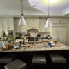
So except for the backsplash and pendants our kitchen is done. I was able to choose stone and all our bathroom tile pretty quickly, but I am having the hardest time committing to a backsplash tile. I am going for a transitional look as I think you can tell from the photos.

The cabinets are Revere Pewter which is a light gray/beige. The counters are Imperial Danby so they have streaks of gold, blue-gray, green-gray. The Island is Pietra di Cardoza. Floors are dark walnut. The room is painted White Dove.

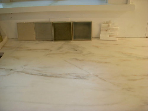
I was thinking about doing either the light gray-blue tile pictued here among the squares - but in a 3x6 subway format, danby tiles in a 3x10 format stacked, or just long thin white tiles also in a stacked 3x10 size. Anyone have suggestions? Do you think a Danby tile backsplash will stil read fairly traditional even if I do a more contemporary layout with the stacked thin tiles?

Help! I would appreciate any great Gardenwebber ideas!

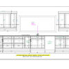
Here are some photos - the tiles pictured are not the actual shape/size I would use

">


">

Comments (16)

  • 16 years ago

    I like tile #2 pictured here. Your kitchen is very nice!!

  • 16 years ago

    I like #2 from the left on my monitor colors.

  • 16 years ago

    #2 if you are going for monochromatic. #4 if you want contrast.

  • 16 years ago

    I think if you want a more traditional look, then #2 in a subway pattern works best. If you want something a little more modern, then #4 in the stacked pattern would be my choice.

    Color #1 has too much beige and does not blend well with what you have. #3 just isn't doing it for me.

  • 16 years ago

    I like 2, followed by 4. Beautiful kitchen!

  • 16 years ago

    I like 2 and 4. How about a checkerboard design?

  • 16 years ago

    You guys are great. I should have explained that I wasn't really thinking of 1&3 unless combined with 2&4. With this company, you can do anything you want; but then I would have to come up with the design which I am not good at.

    Chris45Ny - thanks.

    Yes, I was going for either #2 or a 2 & 4 combo (as you suggested paintergirl.)

    Chocolate bunny - these tiles I can only get in fairly standard field sizes 3x6, 4x4, mini bricks, etc. What do you think would give the most contemp feel - should I stack 3x6 horizontally?

    Do any of you have any other tile ideas? I want to skew more modern, but somewhat classic if that makes any sense. At one point I found a beautiful acqua large format tile at Porcelanosa, but having worked with those in my bathroom (even though it came out gorgeous,) realized that there would be too much cutting to work here. And then I was concerned that I would eventually regret doing that color - like when you go to a house that hasn't been renovated since the forties and has those pink tiled bathrooms that completely date it! (just in case we decide to sell in next year or two which could happen.)

    Thought I might add bright color in a less permanent way such as the pendants on our cable lighting instead and/or counter accessories.

  • 16 years ago

    I like the thin white tiles (#5) best. Followed by #2 and then #1.

  • 16 years ago

    ctreno - Love your choices of materials. I have RP on my walls and pietra counters, but I opted for white quartzite on the island because I knew i would be fussy/freaky about the marble (though I LOVE it.) I have red birch for main cabinets, but would have done the walnut if my kitchen wasn't so dark.

    Have you considered an opaque or regular polished glass - a gray/charcol or even med or light gray (or a darker gray taupe than the RP) with with light grout? For some reason that is the first thing I thought of when I saw the kitchen. I think I was looking for more contrast, to break up the white. I think you can do that with the ceramics but I find the ceramics don't look nearly as lovely in photos so I have a heard time choosing them in picture but in person...love them.

    Here is a link to davetz's kitchen in the FKB
    http://finishedkitchens.blogspot.com/2010/02/davetz1s-kitchen.html

    Sewanhankagirls also uses a larger gray tile - not sure if is glass but it has the uniform look.
    http://finishedkitchens.blogspot.com/2006/07/sewanhakagirls-kitchen.html

    What are you trying to do with the backsplash? Pull from the contemporary to the transitional, pull colors in the kitchen together, add texture that you don't have (small detail to the large scale rectangles you have?)The tiles you have picked are very nice, but am curious if you are trying to warm it (not color but style) away from the contemporary. The marble would be more white - is that the look you want?

    Of the ones you have I would prefer the 1st two. The 1st one would warm the space, the second is a nice compliment with more lovely gray - but I would not introduce the green of the last two. I might try to do something tauper than the 1st choice if you can find it, but definitely darker than the RP. I love marble, but it seems more contemporary because it is more white, although I know the marble has some detail to it.

    Make sure you know where you want your colors to lean - pietra can go almost blue (next to my BM RP it does seem a bit blue that is why I need a back splash or new paint color :) So really test out how a gray bs might make the cabinets look - more taupe or gray in contrast? Let us know what you pick.

    I am taking interest because I am in this camp of choosing a back splash and considering grays & whites.

  • 16 years ago

    Sparklekitty - thanks. I am going for a look more like Sewanhankagirls (and would even consider that tile but I think Ann Sacks' prices are higher than I can go.)

    I'm trying to do a backsplash that will be somewhat timeless, but not feel too traditional. I'm not really trying to make a statement with it as some people like to do, just want clean, classy,contemporary, but not trendy contemporary. The RP cabinet color is tricky because it is not gray and not beige (and looks a little different than the paint - we tested it as a wall color as well.) The glass in the uppers has a slightly greenish tint (not what I had expected, but don't feel like replacing it right now.) The marble has the golds, grays, and greens.

    I was sort of working with a designer who suggested to just do clean, classic white (not stone) in an interesting format, but I am feeling that it might be too white. On the other hand, I like a really bright kitchen.

    It's hard to make the leap based on one little square sample. The marble tiles in the photo aren't what I would get. If I were doing it, I would get a longish (about a 2x10 or 3x10) and stack them.

    That's interesting that your Pietra reads blue. I was going to do marble on island and Lagos on the perimeter, but when I went back to see the slabs, either the lagos they showed me wasn't the same, or I just didn't like it. So I switched everything around and for your reasons, decided that marble on the eating, homework, etc. island probably wouldn't be a good decision. Fortunately, I had enough Danby to change and do the perimeter. The stone guy then recommended the Pietra and I am very happy with all.

    What are you considering for backsplash?

  • 16 years ago

    Looks terrific. Would definitely go with the stacked thin danbys if it were me. I heart marble. Your floor is a great contrast, btw.

  • 16 years ago

    I have read that the 4x4 tile is making a comeback thanks to Martha Steward, but I don't see it as modern or trendy. I think smaller tiles (i.e. 1x1) are more modern. I think 3x6 is your standard size subway tile.

    This is what I mean by "stacked tile". It's trendy (IMO) but not too over the top. My 4x4's are stacked.
    {{!gwi}}

    This is obviously your traditional subway pattern which to me is more "classic". Obviously this is of a bathroom but I really like the random darker colored tiles

    This subway tile is vertical.
    {{!gwi}}

    Sorry for the giant pictures - I'm too tired to resize them.

    If you're concerned about comitting to too much color, you can always do either color #2 or #4 as an accent row in a basic white subway pattern.

  • 16 years ago

    I love the tiles--I like number 2 also. Would you mind sharing the manufacturer? Your kitchen is gorgeous!

  • 16 years ago

    Your kitchen is so sleek and modern looking I would not put a busy back splash in. Keep it simple and sophisticated. I guess I like #2 the best also but would not do checkerboard.

  • 16 years ago

    Gorgeous kitchen! I like #2 tile best, followed by #4. I love marble -- but with such beautiful marble counters, I wouldn't do a marble backsplash. Your kitchen is already so modern that I don't think the backsplash needs to be ultra modern to make the overall kitchen feel very modern. The advantage of subway tiles is that they are so classic that they can read traditional, retro, or modern in different contexts. I think that vertical tile is very trendy and is going to look dated sooner than other tile applications. I personally love checkerboard anything; but it your kitchen I would be afraid that checkerboard (a country or "bistro" look in my mind) would look discordant with your modern, sleek style.

  • 16 years ago

    Love your kitchen. You say that the manufacturer can do pretty much anything you want? Could they make #2 in a larger format for a more contemporary yet classic look? Like a 4x12?