Software
Houzz Logo Print
donna214

Almost Done-Need Color Advice

17 years ago
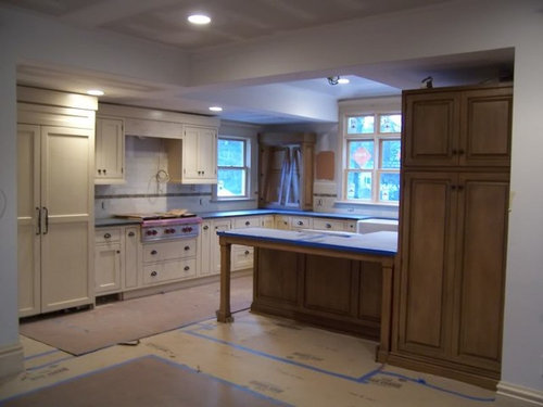
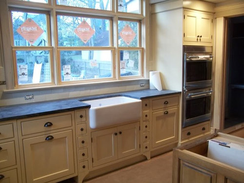
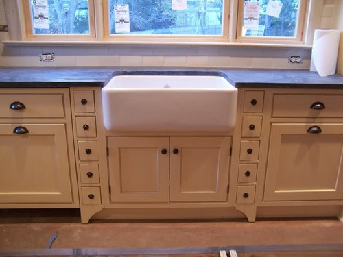
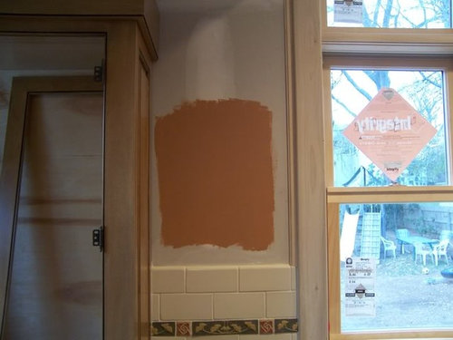
Hello all. I posted this on the Decorating Forum but wanted to get your advice too. Took these pics last week, and my floor has a new coat of waterlox on it now so can't get in to take more updated pictures until this weekend. My kd has suggested BM potters clay for the walls, cream fleece for the trim and monroe bisque for the ceilings. I was worried about the potters clay being too orangy, but she said the ceiling color will tone it down a bit. Anyone think this will work?


Comments (10)

  • 17 years ago

    I feel like the color reads a little too peach. I'd have to research (and I"ve got to get to sleep soon!) but I think a similar color with a little more red in it would give the feel I believe you're looking for.

    your kitchen is off the scale BTW

  • 17 years ago

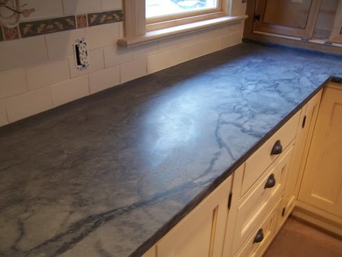
    Donna, I love your kitchen. Absolutely gorgeous. And your soapstone, whoa, that's beleza right? Just beautiful. The color looks too orangey for me. The flower in your backsplash appears a bit more red than the sample on the wall. I'd go more in that direction.

  • 17 years ago

    Wow! Lovely kitchen you have created there!
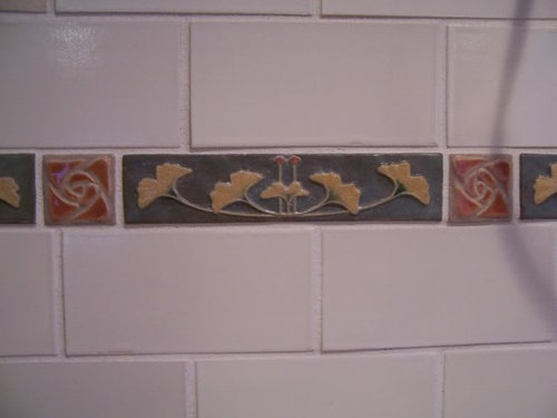
    Are those Motawi tiles?

    I like the color, but I am partial to Orangey tones.
    I have seen the Bisque and I think your KD is right.

  • 17 years ago

    Thank you. My camera is not that great and I couldn't get the tile colors to show up that correctly.

    Remodelfla, it does show it bit more orangy than peach in person. Also the ginko tiles show up almot tealish on my monitor but are actually a mossy green.

    Pluckymama, yes the counters are Beleza and what I think I love most about the kitchen.

    Caligirl, the tiles are Meredith Art Tile. They have some really beutiful stuff and lots of arts and craft type designs which is very loosely what I was going for without the quarter sawn oak cabinets. That is part of the reason my KD picked this color, to go more in that direction.

    Thanks for all input. Keep it coming!

  • 17 years ago

    Donna, When I look at my BM fandeck, the potters clay looks more brown/orange than orange. Looks different than in your pic on my monitor. Could you take one of the tiles into the BM store and have them do a paint match and see which color is the closest? I once painted a back wall around a tan brick fireplace BM Mayflower red HC-49 and it was a great color. Received many complements on it. I've used BM Audubon Russet HC 51 and liked it as well. What I've found with the red family is that until you have several coats up and see it all around it is hard to tell what it is going to look like. If you're decorator is good, and she has seen the combination before, you might just want to trust her judgement and go with it.

  • 17 years ago

    You have warm wood floors, warm cream cabinets, warm wood cabinets, and a lot of warmth in your tiles. If it were my kitchen, I'd go with a lighter version of the tile's mossy color on the walls.

    Fantastic kitchen, by the way. Love the tile, the cabinets, the details. Can't wait to see the finished room.

  • 17 years ago

    BEAUTIFUL kitchen!!!! i have to agree with rhome410. i love color and have it all over my house. i have also used audoban russet in my family room. however, i feel like i would like a lighter color in your kitchen......how about something that blends with the yellow/tan leaves on your tile?

    totally personal preference and anything will look great in that gorgeous kitchen. i just think that the dark clay color might actually distract from the stars of the kitchen, like your soapstone.

    let me also add, i'm no decorator!!!!!!!!!!!!

  • 17 years ago

    I second the suggestions of Rhome and gglks. Choose one of the accent tile colors other than the russety orange. Either the tan or the green (but don't go too yellow -- make sure it has grey or brown undertones to pick up the tones of the counter, maybe?)

    I think the craftsman orange would look great in one of those craftsman kitchens with the dark wood moldings, but in your kitchen, with the cream painted cabs, it's just jarring. The orangy color is just going to counteract the subtlety of the beautiful cabinetry.

    That's not to say the kitchen is anything other than stunning so far -- I love the cabs, counters and tile!

  • 17 years ago

    I love the color your KD chose. It doesn't look like you have that much empty wall space to be painted so it will just be a great accent with all those beautiful creamy cabinets.

  • 17 years ago

    Beautiful kitchen. I am not sure if I'm a big fan of the Potter's Clay. Tonally, it is much stronger than just about everything else in your kitchen.

    For something that contrasts with the rest of the room as much as that colour does you need to have a lot of it - broad expanses so that the eye calms down a little. Even then, you'd need fairly vibrant accessories and furnishings of the same intensity as the Potter's Clay paint, so that they eye is not drawn to any specific pieces or sections of the wall.

    If it were my room, I would be trying hard to maintain the calm, honest feeling that flows from your cabinetry.

    My suggestion would be to start with the general green tone of the countertop and then wash it out with the addition of some white. Calm it down to about the same intensity as the cabinets (soft) and I think that you'll find it gives a very cohesive feeling.

    I would leave the dividing coffers on the ceiling the colour they are now and lighten the greenish wall colour up a tone and a half and use that for the ceiling.

    It's a truly beautiful room so far. Looking forward to seeing more pictures. :)

Sponsored
Hope Restoration & General Contracting
Average rating: 4.7 out of 5 stars35 Reviews
Columbus Design-Build, Kitchen & Bath Remodeling, Historic Renovations