

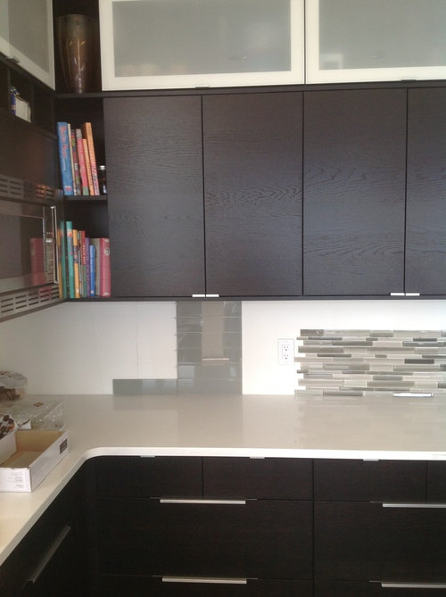
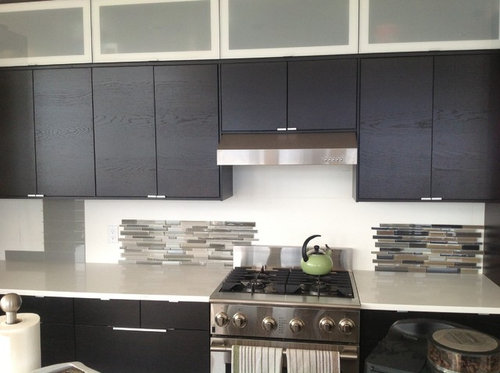
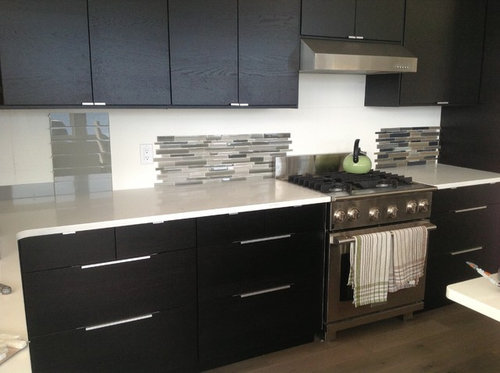
Need help with kitchen backsplash
11 years ago
Featured Answer
Sort by:Oldest
Comments (24)
 11 years agolast modified: 11 years ago
Related Professionals
Beaumont Interior Designers & Decorators · Bronx Interior Designers & Decorators · Hays Architects & Building Designers · Chambersburg Architects & Building Designers · Florence Architects & Building Designers · Anniston Architects & Building Designers · Plainfield Architects & Building Designers · Burlington Architects & Building Designers · Salem Architects & Building Designers · Queens Architects & Building Designers · Brunswick Kitchen & Bathroom Designers · Lexington Kitchen & Bathroom Designers · McComb Kitchen & Bathroom Designers · Norfolk Kitchen & Bathroom Designers · Farmington Kitchen & Bathroom Designers 11 years ago
 11 years ago
- 11 years ago
 11 years ago
- PRO11 years ago
 PRO11 years ago
 11 years ago
 11 years ago
 PRO11 years ago
 11 years ago
- 11 years ago
- 11 years ago
 11 years agolast modified: 11 years ago
- 11 years ago
- 11 years ago
 PRO11 years ago
- 11 years ago
 PRO11 years ago
- 11 years ago
 PRO11 years ago
 PRO11 years ago





Related Stories
KITCHEN DESIGNHere's Help for Your Next Appliance Shopping Trip
It may be time to think about your appliances in a new way. These guides can help you set up your kitchen for how you like to cook
Full Story
KITCHEN DESIGNKey Measurements for Your Kitchen Design
Get the ideal kitchen setup by understanding spatial relationships, dimensions and work zones
Full Story
MOST POPULAR7 Ways to Design Your Kitchen to Help You Lose Weight
In his new book, Slim by Design, eating-behavior expert Brian Wansink shows us how to get our kitchens working better
Full Story
KITCHEN DESIGNDesign Dilemma: My Kitchen Needs Help!
See how you can update a kitchen with new countertops, light fixtures, paint and hardware
Full Story
SELLING YOUR HOUSE10 Tricks to Help Your Bathroom Sell Your House
As with the kitchen, the bathroom is always a high priority for home buyers. Here’s how to showcase your bathroom so it looks its best
Full Story
ORGANIZINGDo It for the Kids! A Few Routines Help a Home Run More Smoothly
Not a Naturally Organized person? These tips can help you tackle the onslaught of papers, meals, laundry — and even help you find your keys
Full Story
LIFE12 House-Hunting Tips to Help You Make the Right Choice
Stay organized and focused on your quest for a new home, to make the search easier and avoid surprises later
Full Story
COLORPick-a-Paint Help: How to Create a Whole-House Color Palette
Don't be daunted. With these strategies, building a cohesive palette for your entire home is less difficult than it seems
Full Story
COLORPaint-Picking Help and Secrets From a Color Expert
Advice for wall and trim colors, what to always do before committing and the one paint feature you should completely ignore
Full Story



Ann