Software
Houzz Logo Print
drdcon

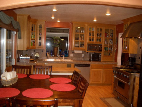
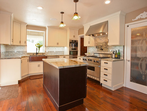
Before & After: Kitchen Remodel

This kitchen remodel included:


“Linen” Shaker cabinets, contrasting “Espresso” island, “Fusion” granite countertops, custom “Blue Slide” handmade subway tile backsplash, new Miele brand Coffee Center, Speed Oven and Warming Drawer, a new hand-hammered copper farm/apron sink, a Grohe kitchen faucet and pot-filler faucet above the range and LED recessed and under cabinet lighting, as well as new pendant lighting.


Fortunately they were able to use their existing Viking range, Bosch dishwasher and KitchenAid refrigerator.


Kitchens · More Info

Comments (83)

  • 11 years ago

    Glass door or open upper cabinets are all the rage now, but I notice that these homeowners went from glass doors to closed doors. Of course. No one really wants all the dust and grease their dishes would accumulate by being out in the open, as well as having to keep the contents completely orderly and decorative rather than functional.


  • PRO
    11 years ago

    Wow, Looks great!


    Nice job:)

  • 11 years ago
    Love the new kitchen. So bright and inviting.
  • PRO
    11 years ago
    What a fresh new look, looks like you added a double oven and were able to use the stove a range hood. Great update.
  • 11 years ago
    The new kitchen is like the difference between day and night compared to the older darker version. Great job!
  • PRO
    11 years ago

    I like it.

  • PRO
    11 years ago

    Very nice!

  • PRO
    11 years ago

    Wow, we love the feedback! It's not typical for us to see such a divide. About 1/3 of you prefer the "before" kitchen. We noticed that the 11 "Pros" that commented were all positive. What can we gather from this?:

    - Are the "Pros", whether they be contractors or designers, out of touch with what the client really wants?

    - What are the demographics? In other words, does the younger crowd prefer the more modern "after", while the more seasoned people prefer the more traditional "before"?

    - The current trend is "oak is out." We all know that styles change. Will these "afters" be considered dated, sooner rather than later?

    Again, thanks for the feedback. We look forward to the continued discussion.

  • 11 years ago

    I don't buy the "oak is out' statement. It should depend on the character of the house. You don't put ultra modern kitchen in a converted castle, for example.

  • PRO
    11 years ago

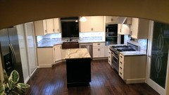
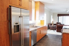
    There were a couple questions regarding the refrigerator, island and dining area. Although certainly not a professional picture, this will give you a better prospective:


    The refrigerator was originally to the right of the range, where the pantry door is currently. We moved the refrigerator to the opposite side of the kitchen and recessed it into the wall, which created a much better flow and allowed us to build a walk-in pantry at the refrigerator's prior location. Also, please note that without the island, there would be no efficient food prep area. Since the dining area has been relocated to an adjacent room, there was no need for bar seating at the island. Besides, this kitchen is too small for that type of arrangement.

  • PRO
    11 years ago

    Great updates! Much brighter and cleaner!

  • 11 years ago

    I could care less about trends. Like before better but the after floor is nice.

    I would never follow a trend at such a lofty expense.

    Trends are for paint colors...

  • 11 years ago
    I think both look very nice! (My cabinets are like the After and with an oak floor.) These folks were likely set on another look and could afford it. I happen to think the Before kitchen would look better with a non-wood floor, so as not to compete with the material and color of the stained cabinets.
  • 11 years ago
    What is the small rug in front of the range made of?
  • 11 years ago
    The original could have been easily updated with black granite, halogen lighting, new farmhouse table.
  • 11 years ago

    As lovely as the before is, I prefer the clean, streamlined vibe of the after. Given all the time I (am forced to) spend in the kitchen, a close, visually dense, "cluttery" space would aggravate me even more. Very nice do-over, and I feel certain somebody was extremely thrilled to be in receipt of the before cabinetry.


  • 11 years ago

    I prefer the after. I like the spacious look as well as light created by the lighter walls and cabinets.


  • 11 years ago

    I think people need to think beyond the look of the kitchen, although this must feel like a breath of fresh air to the homeowners! There was very little prep space in the old kitchen and now there is a ton. I like that the island doesn't impede movement within the space. And what looks to me like a walk-in pantry is fab! My only criticism is that with a 36" oven AND a speed oven AND a warming drawer, it would seem to me to be a little bit overkill. And I'm a pastry chef!

  • 11 years ago

    The before is so much warmer.

  • 11 years ago

    I like white cupboards/cabinets, so that change appeals to me. I would have kept a few glass cupboard doors, though. And, the fridge (not pictured, but location described in comments) is too far away to be practical.


  • 11 years ago

    Both are very nice but my ideal house has NO kitchen.

  • 11 years ago
    I absolutely love the new and in my opinion improved kitchen. The lighter shade of cabinets, the floor color, putting in the island...

    1. the lighter tones/hues in there make it look so much bigger.
    2. the island will give you so much more working space, besides more storage space.
    3. the entire kitchen makes me want to spend more time in there and I would enjoy entertaining in that kitchen.
    4. That kitchen brightens and makes me just smile.
    5. I would love such a kitchen...

    Thank you for sharing your kitchen... Hope you enjoy that kitchen for a long long time. :)
  • 11 years ago
    P. S. I'm from the older generation... 55, love the new version of the kitchen. The older kitchen, I would hate to be in there for long, let alone cooking in there. I would rather order out or go out to eat. The new version with the beautiful darker floor to contrast with the cream color cabinets... I would love to cook, or even learn to cook just to be in that kitchen. lol.... what an inspiriation for my new kitchen to be!
  • 11 years ago

    Love the changes. The old wasn't bad but the new is a much happier space.


  • 11 years ago

    Love the after! I have a dark kitchen like the before picture above. Would love to do what this homeowner did, but my home is only a few years old so it'll have to wait.

    A bright kitchen would start my day off in a cheerful mood, especially with the long winters we have in Ohio.

  • 11 years ago
    I'm in the camp that prefers the before kitchen.
  • 11 years ago
    loving both but the first one a but more romantic feel to it
  • 11 years ago
    If you study the pictures and contractor comments, this redo wasn't just about cosmetic whims. They made structural changes that improved the function and gave a better flow. The before had a cramped look, you could almost lean back in one of the dining chairs and help yourself from the stove. Every family tends to congregate in the kitchen and they didn't have room for that. Give them kudos for reusing appliances.
  • PRO
    11 years ago

    Lovely work—very bright and functional. The granite is gorgeous, and anytime appliances can be reused that's a win. Well done.

    Reminds me a bit of a remodel we just completed, except we went from white cabinets to a wood finish!

    [Before & After: Scandinavian Inspired Kitchen Remodel[(https://www.houzz.com/discussions/before-and-after-scandinavian-inspired-kitchen-remodel-dsvw-vd~2908421)


  • 11 years ago
    Beautiful!
  • 11 years ago

    I like both but do prefer the updated kitchen, however the old kitchen has a warm, homey feel and the new kitchen apparently has no eating area!

  • 11 years ago
    I like the before kitchen. I prefer a larger island and the refrigerator closer to the sink and stove.
  • 11 years ago

    I prefer the before kitchen. There was really no need to waste money on a new kitchen when the old one was updated. Just saying...

  • 11 years ago
    Both seem like a good layout for a kitchen that has so many doors and foot traffic.
    I think i'd prefer the island version - image 2 - as it brings the cooking & prep closer into the eating area, feeling inclusive. More people can work at the same time- More suited to adults, a family with teens.
    Whereas the counter bar is more of a server's area, apart, cooking & prepping for younger children.
  • 11 years ago
    Great layouts for an area with so many doors.
    I think I prefer image 2 as the island means the cooking and prepping are closer to the eating area, more inclusive. It also means more people can work in the kitchen at the same time - good for a family with teens, young adults. But that is just where i'm at!
    The counter bar is more suited for one working in the kitchen - for a young family? And it does keep the prep area out of the circulation/foot traffic routes for when kids come tewring through!
    Well done!
  • 11 years ago
    It was beautiful before, but looks like something out of a magazine in the after photo! Very nice!
  • 11 years ago
    Absolutely stunning!! Great job
  • 11 years ago

    The island is awkward. You have to walk around it to get to the refrigerator. Unless you don't really cook in this kitchen.

  • 11 years ago
    Both are beautiful. The light kitchen has a few more modern touches while the darker one is more warm and inviting.
  • 11 years ago

    Both are nice to me so unless the renovation is free, I will not change it.

  • PRO
    11 years ago

    So much brighter. This is a great upgrade for the space. Well done!

  • PRO
    11 years ago

    Nice job with this!

  • 11 years ago
    last modified: 11 years ago

    The after kitchen looks so much better to my older eyes... hehe.

    Part of the less homey feel is that the homeowner has not really lived in this kitchen to add those touches... a few counter things that just seem to collect and I would rather keep hidden. Even the toaster n coffee maker not visible... just saying. I wish I could keep my counters (almost) so void of 'stuff'.

    I prefer the cleaner lines of the cabinet uppers and no glass front cupboards, there was just too much 'going on' before. A third pendent would have been my preference... and they look a little high but that's prob the picture? The island looks slightly boxy or something, not sure what might be different. Anyway, just nit-picking... I am trying to make such decisions myself at present so those things just pop in my mind. Trying to decide between stained or painted cabinets. It has just come to mind that I should paint my existing cabs quickly and use that as a guide...

    This looks like a kitchen I could spend lots of time in. Great job!!!

  • 11 years ago

    For those that commented before is better than after: Are u all crazy? I love this adorable, elegant and clean trans!!

  • 11 years ago
    Very pretty kitchen. I do find the island a bit odd and the pendants should be lowered at least a foot.
  • PRO
    11 years ago

    My favorites: the new floor, the copper sink, and the drawer hardware.

  • 11 years ago
    Quedó hermoso! Cambio total.!! Antes, los muebles con tantas ventanillas, se veía un desórden total. Bello!
  • 11 years ago
    The after isn't just for looks or a more modern feel. It is so much more efficient: more workspace, storage, light, cooking and prep options...love the pot filler and beautiful pantry door! Having all glass uppers (in before ) made it busier, not neater by showing all the contents. The island is a good landing spot for items from stove, pantry, sink or refrigerator. Great remodel job in existing space!
  • 11 years ago
    When I'm working in the kitchen, I like to encourage others, whether it's my daughter as she passes by or it's dinner guests, to sit down and chat with me. That is why I have a counter with barstools. A kitchenette table can serve if there is no island or counter with seating. Cook can be a lonely job especially during holidays.

    They are both very nice kitchens with different strong points. I could argue for each of them - with modifications.
  • PRO
    11 years ago

    Love the white cabinets and the new flooring. Nicely done!

Sponsored
Hope Restoration & General Contracting
Average rating: 4.7 out of 5 stars35 Reviews
Columbus Design-Build, Kitchen & Bath Remodeling, Historic Renovations