Software
Houzz Logo Print
natanddan

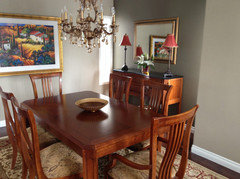
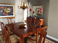
Does this room work?

11 years ago
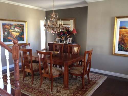
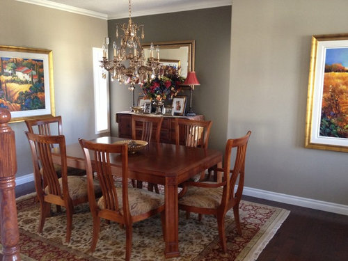
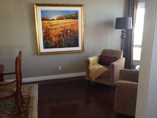
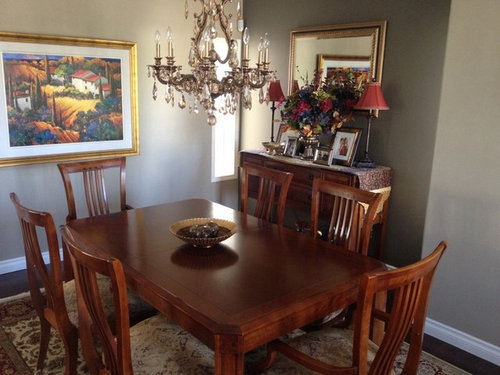
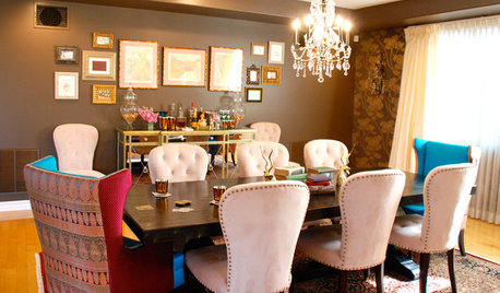
Trying to get this dining room/ small sitting room to
Flow. Do you think it would help if I recover the dining
Chairs with a solid color?

Comments (107)

  • 11 years ago

    I recently staged a house using a Tuscan theme based on the homeowners items that I "shopped" from. I'm wondering if what you're really after is that tied together look. Your wall art and red and yellow highlights in the color scheme leans in the Tuscan direction. I would narrow down your research to that theme and maybe you will find the inspiration you're seeking.

  • 11 years ago

    Let the mirror be unblocked for light to reflect in the room, I would paint the walls a lite tan about the same as the edging on the rug, a solid color on the chairs and less drama in the paintings, to busy. Agree the lighting could be up dated if you're incline, too.


  • 11 years ago
    It is a nice room. Just the colour of the walls is so sad! Choose a happier colour: you can pick a light yellow or blue out of one of the paintings. Since there are not many windows and little light from the outside (it seems) the room should be lightened up by a bright colour on the walls. Even white (with a little yellow) would do!
  • 11 years ago

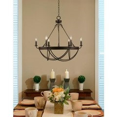
    Although it IS a pretty room, I think I'd try updating a bit. Try moving the rug into the sitting area and turn it perpendicular to the wall. Then look online for a natural fiber, (sisal etc), rug for under the dining table. A less formal chandelier such as the one pictured. The sideboard could also be updated as in the attached photo.


  • PRO
    11 years ago
    last modified: 11 years ago

    The paintings are all much to large in relation to the room, they give it a confined feeling. Also, the chandelier should be scaled down or try using a simpler designed fixture, about half the size. Try a few smaller prints or paintings and you'll immediately see and feel the difference.

  • 11 years ago

    Large picture dominates the room...why not switch sitting area with dining table, rehang the large picture over the seating area with two smaller pix stacked on either side to give scale to the wall. Turn table other direction and remove two chairs. Beautiful chandelier but a bit fussy with the arts and craft table. The mirror if hung vertically where the large painting is now would increase size of room and reflect light.. Sconces on either side would lend it elegance. The earth tones need some pops of colour!

  • 11 years ago

    I like the room! Seems comfortable and inviting. Love the chandelier and the paint w/ contrasting trim. Great job!

  • 11 years ago
    Move one of the wall chairs to the right of the buffet. Can the other one be put on an angle in the corner it is in or moved elsewhere in the house to be quickly retrieved when you have six people sitting at the table? Lower the mirror. Take off the buffet lamps. Table lamp between the chairs instead of the floor lamp. Without the tall lamps I think the chandelier can stay until you really want to replace it, and I think the room will feel more like a cozy conversational gathering spot amidst art, either for two in the chairs or 2-6 around the table.
    Maybe with the lower mirror the floor lamp could go to the left of the buffet in front of the window?
  • 11 years ago

    Lots of ideas here. My 2 cents: I find too much weight on the left side. Removing some of the chairs from the table improved it some, but it seems to have narrowed the space between the buffet & the doorway. Would it work to put the DR set where the sitting area is or is that too far away from the kitchen? If so then move the rug to the sitting area to visually open up some space under the table. That would then tie the chair seats to the rug rather than having them compete. I'm sure the chandelier was pricey and you must like it a lot, but like others I find it too formal and large. Would it be bizarre to remove some of the crystals, I wonder? If you're sticking with the new buffet arrangement put the flowers in a lower container or try it between the upholstered chairs to bring some weight to the right side of the room. It's great that you're showing us pictures of the changes!


  • 11 years ago

    This is a lovely room. The muted pattern on the chairs is fine. If you're looking for more drama you could recover with the color on the small lamp shades. An ottoman covered in a similar shade might complete the sitting area and blend it all together.

  • 11 years ago
    I would recover the chairs, solid color in a natural fiber. I would also get a solid color 100% wool rug. I think the paintings are nice, and I am very picky!
  • 11 years ago
    last modified: 11 years ago

    The size of the rug is stagnant - needs to be a longer rug so it flows into the sitting area. I would get a new rug with blue in it and recover the four chairs with a tiny bit of blue. (That large painting has a beautiful blue sky - bring that blue into the room). Then cover the two end dining room chairs with blue fabric so the chairs don't all match. Last thing - perk up the sitting area with unexpected pillow sizes to break up the boxiness of those 2 sitting chairs. Capeanner's comments above are correct; the buffet table is crowded-try one buffet lamp and move the mirror over so the look is asymmetrical. But if you want flow and have limited funds - a longer carpet with a contemporary pattern is the best advice. (The border around the rug is visually confining - a rug without a border is my best piece of advice).

  • 11 years ago
    last modified: 11 years ago

    Reading latest post, looking at room, and making another opinion at what you might want to consider. Leave the room grey, remove all the stuff except the paintings, add a back chandelier as shown above, upholster the chairs in black, then add accent color of your choice taken from paintings in colors of pillows on chairs, painted pottery plate pot etc that has colors of painting, on the table with no runners anywhere, keep it clean......candles on buffet as shown above, odd shapes and sizes, 3 - 7 on buffet, and call it good. Someone mentioned the Tuscan look which I think is what your paintings are all about, but I think the paint is grey and the sitting chairs are grey because it works with all the rest of your furniture in your home?

    The paintings are gorgeous and I am sure they have emotional meaning to you so you should of course keep them!!!!!!!!! Let's not throw the baby out with the bathwater, etc. haha

  • 11 years ago

    I think you need to do any or all of these options: change to white dining set; update pictures to more simple 2-3 color design pictures (yellow/black or gray); OR keep dining set, but change out chair seat coverings and rug to a combo white/gray/yellow. Grey and brown just don't get it in my book - gray with your white moldings can be turned into a cheery room!

  • 11 years ago

    Wow! Lots of feedback. Great. Thank you everyone. Over the next few weeks I will work with some of your suggestions, and get back to you with some photos. Thank you :)


  • 11 years ago

    You have great pieces to work with! Furniture and art are fabulous. I agree with comments about the mirror and think decluttering the buffet certainly improved the look and feel. Not sure what color you have on the walls, but it seems cold. Perhaps warming up the walls would make your room more inviting, cozy, and conducive to dinner conversation as well as showcasing your beautiful furniture and art. I wouldn't change the rug or chairs upholstery unless you are sick of them. Agree with other comments regarding a table runner and low, simple but dramatic centerpiece. Keep your buffet mostly clear.

    For me, there is a difference between "Wow, we have a fabulous dining room" and "Oh gosh, we have a wonderful space that invites family and friends to come together to share meals and conversations." Whether the dining room is an every-meal space or a special occasion space, someone wisely advised me to "stage" my space so that minimal effort is required when it would be used.

    Lots of great comments! Good luck!

  • 11 years ago

    I don't think anything in the room needs replacing. I think it needs, as the owner says, flow -- a way of wending the focus of the eye around the space. As it is, everything is pleasantly geometric, but in angular forms that don't move the eye. Try setting up a threesome -- one large palm between the front-window chair and the dining room proper, then also a plant in each of two smaller areas that aren't quite parallel to each other, probably at the far end of the dining table. Possibly you, owner, are a scientist or logician -- all those beautiful yang forms, not tied together with yin flowing lines! So you might enjoy making a pencil sketch of the basic shapes you see together in the room, just pencil outlines of their overall perimeters. On copies of that map of the room's shapes, try drawing in various lines with some circularity, for example from the window chair to a dining room chair, from the top of a painting to the floor . . . just experiment, and see what pleases your eye. Then speculate what sort of added item could provide that. At the very least, put all lights in the room on rheostats and raise light on the painting at the far end of the dining table and also on two areas at the far end, at least one of them small. Got flow?

  • 11 years ago

    I would change the rug. Perhaps something simple with charcoal and gold. I would also reupholster the chairs. Maybe a wide stripe with white and gray. Maybe turn the mirror horizontally over buffet. The lamp on the buffet is too small. If your budget allows I would love to see a round table, but I'm not sure that you have room for it.

  • 11 years ago
    It's the paint colour that doesn't work for me. It doesn't do anything for your lovely furnishings and art.
  • 11 years ago

    Here are the things that disrupt my visual flow in your room:

    1) The stair balusters and newel seems to intrude into the room with a different style than anything else in the room. Maybe moving the table to the other end of the room would alleviate the intrusion, but regardless, the balusters and newels should be replaced with a style that matches your classy furniture;

    2) The chandelier also clashes with and detracts from the style of the furniture. It is visually jarring;

    3) The rug is the wrong proportion relative to the table. The end chairs have a look of confinement because there is not enough rug behind them. The side chairs look more secure. I think the back legs of all chairs should be the same distance from the edge of the rug.

    4) The field panting is too small to stand solo on the wall, leaving large gaps of empty close to the table and gives me the feeling that the table is crammed into the end of the room.

    5) I usually eschew ornate or heavy crown molding, but in this case the crown seems a bit insubstantial. That may have to do with the color. Because the ceiling, crown, base, and baluster are all bright white against a dark floor and drab walls, they compete for my eyes' attention with the painting frame mats. Ceiling and trim is inherently boring, no need to draw attention to it and away from good art. Changing all that trim to a shade closer to the wall would be easier on my eyes and would make the paintings stand out even more.

  • 11 years ago
    I like chairs that don't "go with" the table. How would you like some tall white-washed ladder-back chairs?
  • 11 years ago
    :) so there you have it...78 answers and 78 different opinions! Isn't it great?
  • 11 years ago
    remove thr ug and painting that feature wall with the mirror a brighter colour perhaps?
  • 11 years ago

    You've done a great job here. The only things wrong are the mirror is too high and the flowers are too tall. Fix those and you're done.


  • 11 years ago

    Needs a splattering of blue from the pictures, maybe some blue pillows, drapes or recovered chair seats.

  • PRO
    11 years ago

    Beautiful. If you want a real change, perhaps you could move the buffet table and the mirror to the wall near the two chairs. The art work currently placed near the chairs should be hung on the wall where your buffet is now.

  • 11 years ago

    Natanddan: I signed in just to make one comment.... I think your chandelier is fabulous, it does not need changing, in my opinion. As long as you like it, too. I think "modernizing" everything can be a mistake, particularly if you have something truly beautiful.


  • 11 years ago

    Dreammaker, I thought that at first, but the wall where the buffet is is recessed.Don't think it would fit in the space with the two upholstered chairs.


  • 11 years ago
    You have some beautiful pieces to work with! Here's my left field input.... I'm not sure of the layout of your room in relation to the kitchen. Is it possible to flip-flop the dining and sitting areas to create flow through the space better? You have an eclectic assortment of furniture, lighting and accessories. that's completely fine, but be more deliberate in your eclecticism. Some of the posts about switching up accessories, for example. The club chairs could make a neat statement near the arts and crafts buffet....with a large gilt framed painting over it. (OR)The mirror is not the proper size for the buffet hung the way it is. If you want to use it, try offsetting it vertically to one side with the large flower arrangement balancing the other. Maybe put one candlestick on front of the mirror. That's all for now....feel free to accept or discard my advice!! And Have fun!!
  • 11 years ago
    PS....Gold, grey and taupe is one of my favorite color palettes!!
  • 11 years ago
    Personally I think the chairs should be a solid color so they don't clash with the rug. I love the area with the chairs, but it does feel like it's missing something (an ottoman perhaps?) overall great room!
  • 11 years ago
    last modified: 11 years ago

    In keeping with Grovers wonderful photo enhancements above - I'm still thinking that a less feminine chandelier would be the ticket here. Look into a neoclassical bowl chandelier if possible.

  • 11 years ago
    I think the chairs need a bright wow factor to bring it all together.
  • PRO
    11 years ago

    I like the second set of pictures after clearing off the buffet. The dining area has a lot going on, seeming too busy and less is definitely more. A new light fixture in a darker metal, with a more contemporary style seems more suitable to the space. It would ground the room better and tie in the sitting area. I noticed that the sitting area is casual while you are attempting to go with a more formal look in the dining area. Even choosing to "lean" a picture or mirror on the Buffet as opposed to hanging it and adding maybe a large bowl in front of it, would also tame down the formalness of it and tying the two areas together. I guess it all depends on what you are willing to change or spend. If you are really attached that chandelier, then the sitting area needs more. Definitely a lamp in a similar style of the chandelier to replace the one in the picture or a table lamp. Also some pillows and throws with some similar patterns would bring more connection to the two spaces.

  • 11 years ago

    The one thing that captures my attention every time I see this room is the color of the lampshades. I would go more neutral there because, to me, the color fights with the art. JMO

  • PRO
    11 years ago

    I would just un-clutter the buffet and find a different center piece for the table. you could add a throw on one of the chairs to add a little color. If you really want the lamp, perhaps a throw to match would make the room uniform in colors. Sometimes less is more when the rug is a pattern and the walls have colorful pictures.

  • 11 years ago
    I agree with Nicole, I was wondering would it look better to move the sideboard and mirror where the large picture is and the picture where the sideboard is, just flip flop. also clear the sideboard a bit. pics can be hard to see the real dimensions of the room that's just my guess.
  • 11 years ago

    The room needs more warmth. Buy chandelier shades and a cord cover for your light fixture. Tone down the Brightgold of the madded frames

  • 11 years ago

    Gold is warm; silver is cool.


  • 11 years ago
    I hate cord covers on chandeliers
  • 11 years ago

    i only like them if they are velvet.

  • 11 years ago

    I think the chairs look very nice with the rug as they are.

  • 11 years ago
    I am in the camp suggesting to repaint the room. Light shade of warm green color (with yellowish undertones) or vice versa yellow with a hint if green, or an elegant blue with a hint of gray perhaps.
    The current wall color calls for silver picture frames , black or nickel chandy and a dining set that is nickel and white, perhaps a teak table and lucite chairs with sheep skin covers. So totally different from what you have going on.
    I would repaint the room as the first remedy. Or change both rug and chair covers, especially if you don't want to paint.
    I also liked a simpler chandelier that someone suggested.
    I loved your flower arrangement in first pic, but I would put it somewhere next to the wall on a small pedestal instead
    I liked when you took stuff off the buffet. I would probably take the lamps away and just leave a couple if family pics in square frames and have small flower arrangement. I think current lamps are too tall and thin. But in not s fan if lamps as part of a vignette in general, so I may be not the best person to give advice about them :)
    In any case I applaud your bravery to post pics and ask read all our 1001 opinions! Good luck!
  • 11 years ago
    Ah, sorry for typos, my autocorrect has gone crazy. " I do no how too spel :)"
  • 11 years ago

    You have a lot of comments here. My thought is that you have fabulous taste! My two cents? Clear the cluttered buffet and paint the room a lighter more cheerful color. Have fun.

  • 11 years ago
    Nice but safe and very formal/traditional.The wall colour pulls the room down as it feels quite heavy, and that lovely chandelier gets lost. The wall pictures are very traditional also.

    If it were me?
    Review wall colour.
    Lessen the timber influence by painting/changing picture frames and/or chairs and buffet (I'm loving gloss paint finishes for a bit of wow factor).
    Definitely change seat fabric for contrast.
    Pop/contrast colour for room highlights?
    Curtain fabric change or highlight? (A contrasting strip of different fabric at the bottom/top switches things up a bit and adds surprise/contrast).
    Modern art i/l/o traditional?
    Definitely need something with the armchairs - cushions, a small area rug/table perhaps?

    Have fun! Don't be afraid to be bold in your life. Check some Houzz pictures to find one you like. A unifying theme/colour/furniture treatment will consolidate the area for you. It needs a bit of contrast/pop/pizzaz!! Unless you really like traditional of course.

    Have fun!
  • 11 years ago

    What's left? She buys a new house?


  • 11 years ago
    I have followed this discussion for several weeks and have enjoyed reading all the input. Have you considered switching your dining and sitting area? Space may have limited your choice for furniture placement, but I find the table at the end of your stairs to be disconcerting. The current table area would make a lovely sitting/reading area while your sitting area seems to have more light which would be lovely with your dining table. Of course you would have to move the lighting, but that is not a major expense in comparison to some of the suggestions. It is good that we all have different ideas, but at the end of the day it is your space and your decision.
  • 11 years ago

    That switch was already suggested.


  • PRO
    11 years ago

    In my opinion the room does not appear to be very large and the amount of furniture, art and accessories is more than the room can handle. I would move the large square piece of art and place behind the dining table and move the other landscape to the wall between the sitting area and dining area. Then consider either removing the rug altogether or using a lighter colored rug. Finally, recover the chairs in a lighter fabric (you can find some that are pre-treated to resist staining). Take a "less is more" approach to show off your favorite pieces.