Software
Houzz Logo Print
betshsu

kitchen counter color advice

11 years ago
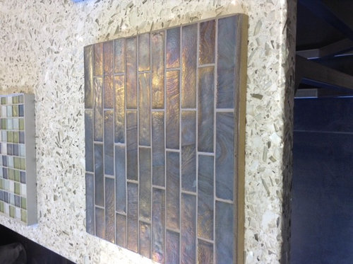
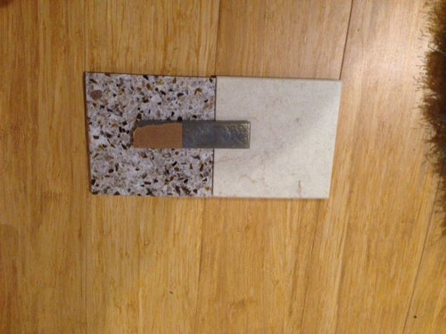
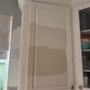
Looking for some input on a countertop color choice. The tile backsplash is a 3/4" x 3 3/4" offset; it is a glass irid, though the irid is only really noticeable when the light hits it, so much more so as a horizontal surface than vertical surface. We would tile up to the upper cabinets and completely around a window over a range (sorry... I have no idea why the photo is rotated... but the tile would be installed horizontally):


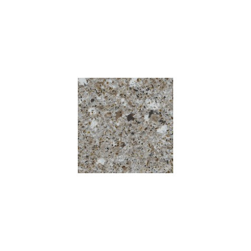
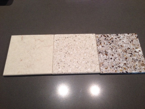
We would like to use Eco by Cosetino for the counters. We were leaning toward Forest Snow because it pulls in the wood color of the cabinets and the brown undertones of the tile

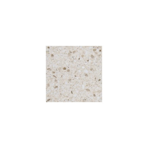
But now I'm worried it might be too busy with the tile and we should go for something cleaner like Luna:


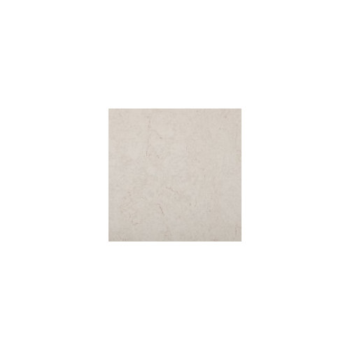
Or Creamstone:


Or maybe even just the closest thing they have to a pure white (polar cap).


My husband is a bit partial to Creamstone because he prefers simpler, but doesn't have strong opinions. One potential downside to Creamstone is that for cost reasons, we will probably use the same top for our bath vanities and the Creamstone is extremely similar to our bathroom tile.


Some additional photos of samples for color reference:

Cabinet sample (honey stained alder) next to Luna (on the left):


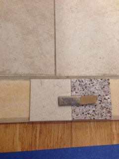
Tile sample on Forest Snow and Creamstone on the wood floors that will be in the kitchen:


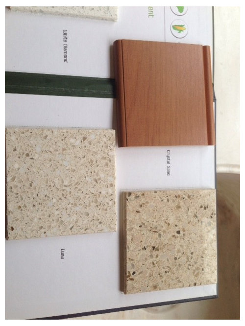
Real life samples of Creamstone, Luna, and Forest Snow side by side:


Any color/design experts want to offer up their opinion? Thanks!

Comments (16)

  • 11 years ago
    last modified: 11 years ago

    I actually think if you do a grout color that's similar to the tile, you'd be fine with the forest snow. The tile itself isn't busy, just has slight variations, yeah? (It's had to tell with the sample photo because it is laying horizontal, but that's what I recall.)

    If, however, you do a contrasting grout, it will make the pattern of the backsplash pronounced, and you will want a quieter stone.

    My personal preference is the creamstone, but I like a less-busy countertop.

    betshsu thanked Hillside House
  • 11 years ago

    Thanks! My husband likes the Creamstone for the same reason as you.

    Yeah, the tile isn't really patterned, except for the slight sheen and color variations. We were planning on doing a darker grout to blend with the tile.

  • 11 years ago

    Same here: I prefer less busy counters, especially if you go with a cleaner look (your cabinets?) and if there are other items that provide interest, like the tile. I don't think it will look boring but rather casual/elegant.


    betshsu thanked nosoccermom
  • 11 years ago

    Our look is pretty clean and simple. The cabinets are as you suspected pretty clean -- a simple shaker, no beveled edges or raised panels.


    So follow up to going with a cleaner look (and specifically Creamstone). Issue that it basically matches our bathroom tile? And does cream on white (bathroom sinks) look off? Maybe we just need to trek out to the warehouse/showroom this weekend and see what a huge slab of Creamstone really looks like.


  • 11 years ago

    I strongly prefer the Creamstone, too. I think it will look best with your dark tile and two shades of wood. Why does it matter that it is similar to the bath tile? They won't be visible at the same time. And the Creamstone won't make anyone think "bath" when on the counter with the surrounding splash and cabinets (IMO).

    White with cream can work great, it just depends on the white being not a blueish or grayish white. Most bath sinks that I have seen are fine with creams.

    betshsu thanked raee_gw zone 5b-6a Ohio
  • 11 years ago

    I should clarify that the only reason I am concerned about the creamstone being similar to the bath tile is that we might use the same top for our bath vanity (for cost reasons -- the slabs are huge). I have no idea if it would look weird to have very similar tops and floors, or if the wood of the vanity is enough to break it up.

  • 11 years ago
    last modified: 11 years ago

    I like the Creamstone as well. I think it is more subdued and while the tile isn't a pattern, I think it makes a statement. I think the counters should be more subtle. All of that being said, I think a more gray counter color would look good as well. Have you considered the Polar Ice or Gray moss?

    betshsu thanked kelleg69
  • 11 years ago

    I agree with may_flowers. Something in the grey/blue/black family would go with your backsplash tile WAY better. It just has no relation to the beiges.


    betshsu thanked Jillius
  • 11 years ago

    I agree with may_flowers and Jillius. There are no obvious clashes, but they just don't connect.

    betshsu thanked Bunny
  • 11 years ago

    I actually really like the counter the sample is laying on in the first picture. Is that one of your options? Agree that the backsplash is really gray in tone and I would bring that into your counter choice. For Quartz I like the more textured options although my husband thinks they look like fruitcake. :-)

    betshsu thanked jenibufford
  • 11 years ago

    Ha, fruitcake. We really have any counter choice open to us, we just had a preference for the recycled materials counters in a resin as opposed to concrete base, which really means the Eco line because RecycledGlass requires a min square footage. I'm guessing the counter in the first photo is a quartz, which is probably what we would do if we didn't do the Eco. Unfortunately, Eco doesn't have nearly as many color choices as RecycledGlass or any of the quartz options. The only Eco with any gray are the Forest Snow, Riverbed (which is a darker, grayer version of Forest Snow), and a pure gray. We didn't want to go too dark with the counters because the kitchen only has one small window, and it's on a side of the house that doesn't get much light.

    It's interesting the folks read gray -- I read more browns. I think we're going to go to the Cosentino showroom next week to see large slabs in person and I'll be sure to keep everything in mind folks said here about watching for color undertones and making sure everything connects. And worst case, we can look at the quartz options at the same time.

  • 11 years ago

    It's a pretty backsplash, with the iridescence playing off through light. An important decision on your part will be which under cabinet lighting you choose, warm or cool/bright to best bring out it's effect with your Alder cabinets.

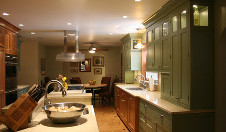
    Would you consider a darker countertop? Here's one from Houzz (sorry, I don't know how to use their embed feature) as well as a link to overall search for Alder and iridescent backsplashes

    http://www.houzz.com/photos/traditional/honey-stained-alder-kitchen-cabinets%2C-iridescent-backsplash-

    [https://www.houzz.com/photos/cliffhanger-cabin-traditional-kitchen-calgary-phvw-vp~5142467[(https://www.houzz.com/photos/cliffhanger-cabin-traditional-kitchen-calgary-phvw-vp~5142467)


    betshsu thanked avamom2012
  • 11 years ago

    We haven't chosen undercabinet lights yet, but knowing my husband, they will be LEDs.

    I'd say anything is open for the counters, though we've tended away from the darker colors because of the lack of natural light. Maybe it's not something we should be overly concerned with though.

  • 11 years ago

    I guess this points again to the differences in monitor color representation. I completely read the backsplash tiles as brown (with some beige and iridescence, so blue/green/violet). Certainly was googling for images with brown backsplash.


  • 9 years ago

    what did you go for? I am looking at the same colors...Forest Snow or Luna...with medium cabinets and floors and a white subway tile back splash.

Sponsored
Bella Casa LLC
Average rating: 5 out of 5 stars17 Reviews
The Leading Interior Design Studio in Franklin County