Software
Houzz Logo Print
debraw1968

Light greige suggestions that don't look pink???

11 years ago

P L E A S E H E L P!! Feeling frustrated!

I am re-doing a small bedroom and want to achieve a light and airy look. I am looking for a nice light greige that does not read pink on the walls
in my house!! Is there really such a thing? Does this colour only exist
in pictures?? I've seen lots of examples on here that have the look that
I want to achieve, but those colours just don't seem to work in my
home!

I saw examples done in BM Edgecomb Gray and some using BM Balboa Mist
that have the look I want. I bought samples of both of those, but they don't look anything like the pictures when in my
house. They turn out a lot darker as well as have pink undertones that don't
show in the pictures.

Today I tried BM Silver Satin, while not too dark it dried to a soft pink instead of gray : ( What the heck??!!

Can someone please recommend a colour or two to try to help achieve
what I'm going for and that doesn't look pink??? I have a very small
house, less than a 1000 sq ft.
The rest of the house is painted a BM Shaker Beige, but I had to have it
tweaked because it too read pink on my walls! There is nothing red that would cause a reflection. My flooring is a paler laminate, not quite a light as maple, but not redish at all. The trim is BM Cloud White.

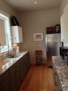
Here are some examples of what I'm trying to achieve:

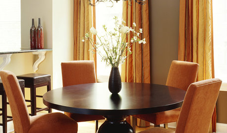
Cape Cod style - BM Edgecomb Gray

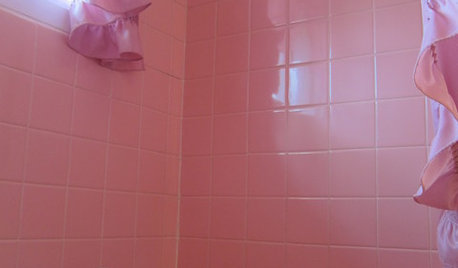
Another BM Edgecomb Gray

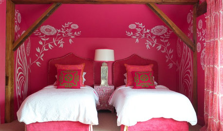
Example using BM Balboa Mist

Comments (31)

  • 11 years ago

    I have to suggest good old Revere Pewter. We just repainted our bedroom this colour (and our whole house last year) and no pink at all. Touch greenish undertone if anything. Love this colour.

  • 11 years ago
    last modified: 11 years ago

    Lighting is everything and w/o knowing the lighting in your room, it's hard to suggest colors. which way do the windows in the room face? what kind of light is in there throughout the day?

    Check out BM Rodeo


    Debra W thanked User
  • 11 years ago

    Another vote for Revere Pewter. I agree that it has a slight green tint.

  • 11 years ago

    I used SW Accessable Beige. I love it. Its on the ceiling and walls in our butler's pantry. Also, pretty much of of our home is painted this color. This is in a north facing room. So, if it doesn't look pinkish here then I do not think it would anywhere.

    gw · More Info


  • 11 years ago

    SW Agreeable Grey.
    Also, any chance that it's the store mixing the paint? To me, Edgecomb Grey had a definite greenish tinge.


  • 11 years ago
    last modified: 11 years ago

    Okay, I've been through this nightmare lol. Here's what worked for me. BM Baby Fawn (medium griege), BM White Down (lighter and slightly more beige than griege), and BM Etiquette (light griege which is Aura). I found White Down was the most versatile. All used with BM White Dove trim. I think Baby Fawn may work for you.

    http://m.benjaminmoore.com/paint-colors/color/baby-fawn

    Edited after reading soccers question about store mixing the paint. Are you using those little BM color samples?

  • 11 years ago

    I also have a major aversion to pink. I'm not a color theorist by any stretch, but it would seem that if there is any red in the beige part of greige to warm up gray, you run the risk of pink depending on how light you go.

    Many people are averse to green undertones but I like them. It's probably the anti-pink/lilac in me. I think the green/yellow component neutralizes the red component.

    I really don't know what I'm talking about. :)

  • 11 years ago
    last modified: 11 years ago

    I can't get Sherwin Williams paint in my area. Wish I could! I like the Revere Pewter on the colour chip but it is darker than Edgecomb Gray. Edgecomb Gray is the same paint as Baby Fawn. I like it on the chip and in pictures, but it doesn't work in my house.

    The room in question has a south facing window. We use compact florescent light "Daytime" bulbs in the lights. Does anyone know if there is another name for BM Rodeo (1534)? I'm assuming that is the US colour chip, where as I'm in Canada and some of them are numbered differently. I would like to see that one.

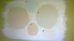
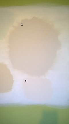
    It actually looks darker in person than what these pictures show. The first picture was taken this morning with natural lighting. The second picture is just closer. The window is on the wall to the right of this one. The colours are: 1. BM Edgecomb Gray or Baby Fawn, 2. is BM Balboa Mist, 3. BM Silver Satin. 4. is BM Manchester Tan, just because I had some, 5. is BM Whispering Spring, just to try an an alternate colour.

    Is it just me, or do others see pink? Could the green be affecting it? Actually I have the same problem in the north facing room across from this one and it had a soft yellow before painting it. Shaker Beige.


  • 11 years ago
    last modified: 11 years ago

    edgecomb definitely read more violet/pink than I had anticipated on my walls.

    I ended up going with French Canvas which is a light olivey off white.

    The green in your room is probably making it look even MORE pink.

    I also considered stonington grey, but this is quite grey.

  • 11 years ago

    Also remember that you are looking at these swatches up against a white background. They are not going to seem as dark when the entire wall is painted.

    The BM Canada site seems to have Rodeo

    http://www.benjaminmoore.com/en-ca/paint-color/rodeo

  • 11 years ago
    last modified: 11 years ago

    I called one of my local BM dealers and she said that Rodeo is in the American colour deck. They have a fan deck they can show me. In the meantime, I'll prime over the rest of the green paint to see if it will help with the pink. My hubby doesn't think I should be getting any more samples pots. They're $7.99 (Canadian) each here! He won't notice if I buy one more, hahaha!

  • 11 years ago

    I totally agree with you!


  • 11 years ago

    Manchester Tan has no pink and is a great color.


  • 11 years ago

    I have it in a north facing room.


  • 11 years ago

    I have BM Clay Beige in my condo. No pink.

  • 11 years ago

    I think the green paint is making anything with any warmth look pink by comparison. You can't tell sith a spot on the wall -- at least one or two wals before you can start to tell, but priming will help (it reduces but won't eliminate the green).

    I find flourescent lighting to be the hardest to deal with when working woth colors. That could be part of the issue. Do your fixtures give you the option of changing to LEDs? If not, you can work around it.

    On my monitor, 2 looks the purest grey, 1 greige, 4 beige, 3 cream and 5 pael aqua. But anytime I order a sample of anything based on screen colors, I'm really surprised at what I get. LOL

  • 11 years ago

    I recently had this same problem. As soon as I changed the one light bulb in the room from compact florescent to incandescent, the pink disappeared. I changed to a soft white incandescent. I know it's not as energy efficient, but I'd recommend at least giving it a try if you haven't already.

  • 11 years ago

    BM Revere Pewter has a green undertone. BM Manchester Tan is very neutral. Some say it has the faintest green undertone.

  • 11 years ago

    BM Jute... no pink

  • 11 years ago
    last modified: 11 years ago

    I have Manchester Tan as sample 4 on the first picture that I posted. The swatches I did on the wall are actually larger than they appear in the photo. Numbers 1 and 2 are about 20 inches or so across, but I'll paint bigger sections once I get the green covered up. I'm going to have another look at Clay Beige, as well.

  • 11 years ago

    I think that 2 Balboa Mist looks like what you are seeking. I see zero pink there and a definite greige.

  • 11 years ago

    Yes to Clay Beige. Best way, I think, to judge a paint swatch is to paint it right up against something it will be contrasting with in the room, so trim, a piece of furniture, windows...

  • 11 years ago

    Dang, I wish I would have posted on the forums before picking a greige because I LOVE some of them that are posted here. LOVE Jute. We're in the middle of painting most of our house a greige (yes, still) and we chose Agreeable Gray. Sometimes it has a funny cast to me, and I canNOT figure out what it is to save my life. Pinkish? Purpleish?

    And I wish I would have known the "it won't look as dark when painted on all walls since you're sampling against white" thing before. We almost went with Revere Pewter but it looked SO dark on our sample spots, that we went with Agreeable Gray. Now I think Agreeable isn't quite dark enough, except at night when it looks really dark.

    I'm starting to feel like 90% of our house is color mistakes. :(


    To the OP: Start with considering your lighting. Flourescent makes everything look funny. Can you change your bulbs to something else? And I really like your #2, it doesn't look pink at all to me. :)

  • 11 years ago

    It's funny how everyone says how dark RP is. It is so light in our house!

  • 11 years ago

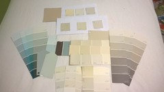
    I was away from home today and was able to go to a Sherwin Williams store! I now have more chips to play with and will be picking out a couple more samples to try. Shhh, don't tell my husband!

    Agreeable Grey and Accessible Beige are amongst the strips on the right side. I see a bit of pink in the Accessible Beige, so I'm leaning more towards the Agreeable Grey, between those two.

    I'm also really loving the SW Sea Salt! I don't normally like to use multiple colours in my house, but I may have to use that somewhere!

  • 11 years ago

    Sea s Salt is a beautiful color, very airy and beachy in the right light (meaning, a lot of light). Very nice in a bathroom or a bedroom.

  • 8 years ago
    last modified: 8 years ago

    Our local SW store has a couple of walls painted Accessible Beige. One looks gray and the other looks pinkish beige.

    Agreeable Gray looked like the perfect neutral gray in the store, but it looked cool gray (almost blue) in a test patch on our walls. It's not at all the transitional gray we're looking for. (By transitional, I mean something that will work with warmer furniture and cabinets.) People who are looking for a true gray with no noticeable pink cast might love it, though. It's light, but it seems to have enough depth to contrast with our white trim.

    I've looked at Benjamin Moore paints online (haven't been to a store yet), and I was loving Edgecomb Gray, but the comments that it tends to look purplish are scaring me away. Tapestry Beige looks like a possible alternative. Clay Beige looks pinkish next to Tapestry Beige.

  • 8 years ago
    last modified: 8 years ago

    Edgecomb Gray did have pink undertones in my guest bathroom, which actually worked well with the crema marfil marble shower.

    I used BM Classic Gray in my master bath. It's a very pretty light greige. More of a beige/ivory in my windowless bathroom and more of a light warm gray in my master closet with natural light.

  • PRO
    5 years ago

    Try Changing your 💡 lighting. I am 98% sure that’s the problem when colors don’t look right; and check that your trim and ceilings are white not off white or a tarnish hue.

    kathy edwards

    EDWARDS INTERIOR CONCEPTS

  • 5 years ago
    last modified: 5 years ago

    Since someone recently brought this thread back to life, I thought I would post an update. I ended up using Benjamin Moore Classic Gray. It is a lot lighter than I had originally intended, but it was perfect for the bedding that I had picked. I painted the trim B Moore Simply White, which I find much cleaner that the Cloud White that a lot of people use. I have since moved.