

Gone 1978!
13 years ago
last modified: 13 years ago
Featured Answer
Sort by:Oldest
Comments (12)
 PRO13 years ago
 13 years ago
- 13 years ago
 PRO13 years ago
- 13 years ago
 PRO13 years ago
- 13 years ago
- 13 years ago
- 13 years ago
 PRO13 years ago
 PRO13 years ago
Related Stories
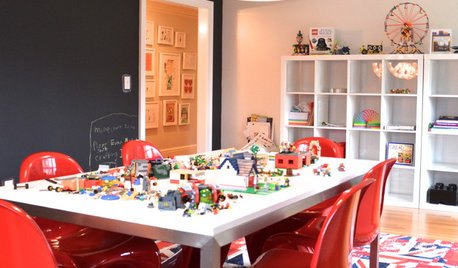
LIFEGreat Game Setups for Snowbound Days
School might be closed, but the kids will be open to fun — and out of your hair — when you set up a space for table games
Full Story
KITCHEN OF THE WEEKKitchen of the Week: Goodbye, Honey Oak — Hello, Minty Green
After more than 30 years, the Kloesels revamped their space to reflect their rural country town and Victorian-style home
Full Story
ECLECTIC STYLEGet Creative Salvage Ideas from Houzzers' Reuse Projects
Save money and show off your resourcefulness by borrowing from these creative home projects using salvaged materials
Full Story
KITCHEN DESIGNDIY Spirit and $8,700 Transform a Townhouse Kitchen
The Spanos taught themselves some remodeling tricks, created a Houzz ideabook and then got to work on their kitchen makeover
Full Story
HOUZZ TOURSMy Houzz: Turning a Netherlands Barn Into a Country Home
Once a place for chilling milk, this Dutch home now lets the owners chill out in easygoing comfort
Full Story
LIFE10 Steps for Saying Goodbye to Sentimental Objects
Are keepsakes cluttering your space and your life? Consider this approach for letting go and moving on
Full Story
REMODELING GUIDESNot Your Average Ranch
Add sizzle to your ranch house by working with what you've got
Full Story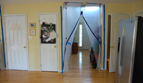
HEALTHY HOMEWhat to Know About Controlling Dust During Remodeling
You can't eliminate dust during construction, but there are ways to contain and remove as much of it as possible
Full Story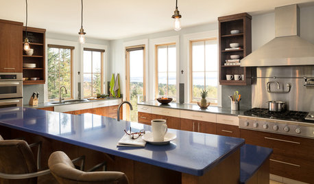
DECLUTTERING5 Ways to Jump-Start a Whole-House Decluttering Effort
If the piles of paperwork and jampacked closets have you feeling like a deer in the headlights, take a deep breath and a baby step
Full Story
BUDGET DECORATING13 Versatile Furniture Pieces That Grow With You
Build a collection of high-quality pieces that will work from that first solo rental to a long-term home
Full Story


Grace Reed