Software
Houzz Logo Print
tvq1

Advice on backsplash choice, please

11 years ago
last modified: 11 years ago
We are in the process of re-doing our laundry area. It's a classic case of project creep. Our water softener died--so let's move it from the laundry to the garage! Now that we have that space--let's put in a laundry sink! Well, we might as well replace the very worn and ugly cabinets above the washer and dryer. Hmmmm--our very old dryer has been acting funny--let's just get a new washer and dryer now rather than have to reposition cabinets later……….. Yup--MAJOR project creep!

If you're still with me, here's my question:

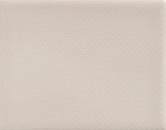
I've been shopping for a back splash for the sink area Our new cabinets are white, walls are BM Ashley Gray (a very warm gray), appliances are white. I've chosen a granite look laminate for the counter, the sink is a white composite granite.

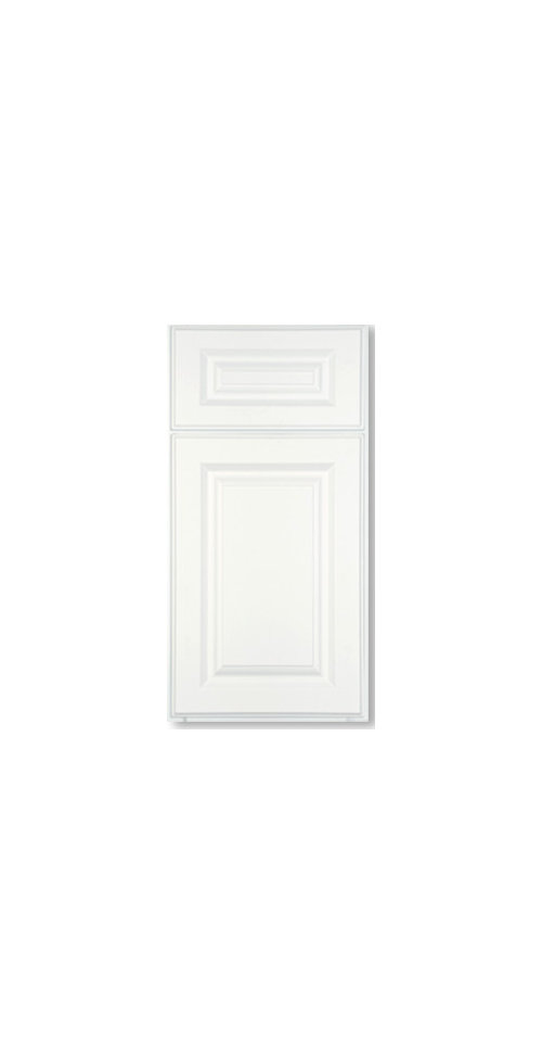
Cabinets: 36" sink base

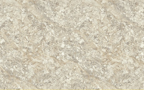
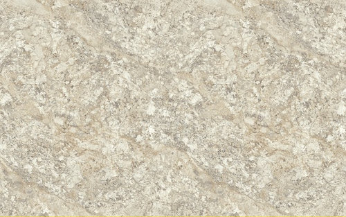
Counter: WIlsonart Spring Carnival in the honed finish (not shiny) In real life and in our laundry it reads much lighter and less golden-more white and warm gray. The grays in this play perfectly with our wall color: I've looked at a counter done in this laminate at a showroom--it's really very pretty, and certainly good enough for the laundry room. VERY little of this counter will show-6" on each side of the sink, and a couple of inches front and back.

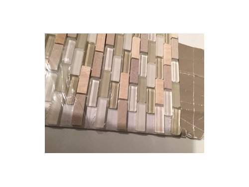
This is the backsplash I'm considering, would be 4" tall with a pencil trim to finish it off nicely. It will be on two walls--left side of the cabinet and behind the sink. The white washer is on the right of this counter. (The small grayish swatch to the right is our wall color)

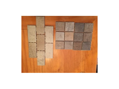
The advice I've received from the designers at the tile showrooms is to keep it simple. Their recommendations have been kind of ugly, I think:

Am I crazy? I know it's "just a laundry room" (to quote my husband), but I want it to look nice!

So--be brutally honest--will my choice of the mosaic tile "fight" with the small amount of counter top that will be visible around the sink? Is it too busy? I really want something with a little personality and "zing"!

Sorry this is so long…..

PS: While we're at it--oil rubbed bronze or polished nickel for faucet and cabinet hardware? Door hardware and light fixture are currently the bronze finish.

Thanks in advance for any advice!

tvq1

Comments (13)

  • 11 years ago
    last modified: 11 years ago
    There's several things I don't like about the glass mosaic.

    It's got a lot of pink, mosaics never look good with patterned counters, the style is contemporary while your cabs are traditional, a laundry room is utilitarian while glass stick mosaics are more urban sophisticate (or were when they were a new thing), and to my eye that kind of mosaic looks off-the-shelf Home Depot. I see it more in refreshes than I do in new construction and remodels. For those reasons, I think I'm developing a prejudice against it. Hate is too strong a word. ; )

    The designer recommendations are wrong too for many of the above reasons. I don't think their choices are keeping it simple at all. I would pick a solid ceramic with one of the colors from the counter.

    tvq1 thanked User
  • 11 years ago

    I agree with mayflowers.

    tvq1 thanked Nothing Left to Say
  • 11 years ago

    Yes, too busy. Then again, I tend to be more a simple, functional type person. :)

    tvq1 thanked Jubilante
  • 11 years ago

    I also agree with mayflowers. I think for a laundry room, you want something practical that won't date quickly, but you can still find something interesting and pretty. I like this collection from Mission Tile- it's textured solids. If you click on the "More info" you can see the different shades and texture patterns-

    Textured Subway Tile, Oyster Bay, 4"x5", Pin Point · More Info

    tvq1 thanked jlc712
  • 11 years ago

    Thank you all for your frank advice. Mayflowers, you hit the nail right on the head! I knew something just wasn't quite right--and it was the "too contemporary" AND the off the shelf Home Depot look that you articulated perfectly.

    Sigh----back to square one. I think I will order the counter top, and just hold off on the backsplash decision until it's installed.

    jlc--I do like the tile you posted--maybe I can be satisfied with a bit of texture in a solid color.

    tvq1


  • 11 years ago

    I agree with the consensus. jlc, I like those textured tiles. But, tvq, I get what you are saying. Why not have a little fun?

    Along with the idea of texture, you could also do a running bond in various sizes. Look into beveled tiles as well.

    tvq1 thanked eld6161
  • 11 years ago

    Thanks lukkiirish--I have looked at penny tiles--I like them a lot! That second picture is a sweet idea, but a little too cute for me--but very clever.

  • 11 years ago
    last modified: 11 years ago
    I agree you should have a little fun with it. Texture is a good way to make it fun.

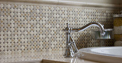
    Here's Pratt and Larson's penny tiles in satin glaze with a dark grout. That would look really sharp with a first row of 4 x 4" tiles and then three rows of pennies. By separating the accent tile with a row of solid tile, you can use a small amount of a busier tile and it won't compete with the counter. You could use any tile as an accent, even a glass mosaic.


  • 11 years ago
    last modified: 11 years ago
    Yeah, I just added that cute one at the bottom for show not for application.

    Those are very pretty pennies Mayflower especially with the darker grout. The only problem with the color is it's the same as the counter. The great thing about the penny tile is it comes in so many colors; it's an easy way to add a pop of color.

  • 11 years ago
    last modified: 11 years ago
    I posted it to show how using a dark grout solves the problem of too much grout being visible with pennies. It's actually a great color for accent tile between cream field tile. It picks up the gray paint. The brown picks up the bronze light fixture and possible bronze faucet.

  • 11 years ago

    Yeah, I can totally see using it in the application you describe. That would be pretty indeed.

  • 11 years ago

    Yup. When I went back to confirm she has gray paint, I noticed the bronze fixture and realized it would actually be a good choice. Pratt and Larson tiles are expensive though. I wonder if there's a minimum number of sheets you'd have to buy. You wouldn't need much to do an accent in a laundry room.


Sponsored
Bella Casa LLC
Average rating: 5 out of 5 stars17 Reviews
The Leading Interior Design Studio in Franklin County