Software
Houzz Logo Print
sroerecke

Help with artwork and side tables

10 years ago
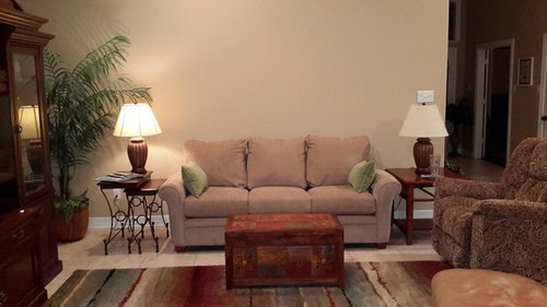
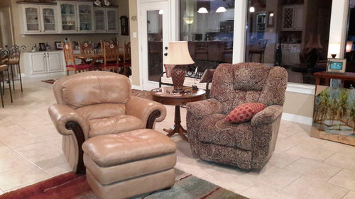
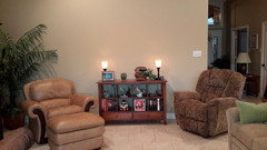
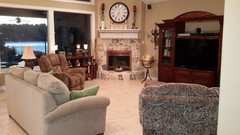
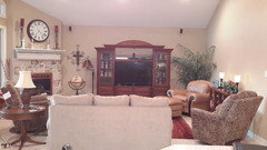
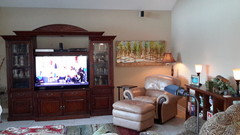
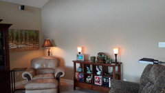
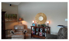
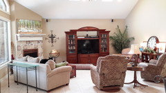
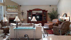
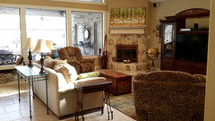
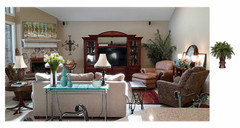
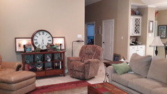
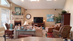
I am looking for suggestions for wall hangings on a vaulted wall, to be placed over sofa. Also, on the other side of the room are two chairs that need a table between them. The issue is the floor plug, its set back from the grouping, but I need to use it. Suggestions on filling the space with table(s). We do need a light source between these chairs.

On another note, please weigh in on arraingment. I've asked this before, but am always looking for an arraingment that is pleasing to the eye but still functional with TV placement. I have tried using smaller chairs, but this is the room we live in and both husband and I gravitate to the recliners because they are sooooo comfortable.

Thanks in advance for any suggestions!

Comments (73)

  • 10 years ago
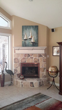
    Maybe what is bothering you about the table is the open legs. They make the cords and outlet much more noticeable. Although I like that table, you may want something that hides the cords more.
  • 10 years ago
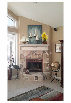
    Susan2494, I have turned the rug the other way in the past, but husband likes it better this direction. I may turn it again just to see if he notices!

    Carol, I believe you are correct, the cords have always bothered me...just makes it look a little messy to me.

    All the suggestions of art are very beautiful, but I still haven't found the one that "speaks" to me. I feel like it will end up being an abstract piece or just a quirky fun piece.
  • 10 years ago
    last modified: 10 years ago
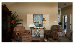
    Sometimes it takes a while to find the "perfect" art. Keep looking. Re: the rug... They won't notice a new dress, but turn a rug and they hit the overhang :>)

  • 10 years ago
    last modified: 10 years ago
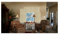
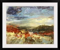
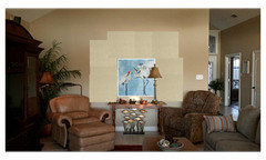
    I just put this up on imagekind. Just throwing it out there. What do you think?

    http://www.imagekind.com/Dreamy_art?IMID=74e79844-a69c-448b-afad-e09d4c9e1f02 How exciting for you!!!

  • 10 years ago
    Laura, very nice, but not me. Thanks for sharing anyway!
  • PRO
    10 years ago
    Get a beautiful pot and a peace lily to hide your cords.
  • PRO
    10 years ago


  • 10 years ago


    I think when I look at the room it is really spacious and pretty. But I think you need some more impact beyond art work which is necessary to add to the interest in the room.....

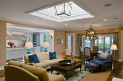
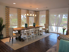
    It would be nice if you could select a rug with some drama in the correct size, and find a deep color in the rug as an accent color and replace the tan leather chair with a deeper colored leather chair. See pic. And I think you need to paint your room a deeper color of what you have now. Go two steps darker. Again see pic below.

    This room uses blue fromthe area rug and repeats it in chair, kitchen, curtains, and throw pillows.....a nice treatment.


    Hyde Park Addition & Renovation · More Info


  • 10 years ago
    Beverly, I love that artwork. I could see that in my house. Where can I find it?

    Soosun2, I love all your suggestions and if I could, I would replace my room with that one and be done, lol! The room looks exactly like one I would have, very put together but also comfy enough for friends and family to really live in and enjoy. Thanks for the inspiration!
  • 10 years ago

    I visited with an interior decorator yesterday, bringing her a similar layout as yours. Her first reaction was to rearrange the two matching chairs together, with the round table between, opposite the sofa. Place the leather chair closer to the sofa. Your room looks very cozy.

  • 10 years ago
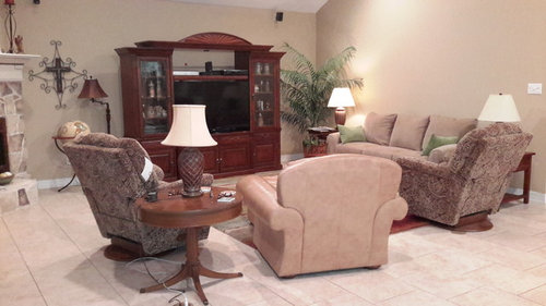
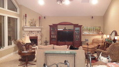
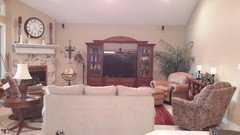
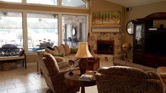
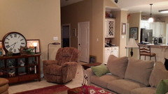
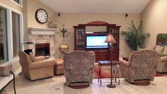
    OK, because everyone has been so kind with opinions, I'm posting more pictures of a different furniture arraingment. I've moved sofa to center of room. Using two chairs and a sofa table against vaulted wall. What's y'all opinion of this layout versus the sofa against the wall? Thanks!
  • 10 years ago
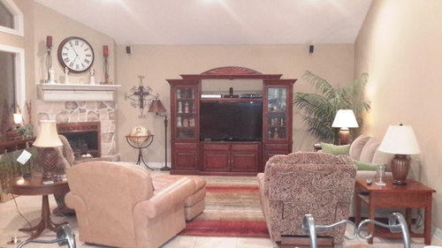
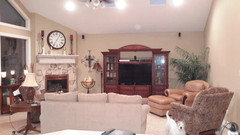
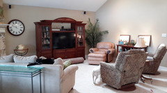
    One more picture...the quandry I have with with layout is actually the shape of the room. Not sure if picture will show it well, but entertainment center is centered on the wall, however furniture (sofa) is not centered with entertainment center. Is that a problem, or just the way I'm seeing it, as I tend to like things symmetrical.
  • PRO
    10 years ago

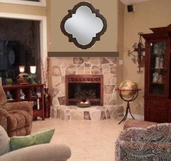
    The white mantel doesn't seem configured correctly, so I have simplified the area, suggested a wood finish mantle. removed the wall clock and would also suggest almost nothing on the mantle.

  • 10 years ago

    The the new arrangement works beautifully but flip the tan leather and the paisley opposite it so the paisley is paired with the other paisley on the long wall with the console between it and the tan leather is closest to windows and fireplace. Adds weight to the wall.

    I noticed on the inspiration picture that there is a very large flat rug and then a smaller accent rug; nice touch I think it works nicely.

    You can move the sofa closer to the wall if you want a more centered look. A pair of colorful lamps on the console table instead of the candle stick type lamps.

    And the advice for a really big picture above the console table would be a nice finishing touch.

    I concur with Beverly's advice on the mantle; she is always spot on! Her rendering looks wonderful. Now just add fun rug with your accent color, add stationery curtains between window panels, new dark leather chair to match rug, and darker paint. I am not asking for much am I? HaHaHa Remember theses are just suggestions.

    No reallly the room looks very nice and I love the new arrangement; I think it uses the room space nicely.

    Lastly, the Inspiration Room is lovely but what is so important about an inspiration is that it pretty much shows how much stuff your room needs to have for a certain level of finish. You have to keep adding layers in your very own personality selelction until the room is full. And I read somewhere that you should budget 30 per cent of original budget just for accessories! Thankfully you can add the accents as you find them.

    I think you have a great room and a great start and it looks very very nice. Good balance between size and funishing! Everything fits! haha

  • 10 years ago
    BeverlyFLADeziner, how can I find the painting that you sent the image of? I really like it. Thank you!
  • 10 years ago
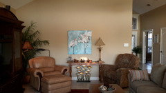
    Hello again, I have rearrainged my furniture, again. I am now considering this arraingment. I am curious how and what art to hang above the console. I know I've asked this before, however, the chair and art above it are in a new place now. They are placed at 90 degrees from the wall with the console. How do you blend art so close together. I'm guessing they have to compliment each other in color, but I'm not sure what to look for. Suggestions please! Thanks in advance for your advice.
  • 10 years ago

    Why not a mirror?

  • 10 years ago
    Need opinion please. Still working on layout of room. In first pic, I've centered the entertainment center within the room which makes it off center on the wall. tried to balance open area with chair, art and lamp. second pic has entertainment center centered on wall. Opinions on which is best, I can't decide. Also, I'm still working on wall decor, so what's in the photos is not permanent. Thanks!
  • PRO
    10 years ago
    Center in room but leave the tree in the corner, will give more balance.
  • 10 years ago
    last modified: 10 years ago

    Keep table behind sofa

    Hang clock over console

    Too many things on left of TV Move floor lamp

    Try picture over mantle (if it fits) or over console on wall (if it fits)

    Remove tall candleholders off mantle (too tall) Back on hearth

    Leave tree behind chair.

    Keep big unit centered on wall.

    Move those things and take another photo.

  • 10 years ago
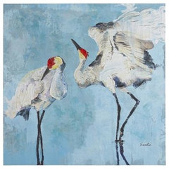
    I'm in the process of implementing the changes suggested. I have centered the entertainment center on the wall and put the tree back in the corner. I've moved the sofa to an angled position to try to add some bulk to the fireplace side of room. The art above the fireplace is not staying, I've ordered the crane canvas to go there. I also plan on repainting the mantel a dark brown. Opinions or suggestions appreciated! Thanks!
  • 10 years ago
    Here's a couple more pics.
  • 10 years ago
    Sorry Houzzers, disregard previous pics of the space. Hubs didn't like sofa placement. Moved sofa back to the middle of the room. I'm thinking it's the size of tan leather chair that's throwing balance of. Opinions or suggestions? Once I get a floor plan that I like, plan to get appropriate size rug with more blue, maybe blue lamps for console or sofa table and other blue accents. Will also hang clock and art at that time.
  • 10 years ago

    I like this way much better. The FP more than offsets the leather chair in the corner. I didn't comment on previous placement by FP, as I wasn't sure it was working. Had to think on it:>). In the middle is better. Once you get your art on walls, it should look complete. I do not like the 3 lamps in a row, If you want to keep the one by the chair, take one off the console, the one on the left.

  • 10 years ago
    Thank you susan2494 for your advice.
  • 10 years ago


    Keep about same height as lamp. Or a little shorter. Just wanted to cover lamp

  • 10 years ago
    Thank you, yes, it does look a lot better.
  • 10 years ago

    Kinda like art above fp.

  • 10 years ago
    I like things symmetrical too. Have you tried moving the couch so it's centered with the entertainment center? Then move the chair that's on the right side of the photo to the left of couch with round end table between the two print chairs. You may need to move around the print chairs until it looks right.
  • 10 years ago
    eveuchan, I agree with the symmetry, however, can't move sofa over because it's the opening to the foyer. I had actually tried that idea and it didn't work. At this point I'm considering moving the entertainment center back over about 3-4 inches, still won't be centered with sofa, but would be closer.
  • 10 years ago
    It looks like if you move the end table, chair and floor lamp out before you move the couch over you should have plenty of room. It doesn't look like there's much room now between the end table and chair. Is hard to tell space from a picture though.
  • 10 years ago
    eveuchan, I've tried moving the sofa over, but it doesn't look right because of the wall and that's also the opening to the foyer. Do to the corner fireplace and that the room is more wide than deep, I don't think I can ever get the entertainment center centered on the wall and the sofa centered with it. it's the lack of symmetry that really bothers me also!
  • 10 years ago

    Call me crazy but I think the long wall is the best place for the sofa with a large piece of art or two pieces of art of equal size that takes up 2/3 the width of the sofa feels the best to me. (It balances the weight of the large windows and fireplace on one side and the weight of the entertainment center in the middle.) As was shown so nicely above in a number of places.

    Place the the two paisley print recliners at a 90 degree angle to the sofa, and the leather chair and ottoman next the the paisley recliner closest to window at a 45 degree angle facing the TV and the sofa to make a U shape of the furnishings. Everyone can see the fireplace and the Entertainment Center and still converse with people on sofa and other chairs.

    Put the wood tables on either end of the sofa. Place the iron nesting tables between the paisley recliners facing forward with smaller one in front, not side ways as was shown next to the sofa and entertainment center.

    The rug looks big enough that you can turn it 90 degrees with the front legs fo the sofa of the edge of the run; actually center it on the u shape furnishings with the lines parallel to sofa if that will work; if rug is 8 x 10 it should just fit.

    Place the pharmacy lamp next to the leather chair closest to the fireplace side and the floor lamp behind the nesting table between the paisley recliners.

    Hang lively curtain panels in a geometric pattern in double panels over the vertical wood slats of the window from floor to ceiling to soften the room. Use a very very very long ORB curtain rod with rings. Also note the shades on the windows; it give a nice functional and finishing touch. I think you have an arched window that follows the vault to a point? Just guessing? Hang panels above the square windows and leave the vault open?

    I like this room as it is big enough to seat people and furniture with a lot of space. Remove the glass console, the bench, and the possible the picture console......not sure if there is enough room.


    Lakeway - Porpoise · More Info

    I like the clock over the mantle too. Art work over the sofa.

  • 10 years ago
    Thank you soosun2 for your thoughts. I'm not sure the chair placement will work due to position of floor plugs. The recliners are on swivel bases and have posed problems before.

    I like the curtain idea, but both husband and I hate to cover view of lake, and privacy is not an issue. Still, softening the windows would look nice.

    Still working on art and clock placement. I do miss it over the mantel, but want to see how the new art that I've ordered will look.
  • 10 years ago
    So here are pictures of 2 potential furniture arraignments. soosun2, I did make some of your suggestions. Not sure about arraignment in first picture with regard to tan leather chair, however, I do think I like the sofa better against the wall. Everyone please share your opinions. Thanks!
  • 10 years ago

    IMO, the 2nd is still best. At least with the sofa you can add some visual interest with the table and accessories on the back of it. With the chairs, the backs are just staring you in the face. And it covers the floor outlets. Are you getting tired of moving furniture yet? :>) BTW, I like the mantle.

  • 10 years ago
    Thanks susan2494 for your thoughts. I agree with the backs of the chairs being so visible. guess I'm a little torn BTW the two. I like the sofa in both places, maybe a little better against the wall, but I lose the glass top sofa table. guess I will live with it for a few days and see if I change my mind. BTW, it doesn't bother me to move furniture, but I do believe it's getting on my husband's nerves. I just tell him moving furniture is cheaper than buying new, lol!
  • 10 years ago

    Late to the party, but I think the issue here is that you have no counter balancing volume opposite the FP, and therefore you have no height on the big vaulted wall. That's where your TV center should go, IMO, it is always worth the $$ to move speakers and TV connections so you can optimize your room. With the TV properly placed, you are also separating the finish on it from the white mantel, which will be a help visually. Then the sofa goes where TV was with your new piece of art above it, end tables and lamps fleshing out the vignette. Try to find art to hang above the mantel. It should be no wider than the firebox and hung 5" above the mantel. Place the two paisley chairs and a table left of the FP, and the leather chair floating opposite the sofa, angled toward the new TV location. If you don't have a glare-free TV, change the shades to something that is light blocking or blackout when closed or down.

  • 10 years ago

    I agree with susan 2494. I like the sofa floating in room. But I'm having a problem with the entertainment unit centered on the wall. Visually, the fireplace is much the same tone as the walls so let's pretend it is just wall. Now, imagine that wall and back wall are all straight wall not curved around the corner and let's center the entertainment unit on that "straight" wall. That would move it closer to the fireplace but keep the plant on far side and possibly globe, for balance. Nothing between fireplace and tv unit. Now the fireplace, tv unit and plant arrangement make a visual U shape at that end of room. If the wood credenza is not too deep, I would place it behind sofa. With your trunk coffee table, you don't need rectangular end table beside sofa. If you remove it and slide paisley chair a few inches down side wall, you now have more walk room from foyer and might even be able to move sofa down a couple of inches. Rectanglular table could possibly go beside leather or to right side of paisley chair. IMO this would look more visually balanced. If this arrangement works, you can move on to lamp placement and artwork. So, ARE you tired of moving furniture yet?

  • 10 years ago
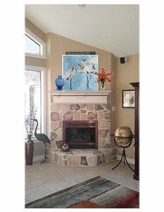
    Finally got my art pieces. 2 questions: Does the mantel need anything else besides the art and second, is the crane painting hung correctly with respect to the table? Thanks!
  • 10 years ago
    last modified: 10 years ago

    Like the art works, but you should center the cranes art over the console. The lamp may be past the edge of print, but that's ok. ANd bottom of print should be 5-7" from console surface top

  • 10 years ago

  • 10 years ago

    Me? I'd like to see them reversed: the taller boats [is wall taller over by tan recliner?], and birds in square by less-roomy mantel.

  • 10 years ago

  • 10 years ago

    Ignore the poor wall patching :>)

  • 10 years ago
    Thanks for the photos, susan2494. I'm really torn now, husband prefers sailboats on the mantel and I like both. I guess it does make sense to put sailboats over the table because they are slightly taller. No matter which one I use over the table, that wall because of its size, still feels blank to me.
  • 10 years ago

    They will both work in either place. Try this


    Turn the chair on the right so more of it's back is on wall. Is that a floor lamp on the left of the chair on the left? Looks like you have 2 floor lamps. Remove the one on right of chair and move the other one in that place. It will fill up a little more of the wall. That's all you need. You do not have to fill the whole wall. The eyes need a rest.

  • 10 years ago

  • 10 years ago
    Changed a few items. Replaced media cabinet with console. my question now is, does the blue crane picture work? I would appreciate any feedback on decorating the TV wall. Thanks!
  • 10 years ago

    I would move the clock down a little bit and the edge the same distance from edge of TV as the picture. Just a little off balance. Otherwise looks nice.