Software
Houzz Logo Print
purplehoneypie

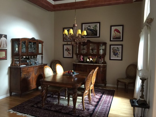
Love my dining room. Followed Houzz expert advice for pictures. Never

10 years ago
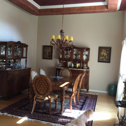
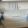
On the left is before. The right is after. The expert suggested I used Audubon prints to add some color height.

Comments (49)

  • 10 years ago

    Agree, just lovely!


    purplehoneypie thanked bonita14
  • PRO
    purplehoneypie thanked Fratantoni Design / Residential Architects
  • 10 years ago

    Wow, Look's amazing!!

    purplehoneypie thanked Barbara Davis
  • PRO
    10 years ago

    Nice spacial planning!

    purplehoneypie thanked Raegan Ford Interior Design
  • 10 years ago

    Love it!

  • 10 years ago

    Harmony space, love it.!

    purplehoneypie thanked Henny Arnanto
  • 10 years ago

    Nice space.

    purplehoneypie thanked Ann Smitt
  • 10 years ago

    It still looks dull. The room needs an uplift. Everything looks gloomy.

    purplehoneypie thanked Cookie1930
  • 10 years ago

    I like it and am constantly amazed that small changes in the right place can really make a difference.

    purplehoneypie thanked msrmom
  • PRO
    10 years ago

    Very nice!

    purplehoneypie thanked Morrone Interiors
  • 10 years ago

    The artwork made a huge difference! What it needs now is a light, sparkling, elegant palette on the dining table. Lots of silvers, golds, and creamy whites, some taller pieces, and glowing candles. Then lights on dimmers. Working with antiques is fun, but I think for every vintage piece, try to add something fresh.

    purplehoneypie thanked dietribe
  • 10 years ago

    purplehoneypie, I love it! A great example of what a difference subtle changes can make to the overall abience of the room. Really like the placement of a dining chair in each corner. Your dining table & chair set is beautiful, by the way (can you share the brand?). Please ignore mrsletts rude comment about the room looking dull & gloomy - it does not. The only thing that I would suggest is perhaps adding a little height to the left. Maybe silk greenery or a collection of tall candle holders (in an odd number, e.g. 3 or 5) or colorful jars, placed on top of the buffet-hutch at the left of the room. Thank you for sharing your updates/changes - good job!

    purplehoneypie thanked User
  • PRO
    10 years ago

    I love it!! Little changes make the world of difference!!

    purplehoneypie thanked Fratantoni Interior Designers
  • 10 years ago
    Thank you everyone for all the helpful ideas and feedback
  • 10 years ago

    What a difference!! I love it.

    purplehoneypie thanked bluebonnet9519
  • 10 years ago

    Awesome!!! And moving the chairs to the corners unblocks the table so it becomes inviting instead of locked in. Perfect!!

    purplehoneypie thanked lauren1331
  • PRO
    10 years ago

    Huge difference, great suggestion, love it!

    purplehoneypie thanked Spiral Stairs of America
  • 10 years ago

    I love it, gorgeous sideboard furniture!

    purplehoneypie thanked User
  • 10 years ago

    Love, love, love the hutch on the back wall. Beautiful curved lines and just the right size. Wherever did you find it? the pictures are spaced well and add that bit of color and really brighten it up. It's a big space and the antiques fit well. That fluff of white dog tail on the bottom pic adds a nice touch of cream to match the plates.

    purplehoneypie thanked cushopn
  • 10 years ago

    Nice adjustments! I am disappointed in the carping that some have contributed. (The lighting in a professional photo would transform the way this appears online --- and hardly any of us has the ability to do that. I congratulate the homeowner.)

    purplehoneypie thanked Liz Matt
  • 10 years ago

    The art being a great improvement was done just right. Notice that the larger objects are placed higher as they should be and the smaller visuals lower. Often people raise small objects out of sight of the viewer just for color. That's a big mistake because if an art object with small objects is worth viewing, it must be closer to the viewer to actually see the detail. Good job!

    purplehoneypie thanked Carol Woolf
  • PRO
    10 years ago

    The new art work is great - adds scale and color. The yellow lamp shades feel out-of-place in your color scheme. Maybe some ivory shades and some tall gold or silver candlesticks on the table?

    purplehoneypie thanked Design Directives, LLC
  • 10 years ago

    I like the changes you made. Amazing how just moving the chairs into the corners has opened up the space. About the shades on the chandelier -- what does it look like without any shades at all?

    purplehoneypie thanked hatetoshop
  • 10 years ago

    I agree with msokie on several points - left side of room needs some height and I think greenery somewhere - either up there or a tree in corner (obviously can't see the other end of room) to balance would help. The new artwork really helps the room. Also agree with several people's comments about the lampshades on chandelier - if they are yellow/light gold as appear in photo they just jump out as being a color that is nowhere else in the room. Good job!

    purplehoneypie thanked bondagarrison
  • 10 years ago
    Thank you so much everyone. I really appreciate the help and input. I agree with the lighting although everything is on dimmers and it looks great at night, the yellow shades don't seem to belong. I really like the fixture. It has Amber beads hanging which I love. Do you suggest ivory shades?
  • 10 years ago

    Ivory ( or white if your drapes are actually white) or have you tried without any shades? Give it a try and see how it looks. :)

    purplehoneypie thanked Diane Land
  • 10 years ago
    nice
    purplehoneypie thanked Michael Turner
  • PRO
    10 years ago

    Wonderful, like the picture frames that hang on the wall. I
    also like the idea of using purple rag to vary the colors found in the dining
    area.

    purplehoneypie thanked In Style Modern
  • 10 years ago

    purplehoneypie - I would try it without shades as someone else suggested and see how it looks. Chandlier appears to be very pretty and appropriate for the room so maybe the shades are just interferring with the prints, etc. and drawing your eye to the wrong place first. If you think it needs shades then I'd say either white or ivory to match your print mats/woodwork. Another thought - try looking for shades online - there are tons of them - you might be able to find a cool shade in like an amber color or beaded or something. Also (I know I'm spending YOUR money here) but I would like to see the baseboard replaced with higher baseboards - they look too small for the height of the room and that grand tray ceiling. Think about the color of the baseboards and ceiling trim also - would a creamier color look better than the white? Obviously hard to tell just from the pictures but I'm almost thinking the woodwork is too much contrast for the feel of the room. I would love to have those cabinets - lovely.

    purplehoneypie thanked bondagarrison
  • PRO
    10 years ago

    Looks Good. We love building dining tables. It's always fun to start from scratch.

    AhmadDoors.com

    Farhan Ahmad

    purplehoneypie thanked AhmadDoors
  • 10 years ago
    I agree, what a huge improvement. I tend to agree with the other poster, with the birds adding a wow, the chandelier should be sparkly. But not a huge issue - perhaps removing the shades and putting a dimmer on the light fixture would help. And you have beautiful dining room furniture = what a great job.
    purplehoneypie thanked gtcircus
  • 10 years ago

    This is giving me some good ideas for my bedroom, which is very bare right now and needs pictures. Thanks!

    purplehoneypie thanked Kelly Mueller
  • 10 years ago

    What a change! At the risk of being "matchy", I agree with some commenters about duplicating the same thing around the other buffet - with the same theme, not exact pictures. A sparkly chandelier would also pump up the volume, as well as changing out the rug. Perhaps consider a rug with a cream background and colors reflecting those in the paintings. No negative comments here, just suggestions to take it to the next level, but the picture placement created a wonderful uplift to the room. Congratulations! Lovely!

    purplehoneypie thanked Delora Dickey
  • 10 years ago
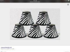
    I have another idea, you could always spray paint the chandelier flat black and add clear prisms and try mixing it with what you have. Also consider adding some zebra shades and punch it up a bit. Recycling is always better! eBay sells replacement crystals for chandeliers. I think the yellow shades are now distracting instead of blending with your new theme. Can you share where you found the Audubon prints they are wonderful?
  • 10 years ago

    Love the zebra shades! I got the Audubon prints from allposters.com. I ordered the giclee prints and framed them myself with frames from Amazon. The antique buffets were bought about 25 years ago from a dealer in NYC. Thank you so much everyone. I will take another pix when the yellow shades are gone. Love all of your ideas!

  • 10 years ago

    The lighter print do help a lot, however, repositioning the chairs was spot on!

    purplehoneypie thanked piecefuldays
  • 10 years ago

    Layering your lighting would be a great next step. Maybe some sconces on the wall to the left?

    purplehoneypie thanked eastonterrier
  • 10 years ago
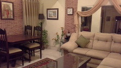
    my siting area
    purplehoneypie thanked Ghazal Talpur
  • PRO
    10 years ago

    Very beautiful.

    purplehoneypie thanked Hamilton Klow Architects
  • 10 years ago

    Though we know it to be true, it is still surprising what a difference little changes can make. The room is lovely. If I were a guest I would feel welcome and comfortable the minute I entered the room.

  • 10 years ago

    Never what?

  • 10 years ago

    I really love the AFTER. What a huge differene that made to the space.


  • 10 years ago

    Beautiful! Those prints add just the right touch.

  • 10 years ago
    The prints were a lovely addition. I don't see the two vintage pictures from the before photo being used in the after photo.
    Perhaps you could hang them above the other cabinet to visually balance the height created by the prints.
  • PRO
    10 years ago

    Better.... Although as many others suggested a bit more color on the walls, one color on the ceiling. Maybe think about a bronze and crystal chandelier without shades and drapes floor to ceiling. And double up on the audubon prints.

  • 10 years ago
    The lightshades, cushions, and rugs could have a more dramatic effect. The layers there are not appealing to me and feel dated. It is neat though and not cluttered.
    purplehoneypie thanked Christian Decor
  • 10 years ago
    This is a gorgeous dining room! The Audubon pictures made such a difference. It does appear to still be a little dark. I would definitely change at least the shades on the chandelier to a white or ivory and I think maybe a different rug with brighter colors. Maybe a little more of the red? And definitely some more pictures on the wall to the left, maybe more Audubon. Your furniture is beautiful, by the way and I'm looking forward to more pictures! Good luck!
    purplehoneypie thanked djellenburg
  • 10 years ago
    Gorgeous
Sponsored
Haus Studio
Average rating: 4.8 out of 5 stars28 Reviews
Franklin County's Preferred Custom Cabinetry & Design Studio