Software
Houzz Logo Print
mchappell

Help with foyer

13 years ago
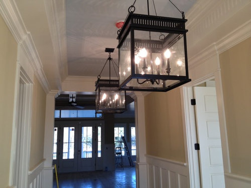
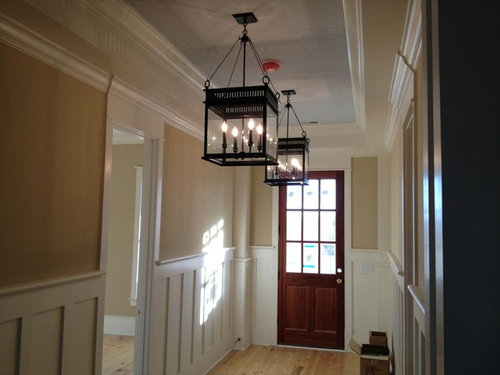
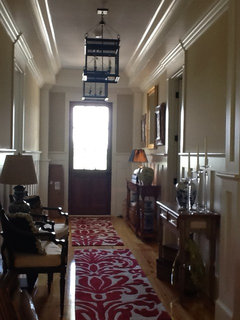
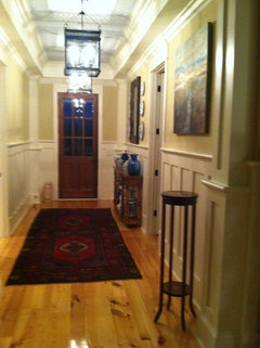
Should have hired real professional. I think these are too large. Suggestions for replacements please!

Comments (61)

  • 13 years ago
    I meant the candelabra was polished brass not bronze. Sorry about that. They are powder black now as you can see.
  • 13 years ago
    Absolutely not true - you picked a great looking light fixture. Try a little higher.
  • 13 years ago
    Ok, I will. Thank you!
  • PRO
    13 years ago
    last modified: 13 years ago
    I have uncertainty that hanging it higher will do the trick because part of the specialness of this light is the way the chains triangulate to the top.

    Also, just a note, painting them black was brilliant. That is what really makes them look so wonderful to me.

    If you can forget how these look at go with a smaller black iron hanging lantern, with a little chain, because it is the chain that gives it that historical look, I think you will be very happy. Although it will be hard, for a while to forget the grand punch of these two.
  • PRO
    13 years ago
    Hi there!

    Please email or call us as we are the manufacturer of these lights and we may be able to help bring them up a few inches.

    lanternandscroll@gmail.com
    704-333-5088

    Thanks!
    Lantern & Scroll
  • 13 years ago
    I LOVE these! Am looking for lanterns for my entry, where the ceilings are 16 feet high. Will definitely consider these!
  • 13 years ago
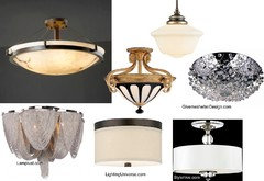
    Your electrician should have even told you- these are too low. Its that obvious. You should just shop around for any---> semi mount or----> flush mount fixture.
    As for style- given your classic entrance and paint-
    I'd like alabaster in a classic simple style- bronze. Here are some that would work. The schoolouse type has varing lengths - you can get them in semi fllushmount, but that would be a less formal style. Look at your style of the furnishings in the house and take a cue from that-
  • 13 years ago
    I love the lanterns. They were my first choice but I misjudged the ceiling height - which is 11 ft in the foyer.
  • PRO
    13 years ago
    - I really really like the lantern "look" best. . I know I have been able to converted some pendants to semi flush, some good suppliers sell parts to adjust, but not every pendant is able to transition. This one has 4 rings. so maybe a short chain -sprayed black-instead of the rods and either a shorter center rod or shorter chain. to pull it tighter to the ceiling. Well Worth a shot because they are your first choice.. and some things in homes are worth a struggle.. for the years of pleasure that follow it. Dont give up too easily on what you love and want. I hope it can work..
  • 13 years ago
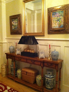
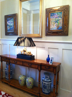
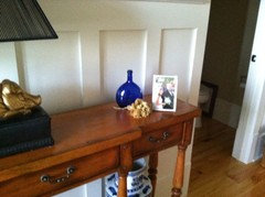
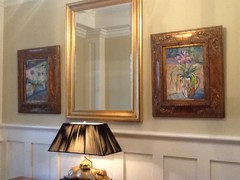
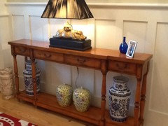
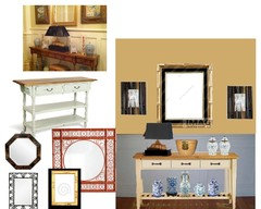
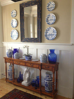
    Now I need help with the art/mirror/furniture. I dislike this but not sure what to do to correct.
  • 13 years ago
    It's very symmetrical. Is that your style?
  • 13 years ago
    last modified: 13 years ago
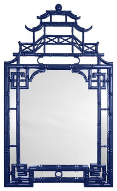
    Pagoda Mirror, Blue · More Info


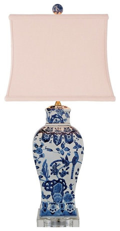
    Asian Blue and White Square Vase Porcelain Table Lamp · More Info


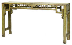
    Treasured Sage Chinese Console · More Info

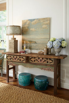
    Asian Side Tables And End Tables · More Info


    Pig gone :>) Pix gone :>)
  • 13 years ago
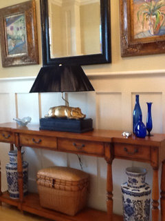
    It's a bit busy for my tastes, but if you like that amount of stuff, keep the items paired with each other rather than across from each other So the two largest items could be on one side, and be counterbalanced by the candlesticks and the smaller items. Or try the lamp on one side and offset it with items of equal weight on the otherside. BTW, your home has GORGEOUS millwork!
  • PRO
    13 years ago
    last modified: 13 years ago
    My clients do this all the time...you have way too much and are trying to fix it by adding more.

    Start with just the lamp on the top,middle, and and then just the larger vases on the bottom exactly where you have them, and the smaller vases, which are on the bottom shelf now, in the middle where the basket is. Then you can add one small piece just to the right of the lamp, to create a "friendly". That little piece that keeps the vignette from being too static ie a small crystle piece that reflects light. And, it "hangs out" with the lamp ergo "friendly".

    Live with it for a little bit, and resist the urge to add anything else. After two weeks, you will be better able to assess if you need to add or subtract anything.
  • 13 years ago
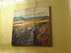
    Pig stays-no matter. What about the mirror and art? Seems so high?
  • 13 years ago
    I guess I could move the pig.
  • 13 years ago
    Ok, less is more. Thank you! Still not thrilled with the art or mirror.
  • 13 years ago
    I like the pig. Fun statement as you enter your house.
  • 13 years ago
    Like the art and mirror.....love the pig........group all the blue and white below more in a cluster instead of strung out....try moving the pig off center then balance on the other side with say a large blue and white plate in a black stand, or a blue and white bowl....we blue and white people have a stash of blue and white items.......good luck, beautiful home.....I live a little north of Charleston if you must do a photo, put in a black frame to pull in the black on the lamp , then make a small collection of three items to the right of lamp w/ two blue and white items and the black framed photo good luck
  • PRO
    13 years ago
    In my opinion, the art just doesn't groove well with your other stuff. Take all three pieces down. Your table looks much better, I would just slide the pig lamp to the left end of the table and center one larger mirror / piece of art over your table. Try a mirror with a more interesting frame - or just reframe the one you have. A dramatic black frame would look great with your lamp and black lanterns.

    The only other thing that may bother you, is the height of your table. Your moulding is pretty tall, so you may want a taller entry table. But if you can find a look you're satisfied with using the current table, then you're all set.

    "Keesee & Associates is a Custom Home Design firm in the Orlando Metro."
  • PRO
    13 years ago
    last modified: 13 years ago
    Sorry, disagree, I think it looks a lot better in the new pictures. And the blue glass friendly that you added let's it have it's classic style, as your architecture is fundamentally classic, with a little unexpected. Now, the mirror and and the pictures are working better. Before it was just too much going on for this little space in the hall. Live with it for a couple of weeks. If you want you can keep your eye out for different side pictures to change out after you have let it settle in.

    Oh also the reason it looks better is the pig lamp IS a focal point! THE focal point. Don't clutter it up with a lot of meaningless stuff. Look at high end design, they always know when to stop.
  • PRO
    13 years ago
    I dont see any wood reflecting the wood of the console table in your new hallway foyer. The hippo lamp works- as does you collection of oriental ceramics- but the heavy gilded gold is not working here. You can move it to another area. Here you want to reflect the cast iron fixtures- so Id change the hardware to a black cast iron. Id resurface the console in a white/ cream. and stain the top you could leave in wood. ( I'd tend to stain like the floor). The mirror area needs to be lighter and more oriental to continue the theme of the collection. This what I would do. Id look for a mirror in black laquer- bamboo if you can find it.. The red also works if you flank it with black.
  • 13 years ago
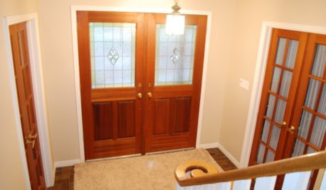
    Wow - GREAT ideas. Ok, tonight I will change to a different mirror. I am not married to anything in here, but the pig lamp. I am willing to move it to another part of the house. I just need to use it somewhere. I have a huge collection of the blue/white although none of it is spectacular. For some reason, I can never get away from 2 of everything. I will try it each of the different ways and post tonight. The picture below is of the whole foyer which may make my dilemma more understandable to everyone.
  • PRO
    13 years ago
    Haha! I disagree, again,...sorry :o/ This is not an Asian style architecture at all. This is an eclectic interesting collection. I think any kind of bamboo mirror would put it over the top. I think I would look at it as "these people are travelers that like to shop for interesting pieces that catch their fancy and here is an artful arrangement of some of these pieces. Sorry, I am probably not making friends here. :o/
  • PRO
    13 years ago
    I see what you mean about twos, mchappell. You don't really need two tables in the foyer. I would try moving one to another part of the house. Perhaps a living room? I'd probably keep the one closer to the front door. The one across from the chairs will just clog the hallway - especially if anyone actually uses the chairs. And if no one does, why keep them? Why not find something more functional to put there?
  • PRO
    13 years ago
    Also, you could push the two rugs together, that might help cut down on all the two's you're seeing and create a more unified feel.
  • 13 years ago
    I appreciate the input. I would not put the picture out there if I didn't want the feedback. I prefaced everything with "I need help". Every comment is sincerely appreciated and taken to heart as constructive! Thank you and keep the ideas coming Please!
  • 13 years ago
    I like as these are
  • PRO
    13 years ago
    Lighting is an important consideration of design - If you place your large lamp underneath the mirror, as suggested above for a "focal" > you will look like Boris Karlov in some horror movie- this is that lighting. Ideal lighting would be soft ambient scones on either side.. but I know you have lanterns and this is not necessary. So balance the weight of it on the opposite side. asymmetric gets the same amount of attention, if not more. The mirror has to function. I wouldn't obstruct it... much less light upward. As per your overall hallway- Id shoot for one wider runner, and go simple- a textured one with a black or blue border fabric..or a smaller print- echoing a touch of blue/ turqu/ for your collection of blue ceramics. A sisal would lighten it up. You dont need candle light in this area of the home. If you are sticking with the chairs- re-cover the cushions to pick up a complentary design from the ceramics... in a similar blueish print... the lamp on the opposite side - stick to black shades. maybe the one between the chairs a smaller secondary one or dispense with it- Ask yourself- is this a necessary function to the space. As per Asian style- you can do any style of mirror you can hunt up- and you like- Id remember keep it light.. keep it simple and black will pick up your lanterns beautifully. Many traditional homes feature many styles. Enjoy your home.
  • PRO
    13 years ago
    I think you are OK here, as long as you lift them up a bit. The higher to the ceiling, the lighter they will seem. They are beautiful and fitting for your home. Definitely add a mirror to the space and hang some family photos - I think once they are lifted up and a few more items are added, you will be happy you stuck with it.
  • 13 years ago
    I think it looks much better with the black mirror.
  • PRO
    13 years ago
    The black mirror frame and the black lamp shade are are placed too close together and are creating an awkwardness within the composition. The original mirror went with the golden of the pig, and the golden tone of the basket you placed below the lamp. It was a nice repetition and spacing of color. The black of the lamp without the black mirror, is now centered within the composition and is reflecting of the hall chandeliers and other black elements extraneous to the table composition. Good job! (Without the black mirror)
  • PRO
    13 years ago
    I hate to state the obvious, but since you already did... have you considered hiring a professional (eg: local, licensed & trained) to help you with the individual design issues, but more importantly an overall design concept and aesthetic?

    It looks like you have a very nice home... a few $ spent to have a designer on board to get a solid overall approach would greatly increase the potential for your home's interior design. With a growing scope of interior design issues through your home, it seems to me one professional working with you and all these elements, in the spaces, directly would serve you better than myriad opinions here based on photographs, and then piecemeal as they are presented. Each question is a design on it's own, but there is also the whole to consider, and a design pro, in your home, seeing all the possibilities at once will have a much more informed position to gauge what makes sense in each case, and more importantly how that case reflects on your overall home interior. They'll see things we don't see here from limited photos, and will be able to offer richer and better informed solutions we can't, regardless how well trained or experienced.

    If you are in the LA area I'm happy to recommend a few interior designers, otherwise try the pro listings on this site or the ASID.org.
  • 13 years ago
    last modified: 13 years ago
    I think they will be okay once you start adding furniture to the hallway. Also I think maybe the angle of how you took the pic makes them look bigger.

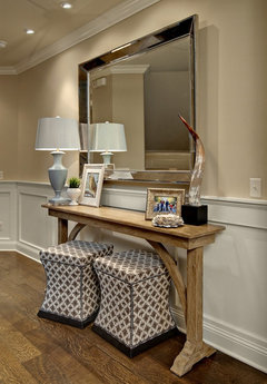
    the cinnamon post · More Info


    Queen Anne Residence 06 · More Info
  • 13 years ago
    Thanks everyone. I have hired a professional.
  • 13 years ago
    I do not think they are to big (it is better over sizing than under sizing) what if you reworked them almost flush mounted by shortening the chaine
  • PRO
    13 years ago
    PS Try to resist the urge to over decorate this hall. Your buildings architecture speaks for itself, and it is excellent from what I can see. I agree with the runner, probably being put together as one. In my opinion the beautiful blue and honey golden palette, with touches of black go fabulously with your wall color and architectural style and ancillary pieces such as ceiling lighting and hardware.But,then, going to a red and ivory/white runner is not cohesive and a little jarring to the composition. If you bring the red up to integrate into your hallway composition, it will be too much. Less is more. Be elegantly understated here.
  • 13 years ago
    last modified: 13 years ago
    I like the new sparser arrangement on the table. I like the mirror as well. The art is too undersize by itself and the frames don't work with everything else. I think two smaller pieces of art placed above each other on either side in a simple black frame might work better.
  • PRO
    13 years ago
    I'm agreeing with the " Less is more in this hall"- The architecture and coach house lanterns are gorgeous- the colonial furniture- not so much. Its cluttering.- You have stuff all down the hallway and heavy heavy ornate gold frames. If it were me I'd paint the console tables Blue or Black laquer or cream. and and /stain the top wood to match the floor. Put the 2 busy red carpet mats elsewhere, and get a proper one piece made for the space simple carpet- possibly with a blue/ or black fabric edging. I like the black frame.. but no designer would put a lamp below it. Put it at a flattering distance to the side for accent.. not under your face. As I mentioned before- you avoid horror movie lighting in any lighting you do in your home. Little bits of stuff just clutter- such as the silver thing and the tiny frilly blue dish. As much as you love the picture frames... they are overpowering and too ornate here. too large beside the mirror.. You want sml / light accent here. The frames might look better hung alone on an empty wall beside each other as in a gallery.. . beside the mirrow maybe light B/W drawings in a light small frame . Hiring a designer now may help you out.
  • 13 years ago
    I love it now. Professional definitely did the trick,
  • 13 years ago
    I think these can work. As a rule of thumb, oversized pieces can make a space look bigger and serve as a wow factor. But i wouldn't add anything else to this hallway- just leave it and let the fixtures play its dramatic part
  • 13 years ago
    Oops sorry,! I didn't notice the pictures u attached were the same space! That looks GREAT! With a personal touch and collection pieces, ur off to a great start! Good taste u have!
  • PRO
    13 years ago
    mchappell, you're space looks great! I love all your blue and white pieces, and I'm glad you found something you're happy with.
  • 13 years ago
    Looks lovely, however I do miss the pig!
  • PRO
    13 years ago
    thats got it ; ) not missing the pig-you can just enjoy it somewhere else, thats all. The new blk mirror and lighter plates rocks.- ; )
  • 13 years ago
    You were all very helpful! I am glad I took your advice. I love the look this talented designer has given us. Thank you
  • PRO
    13 years ago
    last modified: 13 years ago
    mchappell, Glad to hear you hired a professional, and that they were a good fit for you! Not to knock anyone here, or free advice, but it is no comparison to spending a little $ to hire a pro. Happy decorating!
  • PRO
    13 years ago
    Sometimes when I read all the input on some of these discussions..I get so dizzy and I wonder how confused the person who asked the question must be!- so many weigh in- with all these vastly different and sometimes bad ideas they must be frozen. Do I move it left? RIght? Keep? get rid of? With this one- its a small problem, for a professional to just come in and show him... and get the balance right. Its true- professionals create beautiful spaces- and its no big deal. Often times answering something visual with words.. doesn't resonate unless you see it done. Alls well that ended well. Good luck with the rest of your lovely house.
  • 11 years ago

    I think the lanterns look great!