

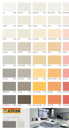
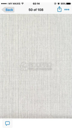
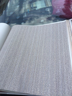
Wallpaper and paint colour advice
10 years ago
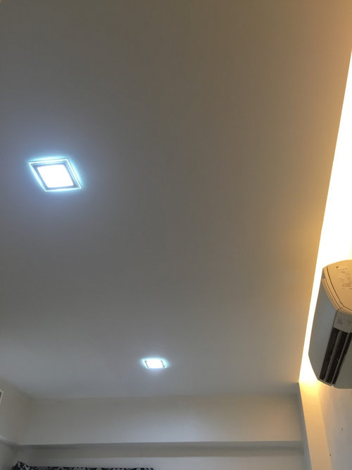
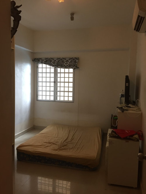
Featured Answer
Sort by:Oldest
Comments (12)
 10 years ago
Related Professionals
Zanesville Interior Designers & Decorators · Buffalo Interior Designers & Decorators · Los Angeles Interior Designers & Decorators · Victorville Interior Designers & Decorators · Magnolia Architects & Building Designers · Emporia Architects & Building Designers · Cookeville Architects & Building Designers · Memphis Architects & Building Designers · Portsmouth Architects & Building Designers · Birmingham Kitchen & Bathroom Designers · El Dorado Kitchen & Bathroom Designers · Miami Kitchen & Bathroom Designers · Vineland Kitchen & Bathroom Designers · Beckley Kitchen & Bathroom Designers · Portland Kitchen & Bathroom Designers- 10 years ago
- 10 years ago
- 10 years ago
- 10 years ago
- 10 years ago
- 10 years ago
- 10 years ago
- 10 years ago
- 10 years ago
- 10 years ago


Related Stories
DECORATING GUIDESDecorating Advice to Steal From Your Suit
Create a look of confidence that’s tailor made to fit your style by following these 7 key tips
Full Story
LIFEEdit Your Photo Collection and Display It Best — a Designer's Advice
Learn why formal shots may make better album fodder, unexpected display spaces are sometimes spot-on and much more
Full Story
TASTEMAKERSBook to Know: Design Advice in Greg Natale’s ‘The Tailored Interior’
The interior designer shares the 9 steps he uses to create cohesive, pleasing rooms
Full Story
MOST POPULAR8 Great Kitchen Cabinet Color Palettes
Make your kitchen uniquely yours with painted cabinetry. Here's how (and what) to paint them
Full Story
FRONT DOOR COLORSFront and Center Color: When to Paint Your Door Black
Love the idea of a black front door? Here are 8 exterior palettes to make it work
Full Story
DECORATING GUIDES10 Design Tips Learned From the Worst Advice Ever
If these Houzzers’ tales don’t bolster the courage of your design convictions, nothing will
Full Story
KITCHEN DESIGNSmart Investments in Kitchen Cabinetry — a Realtor's Advice
Get expert info on what cabinet features are worth the money, for both you and potential buyers of your home
Full Story
BATHROOM DESIGNDreaming of a Spa Tub at Home? Read This Pro Advice First
Before you float away on visions of jets and bubbles and the steamiest water around, consider these very real spa tub issues
Full Story
REMODELING GUIDESContractor Tips: Advice for Laundry Room Design
Thinking ahead when installing or moving a washer and dryer can prevent frustration and damage down the road
Full Story
LIFEGet the Family to Pitch In: A Mom’s Advice on Chores
Foster teamwork and a sense of ownership about housekeeping to lighten your load and even boost togetherness
Full Story



Rina