Software
Houzz Logo Print
lmtchll68

Gray paint purgatory

10 years ago
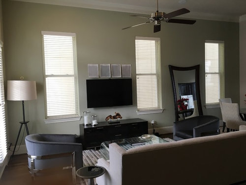
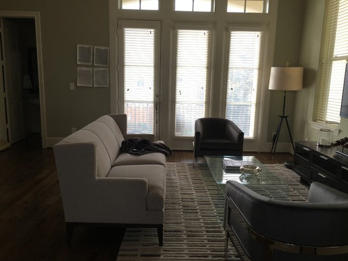
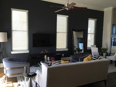
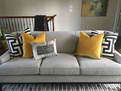
After more paint samples then I care to admit, I need Houzz Community assistance. My next step is to hire a designer. Redoing my living room. Chairs are graphite gray and sofa is taupe with gray specks. Room is south facing but also gets light from the north. I have CFL lights that have a slight yellow glow.

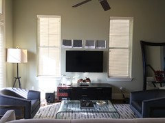
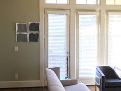
I like BM Coventry Gray (2nd sample) but wonder if it will make the room too masculine. I also like BM Smoke Embers (3rd sample), I also had it reduced 50% (1st) maybe too light and 75% (4th) goes purple at night. I am leaning toward Smoke Embers, but I don't want the room to go "muddy".

When referencing paint samples look at photo with TV.

Any tips on how to get this right?

Comments (72)

  • 10 years ago
    Thanks all. The room is not finished. I will be adding accent color after I find the right paint color.
  • 10 years ago
    @Tess SW GRASSLAND
  • 10 years ago
    I don't know anything about grays... but I love your room... just saying :-)
  • 10 years ago
    Love that rug! Who makes it. It would be perfect for my grey house.
  • PRO
    10 years ago

    Take a look at Benjamin Moore Bone Black.

  • 10 years ago

    hope you went dark grey....difficult witht he light color for the eye to appreciate any one thing in the room. Background color is just that - it envelops the room and creates the atmosphere. Think you need the dark color to ground the room.

  • 10 years ago
  • 10 years ago

    I just wanted to weigh in on the Coventry Gray - I have it in my family room. I also have gray couch/loveseat and lighter chair, as well as similar floors to yours. Like your room I have many large windows and great light during the day. I don't find the colour masculine at all. But I do feel like I chickened out picking a gray colour. It is the darker of the samples I was choosing between, but I think darker would have looked better. Or possibly sticking with one slightly lighter. Coventry is a great gray, but for your room, as I found out in mine, I think one lighter, or a couple darker would make the room.

  • 10 years ago
    Hi Houzz Friends, I am leaning towards BEHR Antique Tin (#2 above TV). BEHR Iron Mountain (#1 above TV) is also nice. Antique has a slight blue undertone that I like. I've seen some really nice pics of BM Iron Mountain, so I want to try that color before I finalize my pick. Unfortunately, BM is closed on Sunday's. Mustard yellow will be my accent color.

    Any suggestions/feedback?
  • 10 years ago
    last modified: 10 years ago

    Nice choices (your two favorites)! Do you plan to paint a sample of both on the wall? I bet your room will look great!

  • 10 years ago
    Yes, I'm going to do that today. I just didn't want 30 paint samples in my wall, so the best 2-4, will go on the wall. Thanks Ann!
  • 10 years ago

    I'm so glad you've decided to go bold with the dark! I can't wait to see the result!

  • 10 years ago
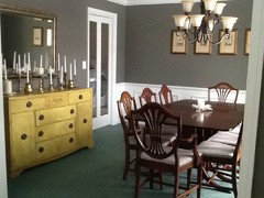
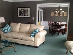
    Go with a darker gray in the room but you Must add some color to the room. The mustard yellow is a good choice but don't be afraid to do something drastic with colors on the walls. Definitely no wall paper borders! Framing posters is a inexpensive way of decorating and bringing in the needed color. Be careful in choosing your gray, because you could end up with a mauve color, yuck! A brown gray like Sherwin Williams Gauntlet Gray is a great color to use. Here are some pics of my living room and dining room where I used this color. I also used the mustard yellow on my sideboard. I have more people ask what color the paint is, they just love it! Hope this helps!
  • PRO
    10 years ago
    Love the darker gray that you have chosen. Don't forget that shades of pink are great with gray too!
  • 10 years ago

    Hi---

    Beautiful room!

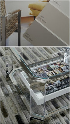
    Take a look at Olympic's Slate Pebble and Gray Goose. These are excellent shades of gray---Fabulous paired with yellow. Hope this is helpful. Good Luck!

  • 10 years ago
    Thanks Natalie!
  • 10 years ago
    My two picks are Evening Hush and Pencil Point. I love the contrast of Pencil Point, but worry that it will be too dark in the evening. Evening Hush is very nice too. I'm just going to paint a full wall and see.

    Evening Hush, Behr · More Info


    BEHR® Paint Color Pencil Point PPU18-2 · More Info
  • 10 years ago
    last modified: 10 years ago

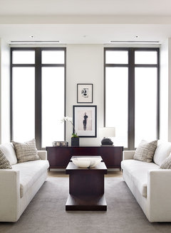
    I would suggest no more grey. White can be a big decision, but can also create a really sharp and classic backdrop. I think white could be a really impactful.

    Mandarin Oriental Residences · More Info

  • 10 years ago
    Thanks Maureen, but it's not a whole room just accent wall. The only thing in the room that is gray are the two chairs and there is gray in the rug. There are also cream dining chairs in the adjoining room. I don't disagree with too much gray at this point, but I am adding mustard yellow as accent color with pillows and some other accessories/art work that will add brighter color.
  • 10 years ago
    last modified: 10 years ago

    I have a lot of grey in my condo, so I feel your pain thinking you might be overdoing it. Check out Glidden's Sutton Place Grey. I matched it in Valspar for my living room/kitchen. It's a light warmer grey that goes well with wood flooring.

    If you want to go deeper and richer, check out Graphite by Restoration Hardware. Its a painful paint to work with, but looks great after two coats. You can also get a pretty close match in BM. Used this color in most of my bedroom.

    Point is, there is so many greys out there, some of which look green, purple, pink, and brown. But you just need to be more discriminate from now on with your furniture and accent pieces to keep it looking cold or monotone.

    I think adding mustard is an awesome idea, and looks great with grey. You may not have a lot of grey, other than the rug, but the rest of your furniture is very monotone, which is great if you are going for a simple and clean design.

    Personally, I'm not a big fan of white walls or cabinets, despite it being the BM's color of the year. Regular white is so stark and reminds me of my renting days. Some off-whites are nice though.

  • 10 years ago
    You have enough natural light to go darker but I agree with those who say you have enough grey. I would lean to a more taupe or beige color from the rug or sofa. The right mustard or straw gold would make the room glow and set off the Grey furnishing you have. Finding that muted golden beige will require beaucoup paint samples but will be worth it.
  • 10 years ago
    The Evening Hush really has a navy blue undertone. What do you think?
  • 10 years ago

    If you are picking an accent wall, does that mean you have your main wall color picked out?

  • 10 years ago
    I say go a beautiful medium blue and change out the rug that pulls both colors plus a accent color like orange or a red to pop a bright color to brighten the room. That color could also go great a a curtain color. Have fun.
  • 10 years ago

    I'm not noticing the navy undertone in the pic.

  • 10 years ago
    Hi Ann! I think that is part of the problem here. The lighting in photos is very deceiving.
  • PRO
    10 years ago
    last modified: 10 years ago

    Of your sample colors, I immediately like number 3 & 4 on the first dark color swatch line-up. These neutral situations are tricky because it's finding that proper contrast... I think the dark will do it. And a dark that blends- some of the best paint colors people don't even notice, if that makes sense. Then you can easily add an accent color. Good luck :) Lovely room!

  • PRO
    10 years ago

    Maybe you could break up the gray with original artwork. A few possibilities and many more at:

    https://www.etsy.com/shop/PamQArts?ref=hdr_shop_menu

    Art - Original Abstract Painting, 48 X 30 · More Info

    Art - Original Abstract Painting, 48 X 48 · More Info


    SOLD!! Original Abstract Painting, 48 X 48 SOLD!! · More Info

  • 10 years ago
    Thanks. These are great, I love Etsy. I have some artwork, just not pictured because I haven't worked my way through the paint. Long painful process when decorating is not my skill set. Lol
  • PRO
    10 years ago

    I'm following, cause I'm in the same dilemma ;p Lovely room btw. Love the carpet. Can't wait to see the final result.

  • 10 years ago
    I'm freaking out, but logic prevails. It's just paint. BEHR Pencil Point, is not horrible, it's a very pretty color, but It is more navy blue then I wanted. From certain angles it's good. Going to put the tv, blinds and furniture back and sit with it a few days before I decide if I'm going to repaint.
  • 10 years ago

    It is really lovely. Please show us a photo once you get the rug and furniture back in. I think that you will need to live with it before you decide as it is a big change. On my monitor it doesn't look navy, though there is definitely a blue undertone. What color is the ceiling? You might want to paint it the same color as your trim.

  • 10 years ago

    Oh I *love* that! I think it looks amazing, and it's not even cleared and arranged with your things yet (usually you have to get stuff in place before a color really takes on its personality). I can't wait to see it with everything back in place!

    We painted most of our house in lighter colors, but per my husband's urging we did one room in SW's High Tea. It's a very dark brown-green (sounds awful, but even the painter was enthralled with it). Everyone who comes to our house inevitably comments on that room and color, and loves it. It has impact, but is also very warm and comforting - and I can see your room with Pencil Point having the same effect.

  • 10 years ago
    My opinion is dark gray. It will add a richness to the room. The trim will stand out and room will look great.
    I have a small room with dark gray walls and white trim. I love it.
    The dark gray will not make room seem smaller.
  • 10 years ago
    Yeah, I was going for a dark gray that didn't feel so drab. A hint of blue is nice, but with the entire wall painted it's not what I wanted. I don't hate it. Putting everything back in place tomorrow, hoping that will do it for me. Fingers crossed.

    Thank you for he feedback!
  • 10 years ago

    Looking forward to seeing it. Maybe you just need a little time to adjust to the change.

  • 10 years ago

    Love all your Mitchell Gold furniture!


  • 10 years ago
    Thanks!
  • 10 years ago

    Hi!

    Well, it's definitely dark--but it might look very nice once everything is back in place. If not, then it's only paint.

    Looking forward to seeing photos. :))

  • 10 years ago

    Hi L Mitch---

    Well---how's it look???

  • 10 years ago

    All these comments and not a single one addresses the CFL's with a yellow glow. Get some LED's with a "white" temperature before selecting your paint color.

  • 10 years ago

    I assume she has CFL's with a yellow glow because she likes them. Indeed, the glow of your bulbs will affect the look of your paint and fabrics.

    I personally seek the warm yellow glow (I miss incandescents terribly!) for its comfort and warmth-of-home feeling. Others may prefer the true-ness and brightness that white light gives to colors and surroundings.

    I don't think either is wrong - it's personal preference - but either way ideally you want to decide which you prefer first. Then working with them in place, pull in your colors.

  • PRO
    10 years ago

    I think it looks great...can't wait to see it all set up! Please post a pic!

  • 10 years ago
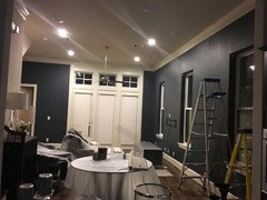
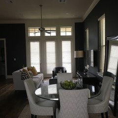
    Not done yet, but here are a few pics! Thanks everyone. In going to replace floor mirror with artwork. Also, thinking of painting the wall behind the sofa a very soft gray. Also Channing the floor lamp.

    Also, experimenting with lighting. Overall, I like the yellow, but I want to see the difference.
  • 10 years ago
    Changing the floor lamp.
  • 10 years ago

    It's looking great!

  • 10 years ago

    Wow! Great work.

  • 10 years ago
    I had the painters repaint it the same day. Lol. BEHR Evening Hush was a much better choice.
  • 8 years ago

    Are the photos in the last post the evening hush? Mulling a number of the same choices at the moment and going crazy with 11 paint samples on the walls! Pencil point and peppercorn seem too blue and iron mountain and thunder gray feel too brown. Kendall charcoal is beautiful and always looks the same but almost the exact color of my couch so I'd prefer something darker.

Sponsored
AIS Renovations
Average rating: 4.5 out of 5 stars15 Reviews
Custom Craftsmanship & Construction Solutions in Franklin County, Ohio