Software
Houzz Logo Print
amberkpick

Help with backsplash .. Please?!

10 years ago
last modified: 10 years ago

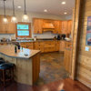
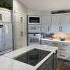
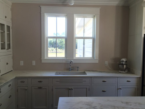
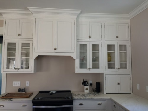
I'm stuck on what to do for my backsplash. My counters ended up creamier than expected (which I'm happy about because that's what I wanted, but now my cabinets make my counters look a little dingy). I had planned on doing a beadboard backsplash, mainly just because I love how it looks, have had it before, and like that I could change colors if I wanted. Now I'm thinking I need to do a tile that ties in the whites and creams, maybe a crackle tile? I don't want super bold, I like simple. I am open to more ideas though since I'm afraid my kitchen is turning out a little... Blah.. Excuse the tiny people and all the unfinished things (Lowes glass cutter isn't working ATM.). But here are pics.

With sink wall.. Would you tile/beadboard to ceiling?

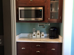
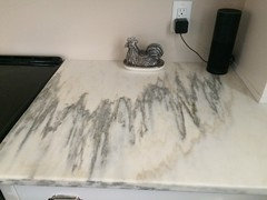
Here's a better pic of countertop color vs cabinets..

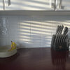
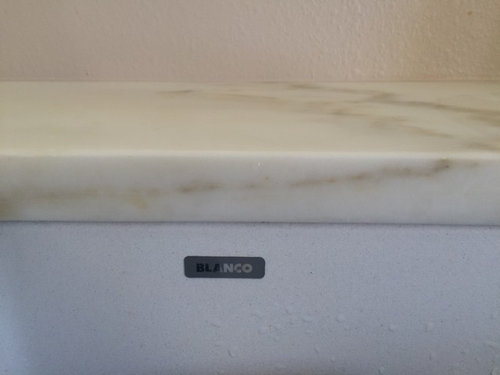
Vs blanco sink

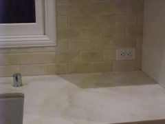
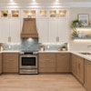
These are the colors I'm trying to bring out, not the grays. I didn't really want the gray streaks but the slabs without the gray didn't have the caramel swirls I love.

Comments (26)

  • 10 years ago

    Oh Amber, you must be over the moon! It's turned out so well! Blah, are you kidding?! It's simple, classic, and vintage. I really like the negative space around your window.

    If it were me, I would do a backsplash (are you planning beadboard or tile, or tile beadboard?) on the sink wall only to the level of the uppers on the range wall. Then I would hang some great art above it there. I do think it would look good with tile to the ceiling too, but that seems to be a trendy look right now, and can lean almost industrial, institutional. Just my opinion, of course:)

    looking good, so good!

  • 10 years ago

    I think the cocoa or red based beige paint is causing the problem. You can do anything....tile backsplash on range wall and up halfway on window wall...then some beadboard rest way up flanking window...window is very traditional-beadboard up around top framing and on sides would look right. Your grayish cabinets and milky counters will work well with the right tile...start bringing home samples and just lay them up. I like the paint color but it's red based...doesn't work here. Beautiful kitchen...don't worry....

  • 10 years ago
    last modified: 10 years ago

    Your kitchen turned out so nice!

    I agree with the above posters about tile placement and paint color. Small kitchen with interest on both walls--less is more. A crackle or handmade tile sounds good. That type of hood seems like it should frame something, so I might put something subtle in tile under the hood. A change of texture or shape, not color. I've always liked Ickaisgirl's. I know that's not spelled right but I never copied it down correctly. This would be pretty in white and cream.

  • 10 years ago

    I agree that the paint color looks pinkish to me. It could just be my monitor. I think it is taking away from the gorgeous cabs and stone.

    I love your kitchen!!

  • 10 years ago

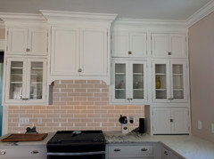
    Nancy thank you so much! I do love it, just feels.. Incomplete?! My initial plan was to beadboard 3/4 of the way up then paint a darker color up top. I'm thinking a tile might be better though so I can tie in the cream and white.. Maybe a white subway tile then a beige grout? Like this?


    I also like Babushka Cat's crackle tile..


    I think you're right about to the ceiling looking more industrial. I'm aiming more for home-y vintage!

    herbflavor & aktillery- The paint definitely reads pink in person as well! I'm considering painting the living room and kitchen (joined) Stratton Blue like our dining room and butlers pantry. My LR rug arrives tomorrow and I'm going to put it in the DR to see how the colors go, if it works Ill consider doing the Stratton Blue. Here it is in the BP..


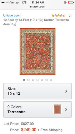
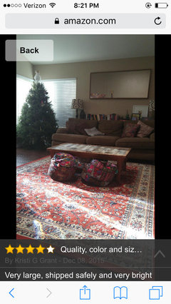
    Here is the rug.. The second photo was taken by someone else who purchased it.

    As far as behind the range, I'm considering doing what Aktillery did with the platter. I saw hers and just loved it!!

  • 10 years ago

    Mayflowers- I like the idea of the interest behind range being tile so it's easier to clean, too. I'll have to start looking at that option..

  • 10 years ago

    Mayflowers, do you know what kind of tile Ickaisgirl used? I love that.

  • 10 years ago

    It looks like maybe Encore Smoke crackle http://encoreceramics.com/smoke/

  • 10 years ago
    last modified: 10 years ago
    herbflavor said everything that I was thinking--I'm glad I read her post first.

    I don't care for blue for my kitchen, but I think it can be very pretty with white cabinets--I think it was crl who recently finished a lovely vintage kitchen with cabinets painted a similar blue to your wall color. Also, a few years ago there was eastfallsglass, IIRC, who had a vintage kitchen with marble counters and blue walls (and a checkerboard floor).

    Light blue kitchens

    eastfallsglass' kitchen (I was wrong about the counters.)


    I can't find crl's reveal, but if you scroll down in this thread, you'll find a few pics she posted.

    Amber thanked mama goose_gw zn6OH
  • 10 years ago

    I'm 99% positive that's not Encore. She had a reveal thread about a year or so ago but since I don't know her exact name, I can't find the thread.

  • 10 years ago

    Jumping in here --

    Gorgeous kitchen.


    I love the look of tile all the way to ceiling. But at the very least - part way up the wall like Nancy suggested. I don't think I would go with beadboard in your kitchen.

    some ideas:

    http://www.drivenbydecor.com/2014/10/kitchen-backsplash-tile-how-high.html


  • 10 years ago

    Mayflowers-so close. Here's lcskaisgir's beautiful kitchen reveal.

    http://ths.gardenweb.com/discussions/2497900/white-and-gray-kitchen-reveal-lots-of-pics

  • 10 years ago

    Thanks, Romy. I think you came to the rescue last time too. I'll change the file name for the photo. What the heck does that name mean??

  • 10 years ago

    Mayflowers - I had the hardest time remembering the spelling but eventually managed to memorize it. We were doing our kitchens around the same time & I mispelled it more times than I can count.

    Amber - I think the right backsplash will pull it all together. I have white cabinets, a creamier countertop than my cabinets and remember feeling my kitchen was incomplete & sterile. Yours actually has a nice warm vibe. I love your pendants. I agree that the paint color is not working. A crackle with some color variation within the tiles might blend your countertop & cabinets. That's just one suggestion. I'm a bit biased toward crackle.

  • 10 years ago

    Two quick ones:

  • 10 years ago
    last modified: 10 years ago
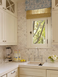
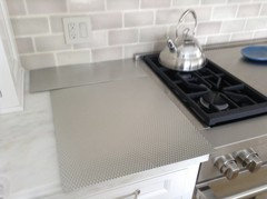
    Shoot me, but I Iove these watery, hand-painted squares for a cottage kitchen. I even like the tiles under the hood because I've never seen it before. You have to enlarge it to appreciate the tiles or save it to an Ideabook and look at the original. Everything's bigger and clearer in an Ideabook.

    Kitchen · More Info

  • 10 years ago

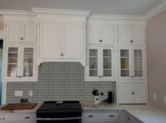
    I agree with Mayflowers with the light gray crackle subway. I think it would look great!!


  • 10 years ago

    Your kitchen is so lovely! It is very similar in color to the one I am designing for our new home. Our cabinetry is a pure white and our quartz is slightly on the creamy side. Another home our builder built with the same quartz and cabinetry used white subway tile, it looks lovely, but too sterile for what I had envisioned for my home. I just decided to use carrara marble subway tiles in a herringbone pattern. I think the grey will warm up the space (at least that's what I'm hoping, though it's very hard to made a decision like this without having seen the cabinetry or countertop in the home first!).

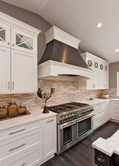
    I also looked at white or grey crackle tile--very pretty! Glass tile would also add a little sparkle to the room. I also like the look of a small tile covering the entire wall!

    Kitchens · More Info

    Transitional Kitchen · More Info

  • 10 years ago

    Amber - what kind of marble do you have? Mine is Imperial Danby, also with grey & caramel veining. I originally planned a marble subway backsplash but couldn't find marble that blended. I lucked out as a nearby tile store had sample tile boards in a warm caramel crackle, Encore Truffle and in a cooler silver crackle, Encore Silver. I took both boards home, expecting to use the Truffle. Much to my surprise, the Silver looked much better. This tile has a mix of grey & taupe which warmed up my kitchen. The variation within the mix adds interest. Other manufacturers of hand made crackle tiles are Fireclay, Sonoma, Pratt & Lambert, Quermere & several others.

  • 10 years ago

    Eam I think I am leaning toward the single colored tile, but I'll order samples and see how it looks in person.


    Romy I love how crackle looks in every kitchen I see it in. If I see JUST a picture of the tile I'm a little turned off by it, but in the big picture it really just works.

    My marble is Alabama White, which is similar to your Danby in terms of hardness and color. Most of the Slabs I saw were whiter than mine. I think the biggest difference is the AW has some more linear streaks (I prefer the light swirls, but at $75 a square foot I'm really happy with it). I shouldn't have any issues finding AW tiles, my countertop fabricators do all things tile and had AW in subways and mosaics. That's also another option. I have a feeling I will have a similar experience with the gray tile looking better. The pewter chicken butter dish I have looks amazing next to my counters.

    OB2B Ahhh. There you are with the mock ups!!! I surprisingly love how the gray looks, unfortunately I am one of those people negatively affected by gray. :(. I love how it looks, though, so I'm still going to consider it! Could I trouble you to do a white subway with beige grout? :D


    Mayflowers those are gorgeous, and I like the 4x4 tiles... What color do you think they would work in in my space?


    Maven thank you!! Herringbone is off the table for me as this will be a DIY installation (Lord help me), but I can't wait to see it in your kitchen! When is your expected completion date.


    Sorry it took so long to respond, we've been super busy lately!!

  • 10 years ago
    last modified: 10 years ago

    Wow, that marble is gorgeous! I thought it was quartz after reading your first post.

    With your cottage elements, I think you have to be careful not to create bling. Homey-vintage like you said.

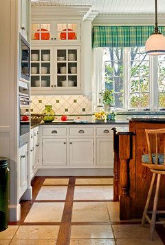
    I went looking for square tiles in traditional kitchens. First I came across this kitchen which is what herbflavor suggested. I like how the beadboard meets the cabinet and extends the wood. You could do a griege tile like in the next photo.

    Green Country Kitchen Farmhouse kitchen with Passthrough · More Info

    Here's a warm greige with white grout. I like it better than white tile/beige grout. You know, you could mock it up by painting white lines all over your beige wall. ;)

    KitchenLab · More Info

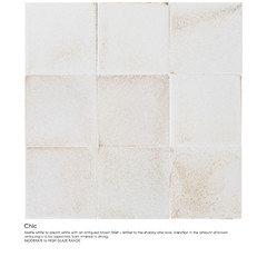
    These tiles remind me of an Encore tile which is a white matte tile with a soft beige/brown glaze that gives it dimension. Romy and oldbat probably remember Michele's four thread quest where she was considering those tiles to go with her Smoke crackle--Encore Chic I believe. I think the square tiles on the bottom row are very sweet for a vintage kitchen. I think they're 3" tiles instead of the standard 4", which would be a nice scale for your kitchen. I wouldn't recommend glossy tiles. I think crackle may even be too much bling.

    Crisp Architects · More Info

    I've always liked the look of subways with a base of squares.

    Transitional Colonial Craftsman · More Info

  • 10 years ago

    Here's the Encore Chic matte tile.I like how it ties in your copper lights, but the base color may not work with your marble. Just thought you might want to try it if you come across a similar tile while at the tile store.

  • 10 years ago

    Mayflowers Ohhhh I like that.. There's a couple other colors I'm interested in as well..

  • 10 years ago
    last modified: 10 years ago
    The Kitchenlab kitchen & backsplash (1st pic) has always been one of my favorites. That is the Ann Sacks Elements Collection in Ghost Gloss. I believe there are quite a few colors in that collection.

    There are crackle tiles that have little cracks all over the tile and then there are hand made crackle tiles which have a watery look. Some have color pooling and color variation and others are more consistent from tile to tile. I think the handmade variety would look beautiful with your marble. The glossy surface would be a nice contrast with your honed marble.

    I've never been able to capture (in a photo) the IRL look of my crackle tile (Encore Silver). Even the professional pics my KD took don't capture it. A grey tile might be perfect but I think my Encore Silver might have too much pink for your kitchen.