Software
Houzz Logo Print
nbier

Paint Color?

10 years ago
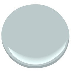
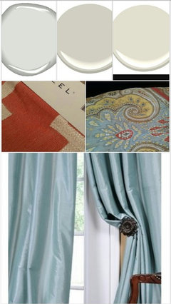
I was on here a couple of weeks ago asking about paint color, but since then our ottoman fabric decision was made and we ordered two of them (30"x22" each). Prior to selecting our ottoman fabric someone on here suggested Benjamin Moore's Revere Pewter. We like that color a lot, but I just want to make sure, would that still look nice in light of our ottoman selection?

If there's perhaps something more fitting that we're overlooking please feel free to include that as well.

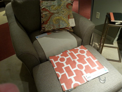
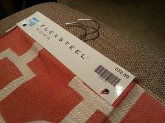
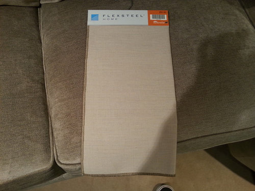
For reference, we bought a couch and loveseat in this fabric:


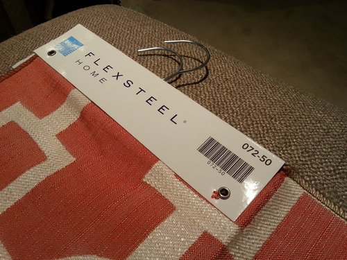
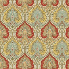
The reddish orange and white fabric in the forefront is the ottoman fabric. The paisley looking swatch is the pillow fabric we chose, but we are very open to going a different route on the pillow front if things just don't mesh right. Note: The chair pictured there is not the style we're buying.


Thanks for your input.

Comments (22)

  • 10 years ago

    BM Smoke...a sophisticated grey with hints of blue would look good with both your fabric choices.

    nbier thanked kjoy1
  • 10 years ago

    The Smoke is very nice but I'm wondering if it's actually more gray than blue...? I don't think you can go wrong with Revere Pewter.

    nbier thanked chloebud
  • 10 years ago
    last modified: 10 years ago

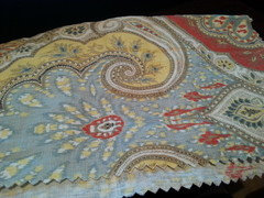
    I don't know if it helps at all, but here's a picture of the pillow swatch courtesy of Flexsteel's upholstery site:

    Like I said, the pillows are something that we're open to changing if it frees us up to pick a better paint color for the couch and ottoman.

  • 10 years ago

    BM Stratton Blue...

    nbier thanked kjoy1
  • 10 years ago
    last modified: 10 years ago

    Looking for a more neutral color? I like your fabric choices:)

    nbier thanked kjoy1
  • 10 years ago

    Thank you both for your advice and compliment on the fabric. We just got done having a dark brown sectional and dark wood furniture so we really wanted to brighten the room up a bit and add some color. We weren't sure if the ottoman fabric was a good choice or not, so it's relieving to hear a neutral party say that it does look nice. Thanks for that.


    We're probably more in favor of a neutral color because I'm figuring that might give us more flexibility in terms of the colors we can select for wall art. Am I mistaken on that though?

  • 10 years ago

    We foolishly bought this painting before we had finalized our ottoman color, and we'd like to include it in the living room if possible, however, we do realize that it might look way out of place and are giving full consideration to putting that in another room instead.

    Here it is pictured in the furniture store:

    Not that I want the picture to dictate paint color, but blue might not look right with that I'm guessing?

  • PRO
    10 years ago

    I have never seen a successful execution of a color scheme, where any work with colors is done through photographs or computer. The reason being - distortion of color. It's hard to recommend a paint color this way. I guess being a classically trained artist we are pretty particular when it comes to color schemes, paints... There are so many factors to consider: Hue of color, it's value, how the light is traveling through the particular space...Undertones of paints, reflections...How a certain color of paint or upholstery looks with natural light or artificial (kind of bulbs used in lighting in ones residence) and so on...

    We always schedule a separate session just for paint color selection when all the other material samples are present in the space.

    We design and install long distance projects all the time but, again, we would need to have all your samples to be shipped to us to be able to specify the colors and / or suggest best upholstery options...

    Or you might consider hiring a designer in your area just for color selection. It will be easy since you already have some fabrics and/ or materials on hand.


    Good luck!

    JS

    nbier thanked Joanna Shirin Design Studios, ASID
  • 10 years ago

    Bm Edgecomb Gray is a tad bit warmer than Revere Pewter, look at it too.

    nbier thanked emmarene9
  • 10 years ago
    last modified: 10 years ago

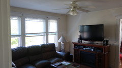
    I think we've narrowed it down to three colors. Benjamin Moore Revere Pewter, Benjamin Moore Shoreline, or Benjamin Moore Balboa Mist. Considering that the living room gets a strong shot of sunshine first thing in the morning and the rest of the day natural light tends to be a little bit more indirect, which do you think we're better off going with in light of the furniture selections? Thanks again everyone.

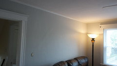
    Here's a look at the room in it's current state. That couch will be gone in a couple of weeks.


  • 10 years ago
    Just a thought: I would wait until you get all the furniture in before choosing the paint color. Dye lots differ, so what you actually receive in the fabric may be slightly different than the samples. Plus seeing all the pieces together in the room may steer you towards whether you want lighter or darker, more color or less color, etc.
    nbier thanked sootsprite
  • 10 years ago
    last modified: 10 years ago

    From a practical standpoint you're probably right, sootsprite.

    To be honest, we sort of have our minds set on painting now while the room is pretty empty (the couch pictured above is just about gone minus a couple of pieces of it.) We've looked at about eight paint samples in our search and those three (Revere Pewter, Shoreline, & Balboa Mist) are the choices we've narrowed it down to. In the early stages we weighed doing a more bold color in that room, but our appetite is for more of a neutral gray tone and the furniture's arrival wouldn't drastically alter that plan.

    If anyone either has any experience with those colors, or even if you haven't and you have an opinion about which color might look best I'd appreciate it.

  • 10 years ago

    I like Shoreline for it's hint of blue, but all will work.

    nbier thanked emmarene9
  • 10 years ago
    last modified: 10 years ago

    Hi---nice fabrics. :))

    I think Revere Pewter is too dark for your space --the other two, Shoreline and Balboa Mist are very light and have a blue undertone-perhaps better suited for your ceiling as the blue will add a sense of height to the room.

    For walls, I recommend checking out BM'S Olympic Mountains, Collingwood, and Ice Fog.

    Floor to ceiling drapes would elevate the overall look of the room. Perhaps a solid light blue... :))

    Hope this is helpful. Good Luck!

    nbier thanked Natalie
  • 10 years ago
    Since there are limitless paint colors wait til your furniture is in room to decide. Light changes so much and even more so with furniture in room.
    nbier thanked Kathy
  • 10 years ago

    Inspiration. Lighter walls of course. Keep us posted.

    Living Room · More Info

    nbier thanked Natalie
  • 10 years ago
    last modified: 10 years ago

    We were on the fence about Shoreline vs Stonington Gray, and we ultimately wound up going with Stonington Gray, cut with 25% white. We agree that we probably should have gone 50% white, but overall we're pretty satisfied. Once we get some new lamps the lighting will be a little better, and then I'm sure we'll like the color a little more. Thanks again, and I'll post an update when the furniture comes in.


  • 10 years ago

    Looks good! :))

    nbier thanked Natalie
  • 10 years ago
    last modified: 10 years ago

    Thanks!

    By the way, we're not 100% sure what direction we're going to go with curtains yet, but we really like your idea about a light blue color. Thanks for all of your great suggestions.

  • 10 years ago

    Pretty color! It really makes your white trim pop. Can't wait to see pics with your new furniture. Good job:)

  • 10 years ago

    The fabrics are beautiful and really stand out when placed together. Therefore I think that the Revere Pewter is a great choice because it still adds a sense of warmth to the room without taking away from the detail of the fabrics. Good Luck with everything it will turn out amazing!