Software
Houzz Logo Print
marketerme

Mid-century-esque house with art wall

10 years ago
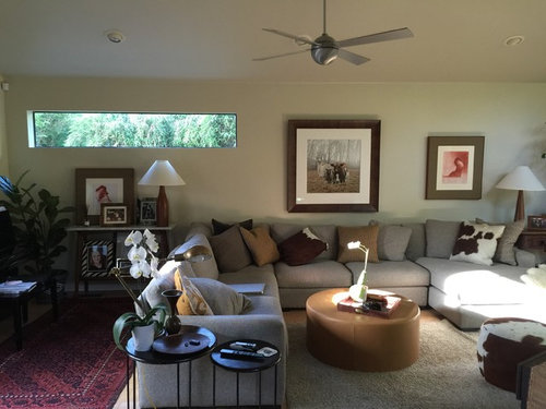
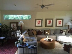
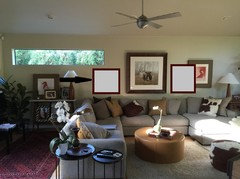
Hi! I have always been challenged by this wall and need some suggestions on what to do. More art? Lighting? Shelves? I cannot move the sectional.
Thanks!

Comments (17)

  • PRO
    10 years ago

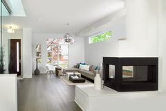
    Your horizontal window is a strong design element that creates the mid-century vibe. I think it should be more of a focal point on this wall. There's not enough info in this photo for me to make a recommendation, as I cannot really "read" what's going on left and right of the sectional, however the room feels cluttered to me. Sometimes "editing" is the simplest and best solution and less can truly be more. The photo below is far more "modern contemporary" but makes a statement about editing.

    Modern Toronto Infill · More Info

  • 10 years ago
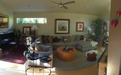
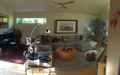
    Thank you. I feel Like it looks cluttered as well and without the stuff, it looks a bit cold. Add to that is my DH's rug collection, that we have to work in somewhere (not necessarily in this room. Here's a shot of the room. It's long and narrow, with an angle on one wall.
  • 10 years ago

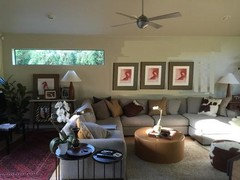
    You might consider removing the large picture (which looks very intriguing, so find it another home) and replacing it with two more square works that relate, framed the same way. Centre the three between the edge of the window and the edge of the lamp on the right. Cool room. I love that you have use the Persian rug to define the second space.

    Alternative placing, closer together, centred on the sectional.

  • 10 years ago

    Interestingly, I don't find it cluttered. I think that's because you have arranged your things well. And I like that it resolves into two 'rooms'.

  • 10 years ago

    See what you think:

  • PRO
    10 years ago

    Declutter the table on the left.

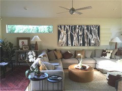
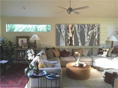
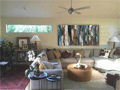
    One large artwork centered on the sofa and aligned at the top with the window (this is key in visually fitting it in).

    Check out my artwork here: https://www.etsy.com/shop/shoagallery

    I can customize to your size. Some samples below. Enjoy decorating!


  • PRO
    10 years ago

    The corner under the window just feels dark. I like the idea of brightening the space up. Maybe a lighter rug that plays on the natural light? I also agree the table feels cluttered and could be removed from the space.

  • 10 years ago
    Thank you, everyone. I definitely will be moving that small table and the art suggestions are great. How are you editing the photo? Photoshop?
  • 10 years ago

    yep

  • 10 years ago
    last modified: 10 years ago

    Lots of good suggestions here already. Be prepared for it to look a bit bare at first - that's the MCM look. Lots of peaceful bare space.

    In addition to removing the table, also remove the plant beside the piano. Leave some breathing room in that area.

    Simplify the end table arrangement by pushing the 2 tables together so they "read" to the eye as one item, then remove all the decor and leave only the lamp. Would the matching end table lamp look good there, instead of the swing arm? If it is too tall then, reverse the table so the lower end is at the back.

    Simplify the pillows by removing the tan colored ones or covering them in a solid color, either the sofa color or the dark brown from the patterned pillows.

    If new art is not in your budget right now, the 3 pieces on the window wall could be hung closer together in a longer low arrangement over the sofa. The space between them should be a bit larger than the width of the frame. Maybe someone with good photoshop skills can assist. I also like the piece half-hidden behind the plant in the right corner of the room. It would look good over the piano if it can be hung horizontally, if it is an abstract.

    Nice room with attractive furniture and decor. Just needs a little editing to freshen up its style.

  • PRO
    10 years ago

    I use clunky powerpoint but it's just to get the point across nothing major :)

  • 10 years ago

    I would go with a natural linear piece of artwork such as driftwood, or even create something lovely yourself with driftwood and airplants. I think those would be a lovely focus which would follow the MCM style of connecting the indoor space with the outdoor one. I would like the way it played with the furniture and colors you currently have.

  • 10 years ago
    Thank you so much! We are design fails, as all of this furniture is literally less than a year old! Including the farm animal piece that we just paid through the nose on (photo plus frame.) we didn't, however, work with a designer.
  • PRO
    10 years ago

    Mark, your pieces are beautiful and tasteful, and the artwork is nice, just doesn't fit in there. Put it to use somewhere else and enjoy it. Keep us posted on what you decide.

  • 10 years ago
    last modified: 10 years ago

    Not design fails at all.

    I like the art and, most importantly, you chose it so I think you do too. Just because some people here have recommended something different, don't think you have to discard what you have already chosen. Don't miss the point that art work is sold on this site and this is an opportunity for people to display what they have available for purchase.

    You never intended it to be the only piece on your art wall. IMO you just need to re-hang the other 2 smaller pieces closer. Or you may choose to make it a gallery wall with more art pieces than just the 3. You wouldn't have spent a lot on this piece if you didn't like it.

  • PRO
    10 years ago

    What did you end up doing here?