Software
Houzz Logo Print
milimi

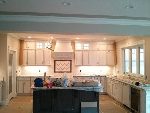
Does this backsplash look ok

10 years ago
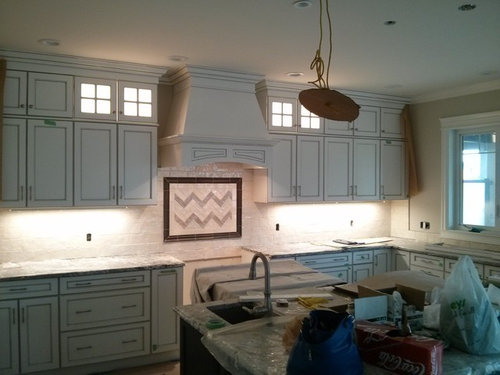
just installed and I am unsure about it

Comments (60)

  • 10 years ago
    I agree the dark frame is jumping out. It seems like the dark pieces are only in the middle / center of room. I think it could be worked with. Maybe try taping over the frame and see if it looks better, just a thought
  • 10 years ago

    Yes since you asked, the framed decoration is not a success. But otherwise very attractive kitchen.

  • 10 years ago
    It's not awful. Maybe a little harsh in color but you could pull in black accent pieces like a chalkboard menu etc to tie it all together. Nice kitchen for sure!
  • 10 years ago

    The kitchen has really beautiful elements to it, but you're asking for opinions, so----I do not like the framed tile portion with the zigzags. Especially the black frame and that the pattern is not even. Like another suggested, if you don't like it now, fix it now. It's not that big of a job to redo it at this point in the renovation.

  • 10 years ago
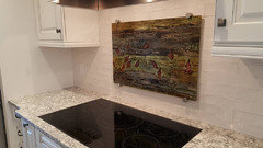
    this is custom made tile to match the colors from the granite, including the dark border. I was the one who laid the pattern. to me it did not look bad when it was laid on the floor. the original idea was to have random mix of different color tiles in the herringbone. the herringbone actually has four different colors one of them being the color of the main tile. in any case, since the insert area was not very big. when trying to put the herringbone color tiles randomly it ended up looking like someone screwed up with the pattern. I guess based on the comments ( and I do appreciate them) it still is bad pattern. to be honest I have no heart to tell my husband that we need to redo the insert. I think that I will have to live with it for a while and see. I did want honest opinion on this and do appreciate it. please keep with this discussion and thank you all
  • 10 years ago

    Would you hang a framed picture of a zigzag on a wall in your house? If not, then why would you hang one behind your stove?

    I'm not against a framed accent behind the stove. But I think it needs to be treated the same way any other art is. Art needs to fit the context. And art needs to provoke an emotional response. So, you've fit the context by using tile and an appropriate size. But I think you're disliking the effect because the "picture" doesn't do anything for you.

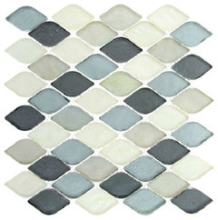
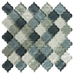
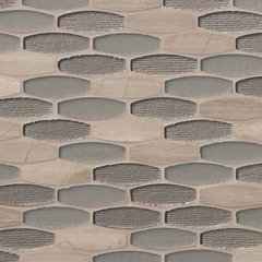
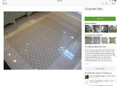
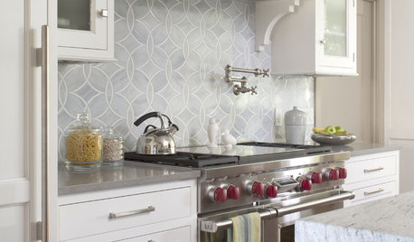
    If I were filling that frame, I'd use something with curves in white and greyed aqua/blue (colour might not be right since my monitor and your actual colour may not agree). Maybe one of these:

    This 1st on is my favourite. It makes me think of water and movement, or maybe leaves and wind. At any rate, I know I'd be happy looking at it for years. And that is the test your framed tile has to pass: will you be happy looking at it for years?

    Glass Tile Mosaic Backsplash Gray Scale, Sample · More Info

    11"x11.5" Glass Tile Mosaic Dentelle Series, Waterfall Gray, Set of 10 · More Info


    Ellipse Gris Oblong 12"x12" 8mm Blend · More Info

    Robert A. M. Stern Collection Quartet Linen · More Info


  • 10 years ago

    Beautiful kitchen and I love the tile backsplash! Since you appreciate honest opinions, I agree the framed section needs work. Also, I wouldn't have put the taller backsplash on the side walls. Instead just use the short except on the real back of the wall sections.

  • PRO
    10 years ago
    The chevron pattern in the medallion is not centered properly so that is a problem. So, that detracts from everything. However, since you feel you have to keep it at least for now, perhaps you can put some decorative, dark items like a easel with an interesting cookbook to the left of the range space to balance the dark frame. I think with accessories and other elements in the space you can reduce the impact of the off centered chevron pattern. Not sure who installed it (husband?) but a pro tiler would have pointed out the symmetry problem right away. For me, I could not live with this. I would mentally scream every time I walked into the space. A shame because otherwise beautiful job.
  • 10 years ago
    the tiles were installed by a pro installer who is a friend and that is the main problem here. had it been my husband i would replace it. I have to ponder over this a bit more, but honestly i am having anxiety over this. I mean I laid the pattern so really it is my mistake, but I also was expecting from the installer who is a friend to say something, if it was off. thank you all for your comment. it's been difficult stressful almost two years since we started building
  • 10 years ago
    Right now the framed tile piece is all we can focus on, but once you put your kitchen back together and have a few things on the counters, it may soften the look a great deal. It's the same think when you paint a room a vibrant color and at first you are horrified that you have made a mistake! Then you put the furniture and artwork back in place and realize it turned out beautifully. I understand that you are in an awkward position, but wait and see what things look like after all is done. And don't be too hard on yourself. Your kitchen is lovely!
  • PRO
    10 years ago
    Oh boy. Tricky. But it is your house. If the person is a true friend, just get together and in your most heartfelt way, say "Sammy (insert real name) I have made a terrible mistake and I really need your help. I messed up design and the chevron tiles are not centered properly. Is there a way we can fix this?" The current trend is away from these medallions over ranges and just doing great tiles all around backsplash area. One solution would be to take the chevron part out and just replace with the subway type tiles like the rest of backsplash perhaps putting them vertically but centered, just for some interest. Might be best to remove entire medallion and just do entire backsplash in the other tiles you have, which are really nice. (Hoping you can get more of them in the same die lot!). I wish you luck. Remember, it is still your kitchen and you have to live with it for a long time.
  • 10 years ago
    dinkyhowk thank you so much for your kind words:)
  • 10 years ago
    I'd change the area inside the dark frame. It looks funny with the pattern not appearing symmetrical. If you have tile leftover, the simplest thing would be to put it over that tile and do the pattern evenly. If you first paint on Bond-It (or any bonding agent), you can tile right over tile. That's if there's enough depth to the dark border tiles. You don't want to stick out beyond that. As a contrast, you could also use mirrored tiles or stainless tiles inside that area, or even a piece of mirror.
  • 10 years ago
    You are not the first to have had a great idea that took a lot of work turn out not quite what you wanted. I have done it before you!! What strikes me about this "conversation" so far is your comment that you would have thought you installer would have said something if it didn't look right. Well, even if he didn't like it, he would tried to protect your feelings, just as you're trying to protect his now. Own up to it if you're not happy and discuss it with him. And just remember it will be a lovely kitchen when all is said & done.
  • 10 years ago
    you know bearpocketbook , you are so right about this. I should just get it out and talk to the installer. there were so many great comments in this discussion today.
    I just had an idea. what do you think about putting the painted glass (bolted) to the wall over the current insert, the same size as the insert. the place where I had tiles made for me also does the glass art. of course considering this fiasco with the herringbone pattern I am scared to venture into this. but just thought that glass insert would be the least amount of work and money. any thoughts on this?
  • 10 years ago
    It is such a beautiful kitchen don't leave this one thing unsettled in your design. Change it now and it will soon be forgotten, so you can start enjoying all your hard work.
  • 10 years ago

    wait for it....... the lighting, the decor you put out, even the bar stools.. balance will come.

  • 10 years ago
    this is what I had in mind with glass insert, but in color that goes with my granite and cabs.
  • PRO
    10 years ago

    I doubt that would look right. Just bite the bullet and fix the tile would be my vote. Trying to "cover" the error would look just like that. The depth isn't quite right so not going to work well. Sorry, I would love to agree, but I have to be honest. These "construction problems" are very hard emotionally to deal with, but you know in your heart of hearts it needs to be removed and replaced in some fashion. I don't think you would have posted this in the first place if your mind and heart didn't tell you this was off. Just do it!

  • 10 years ago
    Beautiful kitchen. The insert does look a little "Charllie Brownish" to me. I think I would have preferred just changing the pattern slightly over the stove but keeping the color the same as he rest if the backsplash. With that said, It may not stand out as much with the appliances installed and kitchen accessorized. Are there other vertical darker elements (dark window frames maybe?) that you can tie the dark framed design to? I feel your dilemma. Everyone has one or two of these in large projects. We had a few in our new home design. I have a mud room powder room that I had a grand idea of mixing shiny and flat tile on the wall in he same color. It looked great in product brochures but you can't even tell the difference in the finish on he wall. It was a frustrating use of time and money to achieve a aesthetic that can't be seen. Ultimately I decided it wasn't worth changing. That is something you have to decide for yourself. Good luck, and enjoy that beautiful kitchen.
  • 10 years ago
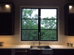
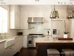
    After looking at your pics again I'm wondering if a dark window frame over the sink would help tie in the dark frame over the stove. You could keep he molding white. Here is a pic of what I am talking about (please ignore the dirty dishes in the sink:)
  • 10 years ago
    ok - did not sleep last night over this so it is obvious I have to change this. talked to my husband about it and he agreed to take our the tiles if I don't like them. the thing is now, I don't have enough any tiles from the I sent in a single color to finish this, nor enough main tile to completely replace the medallion. as mentioned earlier in this discussion all tiles were custom made( hand pressed) for me to much the colors from the granite. I know that many of you don't like features above the stove and that is personal preference. We would like to keep the medallion, but I am now nervous about the colors. obviously I have to go back to the tile studio and have them match color again. From conversations yesterday many of you commented on the black medallion frame. it is actually not black but dark pewter, so I agree maybe stands out. Are you suggesting that I replace the dark frame as well. I don't think that I dare going with herringbone. what do you think if I order darker color from the current insert tile in 3x3 size and have it installed not straight but in a " diamond shape. any thoughts on the insert design will be appreciated :)
  • 10 years ago
    this is open concept home and the pictures were taken from. the living room. I have lots of Windows in the living room so not sure that changing the color of the kitchen window would work. my kitchen island is dark and i have black door hardware ( pantry door in the kitchen) throughout the house. the stove is Miele stainless steel with dark cook top and the granite ( not obvious) from the pictures has lots of Grays(dark gray, bluish gray and taupe- hence the colors in the insert). but you are correct I don't have any dark features on the wall in the kitchen, mind you I don't have much walls. everything in that room is sort of tone on tone.
  • PRO
    10 years ago
    Milimi- feel your pain. Been there - Done that. I feel confident if you go to your custom tile supplier, and explain the situation you can come up with good solution. The "diamond pattern" idea is a good one, however, centering that pattern is just as challenging so understand that. You can also put some pewter dots at some tile junctions that could tie in the border. If you search on Houzz for diamond backsplash you will see several examples. I designed this for a high end home last year, and similar space and it turned out really great. Clients love it. You have to lay this out carefully. I started with big piece of brown paper and began design in center of space and worked my way out to edges. The detail round hardware are called "clavos". These nail heads come in all kinds of shapes, colors and sizes. This detail would tie in frame so you would only replace the very center tiles. Since that is small area, cost should be manageable. Your tile supplier should know about these and can help. But you can order on line just make sure size is right. Probably under 1/2" round ones. I think this is a plan.
  • 10 years ago
    Flo manganese, do you have a picture that you can share on this?
  • PRO
    10 years ago
    Yes I am trying but Houzz isn't working. I will find on Houzz and give you reference.
  • PRO
    10 years ago
    OK - try searching on Houzz this phrase "kitchen diamond tile medallion Drury Design." The first page, when I did this, pulled up pictures that show this concept nicely. See if that works. The diamond shaped tiles are called "rymboid". Your tile people should be familiar with that term. Take exact measurements of the shape inside the border tile. And a picture. Let me know if you find this. I haven't mastered posting pictures on Houzz. No time. Have a great day! You will get through this!
  • 10 years ago
    Hear you on the open concept. Ours is open also. We did dark window frames in the open areas and white everywhere else. However in our lower level I did dark French doors and side windows and white window frames elsewhere in the same room. surprisingly to me it worked out looking fine. Just a thought. If you are replacing the frame on the tile.
  • 10 years ago

    I think if ur husband is willing to take the zigzag tile out then ur are a lucky girl! My hubby would tell me to live with it. Lol.

    I really don't care for it n I feel for u if u don't either. It's so hard trying to picture in ur mind and in person the exact look u are after.

    So whatever u do, either way - give that man of yours a Big kiss!! He's a sweetheart n a keeper for sure. :))

  • 10 years ago
    Sorry it cut me off. I meant is you are replacing the pewter frame on the tile the window color suggestion would be moot.
  • 10 years ago

    If you're going back to the tile studio for more tile, take good pics from near and far of the current installation with you. Your tile artist may have some good suggestions.

    As I said upthread, the dark frame makes the eye expect a focal point. So put something special there.

  • 10 years ago

    I think if you replace with a basic pattern/all white and light gray/it will look very nice.

    by the way, love the kitchen!

  • 10 years ago
    The dark frame is very stark against the white. Can you do a lighter frame and a special patterned tiles with a motif inside the frame using grays so it is still a focal but more subdued?
    Your kitchen is beautiful. There is a solution so don't get discouraged.
  • 10 years ago
    FYI
  • PRO
    10 years ago


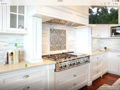
    Well-dressed Traditional Kitchen - Glen Ellyn, IL · More Info
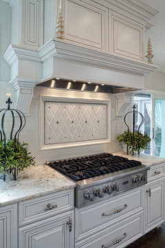
    Finally had a minute to figure out how to get this photo posted to your page. This is an example of the "rymboid" medallion design I spoke of earlier. Notice the small accent pieces that are same basic finish as the inner boarder. I think if you put similar accents the color of your border, this would tie the two together, create a pleasing look and really look "polished". Perhaps you can print this out and take with you to the tile specialty provider.

  • 10 years ago
    Thank you all for your support and suggestions. Today I got in contact with the studio designer and she will work with me to design new inlay. will keep you posted on the progress/end result. keep your fingers crossed for me :). Thanks again.
  • PRO
    10 years ago
    Awesome. I know you will get a good end result. Do post pics. Sometimes you have to take life's lemons and make lemonade! You are well on way to great kitchen! My great pleasure being of help!
  • PRO
    10 years ago
    Any new developments?
  • 10 years ago
    nope:). not yet. will let you know once I decide what to do
  • PRO
    10 years ago
    Sweet. Hope things work out in a good way! Thanks for the update.
  • 10 years ago
    The good news is, you have an absolutely beautiful kitchen. You've clearly spent a lot of time and thought (and money) creating a space you love. You should love all of it. If you can't sleep at night from worrying about the tile insert then I think you'll probably be happier changing it. FWIW I'm fond of inserts that are the same colour as the surrounding backsplash, just a different tile size or layout. But bottom line, it needs to be something that makes you smile.
  • 10 years ago
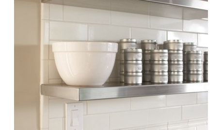
    Here's one of my bookmarked favourite back splashes.
  • PRO
    9 years ago
    Curious of what happened in your kitchen?
  • 9 years ago
    we just moved and are settling in. I decided to take the insert completely out and use just main tile. we have not start work on that yet, will post pictures once it is done. thanks for asking:
  • PRO
    9 years ago

    Hi! Great to hear from you. I think you made a really good decision. Also, I think I mentioned before the trend in backsplashes is in the direction you are taking so it won't look dated right off the bat. Looking forward to seeing the pics once you are done. Good luck on getting settled in. A big process for sure!

  • 9 years ago
    Can you take out the darker grey chevron tiles and leave them all one color?
  • PRO
    9 years ago

    Danielle, sorry, but this was covered in previous posts a long time ago. Fortunately, the herringbone were removed. Just didn't work.

  • 9 years ago
    The frame is too dark. Stands out too much. The zigzag looks unfinished. Kitchen is beautiful. Don't let this ruin it. Change it.
    milimi thanked cineus
  • PRO
    9 years ago
    Read posts. You are way behind.
    milimi thanked Flo Mangan