Software
Houzz Logo Print
bethany_schell

Paint color!!!!

10 years ago
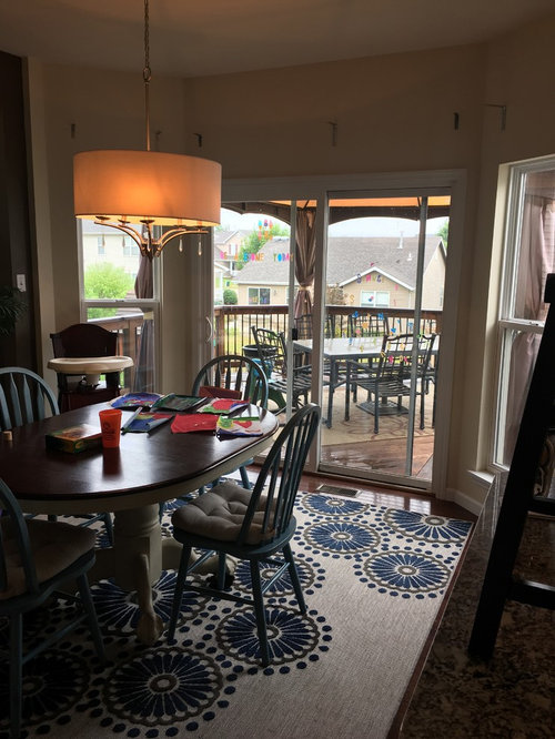
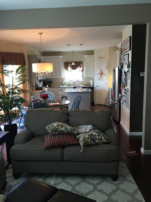
I cannot seem to pick a paint color for the walls in my kitchen! Please help. I want it light and my pops for color in the accessories....

Comments (18)

  • PRO
    10 years ago
    I don't see any ceiling can lighting. If the valances aren't important to you removing them would help. They are dark and further block natural light. The upper cabinets look white but the biggest block in the lowers look dark gray. Pictures are very difficult to assess on line, so I could be wrong in what I see. If your cabinets are white, trying a bright white might be worth getting a sample and doing a sample board to check it out.
  • 10 years ago
    Thanks! So the valances are gone, but we are putting in a cornice and lighter drapes. Will post a pic of the sample. We get all afternoon light, so we do have a gazebo out back to be able to enjoy the outside and have to have drapes or the floors would fade like crazy and it would be a heat box! We will have canned lights put in soon as well, if that helps at all.

    I don't want white walls, have three little children, and just did the cabinets white themselves, so looking for something that would have some depth. but we don't get a ton of natural light as you have noticed....I will try to get a better picture but it is rainy this weekend :)
  • 10 years ago
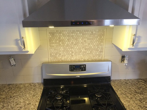
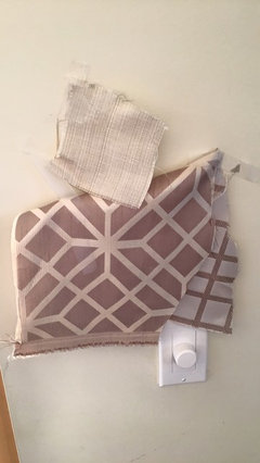
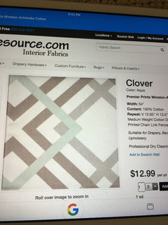
    Oh, and I am in the middle or refinishing a table which will have a light distressed top and gray bottom, which will remove the dark table as well. Below is an older picture when the cabinets started to be refinished, and also our drape samples. The pattern will be on the cornice with nailhead, and the lighter color will be panels.
  • 10 years ago
    Oh, and the island is a gray, along with the hutch both of which was just refinished.
  • PRO
    10 years ago
    Sure, I understand. If you used a eggshell or satin finish it would be very washable and be lighter. I think your light fixture over table might be relatively new, but the linen or cream shade would be better if it was white. The white of your cabinets and the grays are cool colors so it will look more cohesive if you stick to that cool palette. Not sure if the geometric pattern is beige and white or gray. Gray and white would be great. It is on it's way to looking really great. Lot of work and stress I know. Hang in there it will be great.
  • 10 years ago
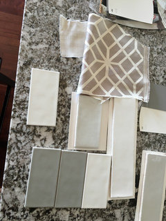
    Funny, the light over the table is white, but now with the cabinets it doesn't look as white. :). And yes, over the range is gray and white. Argh, I have so many paint samples and I don't like any of them!
  • PRO
    10 years ago
    I looked harder at your fabric and I am concerned a bit. If you want the beige, fine but find a fabric that has both beige and gray in it so you integrate the 3 colors. Hope you haven't locked that in? Yikes.
  • 10 years ago
    Well, yes, they are in process of being of being made. They do have a beige tint, kind of a griege, but all depends on what it is up against. the cabinets are less of a true gray and more of a putty gray if that makes sense. Here is a different picture of the fabric...let me know what you think. I didn't end up using the tile or gray paint color in this picture, but is a better one of the fabric.
  • PRO
    10 years ago

    Bethany-perhaps you have already locked in on your cornices, but here is example of fabric that ties all your tones together.

    Geo with linen, whites, grays and a touch of aqua. · More Info
    I noticed in the family room, pillows with a touch of aqua and blue and then again in the rug under your breakfast/dining table being more of a cobalt blue, so something like this would keep your theme going, blend with current wall color but be a bit brighter. Also, would a "solar tube" be possible in your kitchen area? If you are going to get cans in your ceiling, that might be a time to see if that concept is doable. It is basically a tube and mirror system, that takes sunlight from outdoors and reflects it into your space. A small round lens is on your ceiling and you would be amazed at how much natural light that brings into a space, without being a "heat adder". Might want to take a look at that.
    White, creams and grays · More Info
    Just another example of an alternate fabric that blends all your tones together.

  • 10 years ago
    I love that fabric...where did you find it! So, I am spoiled as my inlaws do custom drapery
  • PRO
    10 years ago
    Fabric resources.com. You can get a sample, then order on line and they ship it. Not sure where you are but my orders come from Dallas and I usually get in a day or so. Good price points too.
  • PRO
    10 years ago
    Have you tried SW 7036 Accessible Beige? Or SW Agreeable Gray. Each would work in your space and are light. Try samples of them in your space on sample boards and see which one you like best.
  • PRO
    10 years ago
    The geometric leans to beige but if you love it, then use other accessories to bring tones and colors together. You could bring some of the cobalt blue into space with color on the island etc. if you can hang the cornices so they just come down over top of window frame, that can maximize light but will diffuse with sheers.
  • 10 years ago
    Thanks! I like that idea. Now if I can just figure out the paint color and I am done...
  • 10 years ago
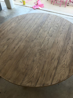
    Ok, I lied. Here is a table I am refinishing....white, gray or all together different on the bottom? What about chairs? The top is a weather oak.
  • PRO
    10 years ago
    Wow. Gorgeous table. If you are going to paint it, I would pick up that wall color in family room which looks med/dark gray? Would that work with the weathered wood top? Hard to tell from pics. But that is a bear to paint. You are industrious! Tying the spaces together with one of your main colors is good design trick. Gray would be color I would repeat for continuity.
  • 10 years ago

    Will you have any extra fabric to are some pillows for couch? A light throw blanket on couch could help to lighten also. Pat