

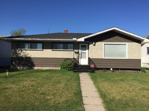
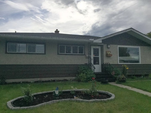
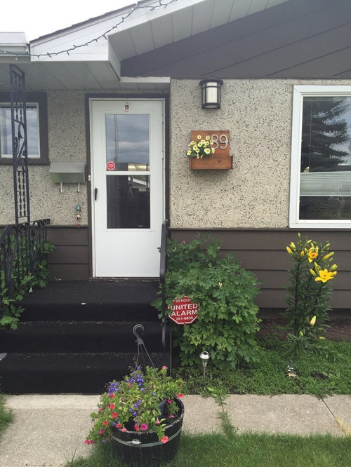
Need help with exterior and door color combination
10 years ago

Featured Answer
Sort by:Oldest
Comments (17)
Related Professionals
Kissimmee Interior Designers & Decorators · Portsmouth Interior Designers & Decorators · Los Angeles Interior Designers & Decorators · San Luis Obispo Interior Designers & Decorators · Wenatchee Interior Designers & Decorators · Panama City Architects & Building Designers · Lake Charles Architects & Building Designers · Frederick Architects & Building Designers · Westminster Architects & Building Designers · Aurora Architects & Building Designers · Lancaster Architects & Building Designers · Elkton Kitchen & Bathroom Designers · Cherry Hill Kitchen & Bathroom Designers · Vineland Kitchen & Bathroom Designers · Traverse City Kitchen & Bathroom Designers 10 years ago
- 10 years ago
 10 years ago
- 10 years ago
 10 years ago
 10 years ago
- 10 years ago
- 10 years ago
- 10 years ago
- 10 years ago



Related Stories

ENTRYWAYSHelp! What Color Should I Paint My Front Door?
We come to the rescue of three Houzzers, offering color palette options for the front door, trim and siding
Full Story
EXTERIORSHelp! What Color Should I Paint My House Exterior?
Real homeowners get real help in choosing paint palettes. Bonus: 3 tips for everyone on picking exterior colors
Full Story
ARCHITECTUREHouse-Hunting Help: If You Could Pick Your Home Style ...
Love an open layout? Steer clear of Victorians. Hate stairs? Sidle up to a ranch. Whatever home you're looking for, this guide can help
Full Story
SELLING YOUR HOUSE10 Tricks to Help Your Bathroom Sell Your House
As with the kitchen, the bathroom is always a high priority for home buyers. Here’s how to showcase your bathroom so it looks its best
Full Story
SELLING YOUR HOUSE5 Savvy Fixes to Help Your Home Sell
Get the maximum return on your spruce-up dollars by putting your money in the areas buyers care most about
Full Story
COLORPick-a-Paint Help: How to Quit Procrastinating on Color Choice
If you're up to your ears in paint chips but no further to pinning down a hue, our new 3-part series is for you
Full Story
REMODELING GUIDESWisdom to Help Your Relationship Survive a Remodel
Spend less time patching up partnerships and more time spackling and sanding with this insight from a Houzz remodeling survey
Full Story
BATHROOM MAKEOVERSRoom of the Day: See the Bathroom That Helped a House Sell in a Day
Sophisticated but sensitive bathroom upgrades help a century-old house move fast on the market
Full Story
COLORPaint-Picking Help and Secrets From a Color Expert
Advice for wall and trim colors, what to always do before committing and the one paint feature you should completely ignore
Full Story
REMODELING GUIDES8 Tips to Help You Live in Harmony With Your Neighbors
Privacy and space can be hard to find in urban areas, but these ideas can make a difference
Full Story



Darzy