Software
Houzz Logo Print
829maxx

Help! Painting Woes of a bachelor!

10 years ago
Hi All,

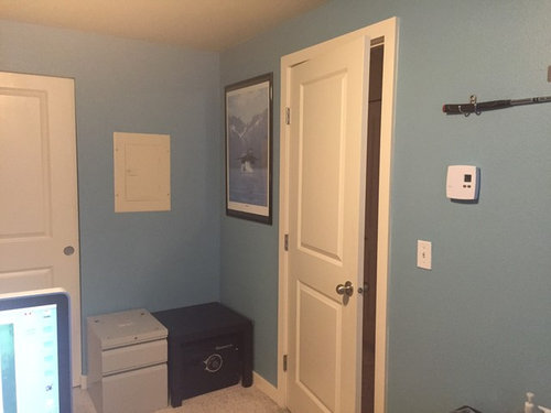
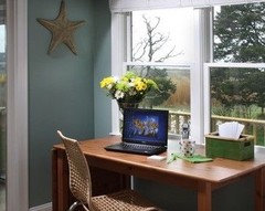
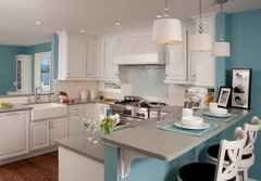
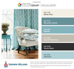
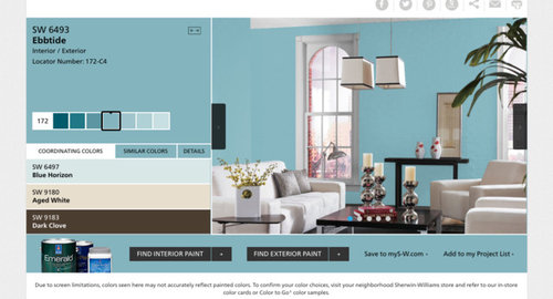
I have a painting dilemma. To start, I am an early 30's bachelor and have a 2 bed/2 bath condo that I am painting. I decided to start by painting the 2nd bedroom that I use as an office first in a color I love (pic and color below - it's sort of a sky blue with a hint of turquoise). As much as I love the color, I have some questions/concerns...

1) Is this a good bedroom/office color? Or, is this more suited for a bathroom?

2) I was thinking of adding an accent wall to break it up a bit. Good idea or bad idea?

3) I want to avoid having too many colors throughout my 1,000 sq/ft condo. I was hoping to use the same color in both bedrooms, but I don't think this color would make sense. I am now thinking that if I ended up doing an accent wall, I could do the reverse in the master bedroom (current color becomes the accent wall color in master, and main color in master would be the accent color in current room) - is that a cool idea or dumb?

4) If I did an accent wall and did the reverse in the other bedroom, what color would make sense? The furniture I have is black, so I didn't think brown tones (although pairs nicely with this color) would work well. I also don't want to make the master bedroom too dark. The rest of the condo will be in a very light grey tone.

I would love any help/advice anyone could give!

Thanks,

Maxx

Comments (76)

  • PRO
    10 years ago
    I'll be back later today with a more cogent reply!!! Thanks for your patience!!!
  • PRO
    10 years ago
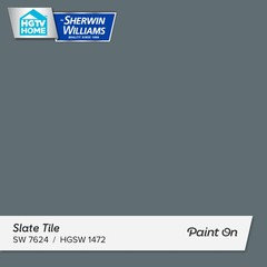
    I didn't read every single post above but I'd suggest find a steel blue between the blue you've already painted and the other grey walls. something to marry the two colors. Consider something like Slate Tile from Sherwin Williams..

  • 10 years ago
    i usually don't discuss colors, so don't consider me an expert, but here is a smoky blue that i like

    Half Sea Fog N470-3 · More Info
    fog

  • 10 years ago
    last modified: 10 years ago
    If you do an accent of blue elsewhere in the space, in a more denim tone, and maybe paint the closet doors in your office a deeper bright navy sort of blue (there isn't any white trim around them, and they would tie back well).

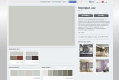
    For walls throughout the condo - bm stonington gray

    Closet doors in office - sw endless sea or bm bayard blue

    If you decide to put one coat over your office walls or want an accent wall in the master- I think you would be happy with a slightly deeper shade with muting - Test bm waters edge http://www.benjaminmoore.com/en-us/paint-color/watersedge

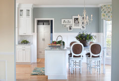
    Glastonbury, CT Kitchen Renovation · More Info

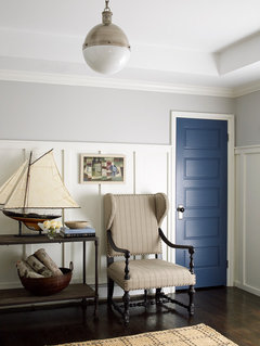
    Here's stonington and bayard on wall and door respectively - ignore the traditional furniture and just see how they work together with white trim - here board and batten walls.

    East Hampton Cottage · More Info

    In a smaller condo like this, using gray and white everywhere with classic dark blue doors throughout and a blue office would come off very polished, masculine and put together. As you are juggling a lot of black things . . look for pillows with intense blue and white and black or gray in the print. Layer gray and white small prints - thick white curtains.

    Kudos for being bold with your blue. Paint is the very least expensive décor item.

    829maxx thanked libradesigneye
  • 10 years ago

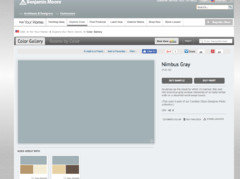
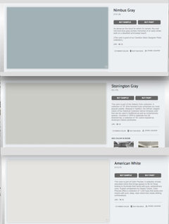
    I think I agree that although I love the Ebbtide color, it's a little too "harsh" and I would rather a toned down version similar to the BM Nimbus Gray. How about something like this?

    2nd Bedroom - Nimbus Gray

    Master Bedroom - Stonington Gray and then Nimbus Gray accent wall

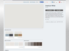
    Rest of Condo - American White (which is the lighter of Stonington Gray)

    Thoughts? Do these pair well together? Will any be too dark for the rooms they are going in? I don't get a lot of natural light in my condo.

  • PRO
    10 years ago

    I love that combo, great job! (I didn't want to insult your chosen color since you had already painted it, I could see where you were trying to go but Ebbtide was a little too intense).

  • 10 years ago

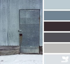
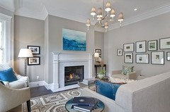
    Interior Designer - Home Stylist, Do you know the names of the colors from this pic you sent?

  • PRO
    10 years ago
    last modified: 10 years ago

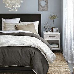
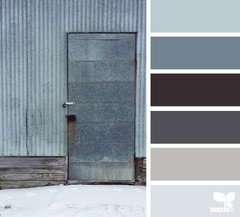
    that was actually a pic I pulled from Pinterest to give you a little inspiration.. I tried to pull a few samples for you that I thought coordinated and it included HGSW3323 Nordic Blue, HGSW3327 Crisp Blue, HGSW3326 Fresh Idea (one shade darker than the crisp blue), SW7015 Repose Gray and SW7636 Origami White. I think those colors cover most of that original image I sent? I'm not saying use every single one of those paint colors on your walls but keep those swatches with you when picking out bedding, window treatments and other decorative elements so you have a visual guide of your color palette!

    829maxx thanked Interior Designer - Home Stylist
  • 10 years ago
    last modified: 10 years ago

    Your approach was a good start, I would flip only two things.

    In the main living space, go stonington gray - it will contrast with your white trim and make the condo feel masculine. White won't do that for you, it will look bleh unless you have a lot of natural light and some cool architecture. In your bedroom, instead of mixing it with gray, put the nimbus on the headboard wall and paint the other walls a clean, bright white - bm simply white. This will add light where you need contrast to the accent wall - stonington and nimbus are too close in value to use together well IMHO.

  • 10 years ago

    I am going to kill myself looking at paint colors....after looking for a while, they all start to blend and I can't tell what goes together...let alone I am not a designer. Here was the original trio I thought would work:

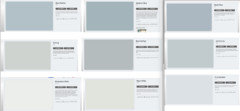
    Here are a few more Darks (2nd bedroom and master accent), Mids (Master bedroom) and lights (main areas). Any mix/match ideas that are better than the original?

    I really like the original (first pic), but was thinking I'd like to tie in more grey if possible? Maybe I'm wrong, but the original scheme seemed to have more beiges?

  • 10 years ago

    You can trust your eye . . all three of these could work. Even pros have to test paint in the space because the light, floors, reflections (even off the trees outside) can affect how the color looks in the space.

    One trick is to paint a foamboard and carry it around in your space - watch it in am, pm, all different types of light at different times of day (even the artificial). You can start with a lot of swatches and put them in a room, but it is tough from a smaller swatch to see all the tones. HD will make sample colors of bm and sw - FYI and SW will make you ben moore colors they all do reciprocity .. HD color pigments are not so exact but often enough to get close with a choice ..

    829maxx thanked libradesigneye
  • 10 years ago

    I think a good general policy is to do whatever Libra suggests you should do. However, if you are going to change bedding, you should do that first. Do you see how the pillowcases look dirty now?

  • 10 years ago

    emmarene you are a hoot! color is just my gift . .. and my hobby, to keep me sane enough to do the technical work that pays the bills. . hope it was helpful, thx for kind words e

  • 10 years ago

    I like the idea of something a little darker for the main part of my home, but want to make sure it goes with my living room which consists of a dark blue couch, light grey recliner, charcoal chair and a rug with all sorts of blues and off-whites. Also, I don't want to make my place dark in general since I don't get a ton of light I will be painting the ceilings white

  • PRO
    10 years ago
    See...once again I get back & Libra has it all figured out!!! I bow to her. I'm pretty good doing this from my phone at night when I should be sleeping...she wakes up & does clean up duty & humbles me!!! Lol. Do what she says.
  • 10 years ago

    Thank you all for the advise! This has been very helpful and much appreciated! Here are my updated thoughts:

    1) I'll be using Nimbus gray or similar color for the 2nd Bedroom.

    2) I think I will go with a darker color like Stonington Gray for the main rooms.

    3 ) I'd still like to tie in the 2nd bed color as an accent wall in Master Bedroom.

    4) Not sure what to do for the Master walls. I was hoping Stonington Gray or the like would have a couple shades lighter, but it doesn't look that way (only one shade lighter). I don't want to do pure white because a) I'm not a fan of pure whites for walls myself b) The trim is an off white - almost creamy color and I think it would look funny. I get that Stonington Gray and Nimbus Gray are too close in darkness for the Nimbus to pop so trying to figure out another solution.

    5) Still have no idea for the bathrooms! Maybe these should have pop since the rest are muted tones?

  • 10 years ago
    Lovely colour. SW worldly grey looks good with ebb tide. Some inspirational pics
  • 10 years ago
    last modified: 10 years ago

    What if you carry stonington through in the Master bedroom and paint the accent/headboard wall the deeper bayard blue? That would flow, tie in bed 2 but be very masculine - add two plug in wall hung sconces over the bed AND have lamps on your end tables . . embrace the cozy and deep drama . .

  • 10 years ago

    Libra, I was starting to think the same thing. With that said, I went to my local BM and got some of the big sample sheets. Stonington Gray seemed to have a beige undertone on my computer, but at home it's very grey (with blue undertone?) and doesn't look good with my lighting and against my trim. I am now thinking more of a greige?? Something lighter but has enough contrast with my trim.

  • 10 years ago

    Here are a few . . but they won't pick up and repeat the charcoal of your countertops (or start the spectrum of silver / gray / black / that your furniture fits into)

    test bm edgecomb gray . . bm light pewter . . .

    that is a nice greige, and another is

    bm broxburn greige http://www.benjaminmoore.com/en-us/paint-color/dc-19#ce_s=greige

    Generally though, I wouldn't pick any of these to go with nimbus gray in a space with black furniture and reddish wood tones . . Grays are warmed by khaki type greens and olives in the mix which i think could fight your casework.

    If you've got creamy white trim and doors, and you are sure you don't like pure gray, I'm going to suggest you go a tad lighter and test some soft tans - bm natural linen may be your primary neutral. look at it with the others at least http://www.benjaminmoore.com/en-us/paint-color/naturallinen


  • 10 years ago

    Ya, I was afraid that it may not work with the blues and grays I have going on with my furniture in the LR. I do like light pewter and broxburn greige. Do you think those would work with all the other colors I have? The Comet color that they suggest as a coordinating color looks nice as well as maybe a replacement for Nimbus?

  • 10 years ago

    I'm not sure why but I also saved Harbor Gray and Winter lake? Can't recall if someone suggested them or if I saved them on my own.

  • 10 years ago

    I also have a card sample of Behr Dolphin Fin that I grabbed months back when I first starting thinking about painting:

    http://www.behr.com/consumer/ColorDetailView/790C-3

    One of their suggested color palettes has a color similar to Nimbus Gray.

  • 10 years ago

    Harbor gray is darker than stonington so I don't think that helps you. Winter lake is a fine color but also not as muted as nimbus gray . .I would not have posted any colors that I thought wouldn't work with your plans, but you need to get a lot of swatches and then put them side by side to see what you think in your light. Harbor has a lighter cousin called bm shoreline that might be the right final answer . . http://www.benjaminmoore.com/en-us/paint-color/shoreline

  • 10 years ago

    Thank you Libra! You rock!

    Any thought on Behr Dolphin Fin? I'll get some searches and will revert back once I have a better idea.

  • 10 years ago

    Okay, so after grabbing a ton of paint cards and checking them against my lighting, etc. I narrowed it down to two and got paint samples. Ultimately, I think the best color for the main rooms is SW AGREEABLE GRAY! It plays as a lighter grey with just enough beige to work against the trim.

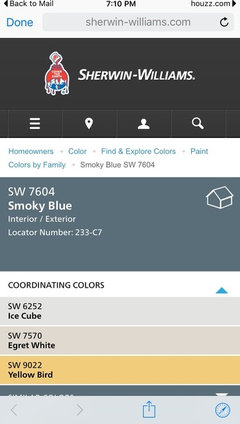
    Now trying to figure out what complimentary colors to use for bedrooms and bathrooms. I saw somewhere on google SW Smokey Blue which looked nice against the agreeable gray, but probably too dark for a whole room (so maybe the accent wall in the master?). They also used a burnt orange as an accent which I thoug could be a bathroom color (since I used some orange in my living room already)?

    Would love any ideas/suggestions to finalize this project. Thank you all again for your time!!

  • PRO
    10 years ago

    how big is your master?? I'm sure you've probably said above the dimensions but I don't recall. if you kept the other elements in your bedroom light; white bedding, white molding, light window treatments you could get away with painting the entire bedroom smokey blue. You can absolutely bring in burnt oranges in your art selections and other accessories but I'd use it sparingly. get a sample of the smokey blue then get another sample and have them add 20% white to the sample and try that on your walls as well, so you'll get the same tone but not as dark. Consider SW Comfort Grey in your bathrooms, I'd keep all the public areas your Agreeable Grey just for continuity and flow.

  • 10 years ago

    i like bottom 2

  • PRO
    10 years ago

    btw what I posted was your agreeable grey, smokey blue and the comfort grey I suggested.

  • 10 years ago

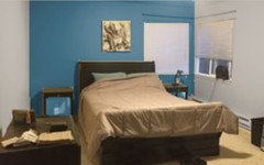
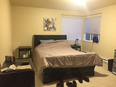
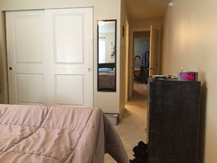
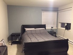
    The master is roughly 12x14 plus a little hallway when you walk in (the master bath is on the right when you first walk in). I really like the accent wall idea for the master behind my bed and then either tying in the same color tone for the 2nd bedroom or something like that? Here are a few pics of these areas to help get an idea of the flow:

    Master Bedroom:

    Master Bedroom looking the other way (you can see light on in master bath and directly across the second bedroom):

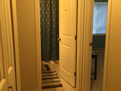
    Hallway from main rooms to the bedrooms (left is master, right is 2nd bed, directly in front is 2nd bath)...which gives you an idea how close all beds/baths are to each other:


  • 10 years ago
    last modified: 10 years ago

    Great corner window . .makes me want to help you find drapery and also makes me want to chat a bit more about an accent wall. . .here, your architecture would fight it if you plan to leave the bed on the wall with the window. . .the corner window is the feature you want to play up here . . the rods want to extend past it so you can hang drapery past it .. guessing the sleigh bed doesn't fit in the room any other way though . . is there a view of green or privacy from the windows? or just decent natural light? Also, your headboard is dark, so you want contrast back to the wall behind it . . I think this room is a candidate for the lightest shade of warm gray you come to select . .and maybe do a horizontal banding around the room instead . . Or, put the dresser on the opposite wall / window wall and shift the bed to the center of the wall area left without the window . . or as far left as possible to get in and out of the bed / your nightstand width. The rest of the room gets nicer that way . .

    829maxx thanked libradesigneye
  • 10 years ago

    What is considered a warm gray?

  • 10 years ago

    Also, what can I do with the 2nd bedroom color?

  • PRO
    10 years ago
    last modified: 10 years ago

    829 - Agreeable Grey is a warm grey. You can use the comfort grey in your second bedroom but I'd keep everything to those three colors. You can go a few shades darker than your agreeable grey for your office to give it some depth without introducing another color. SW7031 Mega Grey would be a nice for the office

    829maxx thanked Interior Designer - Home Stylist
  • 10 years ago

    If I left everything in shades of grey, can I do a little more color for the bathrooms? Any suggestions?

  • PRO
    10 years ago

    what were you thinking? I think with the colors we've been talking about you'll have color in your home. Masculine sophisticated colors.

  • 10 years ago

    I love the "masculine sophisticated colors" statement - that's exactly what I'm going for.

    You guys are the pros so I probably don't know what I'm talking about, but every room will be a light to mid shade of grey which seems like it could come off a little "drab"?

  • PRO
    10 years ago

    you have that dramatic slate blue color in your bedroom and that comfort grey has more green in it than you realize. comfort grey is a shade darker than Sea Salt, which is a great color for a bathroom but a touch too feminine for you IMO. I love comfort grey because it does have more of a grey undertone but its definitely going to pull that green tone wherever you put it.

  • PRO
    10 years ago

    keeping walls neutral in your 'public' spaces allows for you to have more fun with accessories and your furnishings, I'd take advantage of that! Put color in accessories you can switch out with ease!

  • 10 years ago

    Sorry, I think I got confused as to what all we have discussed and my takeaways from them. Looking back at the recent posts, here's what I've got:

    Accessible Gray - Main Rooms

    Smokey Blue potentially somewhere (I don't think I want my whole MBR to be that dark)

    Possibly Mega Greige in one of the bedrooms?

    Comfort Gray potentially in the bathrooms?

    What do you think about the other colors on the same strip as Smokey Blue (as either a replacement for it or something else?)

    http://www.sherwin-williams.com/homeowners/color/find-and-explore-colors/paint-colors-by-family/SW7604-smoky-blue/#/7604/?s=coordinatingColors&p=PS0

  • PRO
    10 years ago
    I like those colors with it but not necessarily for paint, you can bring those in with your accessories, bedding and window treatments
  • 10 years ago

    Oh sorry, I meant on the same scale from light to dark. Any of those look good?

  • 10 years ago
    last modified: 10 years ago

    You have lots going on already - thoughts on placing bed in corner [away from heat] and having curtains be additional focus, maybe in "your color".... because I don't know if the bed and window look ideal as it is.

    "Aspen" Artwork by Albert Koetsier · More Info

  • 10 years ago

    Still working out complimentary colors and getting samples but a few other questions:

    1) what type of paint do I use for the walls (I.e. flat, eggshell, semi-gloss)

    2) what type of paint do I use for ceiling? I know probably flat, but do I just buy the big tub of white ceiling paint at Home Depot or do I buy something more refined. I found a BM White Dove that is very white, but has a little tint of my trim color (tried others too like simply white, pure white, etc)

  • PRO
    10 years ago

    Eggshell in living, dining, office and bedrooms. Satin in kitchen and bathroom, semigloss for trim and flat for ceilings.

    I prefer the trim to match the ceiling, two different whites could fight with each other (one might cause the other to look yellow). I know some people actually paint their ceilings their wall color but with a certain % of white added to it. I prefer a white ceiling but that's up to you.

    829maxx thanked Interior Designer - Home Stylist
  • 10 years ago

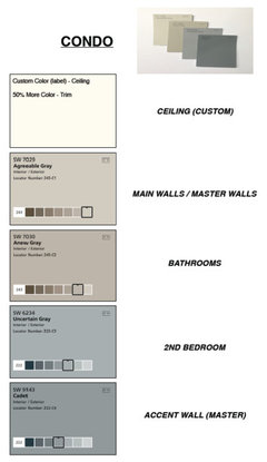
    Sorry for the long delay. Here is what I have chosen for my colors:

    I have it partly painted and will take a few pictures once completed. Thank you all for your help again!!! Greatly appreciated!

  • 10 years ago

    Final Pics! Sorry they aren't very good.

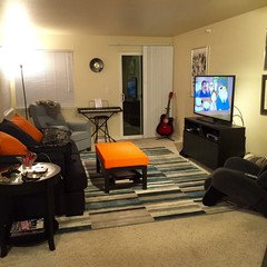
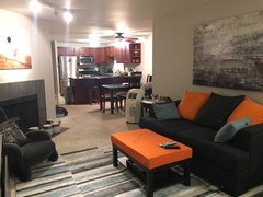
    Agreeable Gray throughout main rooms...

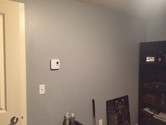
    Uncertain Gray in 2nd Bedroom/Office...

    Master with Agreeable Gray and Cadet Accent (Darker version of Uncertain Gray)...

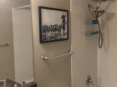
    Anew Gray (Darker version of Agreeable Gray) in Bathrooms...

  • 10 years ago

    It looks nice. I suggest you add something else in Cadet Blue shade in your room.

    829maxx thanked emmarene9
  • PRO
    10 years ago

    You did a great job, love the orange and blue in your living room :)

    829maxx thanked Interior Designer - Home Stylist