Software
Houzz Logo Print
zemptron

Change of heart, need advice!!!

10 years ago
last modified: 10 years ago
Painters are at my house finishing up their prep work, and I've had a change of heart regarding my color scheme.

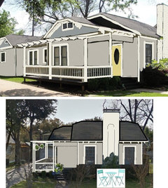
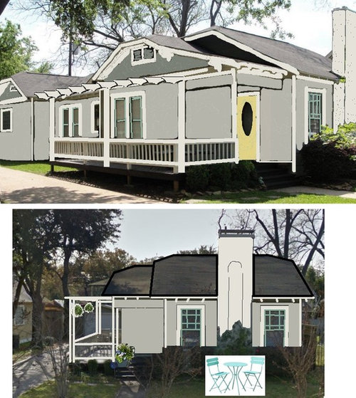
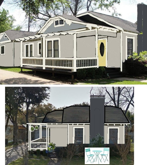
I've mocked up two options in MS Paint, but desperately need help pulling the trigger! What are everyone's thoughts?? Is two-tone siding a good direction for my bungalow?

Definitely open to new ideas as well...

OPTION 1:

OPTION 2:

Comments (19)

  • 10 years ago

    I like option 1

    zemptron thanked jck910
  • PRO
    10 years ago

    I like option 2

    zemptron thanked Cynthia Taylor-Luce
  • 10 years ago

    Either, but I think the door should be turquoise same as the window trim.

    zemptron thanked mramsey
  • 10 years ago
    last modified: 10 years ago
    50/50 split so far ... seems like the Houzz community is as polarized on this one as I am :)

    mramsey - I've played around using the same door color as sash/screens.. it looks nice that way too.. I'll probably save painting the door for last because of how indecisive I am.

    EDIT - also, I found out that both yellows I liked for the front door are interior only paint. So for now, the front door will stay as-is (wood).

  • 10 years ago
    What "feeling" are you going for - cottage? Or traditional?
    The first one IMO denotes a more light-hearted cottage feel with the somewhat unexpected turquoise windows - cute.
    The second option is also very lovely but reads a little more serious.
    zemptron thanked spraguec
  • 10 years ago
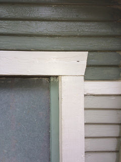
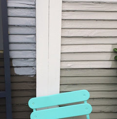
    I snagged some paint samples after work and slapped 'em on my garage.

    Here are the colors in real life:
  • 10 years ago

    And @spraguec, I'm really not sure what look I'm going for. I want my home to feel refined yet inviting.

    I live in a lovely historic neighborhood, and my home was built in 1928. I don't want to venture too far outside of that context with my paint selections.

    Not quite a definitive answer, I know :-/ I'm struggling with this for a reason!

  • 10 years ago

    1928. Keep chimney white. Dark Chimney looks to be too contemporary both for house and neighborhood. It pops nicer too IMO, which is worth what I charge.

    zemptron thanked 19kev77
  • 10 years ago
    @19kev77 - my mother has been advocating the same thing. I think I'm finally swayed... Here's Option 2 with a trim-colored chimney:
  • 10 years ago

    Does anyone have feedback on the 2-tone siding?

    I'm not sure if it looks weird considering the only visible upper-siding is on the sides of the house (the images with the bistro set show the front and center street view)...

  • 10 years ago
    The yellow door gives me pause because you've now mentioned "historic neighborhood" - why not pick a more sedate color for the door and use your turquoise bistro set as your bit of whimsy. Much as you would with interior - keep the main things neutral and add pops of color that can be more easily changed out when something fun catches your eye.
    zemptron thanked spraguec
  • 10 years ago
    last modified: 10 years ago

    Painting the front door is currently off the table - all the colors I liked seem to be interior only paint. Door will stay bare wood for now.

    I agree with you that it is easiest to keep pops of color relegated to easily changed items, but painting a front door is a relatively simple thing to do IMO. Additionally, I see many fun and exciting front door colors in my neighborhood, so I'm not really nervous about going bold here.

  • 10 years ago
    prefer option 1 because the 2 tones siding chops up the space. Using a shade darker or lighter for the gables makes more sense than just dividing the walls,
    zemptron thanked kathleen MK
  • 10 years ago
    last modified: 10 years ago

    Cynthia, I use Sherwin
    Williams Super Paint, so the lack of exterior options is not a quality issue. I
    checked to see if Benjamin Moore offered chartreuse in exterior paint, and
    again this color is interior only.

    My Sherwin
    Williams rep explained to me that this particular color fades in the sun, and
    the yellow tint will bleach out so much that the color is no longer
    recognizable.

  • 10 years ago
    last modified: 10 years ago

    @kathleen MK - I agree with your reasoning, and had a similar thought while coming up with color pallets. I do like the cohesive look of using two complimentary shades of green rather than switching colors.

    I tried to apply a similar effect with Option 2 by using a lighter shade of the sash/screen paints for the gable siding.. but agree that the effect is a bit better in Option 1, especially if the chimney is not painted in the accent color.

    Safe to say I'm leaning towards Option 1 now, and the weather here in Houston has bought me some time. Rain, rain, rain.

  • PRO
    10 years ago

    Zemptron, there is a difference between paint companies and Sherwin Williams is not the best, as illustrated by the fact that their yellow pigment fades in the sun. You need to move to a premium line like C2 Paints (rated the best quality in North America, based on over twenty different categories including fade-resistance) or to Fine Paints of Europe both of which can be mixed in any colour including any Pantone colour you choose. You will have no trouble getting this colour in either paint line.

  • 10 years ago
    last modified: 10 years ago

    Cynthia, I'm still not sure that you are correct here. I just visited the C2 website, and the most similar color available (Lightening Bug) is ONLY available in interior paints. C2 has an entire collection of paints, "The Naturals", which are only available for interiors.

    I am well aware that there is a difference in paint companies. Sherwin Williams' Super Paint is a fantastic line of paint.

  • PRO
    10 years ago

    You may be looking at an obsolete website which for some reason has not been taken down. I was misled by it earlier this year when I wanted a bright blue exterior paint. However, the new exterior formula will allow you to have any colour mixed. You needn't just look at C2's own colours--just choose any colour you want from any manufacturer and you can have it made up. C2's paint mixing system is based on 16 pigments, while other companies have 12 or less, which means that any company's colours can be made in C2, while C2's colours cannot be reproduced by anyone with any degree of accuracy. Sherwin Williams is an ok paint company, especially if you are changing colours every few years. However, the ingredients they use in their paints are not top-of-the-line. For all categories like fade-resistance, spreadability, durability and twenty more, C2 comes in far better than Sherwin Williams. It even surpasses Benjamin Moore's premium Aura line with four times more fade resistance in their yellows. They use Dutch pigments which are the best in the world. C2 doesn't really advertise but they are the first choice of the architectural and design community since we want our projects to be the very best they can be, and our clients depend on us to bring them quality products. Since you are wanting a particular colour, I decided to step up and explain to you how you can achieve this. I wish you success with your project.