

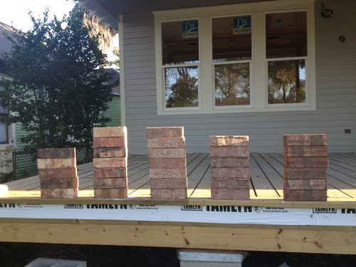
Which Brick?
13 years ago
Featured Answer
Sort by:Oldest
Comments (81)
 13 years ago
 13 years ago
Related Professionals
Daytona Beach Interior Designers & Decorators · Newport News Interior Designers & Decorators · Gary Interior Designers & Decorators · Amherst Interior Designers & Decorators · Newark Interior Designers & Decorators · Flagstaff Interior Designers & Decorators · Wenatchee Interior Designers & Decorators · DeRidder Architects & Building Designers · El Paso Architects & Building Designers · Redding Architects & Building Designers · La Grande Architects & Building Designers · Jackson Kitchen & Bathroom Designers · Williamsburg Kitchen & Bathroom Designers · Chillicothe Kitchen & Bathroom Designers · Allentown Kitchen & Bathroom Designers- 13 years ago
- 13 years ago
 PRO13 years ago
 PRO13 years ago
 13 years ago
 PRO13 years ago
 13 years ago
- 13 years ago
 13 years ago
 13 years ago
 13 years agolast modified: 13 years ago
 13 years ago
- 13 years ago
 13 years ago
- 13 years ago
 13 years ago
- 13 years ago
 13 years ago
 13 years ago
- 13 years ago
- 13 years ago
 13 years ago
 13 years ago
 13 years ago
 13 years ago
 PRO13 years ago
- PRO13 years ago
- 13 years ago
 13 years ago
- PRO13 years ago
 13 years ago
- 13 years ago
- 13 years ago
 13 years ago
- 13 years ago
- 13 years ago
- 13 years ago
- 13 years ago
 PRO13 years ago
- 13 years ago
- 13 years ago
 13 years ago
 13 years ago
 PRO13 years ago
 13 years ago
 13 years ago
- 13 years ago
 13 years ago



Related Stories

KITCHEN DESIGNHouzz Quiz: Which Kitchen Backsplash Material Is Right for You?
With so many options available, see if we can help you narrow down the selection
Full Story
KITCHEN DESIGN12 Great Kitchen Styles — Which One’s for You?
Sometimes you can be surprised by the kitchen style that really calls to you. The proof is in the pictures
Full Story
GARDENING AND LANDSCAPINGRenovation Detail: 4 Popular Brick Patterns for Patios
Classic, durable brick for patios and pathways creates a look that never goes out of style. Which of these four patterns is right for you?
Full Story
HOUZZ TOURSHouzz Tour: Eclectic Chilean Home Embraces Trees
Ficus trees star in the interior courtyard of this Santiago house, which celebrates its design history, quirks and mix of styles
Full Story
LANDSCAPE DESIGNHow Brick Fits Into Today’s Gardens
Natural brick is often considered a traditional building material. Here’s how people are using it in contemporary gardens too
Full Story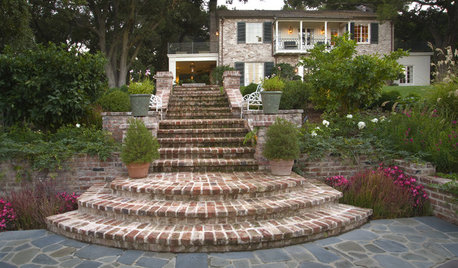
MATERIALSReclaimed Brick Brings History and Charm to the Garden
Old bricks make durable and beautiful pavers for the home landscape
Full Story
HOUZZ TOURSMy Houzz: Clutter-Free Minimalism for a Converted Brick Storefront
Open and bright, this Salt Lake City home exudes calmness, simplicity and comfort
Full Story
TILEHow to Choose the Right Tile Layout
Brick, stacked, mosaic and more — get to know the most popular tile layouts and see which one is best for your room
Full Story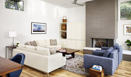
DECORATING GUIDESWhat You Need to Know Before Painting Brick
Sure, painted brick can be a great look. But you need to take some risks into account. Here's how to paint brick like a pro
Full StorySponsored

Columbus Design-Build, Kitchen & Bath Remodeling, Historic Renovations



Jayme H.