Software
Houzz Logo Print
sam_patterson

need help for my kitchen wall and trim color!

10 years ago
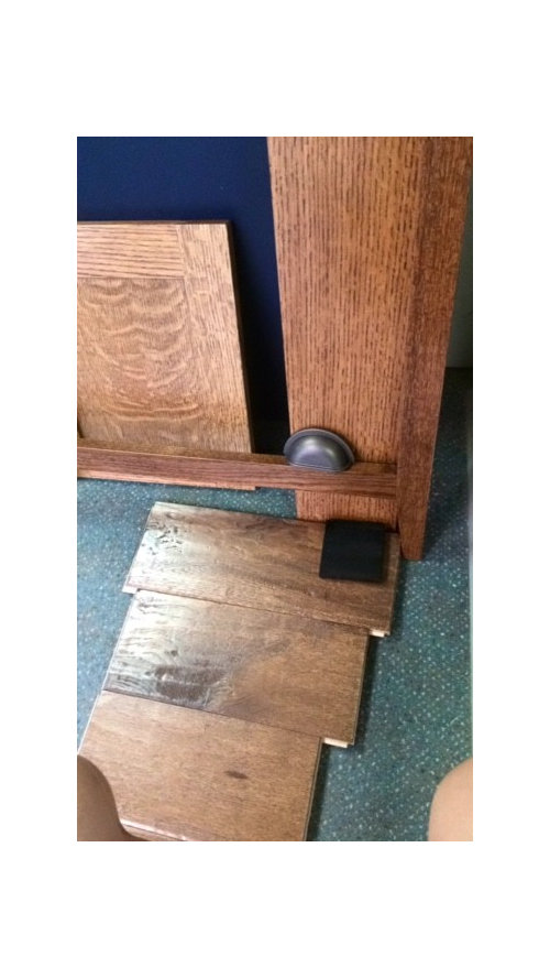
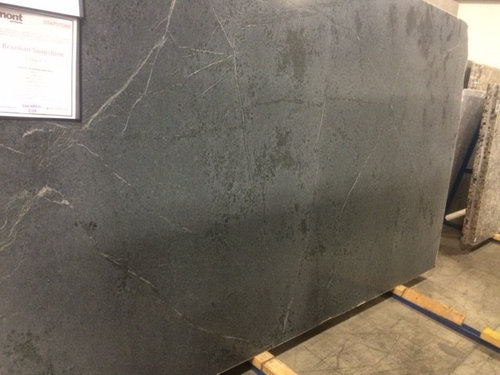
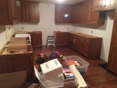
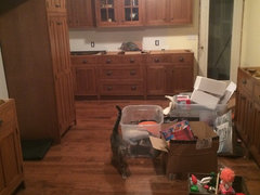
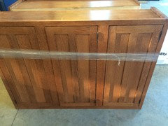
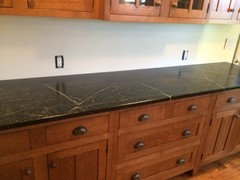
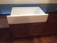
We are in the final stretch of our kitchen renovation. it is time to choose the paint color for walls and trim. i am a little discouraged because i at first wanted a grey/greige color for the walls but our kitchen cabinet stain turned out a little darker/richer than anticipated so i need to brighten to room as much as possible as we are getting black soapstone countertops. (pictures below)


However, we have a white kohler farmhouse sink and will be doing (i believe) a white subway tile as a backsplash.

there are so many shades of white/off white, i was looking for something with a hint of yellow maybe? to warm and brighten? and then a different shade of white for the trim.

This is a terrible picture of the flooring, but it is american scrape solid hickory, candy apple finish up against our cabinet coloring with just a random sample of a blackish countertop. we are going oil rubbed bronze with the knobs and fixtures.


any thoughts?? is this even the correct color to gravitate toward?

any help is welcomed and appreciated!


Comments (18)

  • 10 years ago

    You might post on Home Decorating Forum. love that black soapstone!

  • 10 years ago

    Nice selections. Ditto what Sylvia said. Here's a link someone posted for someone else in a similar boat. These greens are so elegant.

    Good luck!

    https://laurelberninteriors.com/2015/04/19/6-serene-green-paints-that-arent-called-green/

  • 10 years ago

    Before reading your entire post I was going to suggest a soft yellow!!! I think it will look great. I love BM lancaster whitewash & white marigold. Good luck

  • 10 years ago

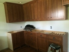
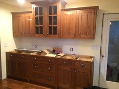
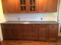
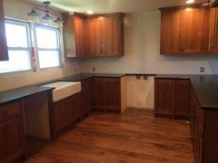
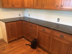
    Here are some updated photos of the cabinets installed. No countertops yet though. And don't mind the junk in the middle of the floor.


  • 10 years ago
    last modified: 10 years ago

    Not sure what the rest of your house is - but that kitchen is classic early 1900s & is screaming out for for the richer earthier tones of that era & craftsman style, which as you know was inspired by nature and natural materials - browns, golds, coppers, moss greens, etc. If ivory or creams are in the room they should be something substantial that stands up to and works well with the heavy wood - not stark white. The light pastel yellow in the pic may make the wood look heavy and dull in comparison - try something more golden with browns/reds in it that would better complement & make it more harmonious with the wood tones.

    Sure try the home dec forum but those folks over there tend to be afraid of color. IMHO kitchens & baths are 2 places where its easier to be a bit bolder and more expressive with color - even if rest of house is more neutral or restrained with color.

    What kind of wood? Very nice cabs - the old fashioned cupboard latches would really be a nice finishing touch. http://www.houseofantiquehardware.com/cupboard-twist-latches

  • 10 years ago

    The stark white will be covered with antique white subway tile. The walls that will be showing are more yellow in person.

    Bold colors with those cabinets and the darker floors would just make the whole room feel like a cigar box.

    Our cabinet maker suggested against the latches because If the cabinets ever shift the doors will no longer shut properly since they're inset

    the wood is quarter sawn white oak with an English chestnut stain. Oil rubbed bronze pulls and knobs.

  • 10 years ago

    My 100 yr old cabs havent shifted in 100 yrs but its certainly your choice/your kitchen! I didnt see you already have the knobs on - the bronze looks good.

    By "bolder" I didnt mean screamingly bright, and not dark or cigarbox in anyway - just .... COLOR, perhaps a soft midtone gold or mossy green.... as opposed to pastel or something with a lot of white in it where you just barely see a hint of color. Spoze you've already seen the historic palettes that many paint co.s offer - can be a good starting point, Ill echo the above suggestion for greens - something about green + rich
    wood just looks so RIGHT to me, yknow? Perhaps because we see that
    combination so often in nature.

    I dunno, what does your feline inspection team have to say about it?

  • 10 years ago

    Lol lets just say we built this kitchen addition ourselves...added it to an existing already crooked structure. Half is new and half is old so the odds of it shifting atleast a little bit are pretty good! Countertops on Tuesday so maybe they will add the necessary contrast to bring the yellow out.

  • 10 years ago

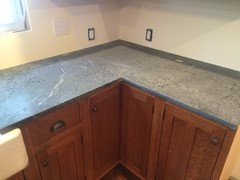
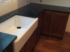
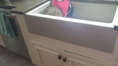
    countertops after being oiled!

    thought on the overhand around our farmhouse sink? its 3/4 of an inch...is that too large? my husband seems to think it should only be 1/8-1/4 of an inch


  • PRO
    10 years ago
    last modified: 10 years ago

    Take a look at Farrow and Ball's "Lichen" or do something similar.

  • 10 years ago
    last modified: 10 years ago

    Overhang is too much! Mine is against the counter with no space. That picture makes it look as though there was an error in measurement.

  • 10 years ago

    Thanks. Your sink doesn't have enough overhang for what we are going for. It was cut on site so there was no error. They say ours is typically what they do but they are willing to come and shorten it a little bit.

    We want to be able to sweep food particles and whatever else directly into the sink. Your sink has a lip before the sink and I feel like food would get stuck there before it made it to the sink.

    The majority of pictures online show a sink with countertops like ours. Yours is a postive reveal. We still want a negative reveal just not as big as what we have now.


    Thanks

  • 10 years ago

    love that oiled soapstone!

  • 10 years ago

    Thanks. The sink is a kohler apron front and it made to stick out that far.

    we do have the metal rack and kohler shave a warranty against staining etc. So we shall see lol

  • PRO
    10 years ago

    If you don't like greens, what about a slightly dirtied aqua? You need to bring in a cool color - not the yellow you now have.

  • 10 years ago

    Thanks but we chose the yellow. Cool colors wouldn't mesh well with the overall feel of the room.

  • 10 years ago

    I think yellow would go very well in that kitchen.