Software
Houzz Logo Print
cecnolan

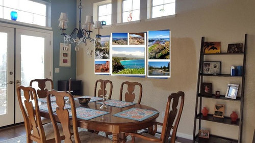
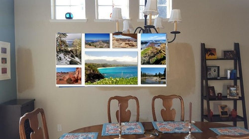
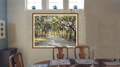
Collage too big or too busy?

10 years ago
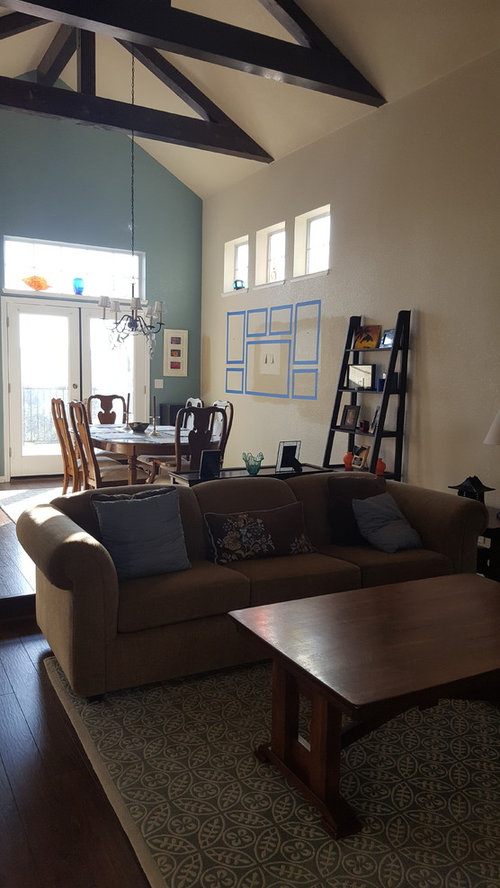
Note that the white wall will be warmed up slightly with pale tan - not the medium tan already sampled on the wall.

I think the high ceilings, bright light, and neutral furniture allow a punch if color for the collage, but the conservative part of me wonders if this collage is too much.

Also, one of my goals with the collage is to highlight photos we have taken on trips. So I don't want to switch to a different style if wall decorations. These will be canvas wrapped.

Comments (21)

  • PRO
    10 years ago

    With those images, yes, it's too busy. You already have lots of smalls in the room. With the right artwork it could look OK although one or two large pieces would make the room more spacious.

  • 10 years ago

    I'm not a huge fan of collages, but I think you've got the perfect location. And - it's art that has meaning to you! My only suggestions would be to space them a tiny bit further apart and if it's not too late, frame them. I ordered one for my son with what they call a "floating frame". It looks really good.

  • 10 years ago

    The scale is all wrong. For a lot of things. The collage that you specifically asked about is much too small scaled for the room, without the use of enough negative space. That isn't a 10x10 room with 8' ceilings. You have to rethink the whole here. Nothing smaller than a basketball should exist in the room as an accessory. The shelving clutter has to go away. Preferably the shelf too. It is the wrong scale. The collage needs to be 5x as large. With plenty of space in between.

    The whole room is contemporary, not traditional. Think about slipcovering the chairs in a color. And getting rid of the accent wall. Change out the chandelier to something more contemporary.

  • 10 years ago

    I think a collage of nicely frame travel pics will look great. But only if you get rid of that ladder shelf full of pics. Otherwise it really will be photos-and-little-stuff overload on that wall.

    you need breathing space

  • 10 years ago
    Good points about the petite ladder shelf and its accessories. But I don't what how to replace its function: I "had" to put the ladder shelf there to break up the space, because the windows are not centered on the wall. Since my wall art needs to be aligned with the windows (right??), the shelf was placed to redefine the wall center line.
  • 10 years ago
    last modified: 10 years ago

    Step back and take a look at your photo...in my mind the collage/windows/ladder are just too busy with so much competition of shapes. It's lovely to have a collage of your travels, but don't think this is the wall for it. Maybe if you photoshop less the ladder, the small chest in the corner and add one large piece of artwork and see how you feel about that kind of look. Simple but impactful. Windows not being centered on the wall is not a problem; the table/art/windows just have to be lined up/centered for proper balance and ladder is not needed.

  • 10 years ago
    Is it still too busy with this trio because of the ladder shelf?
  • PRO
    10 years ago
    IMHO...You do not have to "define the space" by having the ladder there....
  • 10 years ago
    I agree that the ladder shelf adds nothing but busyness and clutter
  • 10 years ago
    And I'm not keen on a trio of artworks under a trio of windows. Either a collage/gallery wall or one really big piece would work better
  • PRO
    10 years ago

    You should get rid of the ladder and have the collage extend pass the windows on both sides! You can also remove the picture to the right of the door.

  • 10 years ago

    I wouldn't do a collage right there. I would remove that ladder, that does not look good, and I would remove that little picture by the door and those colored bottles above the door. Because you already have those three little windows, I would stay away from more little pieces of art and instead do one large art piece on that wall.

  • 10 years ago

    My issue with the ladder shelf is that it is so "collegiate" like milk crate bookcases. I would remove the white trio frames flanking the French doors and make a larger collage of your travel pix on the wall right of where you've placed the ladder. Under the triple windows, try a trio of mirrors just about the same size as the windows. Center them 5' above the floor, and if you don't like to watch yourself eat, get crackled or smoked mirror for them. Be sure they're big enough to have an impact. Another thought is just to hang a floating shelf under those windows, with or without mirrors.


    DKOR Interiors - Interior Designers Miami - Elegant Escape · More Info

    A House in the Woods · More Info

  • PRO
    10 years ago

  • PRO
    10 years ago
    With the height of your ceilings, a single large piece of art would ground the space. Have you tried reorienting your dining table?
  • PRO
    10 years ago
    I think turning the table so the head seat is facing your high window wall would give a large piece of artwork a great presence. It would also help line up high Windows with table. Might be worth a try. Your sofa is lengthwise too. Your travel pictures need a different home. Find a long wall where you could put a photo shelf and stack and arrange your favs that way.
  • PRO
    10 years ago
    Your chandelier needs to be lower too. Bottom should be around 30-33" above table top. Perhaps a more modern fixture would suit better as well?
  • 10 years ago
    Thanks to all of you for the suggestions. Definitely a lot of good ideas to contemplate! I love this website!
  • 10 years ago
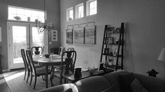
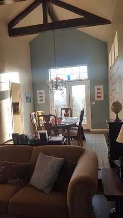
    This is the remainder of the room. So the small white frames flank the french doors (with beloved photos we took), and the (old) table can't be re oriented.
  • 10 years ago

    Even more convinced that the white framed photos should move elsewhere. They can't be lowered to proper height (center point 5' above the floor) without crashing with the light switch. The doors and the window above with your piece there are plenty of action for your accent wall. The blue piece on the left looks good, but it does need a frame and to be lowered. Consider a floating buffet on the triple window wall - there's plenty of room.


    Lake Calhoun Contemporary · More Info

    A.P. House · More Info