Software
Houzz Logo Print
leslieplush

Need help choosing exterior paint colors!

9 years ago
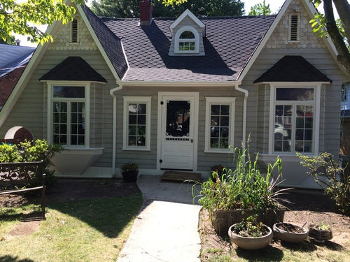
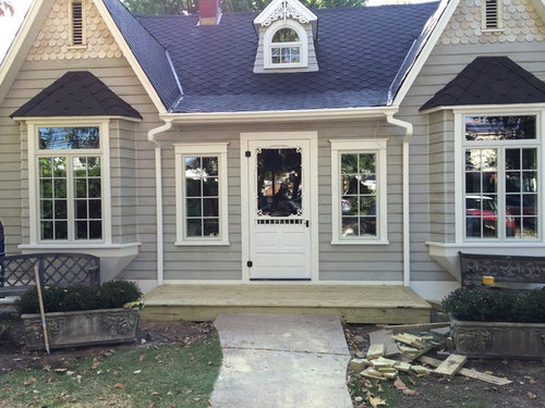
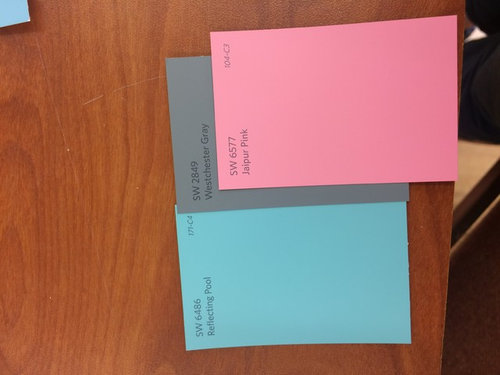
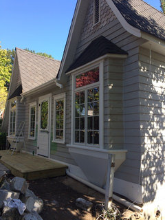
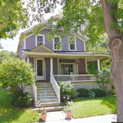
My Painter is coming Monday and I still can't choose a main body color. Right now my cedar lap siding is primed in a pale grey. We would like to have a colorful house. But not sure how colorful I can go before it looks too garish. I'm thinking 2 options -

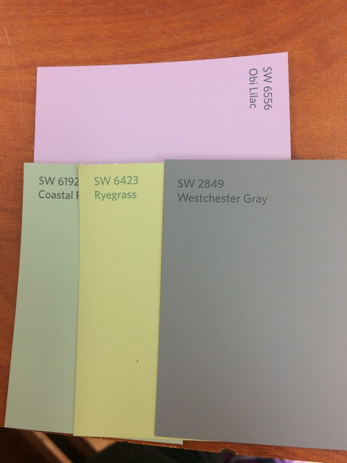
1) body is green, pale to midtone. with lavender fish scallops in the 2 peaks and the scrolls & front door will be in an accent color of Berry pink. I'm not sure if the window trim, soffit & fascia should remain white. I'm open to any suggestions.

2)body is on the bluer side with a coral front door, and the rest the same just altering the shades to suit blue. (violet for the scallops)

any help would be great. oh we are in the process of building a small front porch.


Comments (92)

  • 9 years ago

    Parts of the house made in wood should be painted in sheen no lower than satin. However, I hate sheen so much that I once painted the redwood siding on my house in flat. It looked ok, When I repainted I used satin, I like it slightly less but it is easier to clean. Trim and door can be any sheen that appeals to you, still, if they are wood I would not go lower than satin, Some people really like high gloss on doors and trim, That is a matter of personal taste I think.

  • 9 years ago

    now i'm concerned. I painted my wood siding in flat. Should I paint it in satin?

  • 9 years ago
    last modified: 9 years ago

    Usually satin on all or a semi gloss on trim and satin on rest. It's okay. Don't worry about it. I'm surprised your painter didn't comment about it, though.

  • 9 years ago

    Just stick with your Silver Peony for your trim. I don't think this house is large enough for any more colors.

  • 9 years ago
    Satin holds up better to the weather. If you put two coats on, use Satin as your top coat. Satin definitely on the trim. By the way, you did an awesome job with the house. I was off working so havent' had time to check back in on status. Can't wait to see the finished project!
  • 9 years ago
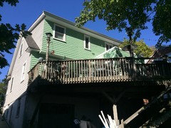
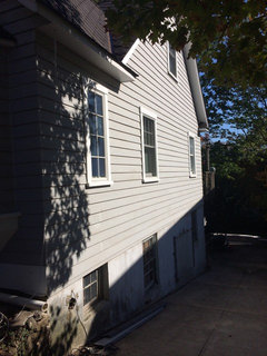
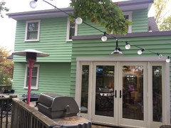
    Thanks so much for the quick advice. The funny thing about my house is that it's small in front but is built on a hill. Here is the back & sides.
  • 9 years ago

    Yes, but the front is small and only so many places to put different colors.

  • 9 years ago
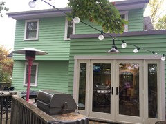
    I have updates!!!!! Finally the back of the house is done.
  • 9 years ago

    Cute! I like the colors together.

    leslieplush thanked Emily Jowers
  • 9 years ago
    Looks wonderful.
    leslieplush thanked gtcircus
  • 9 years ago
    It looks fabulous!
    leslieplush thanked life4real
  • 9 years ago
    So pretty! You chose a wonderful green, really fresh.
  • 9 years ago

    That color is very similar to my house.

  • 9 years ago
    Really kris? What color is yours? Do you like your house in the green? What are your accent colors?
  • 9 years ago
    PLEASE HELP WITH A FEW MORE THINGS
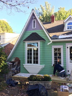
    I'm not sure if anyone will see this but here is the beginning of the front of the house. I have some things I need to figure out still.
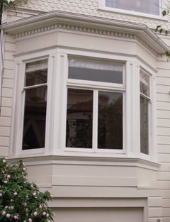
    *The white area under the bay window. I was thinking a
    1) dark green.
    2) same purple color as the scallops and fascia (not painted yet)
    3) darker plum

    *TOP ARCH WINDOW AREA
    1) green same on as body
    2) same purple as scallops
    3) darker plum

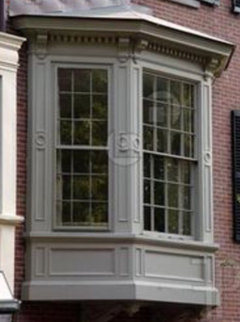
    *BAY WINDOW AREA
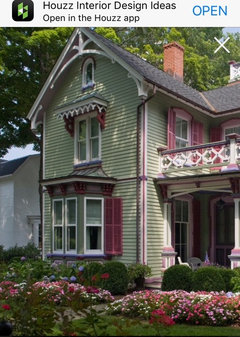
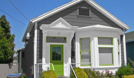
    I feel like it's floating- maybe when it gets painted it won't feel that way. I'm trying to use THIS green & purple house as my model for ideas and color balance. I know they have more colors and do dads. (We do have gingerbread scrolls for all 3 pointed roof areas. Color TBD.

    Thank you all so much!
  • 9 years ago
    Reverse the colors! The purple goes on the bottom and the white on top.
  • 9 years ago
    I think I would like the darker plum on the bases. I think it would ground things more? Also for the top window are having, I think it would be good to do that in the light purple. In your second photo at the beginning, you had some scroll work in that window. The scroll work should be dark plum as a nod to the bases. Are you doing any ombré on the scallops? I think it would be so pretty!
    leslieplush thanked life4real
  • 9 years ago
    OK, I thought base of the window was painted white. I would go with the dark plum for balance since you have light purple in the peaks, it will keep the symmetry going. You can paint it dark green, but you would need to add that color elsewhere to tie it in. Hope that makes sense? You can't just add a color for the first time under the Windows.
    leslieplush thanked gtcircus
  • 9 years ago
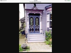
    I remembered this screen door... a bit over the top!
    leslieplush thanked gtcircus
  • 9 years ago

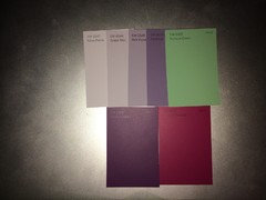
    life4real & bellburgmaggie - thanks for the responces. I think I will go with the purple/plum. I am not sure about the ombre yet, we tried it with 2 colors just to see and it seemed like not enough space. But I'm thinking I should go for it. The current purple is the middle color, ASH VIOLET. Mythical is the shade darker. Then I could use that on the white base under the window. I do have scrolls, but I was thinking lighter not darker in color. But I will give that another thought.

  • 9 years ago
    Even if you don't do ombré, I think the scallops would look good with some variation like you had before. They are so cool and with variation, it draws the eye to see they are scallops rather than one solid color.
    leslieplush thanked life4real
  • 9 years ago

    i guess i'll need a small brush! The variation on the scallops was just a primer coat that I had sprayed on. But I do miss seeing the different random shades of color.

  • 9 years ago

    Either do the bottom of he bays a darker plum or use the green. Both will keep them from looking like they are floating. I would do the same green on the arched gable, because it has the same siding. I like to keep like materials the same color for continuity -so it looks like there was a plan.

  • 9 years ago

    I never saw your question about my paint colors. My house is Antique White and a chocolate brown with the green. It is kind of a Ranchy Craftsman style. I do like my green, but it has faded from the Western sun and we are doing an addition right now, so I am switching up my colors.

  • 9 years ago

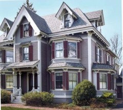
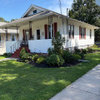
    This house has a color scheme like your second one and doesn't look too garish.

  • PRO
    9 years ago

    deeper colors on top will help anchor the house-if its not too late, paint the fish scales a deeper tone do not be afraid to go all out with your Plum! And use that lighter purple on your window sashes. for under the bay windows-I think I would go an even deeper green. Colors never look the same from one computer to another-SW Antique Lace, or Antique Ivory should work with your colors-

  • 9 years ago

    Charming! Wonderful color choices. Go with a darker plum on bottom of bays. Glad to see down spouts " disapear" will they come back? If so make them green. Your front door could use some trim that would draw our eye. Wonderful changes you have given to this home.

  • 9 years ago

    I'd go with a really dark plum under your windows to ground them, but also to balance out the dark roof right above them.

    Absolutely beautiful home! I bet your neighbors are loving the beautification of their street. :)


  • 9 years ago
    Colorist - thank you for your response. I thought I read darker colors on bottom anchors the house. I do feel that deeper tones are missing from the scallop area. I was planning to add SW6550 MYTHICAL a darker shade purple then the Ash Violet that's on the house now.

    Abzyyx - we took the downspouts off so it would be easier to paint. Yes we will paint them to match/disappear
  • 9 years ago
    Hi solraven thanks for the uplifting comments. I've been thinking I went to bright on the green. But maybe the darker plum will anchor the house better. Do you think the SW 6550 mythical is dark enough? Kimono Violet is the color I was thinking for the front door. Or Forward fuchsia.

    Trim for the front door to add interest. What were you thinking?
  • 9 years ago

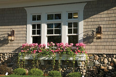
    Hi Leslie, How about two small, gingerbread style or wire window boxes for the windows on either side of your front door? Use one of your accent colors or trim color.

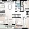
    Plan #013S-0014 · More Info

  • 9 years ago
    On scrolls you go a shade darker on base and lighter on the high relief.
  • 9 years ago

    Leslie, I like the tone of Mythical, but think it should be deeper making it almost a neutral, but ... more interesting. I'd go with Majestic Purple SW 6545.

    I like the green, and if you think it's a bit bright, even better because it will fade/oxidize a bit over time.

    I'd hold off on picking the front door color. I do like the fuchsia, I just need to see it when it's all together.

    With all the exterior and interior painting that you're doing, ask SW for a fan. They gave me one when I painted every inch of our home, and it was super helpful to see the whole array under the on site lighting.

  • 9 years ago
    I hope we get to see the finished project!!
  • 9 years ago
    SOLRAVEN - thank you for all of the great advice. I was thinking I'd like to go more neutral. I'll take a look at the color in my fan deck. I was given one when I started this project. I too want to wait on choosing the screen door color too. However I can pick it as soon as the front is finished. The inside of my house is all painted. I can post those pictures if you are interested. I still need to pick my foundation color. I was thinking to continue the same green or just a bit darker. Any suggestions?
  • 9 years ago
    last modified: 9 years ago

    Yes!! I would love to see the interior! Seriously, I wish you lived across the street from me. Your house would put a smile on my face everyday. :)

    Another color that might be even more neutral, and grounding is Quixotic Plum SW 6265. It's really deep, but should still show off the purple in the outdoor light.

    As for the foundation, I'm not feeling green down there. It seems logical, and like it would make sense, but it doesn't wow me. Surprisingly, I think the best color would be the trim color, medium purple.

    Normally, I'd prefer a foundation to be darker and more grounding, but I'm also looking at your steep, and possibly narrow driveway, as well as the basement area under the patio.

    If you have a walkout basement, it'll make that shaded area under the patio feel more inviting, and more usable. Using a cheerful color will take away the feeling of being under the deck, but instead you'll feel like you're on the "lower level" of your outdoor living space.

    As for the side of the house, I'm imagining myself needing to back up that steep driveway, at night, with the trees blocking the streetlight. Backing up a hill is tricky enough, because you can't see the road, so it's helpful to have higher visuals. If your foundation is dark, it'll make it harder to see.

    And my last reason, burglars want to blend into their surroundings. Purple is such an eye catching color, that anyone standing against it, will be seen. :D

  • 9 years ago
    Darker for foundation
  • 9 years ago

    I love Kimono Violet. Almost painted my front door that color. Went with Concord Grape instead. Still trying to think of a way to use KV indoors.

  • 9 years ago
    solraven - thank you for the ideas. I like Quixotic Plum. But I'm nervous to use that as the base area under the window. I am eventually going to add trim work there. (I think I have an idea picture that I can post) Driveway- we park the cars at the top so we don't bring our cars to the bottom of the hill by the garage door. Under the deck/patio - also an area we don't use to hangout. We have a side shed that needs to be sided. (Hopefully before winter gets here. But I would like it to be a happy color. I thought of the Ash Violet trim color as the foundation at one time. Then after seeing the side of the house painted I thought it would look good in the green or slightly deeper/greyer. TBC I wish you lived across the street too!
  • 9 years ago
    bellburgmaggie
    "On scrolls you go a shade darker on base and lighter on the high relief."
    The gingerbread we have is flat. But I love the 3 dimensional enhancement idea using the paint.
  • PRO
    9 years ago

    I would keep the gray on the body, use a couple of muted colors on the trim, door, and gables in front... such a cute house!

  • 9 years ago
    Sustainable Dwellings - thanks but that shipped sailed I've painted the house already. Your idea is sweet and sophisticated.
  • 9 years ago
    I'm waiting for more pictures because I'm so excited about your whole project! I would love to see the inside too!
    leslieplush thanked life4real
  • 9 years ago

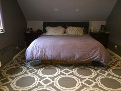
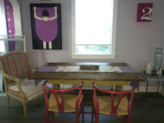
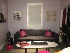
    Life4real - I'm excited too. It's raining today so no painters. Hopefully they will come tomorrow. Here are a few pictures of the inside. These are not the best pictures, I'm not that great at doing that "pinterest" look!

    My bedroom. Pale lavender ceiling with mushroom walls. I painted the floors, created the stencil pattern and stenciled away!

    Dinning room side, same color lavender as bedroom. I made the table from reclaimed lumber. Sanded it down to a smooth finish and painted an old base that I recreated and hand painted with chalk paint and did several waxings to give it a patina.

    The other side Living room area. I have a hot pink vintage sofa that has grey velvet on the back. I'll take a better picture later. Don't mind the grey towel on the sofa. I have a lovely kitty who loves the house and every surface I have.

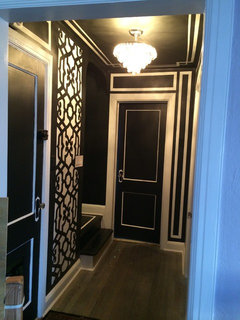
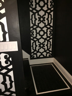
    My lovely hallway - stenciled by me.

    THE LANDING TO UPSTAIRS

    I have a small den, the kitchen 2 small nooks that are all completed. I need a real renovation in both bathrooms but that is for another time. There's more to see but I will take better pictures. Thanks for indulging me!


  • 9 years ago

    Leslie, thanks for the good information. If you feel that a darker green would look best, go for it! You're there in person, and can not only see the space, but get a feel for it. Your color choices have been beautiful and spot on so far, so I'd go for it.

  • 9 years ago
    What fantastic pictures! I'm so impressed with your stenciled floor and hallway! You are very creative and focused to follow it through! Your table! I just love things that have your own handiwork in them!!!!! Great job!!!!
  • 9 years ago
    Life4real - thank you so much. Both my husband & I have our own major projects for the house. He's electrical and plumbing. I am all decorative and furniture but together we do wood working. Our front porch is the newest of our combo.
  • 9 years ago

    Leslie, beautiful! My favorite is the bedroom floor and for some reason, the plaid chair in the dining room. Nicely done mixing those two types of chairs. They're totally different, but are in the same color family.

  • 9 years ago

    I love your bedroom floor and the hallway stenciling! Very impressive!

  • 9 years ago
    Great job!